Life Clock 2017
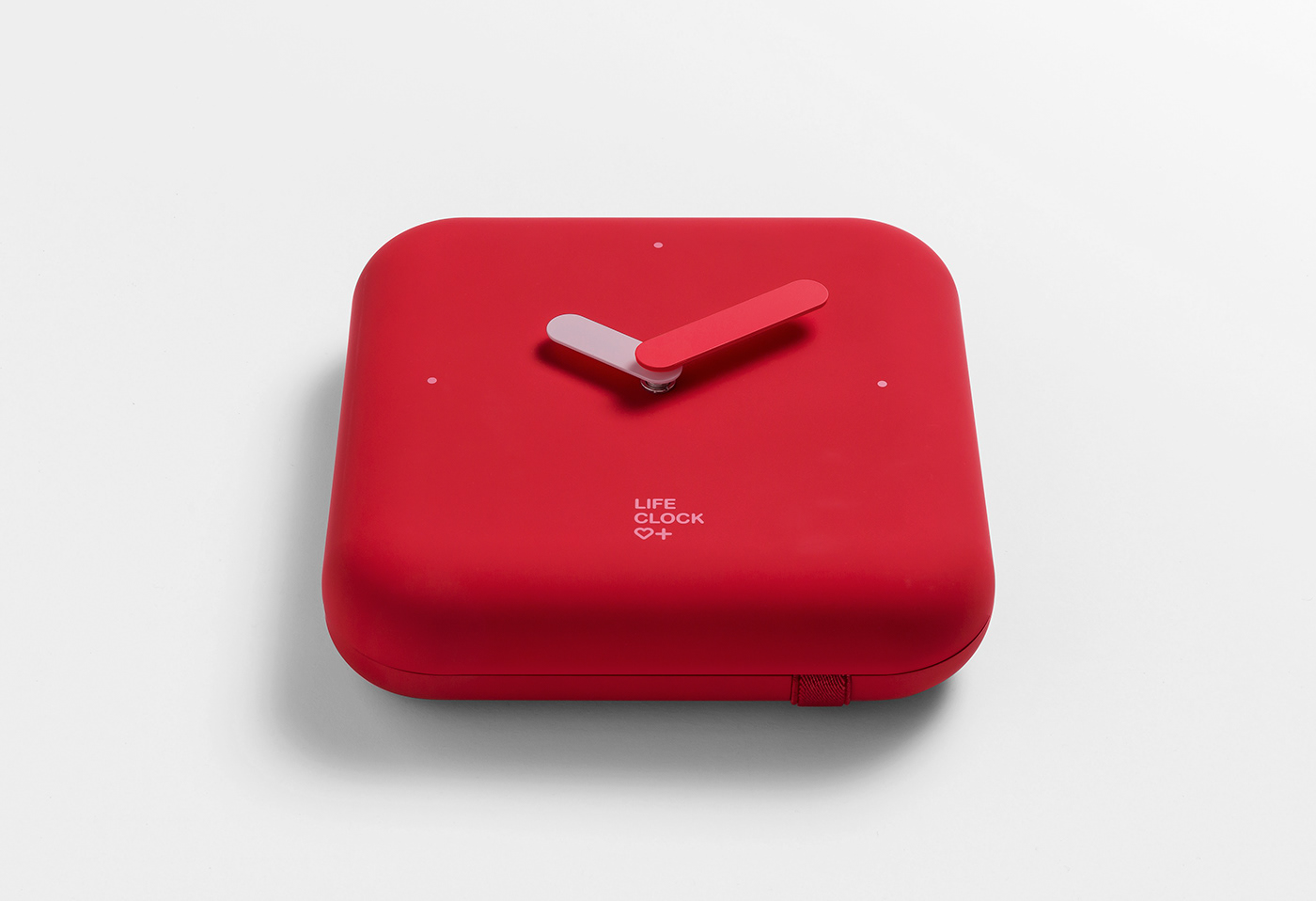
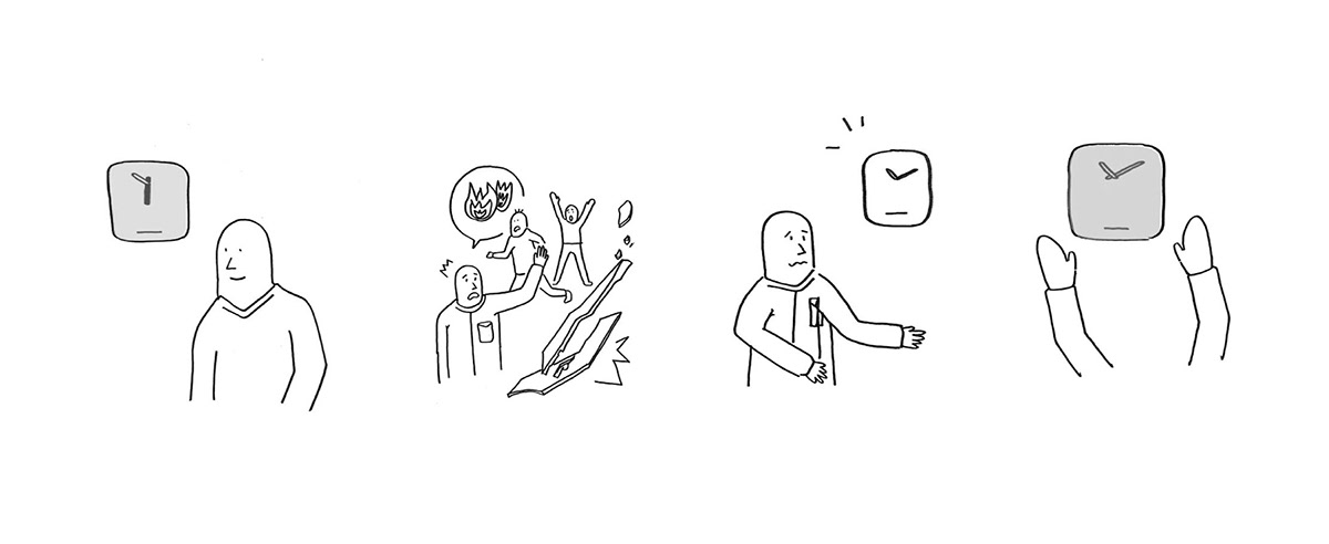
The Life Clock was designed in a way to make it stand out from existing disaster-related products and to ensure it can blend in with the lives of its users much more easily. Disaster supplies, which invariably feel heavy, are necessary items in life.
So, we wanted to use a 'clock' as a metaphor, which is an everyday item that lives and breathes with the people that uses them rather than a weighty object.
So, we wanted to use a 'clock' as a metaphor, which is an everyday item that lives and breathes with the people that uses them rather than a weighty object.
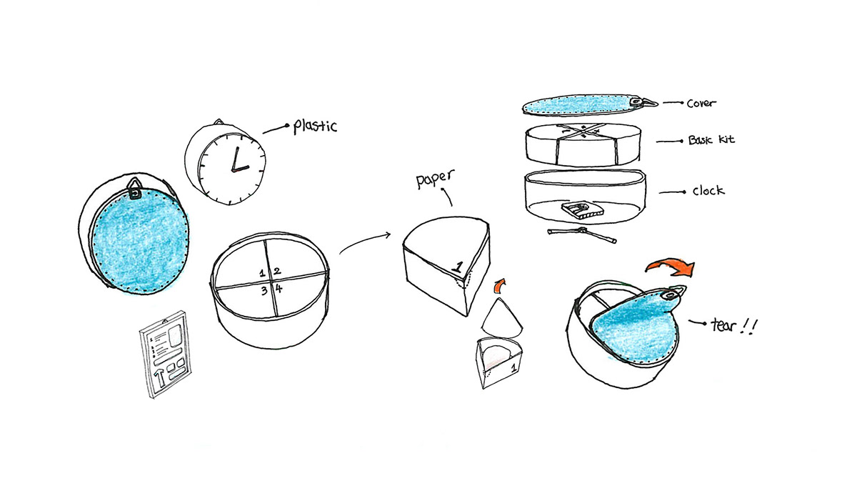
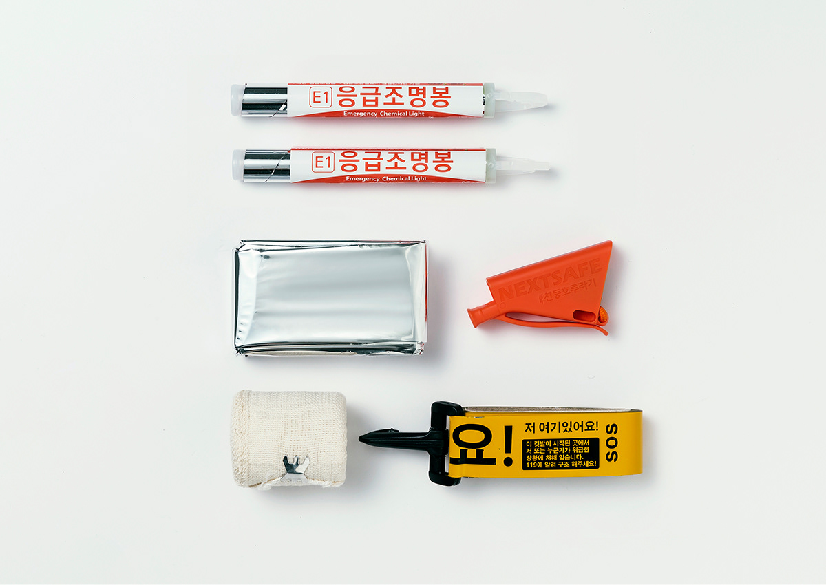
To help see it when it gets dark indoors, the Life Clock features illuminated batons, aluminum thermal insulation blankets to sustain body temperature, compression bandages for first-aid treatment for hemostasis and broken bones, whistles for location-signaling, flags to indicate distress, an ICE card for simple personal medical information, and a guidebook that tells people what to do in case of a disaster.
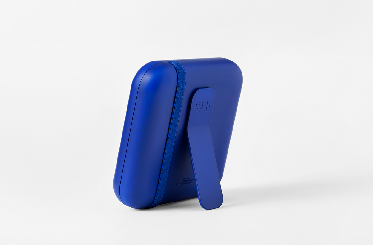
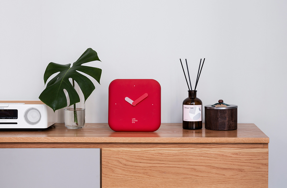
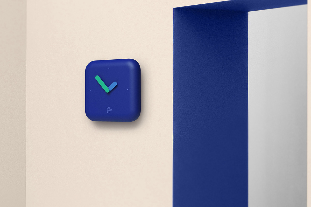
As a clock, it naturally permeates into everyday life, and at the same time, it has an internal structure that enables immediate action in emergency situations.
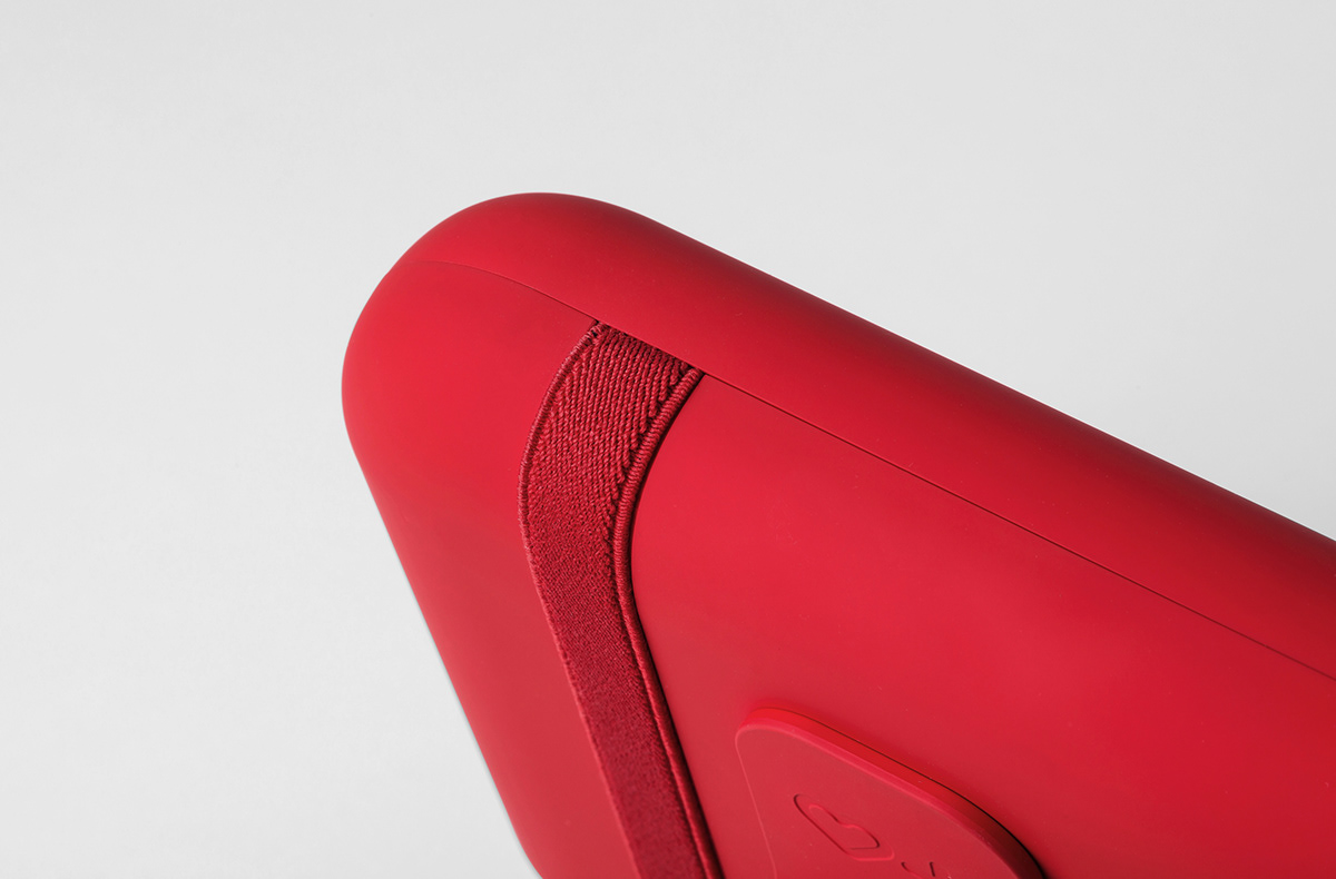
The Life Clock has been launched in three colors – red, blue, gray – to help it break away from the typical presentation of existing emergency or disaster kits and portray a distinct image as an interior decor item.
The Life Clock has been launched in three colors – red, blue, gray – to help it break away from the typical presentation of existing emergency or disaster kits and portray a distinct image as an interior decor item.
Client : Gyeonggido company
Design : SWNA


SWNA
-
2F/3F, 31-9, Bukchon-ro, Jongno-gu, Seoul, Korea
+82 2 6380 9881
contact@theswna.com
contact@theswna.com
-


