


Koorbiënnale Haarlem
The shape of sound
Koorbiënnale is a festival which showcases worlds' best choirs and vocal groups. From experimental music-theatre to warm sounds of gospel and everything in between. Concerts take place in- and around the cities of Haarlem and Amsterdam. From downtown to forests surrounding the cities. The festival attracts and supports an international audience as well as local choirs and music groups.
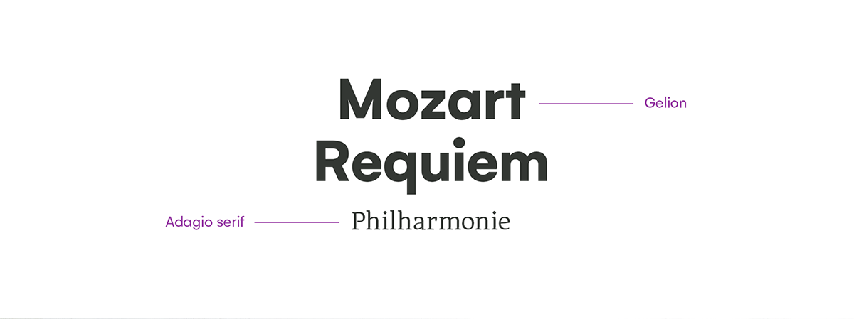
Like the festival, we created a colourful, clear and fluid visual identity. In it's heart are three typical singing birds which reside in the festivals' area and a visualisation of sound in an organic almost leaf-like form. Songbirds were a main part of the 'old' visual identity. If the festival-organisation desires, the new system leaves along with our freshly designed logo leaves plenty of room to go in different directions.
Client: Koorbiënnale Haarlem / Branche: music, cultural, festival
Service: Brand Refresh / Year: 2019


The festival is divided up into three areas. Each area has it's own songbird and color.
The ruby-red color and artwork work as the key visual for the campaign since no specific area is communicated.


spacing
Photos: Melle Meivogel
spacing


