About Irish Rail
The Irish Rail mobile app provides the user real time information about Dublin city's train/metro schedules. This project will be focused on the Dart services.
The app has features such as the display of delays and remaining time to departure, journey planner (Timetables), details of intermediate stations and alternative routes based on current location and also includes door-to-door navigation and walking distances.
Context
When using the Irish Rail app my first couple of days living in Dublin, I noticed that I was constantly confused about the schedule of the train, specially because I was not used to Dublin's public transportation system yet. It happened things to me like, rushing to catch the train without need, or some occasions that I had arrived way to early at the station, while thinking that I was precisely on time. Confused, I looked at the app with a little more attention to see if I could understand it better.
Defining the Pain points
Taking a deeper look at the main flows of the app and talking informally with people who reported to me similar problems to the ones I was having, I had the conclusion that there was a problem in the way that the app displays two different type of train searches: the ones based on your current location and the ones based on the route between two train stations. I noticed that when You search for a train route, you can get two types of available results, as mentioned above: If you search for a route selecting your current location as the departure option, you'll get the information about the time you have to leave your current location to catch the train + the actual time schedule of the train, Or If you search for a route selecting a actual train station as the departure option, you'll get just the actual time schedule of the train. So far, so good. But the problem is not the information itself, instead the way that is displayed: The app displays the time that you have to leave your current location to catch the train, based on a route starting from your current location, in a very similar way that it shows the actual train departure time, when it's based on a route between the location of two train stations.
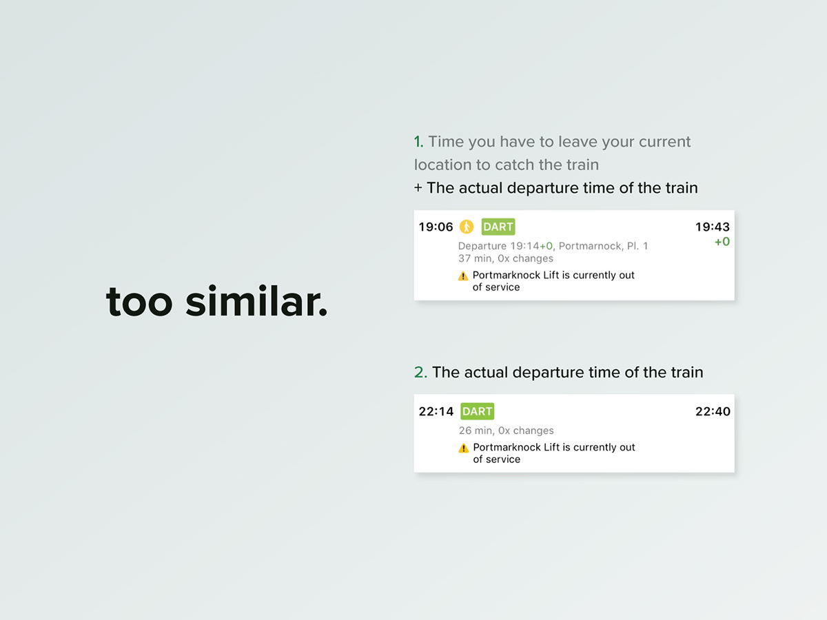
I suppose this layout can make people confused just as it confused me while using it for the first couple of times. Furthermore, digging into the app flows I found out a couple more details of the interface that could be improved, so I decided that redesign the app would be a great opportunity to improve my UX/UI skills.
Challenges
The main goals were:
• Recreate the main screens of the app with a more comprehensive interface, to avoid the misinterpretation problems that people me and other are having within the app "Journey Planner" information hierarchy and other problems that could exist.
• Redesign the app visual identity and adapt the layout to bigger screens, since it doesn't take advantage of phones with screens bigger than 4.7 inches.
• Take into consideration the possibility of new features in the app, in case of them being needed to improve the user's experience. and also to turn the Irish Rail service more attractive to new customers.
Process
User Stories and User flows
After gathering information about the Irish Rail itself and analysing the pain points that appeared at first glance, I decided that it was time to dig into the main app flows to have a better idea of how the app works as a whole through the use of User Stories and some possible Task Flows.
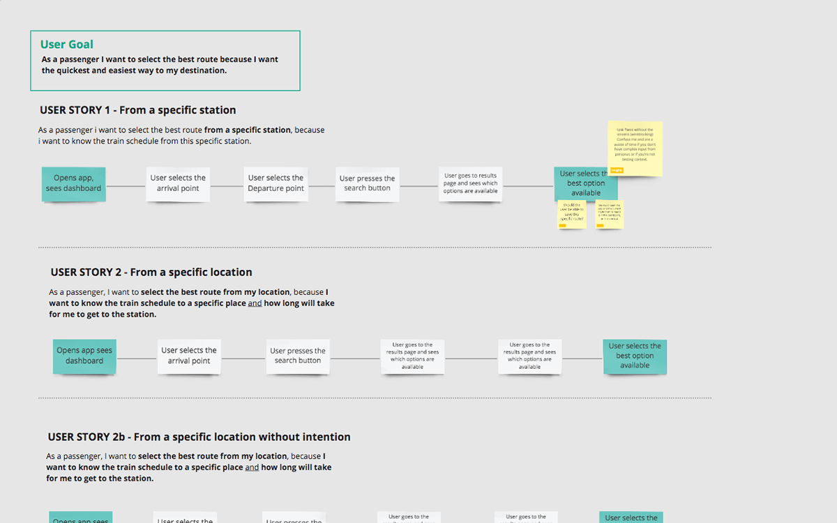
It happened that I found some more pain points and had some insights on what I could to improve them:
• First, the "i" section it's not necessary as a fixed button on the app's toolbar, this section only shows some technical informations about the app and the Irish rail services and it can be stored at a new "menu" section at the toolbar, for example. This could be a section that would have within it new features, as well as features considered secondary regarding the main function of the app: to help them visualize train schedules as quick and as frictionless as possible.
• Another change in the app structure would be join the "Live Trains" and the "Live Map" into one section "Live trains". The reason behind this merger is to simplify the interface putting both things together in the same page in order to try to decrease ambiguity about differentiating a live map from a live train list putting them as two features under the “live” concept.
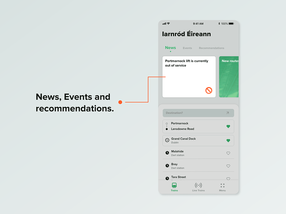
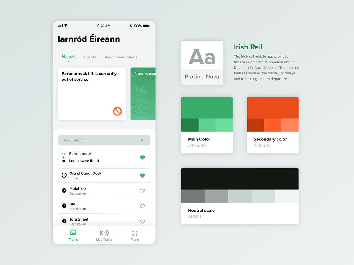
• And the last change of the app would be to do an experiment with a “News, events and recommendations” card at the dashboard page, with the intention to bring to the users a better view of warnings like broken lifts and temporarily inactive routes and stations, and taking advantage of this card menu, were added the secondary sections “events” and “recommendations”, to bring more awareness to the Dart users about the possibilities within the service.
Blockframes
After defining which parts of the app needed improvements, I decided that the next step would be to sketch some possibilities based on my analysis. Then, to allow a faster flow of ideas, I started to do "blockframes" before the proper Wireframes, because they're simpler and allow you to bring more ideas to table without overthinking small details in such a early phase of the screens.
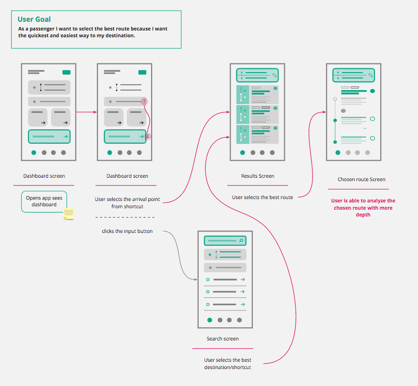
The Blockframing process was focused on the overall layout of the App's main flows. Throughout the process I realised that the app could have new features and improvements and still be relatable, at least structurally, to the old layout and also maintaining a very similar flow. Some of the improvements were:
• A new dashboard with a “News, events and recommendations” card section at upper half of the page, a new bottom menu with just three buttons "Trains", "Live Trains" and "Menu"
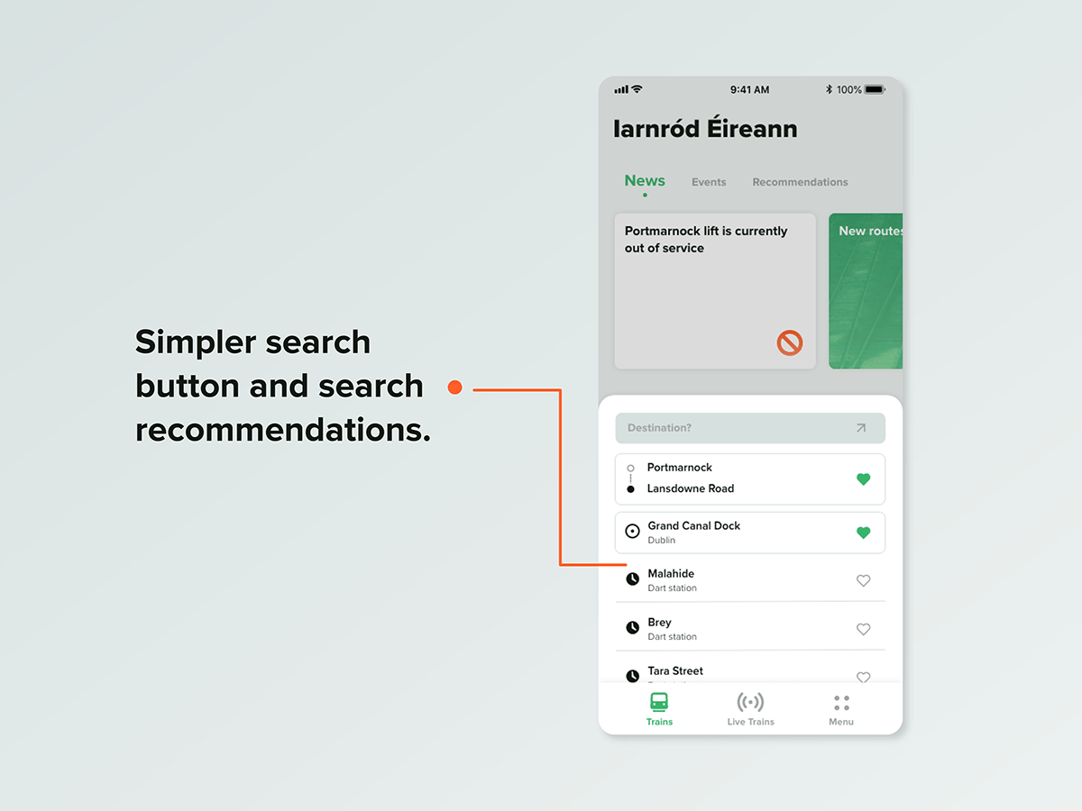
• A simpler search button and search recommendations/shortcuts at the lower half of the dashboard.
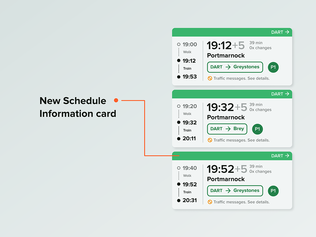
• Bigger cards in the search results page, in order to have more space to display train schedules and details about routes.

• The possibility to edit the route while still at the results page (in the original layout it was only possible to edit it in the previous page), fixed refresh button to be up to date with the delays and warnings.
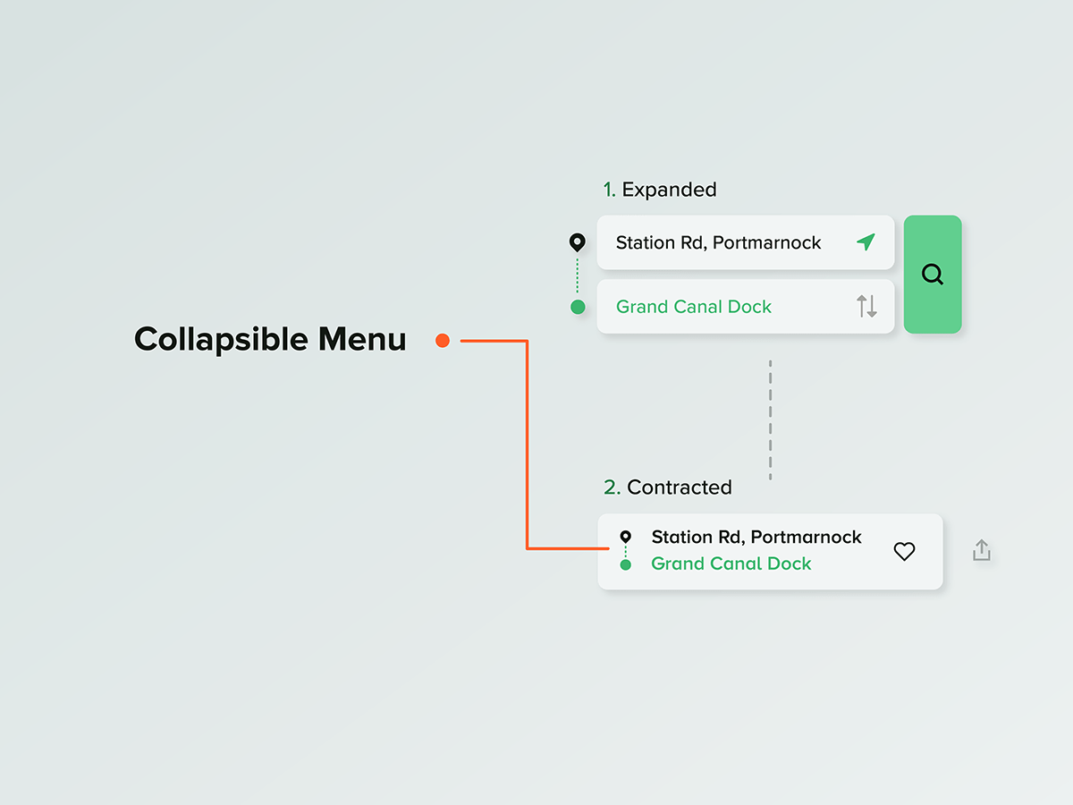
• Collapsible menu Button to save space in the search page.
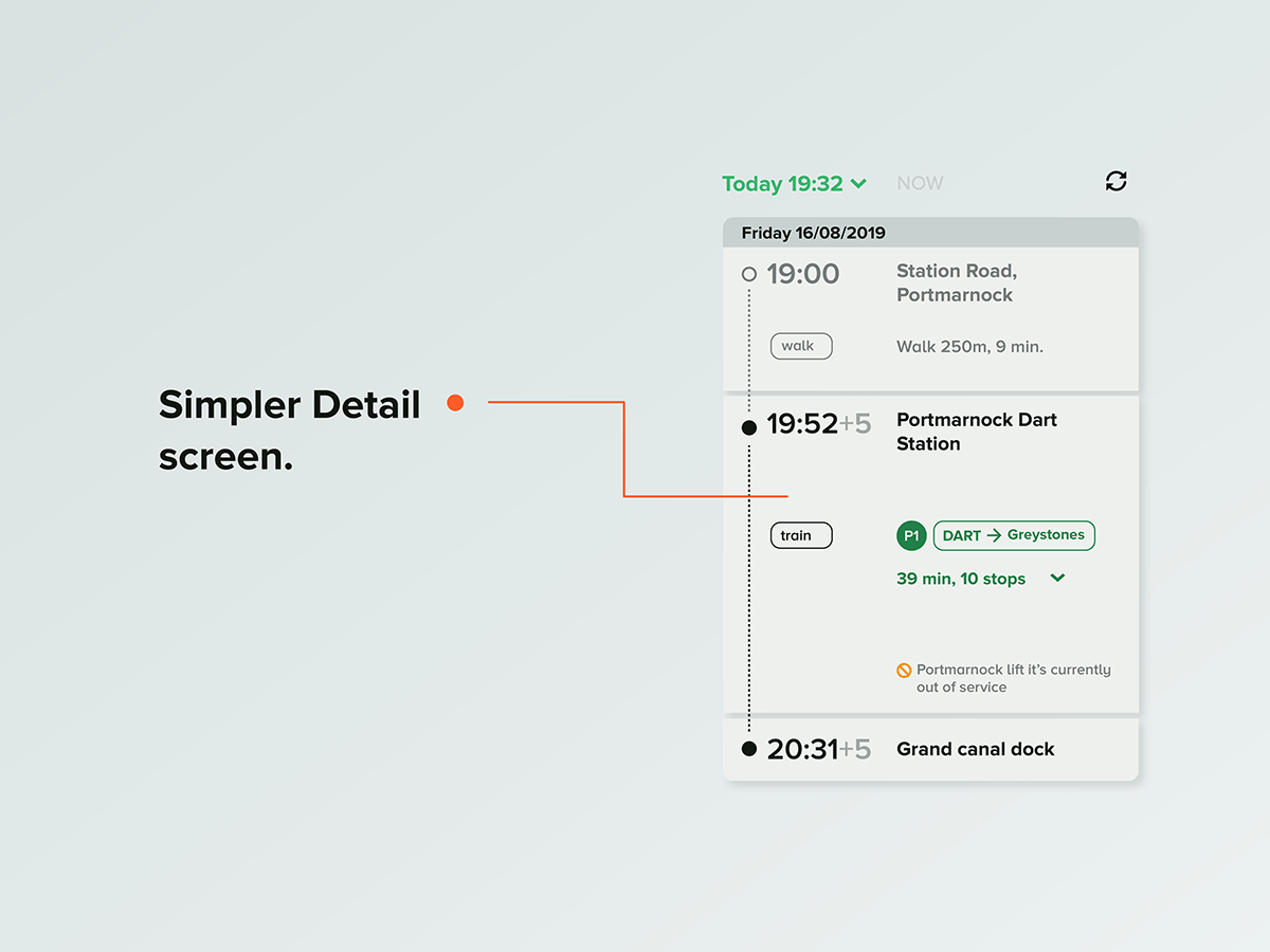
• Detail's page card with a cleaner, simpler design
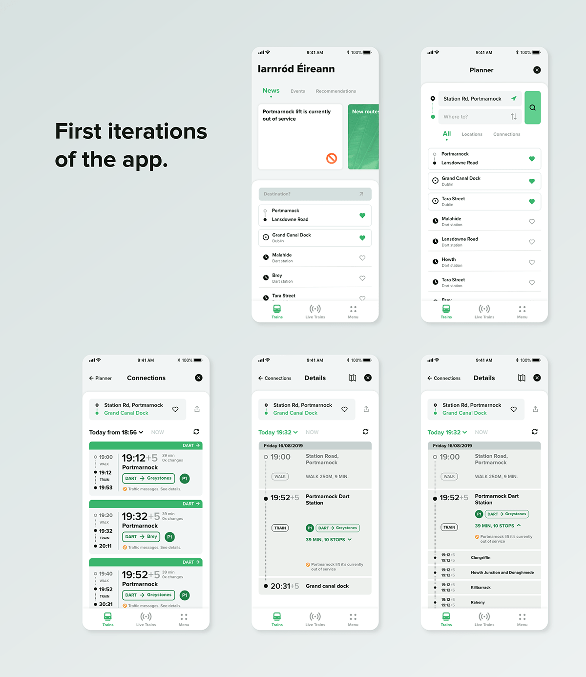
High-fidelity Screens
After Iterating loads of possibilities through blockframing, I decided that it was time to start to make high-fidelity screens, either to check what improvements could be made in the app's visual identity and to try more precise iterations of the train information cards, the main pain point of the app.
The main improvement of the app: a new way to show the train schedule information, showing the user in a much more clear way the difference between the time you have to leave your current location and the actual time schedule of the train (In case of a search based on your current location).
Some other screens: