
Type composition poster
technique: paper, coloured plastic sheet, light
technique: paper, coloured plastic sheet, light
Goethe's 'Theory of Colours' appeared in 1810. On the occasion of the bicentennial anniversary of
the book the Society of Hungarian Graphic Designers and Typographers (MATT) announces
an international design competition entitled 'Goetheorie'.
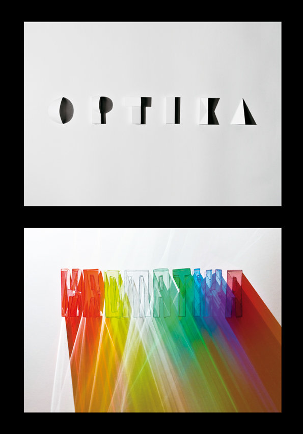
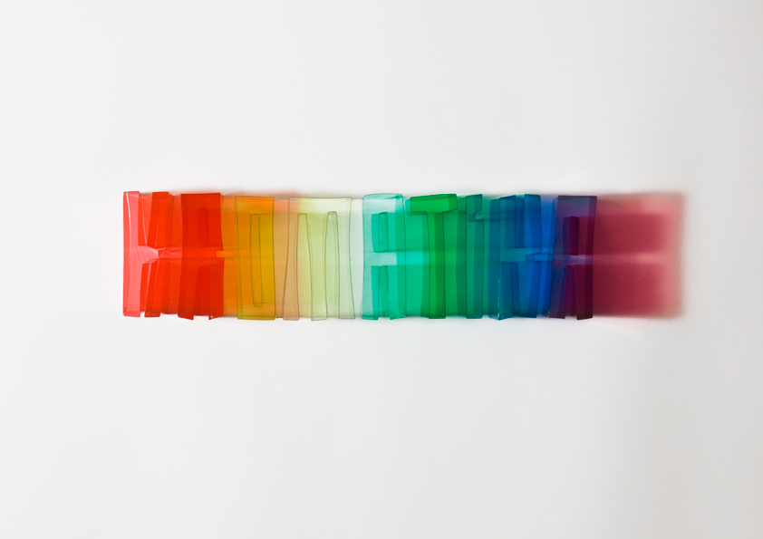
The title Optics/Chromatics refers to a place where Goethe points out that unlike Newton he isn’t so much interested in the science of sight but rather in the theory of colours: he wants to demonstrate the way we actually experience colours, and not the way we are supposed to experience them according to the laws of mathematics. This debate is represented by the clash of the two letterform compositions: one is calculated, geometric, with sharp contours, the other relies on the impressionistic play of colourful shadows.
The title Optics/Chromatics refers to a place where Goethe points out that unlike Newton he isn’t so much interested in the science of sight but rather in the theory of colours: he wants to demonstrate the way we actually experience colours, and not the way we are supposed to experience them according to the laws of mathematics. This debate is represented by the clash of the two letterform compositions: one is calculated, geometric, with sharp contours, the other relies on the impressionistic play of colourful shadows.
PANTONE ARTIST EDITION COVERS
PANTONE published new Artist Edition covers for a selection of its Plus Series guides.
The Pantone Formula Guide and Pantone Solid Chips feature covers showcasing works of art from
my project, “Optics/Chromatics.” To optimize visual impact, the Coated and Uncoated Formula Guide each feature one of the images, divided across the seven guides. The Solid Chip Coated and Uncoated binders each are wrapped in one of the works of art.
Creative Director: Karen Lantelme
Creative Manager and Designer: Timothy Heyer
Creative Director: Karen Lantelme
Creative Manager and Designer: Timothy Heyer
Updating a classic: Pantone Reboots PLUS SERIES
Pantone (Kimberly Palmeter)
Artist Edition Covers Now on PANTONE PLUS Products
Pantone (Tim Young)
Pantone (Kimberly Palmeter)
Artist Edition Covers Now on PANTONE PLUS Products
Pantone (Tim Young)
Award:
A'Design Award & Competition
Graphic Design Of The Day (07/03/2012)


Thank you!


