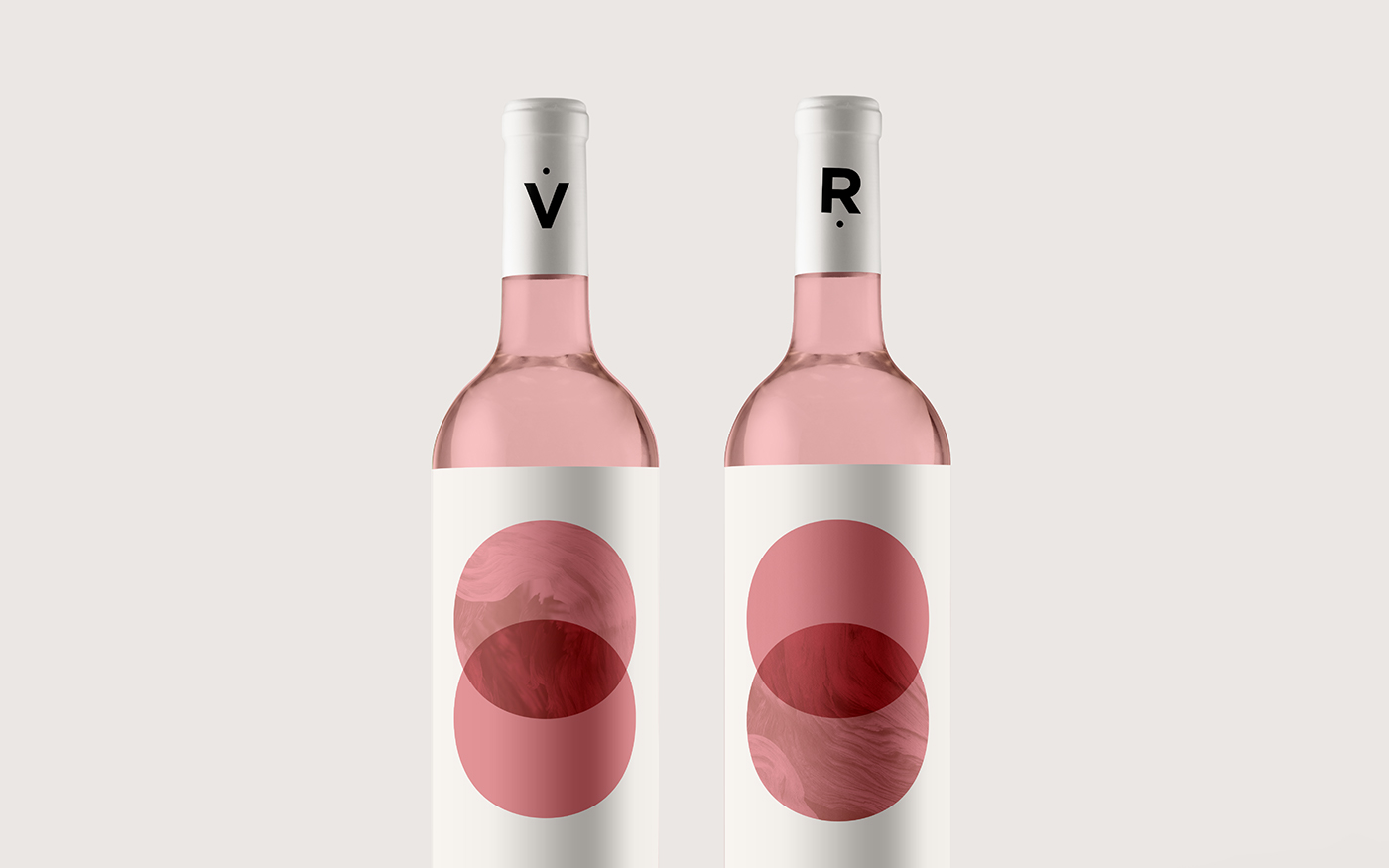
La Viña Roja (Red Vineyard)
-
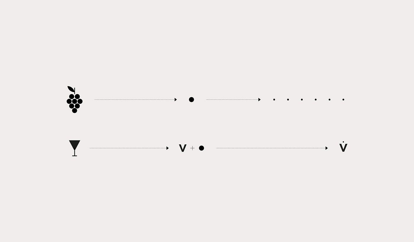
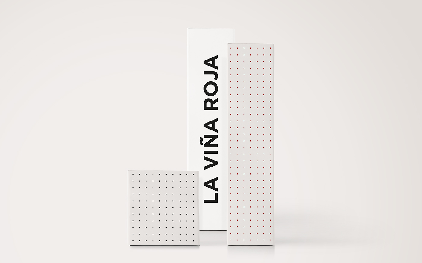
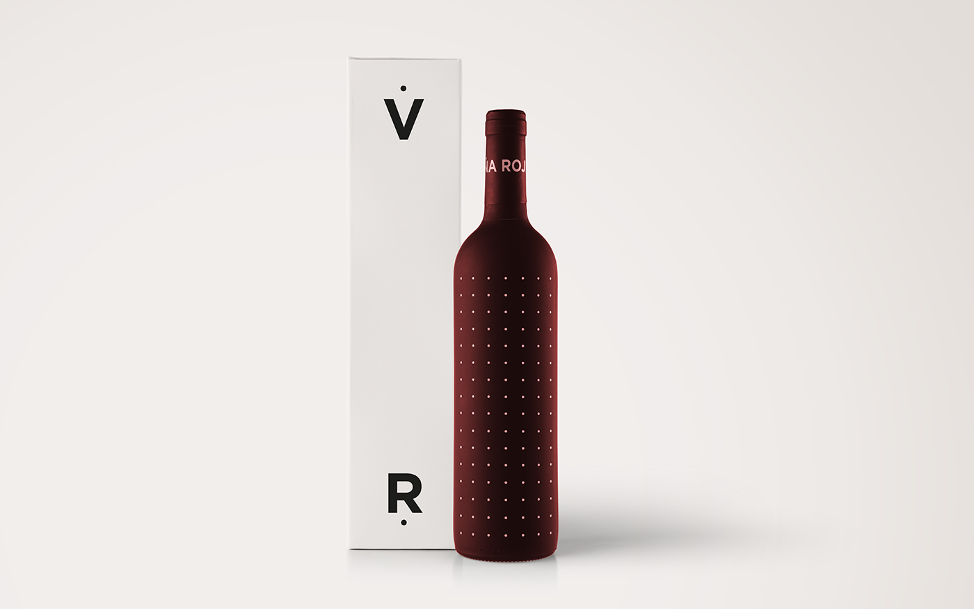
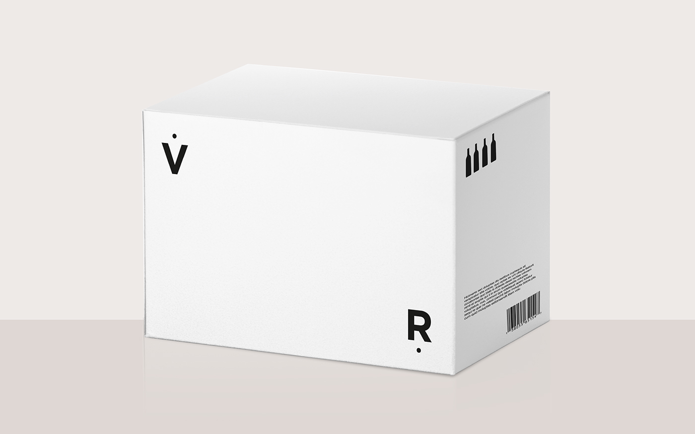
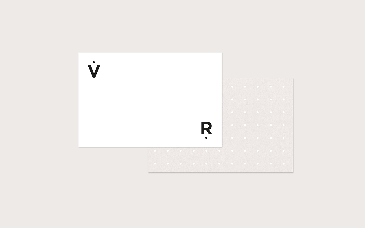
The design is minimalist and conceptual.
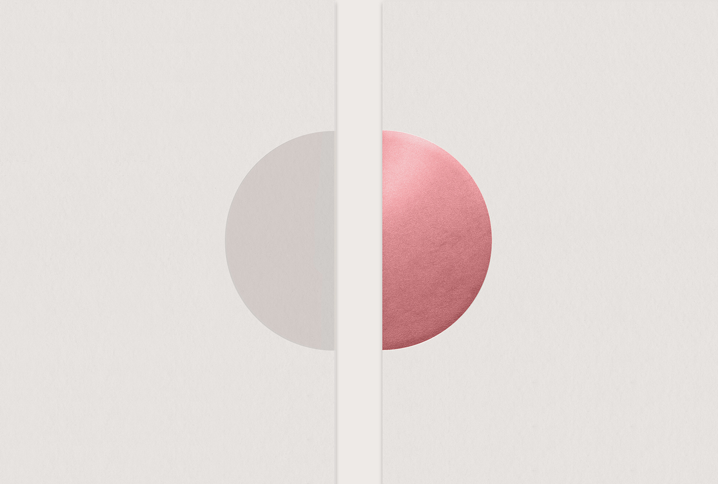
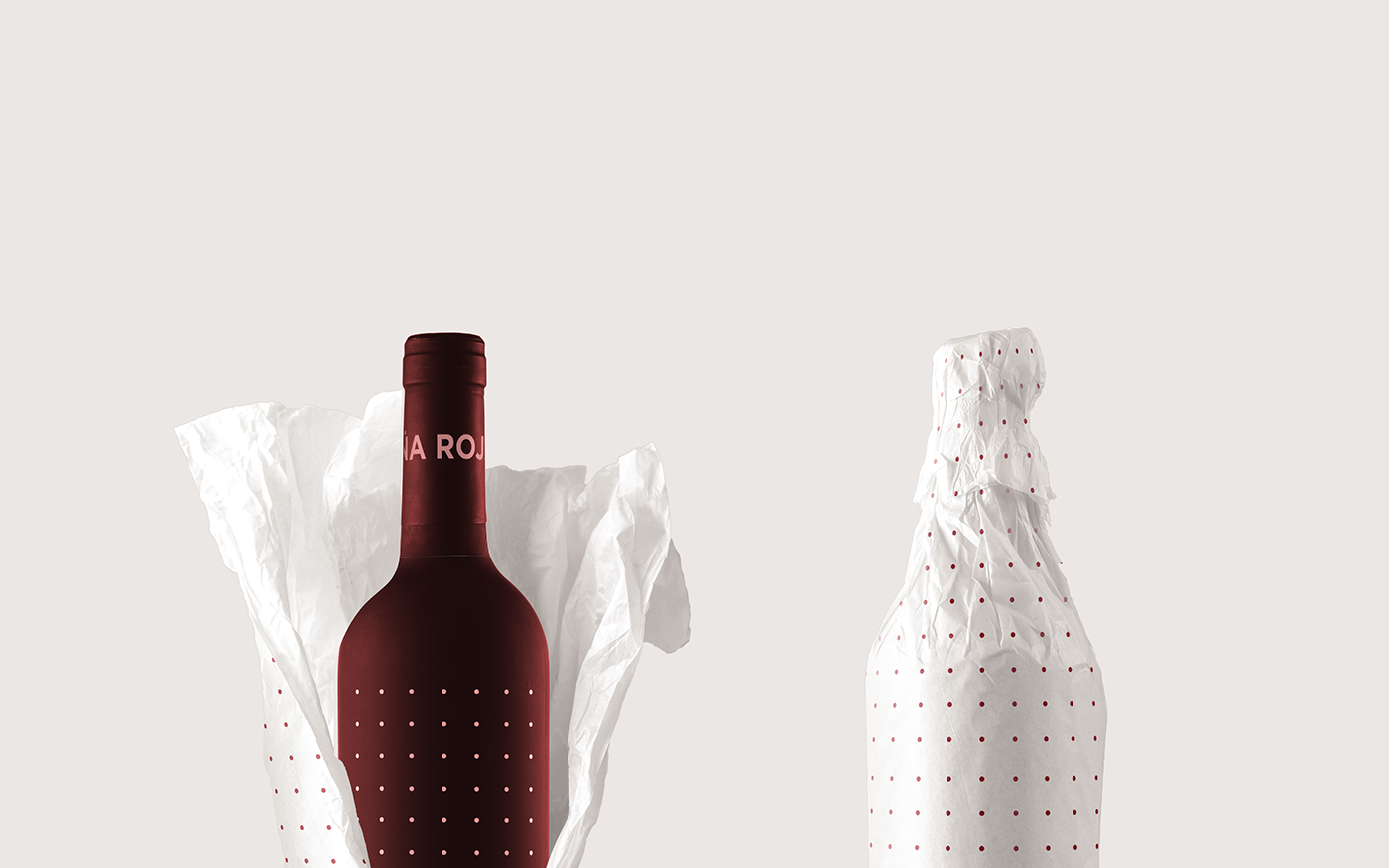
The shape of the circle represents the simplification of the grape’s shape.
And the "v" is the greatest simplification of the wine glass.
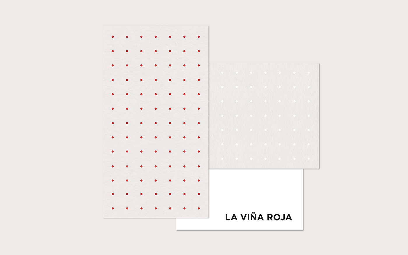
The pattern of circles represents in a metaphorical way,
both the planting in rows, and the grapes that contain the wine bottles.
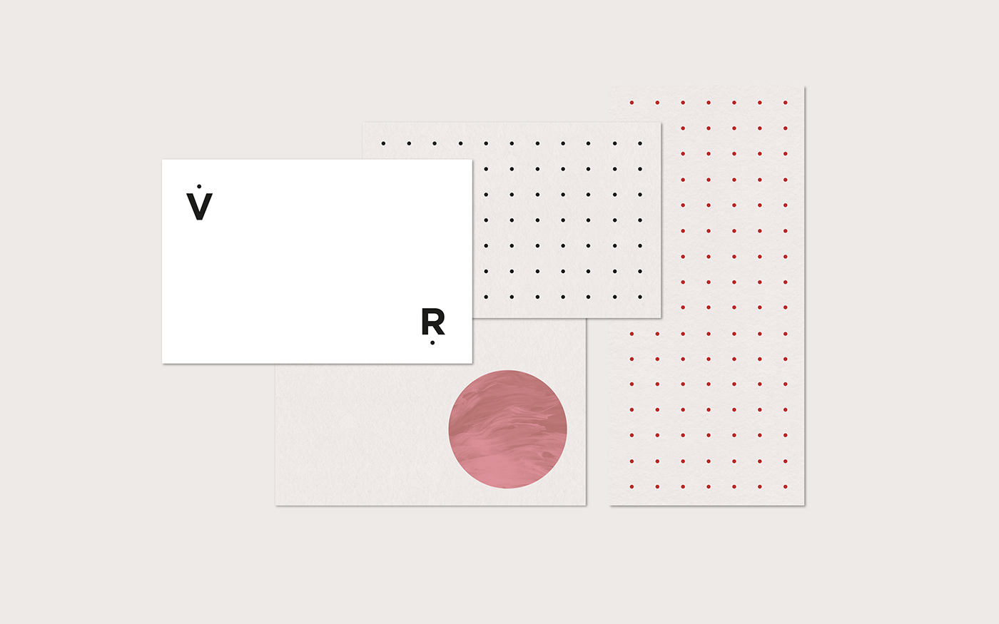
The visual identity features modern typography within a simplified design
by using a minimal colour palette.
The shape of the circle represents the simplification of the grape’s shape.
And the "v" is the greatest simplification of the wine glass.
The pattern of circles represents in a metaphorical way,
both the planting in rows, and the grapes that contain the wine bottles.
The visual identity features modern typography within a simplified design
by using a minimal colour palette.