Centros rebranding
New identity for a forward thinking property developer
New identity for a forward thinking property developer
With their new Chief Executive at the helm, Centros commissioned Hero to refresh their corporate identity to reflect the new name and ownership of the company.
A simple typographical identity was created with a coloured dot which changed hue, adapting to the environment it was working within. This helped to communicate how Centros work when undertaking their urban regeneration, often in historic town centres.
A set of corporate guidelines were drawn up and produced to ensure consistent application.
Logotype

Identity guidelines
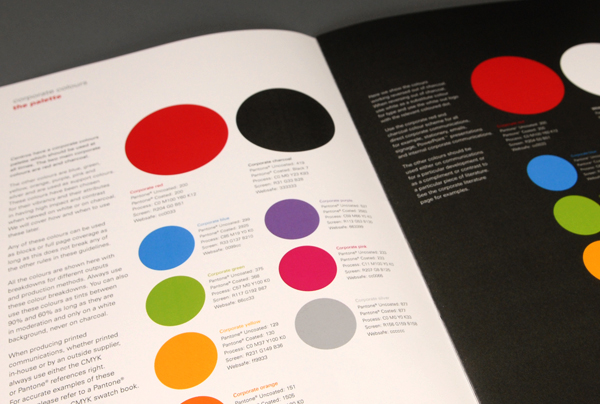
Identity guidelines

Identity guidelines
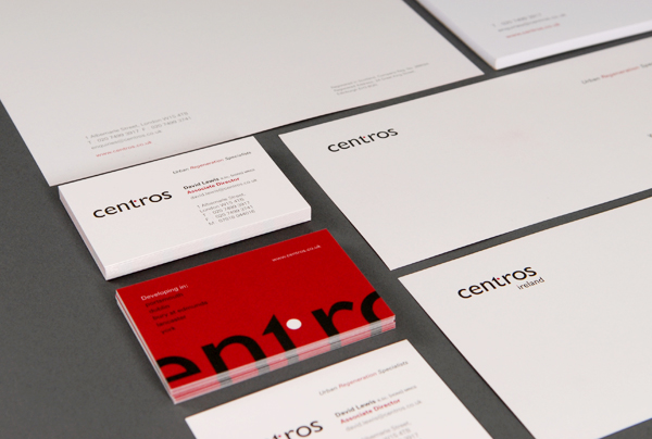
Stationery

Stationery

Stationery

Website imagery – Track record
Website imagery – Charity

Website imagery – Sustainability


