Hans Christofson
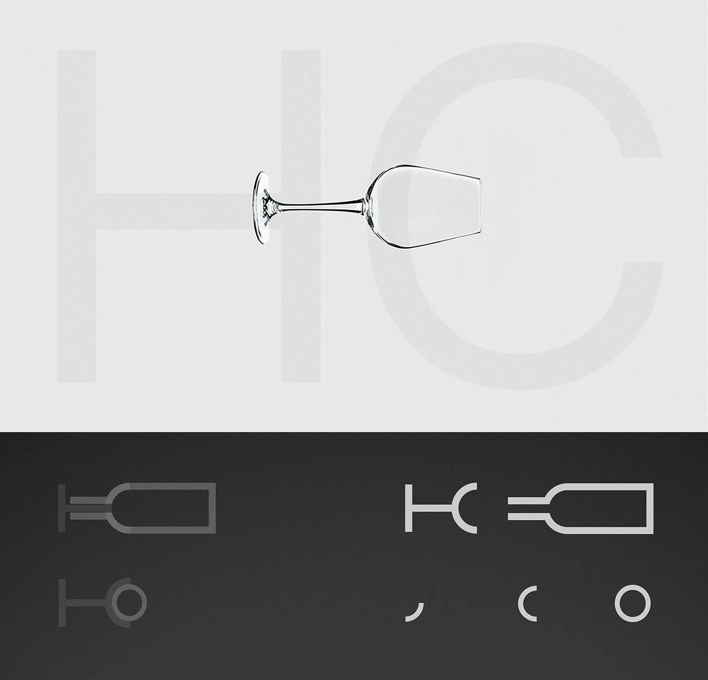
The initals H & C are combined to create a minimalistic monogram depicting a symbol that is inseperably linked
to the product: The wine glass. It is in this very vessel where the essence of the wine reveals itself. The sculptural
nature of the logo emphazises the craft and consistent effort that goes into every bottle. The mark acts as a grid
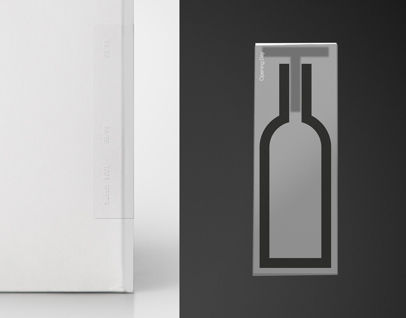
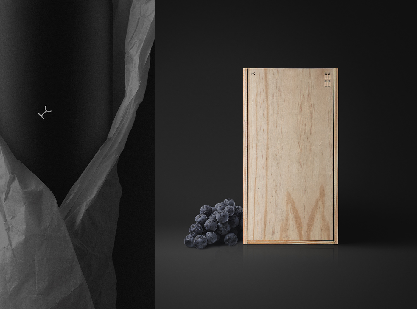
to expand it into further bold & monolithic brand elements that are used for communication throughout the packaging and collateral. The reduced layout and the palette of black & white stand for—purity, precision, and a focus on the essential: Earth & Water, Sun & Moon.


