Packaging is identity at shelf
In 2018, the Danish high-end supermarket Irma implemented a new strategy; “The Urban Irma”, and as a result we have updated their visual identity to fully support their new positioning. As a continuation thereof, we have created a new packaging design for Irma’s two own labels “Irma’s” and “Irma’s hverdag”.
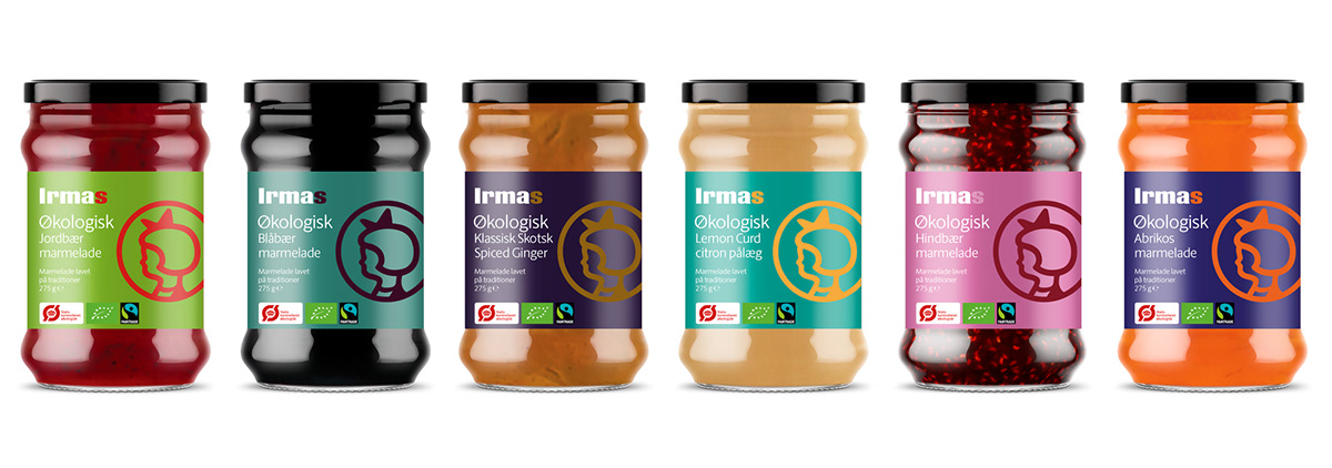
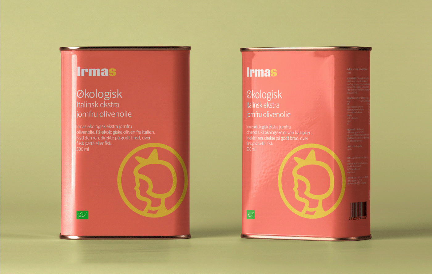
The task was to design two product lines that were easy to distinguish, making it easier for consumers to choose between them. We solved this by creating two very different expressions – one being very colourful with lots of “flavour”, interesting images and the Irma circle girl in front, and the other with a more graphic expression and the renewed checker pattern. Overall, Irma uses a wealth of colours, combined in bold compositions leaning towards the artistic form which is a part of their DNA.
The “Irma’s” product line is the visual identity manifested in its packaging design. Therefore, curiosity in the brand is intensified through the use of colours in a modern expression.


We have created a series of new icons helping the consumer navigate the growing market of products that are gluten-free, vegan, lactose-free, etc. The icons are designed in the same style as the Irma girl in order to ensure a unified identity.

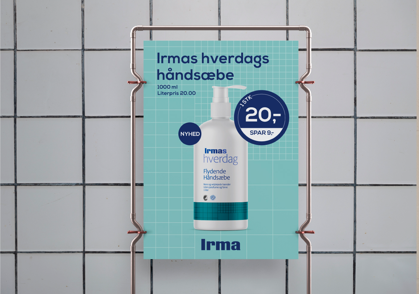
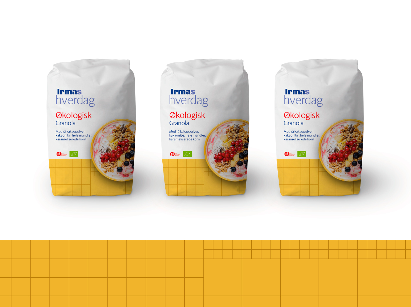
The “Irma’s hverdag” packaging is kept white with colours at the bottom, always with the well-known, yet updated, Irma checker pattern. In this product line the photo style is kept more simplistic in nature yet often graphic in its expression, creating interesting forms and patterns that show the food inside the packaging.