
My friend Chris is a photographer. I'm a UX designer. Together, we decided to start a company helping local businesses with their social media presence. We chose the name Flourish Media.

I deliberately chose a feminine script font for the logo to distinguish Flourish Media from other marketing and media companies in our area. I took inspiration from high-end hospitality brands. That's also where the color choice came in: dark gray looks more upscale than black, and aqua is a very current color.

For social media icons, I chose a cream-colored background to make the logo stand apart from a generic white background, while still staying light colored.


I created the leaf & vine logo by modifying an old printing "flourish" I found.
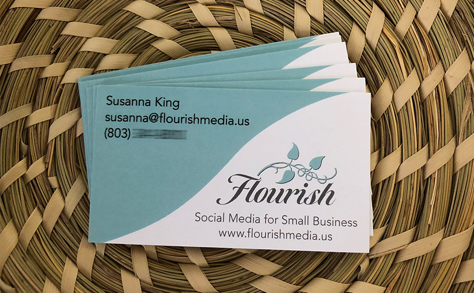
This is the business card I designed for our company.


