


AWO KREISVERBAND HEINSBERG E.V.
A new look for the AWO
The Task
A district association of the AWO with over 700 employees, twice as many volunteers, over 26 institutions, and projects needs a clear, intuitive and cross-media appearance. Our task was, and is to develop this image, and to put it into practice.
The Result
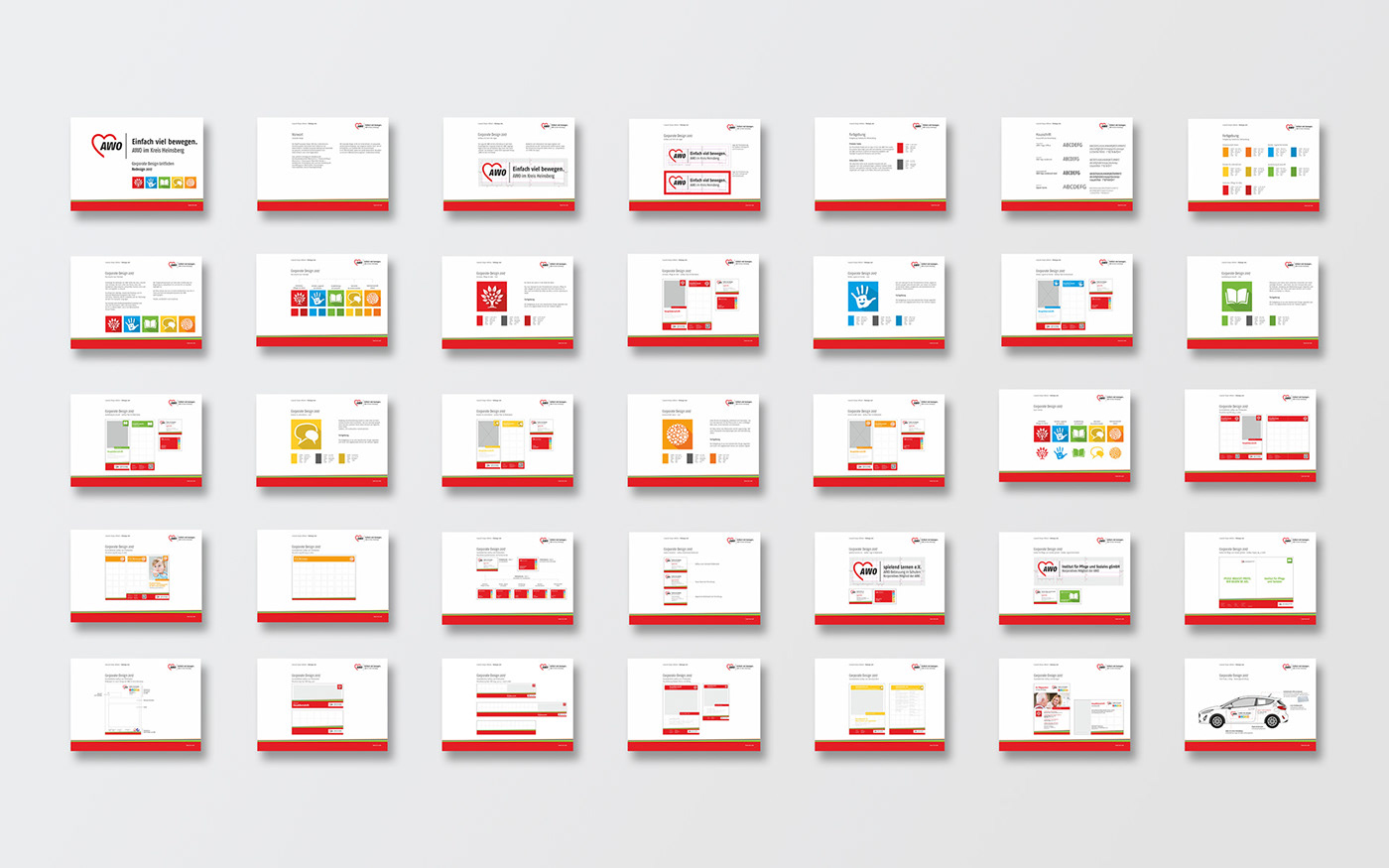
A new corporate design guide, which includes as its core an icon- and color-related control system. This system finds consistent application, and implementation in all print, and digital media.


AWO District Association Heinsberg e.V.
The Arbeiterwohlfahrt is among the associations of the free welfare care on the basis of its history, and its socio-political self-image a charitable organization with special character. In it, women, men, and young people have come together as members, and as honorary, and full-time workers to participate in our society in dealing with social problems, and tasks. The Workers' Welfare Association is active in the field of child, and youth work, adult education, senior citizen work as well as the counseling, and care work in many social areas in the district Heinsberg.
More than 1,500 members of the AWO counts in Heinsberg.
Over 300 volunteers organize, and run social activities for children, adolescents, adults, and seniors.
In 17 local associations in the district of Heinsberg, volunteers work for the social needs, and needs of local people.


A redesign for the appearance of a whole district association of the AWO is an enormous challenge.
It is not only the individual circumstances of individual facilities to be considered here. The overall concept should be developed according to the uniform CI of the AWO, thus also forming an individual USP for the AWO in Heinsberg.
Basic cornerstones of the appearance, typography, and coloring were already given. The creative scope was thus narrow.
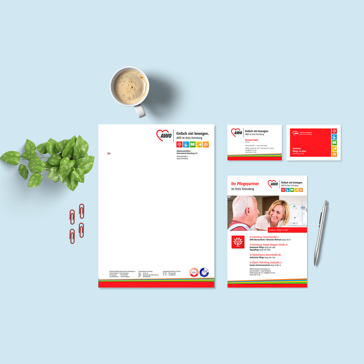
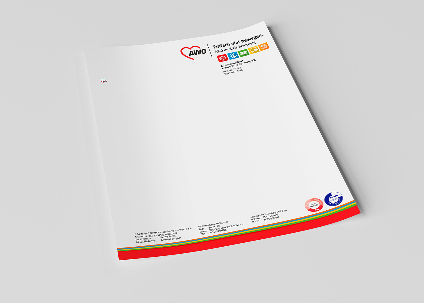
With a clear design grid, we were initially able to ensure a standardization especially in the field of print media.
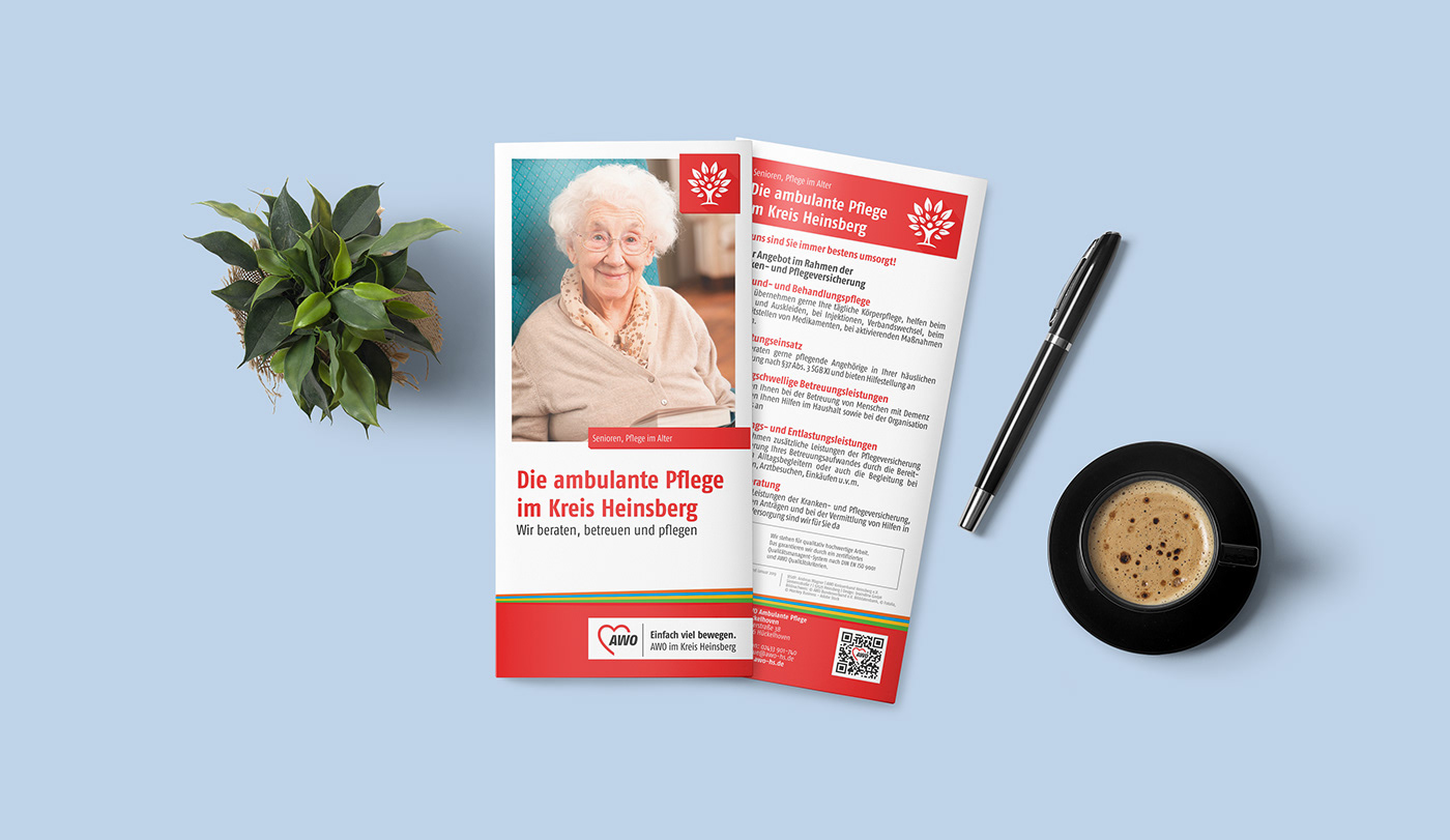
The Icon concept is at the heart of the visual guide. It takes up the existing color scheme, is almost self-explanatory through the symbolism, and forms a unique feature of the AWO in Heinsberg.
The consistent implementation of the newly defined guideline has since been a continuous task in cooperation with the AWO. There are plenty of flyers, brochures, and catalogs to revise, and update. This process is fluent, and it’s great to be able to accompany the design concept from the guide into practice.
The Effect
First results of our work are a unified appearance, and an increased recognition value in all print media. Over 50 flyers, brochures, posters, and advertisements have been revised, and realized to this day.
The AWO has a strong presence, and is the local social service provider.
Our Services
Consulting & Conception | Analysis & Strategy | Corporate Design Refresh | CD Guide | Graphic Design | Illustration | Textile Design |Physical Advertising | Photography


