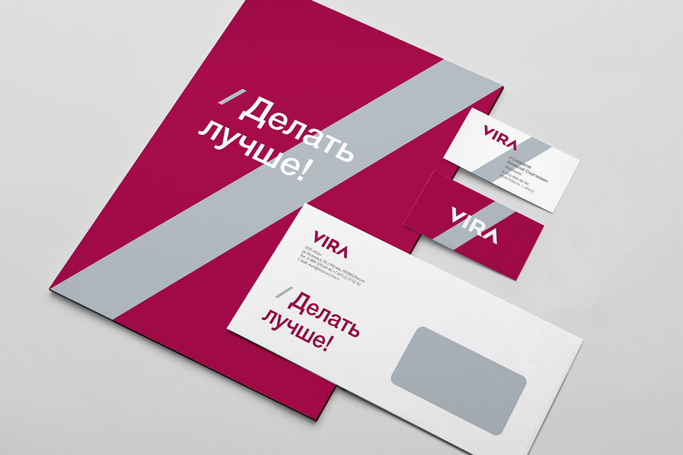
To do better!
VIRA is a development company working wisely, with respect for the person and with the pursuit of excellence. Such positioning was formulated by the Pavlov’s design team for the new brand of the development company.
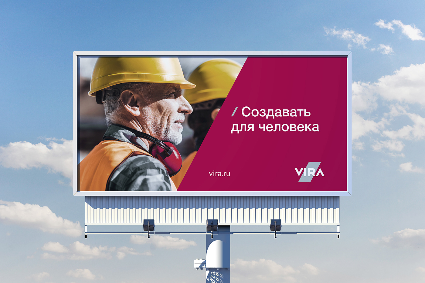
The ideology of the VIRA brand is based on the idea of honest partnership to achieve a noble goal: make the world a better place with what the company can do professionally: build housing for people. In partnership, VIRA relies on transparent, honest and open relationships, strictly within the legal framework, with the ability to listen and cooperate productively. Honesty, openness, the desire to achieve their goals, hard work for the benefit of people, respect for their needs - these values are embodied in the visual attributes of the VIRA brand.
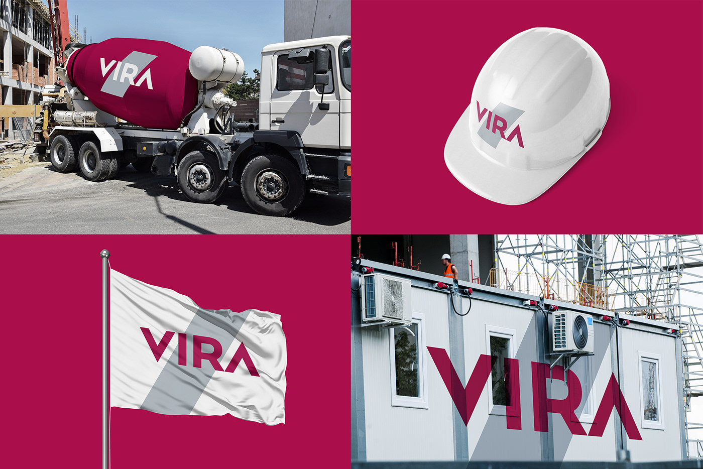
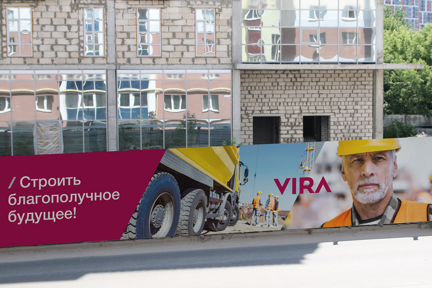
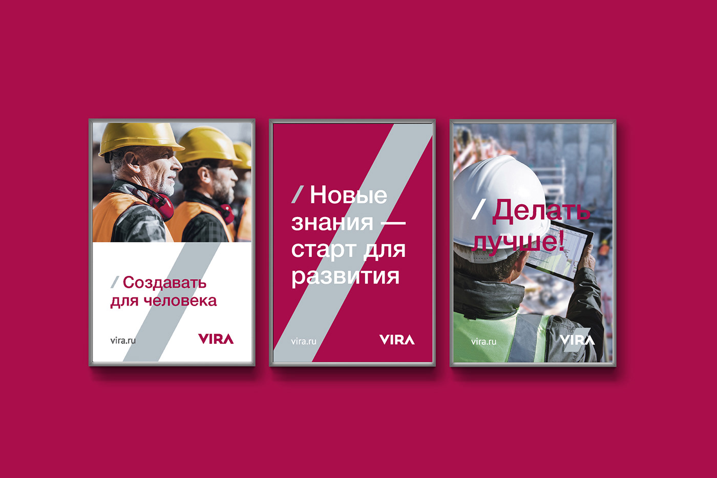
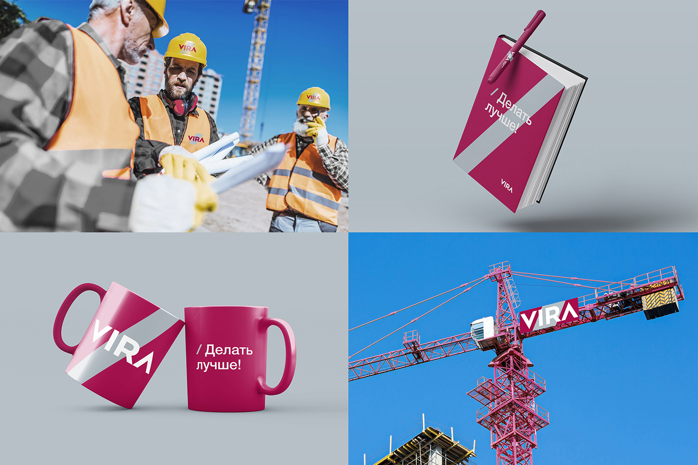
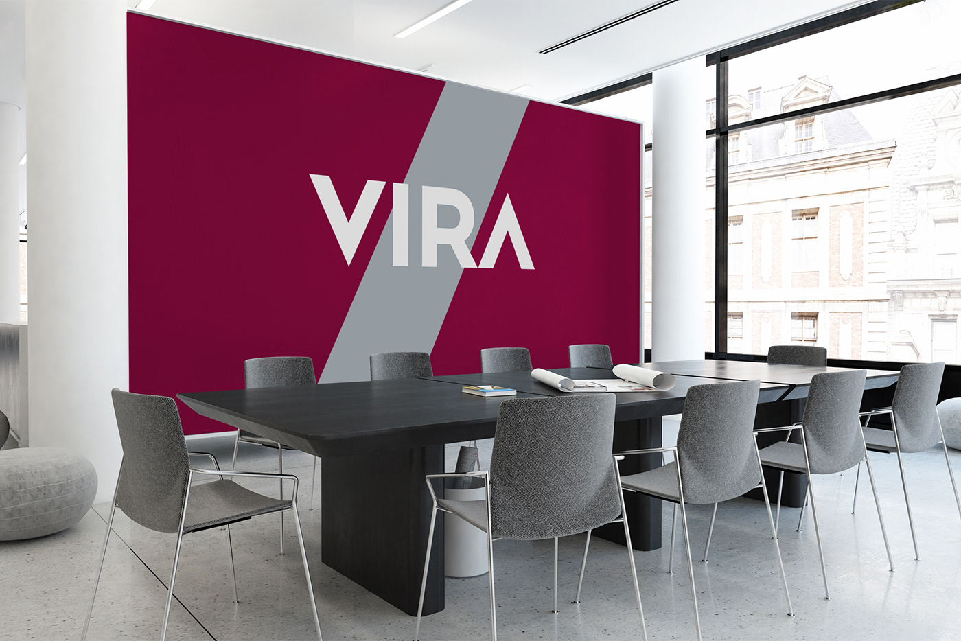
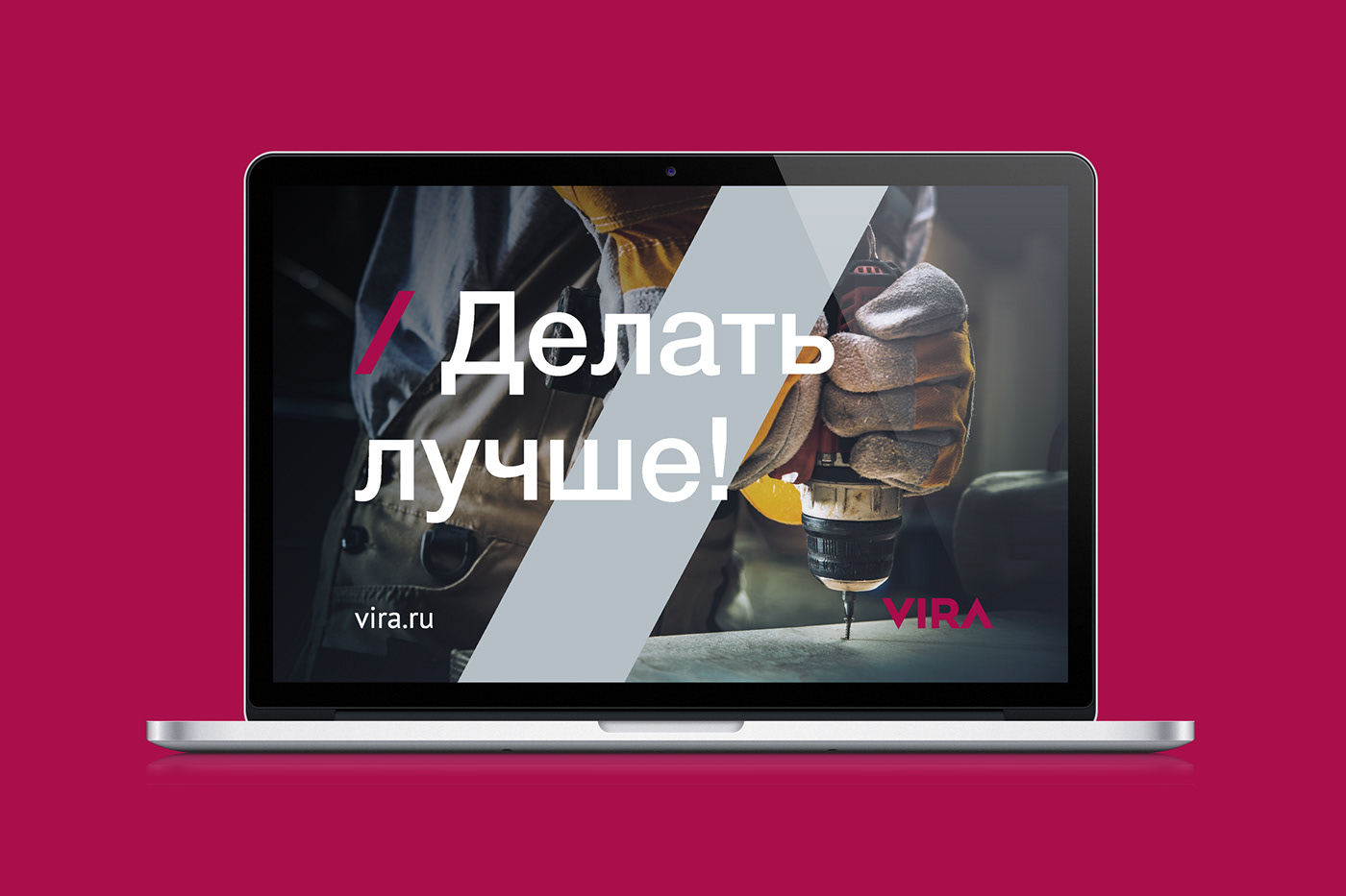
In addition to the logo, a style-forming element is developed - an inclined line that expresses movement, progress and activity. The burgundy color is chosen as the corporate one, which represents strength, solidity, confidence and conservatism. Additional light gray color - stability and reliability.
Делать лучше!
Делать лучше!
VIRA - девелоперская компания работающая с умом, с уважением к человеку и со стремлением к совершенству. Такое позиционирование сформулировала команда Pavlov’s design для нового бренда деволоперской компании.
В основе идеологии бренда VIRA – идея честного партнерства для достижения благородной цели: сделать мир лучше с помощью того, что компания умеет делать профессионально: строить жилье для людей. В партнерстве VIRA опирается на прозрачные, честные и открытые отношения строго в пределах правовых рамок при умении прислушиваться и продуктивно сотрудничать. Честность, открытость, стремление добиваться своей цели, упорный труд на благо людей, уважение их запросов, – такие ценности нашли свое визуальное воплощение
в атрибутах бренда VIRA
Кроме логотипа разработан стилеобразующий элемент – наклонная линия, которая выражает движение, прогресс и активность. Фирменным выбран бордовый цвет, который олицетворяет собой силу, солидность, уверенность и консерватизм. Дополнительный светло-серый цвет – стабильность и надежность.
The project team:
Strategy: Oleg Pavlov
Design: Maria Mamoshkina
Pre-press: Irina Maksimova

