
SUMMER

Too hot me melting...
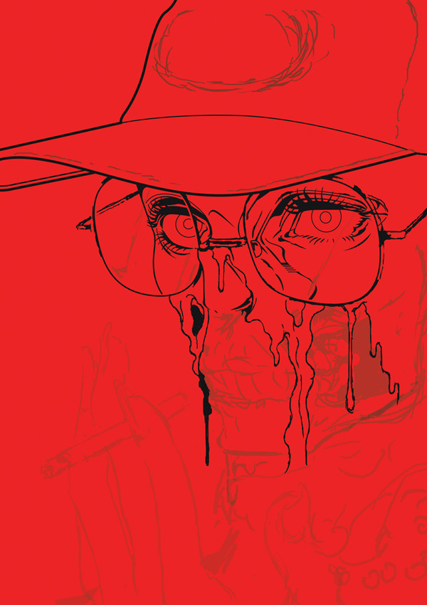
Actually this image was for collab with Adidas 2017 and I thought line drawing was good but coloring not satisfying.
So I picked again 2019 and tried to make this good.

This is the status when I stopped to draw. Let's make this fancy!

First I should decide main key color. The Sunglasses. Which will affect entirely to whole work.

I thought PATAGONIA which I love logo would be fine. So tried to put on the cap.

But there were many color which I don't use usually like purple.. emerald green.. so spent many time on this step.

I passed it and started to draw garment and other objects.

Trial for background.

Simple version.

Wanted to put some Korean words so that spent many times here but couldn't find satisfactory answers.. coz I don't have confidence about using Korean font yet.

Before going final step, I though something wasn't there. Like inefficient. So I tried to make more detail on her. Maybe bcoz the motivation was describing hotness so that my skin was melted and explanation wasn't enough.

Gave up inserting Korean font.. and started to coloring.

End is near. Background is always important. Sometimes it's more valuable than main object. Tried many versions and this is what I like most.

Finally it's done. Thank you for watching!
Made by Adobe Photoshop CS6, 426 layers, 1.5 weeks. 67 x 85 cm.
Visit my pages!


