WASHINGTON KNIGHTS
OVERVIEW
The goal: develop a logo system and visual identity for the Washington Knights – a fictional football franchise that plays in the Metropolitan Division of the Great East Conference of the Ultimate Football League – that is appropriate for its location, sophisticated and versatile, and effectively executes a professional sports aesthetic. The final design should attempt to blur the line between real and fiction and should make it hard to determine whether or not the team is real.
RATIONALE
The naming of this Washington D.C.-based franchise comes from the military professionalism and loyalty of the medieval knight during their time period. Knights were expected to fight bravely, hold their kingdom in high regard, and be noble in the public eye – characteristics fitting for a team representing the nation's capitol. One particular heraldic tradition consisted of flying colored banners and wielding colored shields brandished with the nation’s coat of arms during combat to exhibit power and loyalty. Similar practices are implemented today during modern warfare.
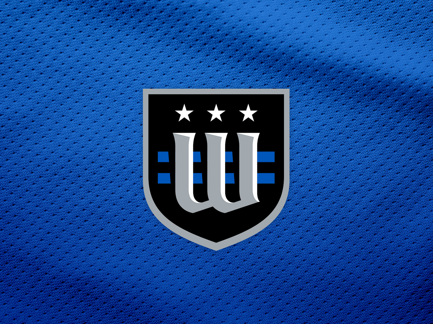
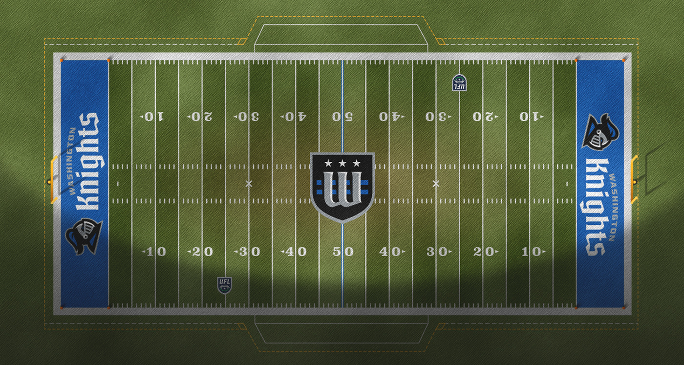
The Washington Knights heavily feature a color scheme of royal blue with black and silver accenting. The primary logo depicts a medieval knight dressed in the primary blue. A secondary "coat of arms" logo illustrates a lockup of the D.C. flag with a stylized "W", seen at centerfield and on the shoulders on the team's uniform. Appropriately so, the team's custom wordmark is constructed with traditional calligraphic tendencies with a more modern take.


