


Product Design Sprint:
Community Issue Reporting
A case study by Haim Repael Azoulay
Product design sprints are fun! I was asked to find a solution for tenants to report maintenance issues and track their resolutions. The focus was on a residential building in an urban landscape in Tel-Aviv, Israel, managed by a maintenance company (which I’ll refer to as “The Company”).
Before looking for a solution, I need to understand the main problems and define them. In order to do that, I chose to:
Find out the pain points of the tenants by questioning friends and relatives living in such buildings without an app, understand the process they’re going through today when reporting an issue.
Perform competitor analysis of existing solutions.
Brainstorm on the subject to try and get more information needed.
Asked some questions…
So I wrote some questions that will help me understand that and make some few phone calls trying to get some answers to these questions

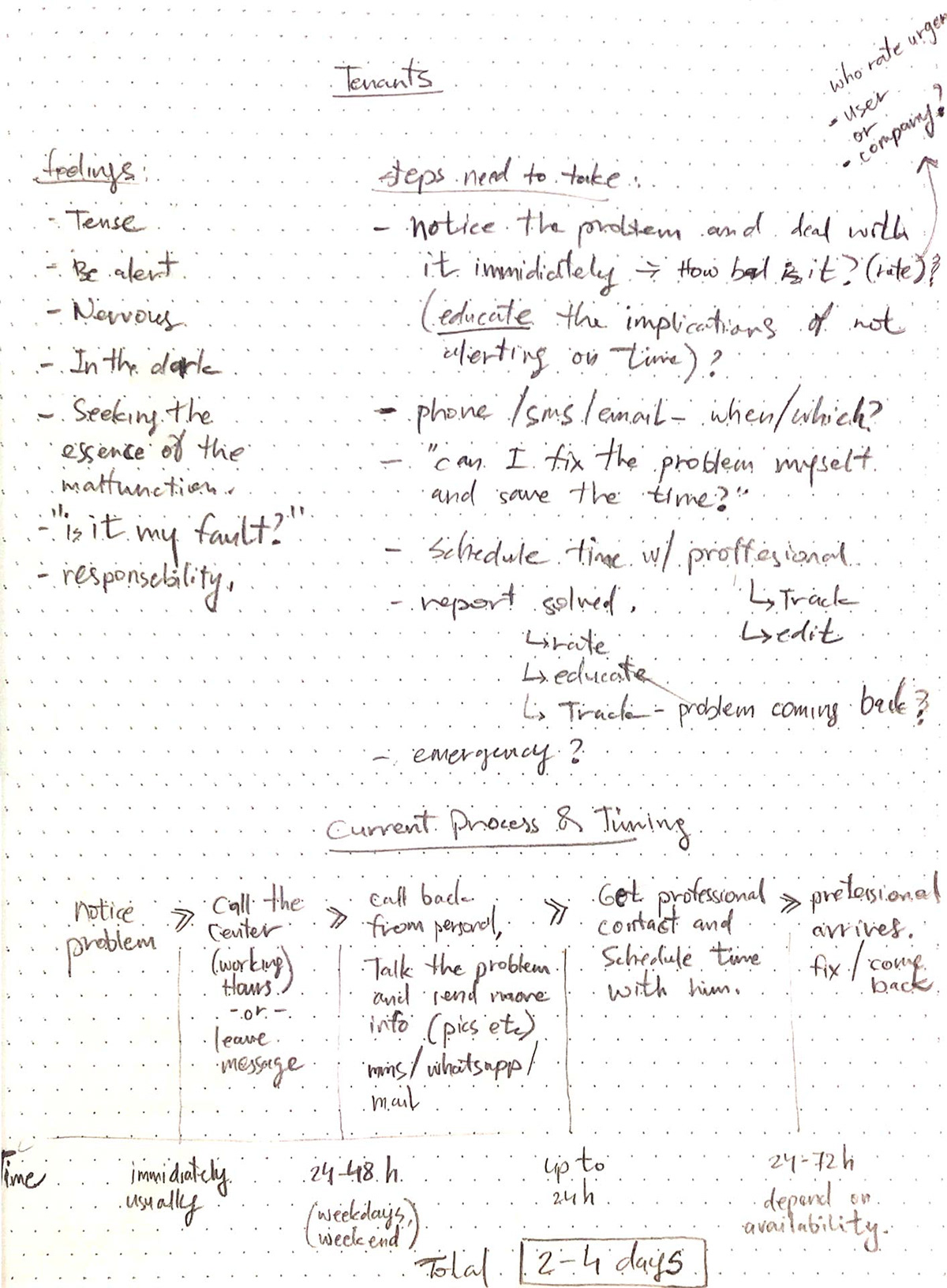
Following the information I got from the Interviewers I created a user flow for the current process as described by them and added the important timing factor for each step of the process:
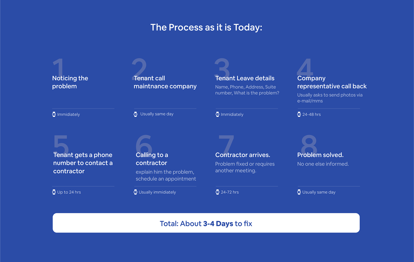
The waiting required is just too long, especially when we’re facing an urgent problem. The reporting process is too long, requires waiting without knowing the status and is not always effective due to lack of information or poor communication.
This results in a sense of psychological distress and discomfort that can adversely affect our lives.
I included the answers of the interviewees and tried to see where it was possible to improve the hardships raised in the conversation with them:
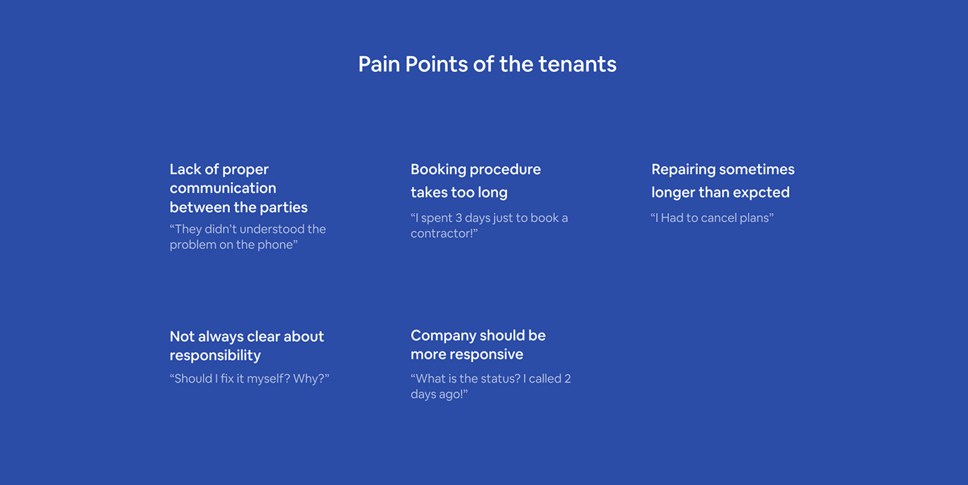
1. Most of the residents turn to maintenance complained about plumbing/water problems, pest problems, and noise from the neighbours.
2. Everyone I asked told me that he had no more than one failure at the same time.
This information will help me decide on the information display hierarchy.
3. Recurring malfunctions or malfunctions that have not ended in one visit are usually caused by non-professional treatment by the professional who came to deal with a malfunction or lack of communication between the parties.
Clear communication about the problem is very important for solving it, so it is something that needs to be emphasised in the solution.
4. In some cases, tenants are not always sure whether the fault in their area of responsibility or the maintenance company.
Such lack of awareness can be solved — in such a case it will be natural to inform the user if the problem is in the company’s responsibility right after he reports it. If it is not yet possible to assist the user than we can present a guide in which he can solve the problem himself, if possible. That way I can help the maintenance company maintain a loyal service and not let go of responsibility.
5. Most of the residents are not satisfied with the treatment of the malfunction — mainly due to communication, multiple stages of the booking process, and the time of treatment for a malfunction that was not clear in advance.
Booking procedure should be faster.
6. Some of the malfunctions fixing processes were longer than expected and there were residents who had to cancel plans for this.
A point to consider: Show the user an estimation of the repair time. In addition, steps should be taken to minimise the current process in order to shorten the time for reporting and handling the malfunction.
7. A large number of the respondents answered that they had called more than once to check the status and received the same answer — that it was being handled. Here as well, the lack of awareness about the status created a negative experience, according to the tenants. The company should be more responsive.
8. Some of the malfunctions can be resolved by the tenant, contractors are sometimes sent to the place even though there is no need for it. As I mentioned earlier, creating an independent troubleshooting guide will prevent a maintenance company from sending a technician for no reason and will prevent the tenant from waiting for nothing.
Competitor Analysis
Learning from other products, tenant management applications contain more extensive information about living in a common housing structure: rent payments, various payments, tenant communications, and other information about the company. In this exercise, I was asked to find a solution to the maintenance problems without reference to the rest, and so I did.
When examining competitors, I noticed these design patterns:
1. Reporting process always presented by using a Wizard. The user should choose a malfunction from a graphic menu including illustrations. This is definitely a keeper since it's easier to understand.
2. For each report, you may add images and comments. Haven't found an app allowing the user to add a video. I think this can be very useful.
3. The request is sent and the tenant is expected to wait for a response from the management company. It is not always clear what is the next step in the process. Should someone call me? How the coordination supposed to take place?
4. As soon as we reported the problem, the treatment continued to be quite automatic, and given the psychological element, a soothing word or "human connection" could alleviate the distress.
5. As soon as the service provider did the job and the tenant marked the problem as resolved, I didn't find any further proactive follow-up by the maintenance company (Except for the technician's rating). An initiated approach for a certain period of time after the fix is another way to establish the trust of the tenant in the service and be satisfied with it.
6. Just a thought about smart homes - In the era of IOT, appliances or even light bulbs can report themselves to the company. I have not found a reference to this in any app and due to the timeframe given I didn't practice that in this exercise.
The Goal
At this point, I can already mark the goal: Help the building’s residents who encounter a maintenance problem report it and to solve it in the fastest and most efficient way with zero margins while maintaining direct communication and orientation at every stage of the process.
Solution
There are 3 aspects we need to consider in the final solution:
1. Time
All agree that the treatment of a malfunction should be as quick as possible. In addition, there are failures that do not require a technician and can help prevent the waiting time. Possible solutions:
1. Rapid reporting using clear steps and fast coordination with the company and the contractor will accelerate the handling of the repair.
2. Using means such as push and chat will shorten processes and allow the user to respond regularly and quickly.
3. Preventing malfunctions by education will result in saving the unnecessary waste of time.
2. Communication
The communication needs to be clear and precise in order for the process to be as seamless as possible — clear communication will remove concerns and help the user’s psychological state. It will also prevent faulty communication that causes a wrong diagnosis of the malfunction and waste of unnecessary time. To overcome this obstacle I thought of several solutions:
1. Chat view is familiar to users, clearer, faster and more coherent. The conversation is also stored in one place and not scattered in different parts of the application. All parties can always check and see where the process is at any given moment.
2. A conversation between all the factors in one group will reduce the pain of mediation.
3. Use all possible means to effectively identify the problem and thus lead to effective treatment. Such as: Taking a pic, illustrate on a pic (for directions), take a video etc.
3. Coping the unknown
Lack of awareness about the problem, how to deal with it and the hidden factor of the fixing duration can leave an unpleasant feeling that accompanies the tenant during that period and affects his mental status quo. A solution can come in the form of:
1. A clear follow-up at each stage, direct and personal communication
2. Add a brief explanation of the problem, in a form of a guide including ways to deal with the problem and statistics about the problem.
3. Present an average fixing time will help him cope better with the coordination of schedules and preparations for coordination.
Success metrics
Time: Shorten the process by 50%
Communication: Decrease “status check calls”, Decrease unnecessary waiting for a contractor.
Coping the unknown: Higher user satisfaction by performing a survey and collecting feedback.
Brainstorming before sketching
Now, it’s easier to continue and do some brainstorming to start sketching. I “spilled” all the information I had collected, and tried to build actions required to begin forming the screens and the flow. At this point, I have already received a general picture of the steps in the process, some features I will present at each stage of the process and general ideas about the product itself and how it can be optimized. Our users are the tenants — Looking at the data, most of the tenants in the rental market in Israel (59% to be accurate) are aged 25–34. There are more men than women, but the deviation is negligible. (Source: Noam Gruber, Taub Center for Social Policy Studies in Israel, Data from CBS Expenditure Survey) The target audience is very wide so no need for deeper details about the personas.

I started to write down the features/components I think the user will need, with some details for each step of the way:
1. Onboarding
2. Report/Book a repair
3. Tracking
After that, I sketched the whole flow and tested it, I found some changes are needed so I moved on to Figma, to get a better view of the process and to easily adopt changes. As some screens are pretty obvious, I excluded them out (Such as Menu, Settings etc) and draw the main screens with some background actions for a better explanation of how I see it.

User flow above: dark-grey Outlined rectangles are the screens, dark filled rectangles are the background actions and light-grey outlined rectangles are buttons.
Design the Main Screens
Moving on to wireframes design, I started some low fidelity sketching with the help of Mr. Pencil and Mrs. Eraser. The parts that were most important to include in this case study are the onboarding, main screen, report screen, and the wizard. Using the features/components from the data and brainstorming, I started the create the skeleton for these screens.

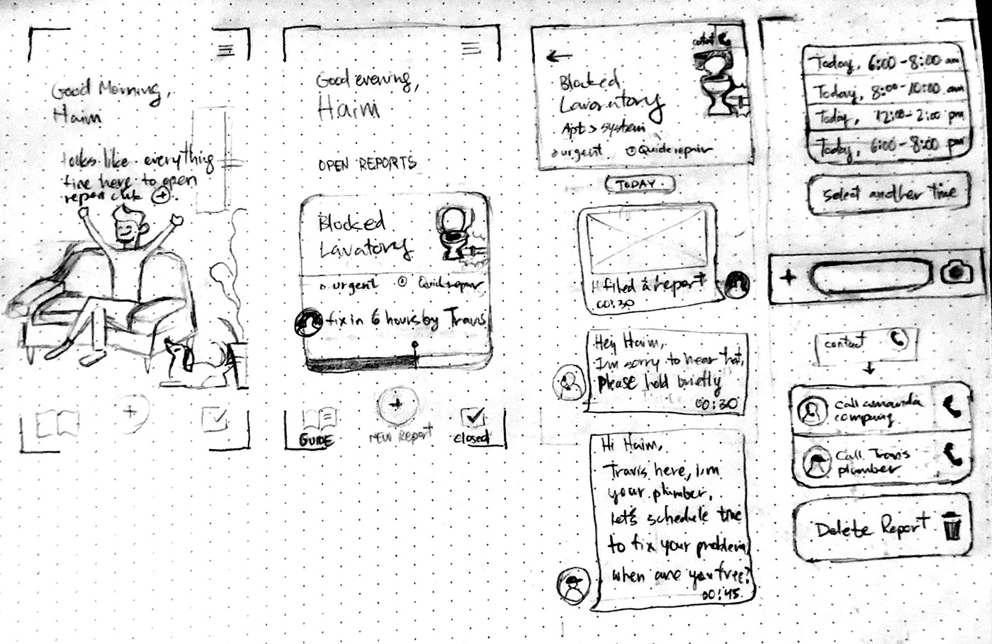
After thinking about the data structure, I moved to Figma again to start creating the screens. This is usually the part when I get to meet the product face to face. The screens design formed according to the lo-fi wireframes with some changes that came after I had tracked the flow a few times. This is the final result:

The Onboarding
After passing through the walkthrough and OTP, a user must verify it's personal and contact details that are already filled in (I assume that a tenant downloading the app is a registered tenant on the company’s database and will be identified by their personal phone number) This will shorten the onboarding process and achieve our goal to minimize the whole process time. Some details are editable, you can take into account that the payer is not necessarily the person who lives in the house and deals with the maintenance and therefore, to make communication easier, a user can update the first name (surname will remain constant) as well as the phone number and email of the current tenant (The name on the contract and the apartment number cannot be changed).
In order to avoid redundant information, I didn't dive in the resolution of changing details, adding images and settings screens in this case study.
After verifying the details the user is taken to the main screen with an empty data set inviting him to file a report.
The Wizard
Back to the goals, Time and clear communication are crucial, so the challenge here is to set up a quick and understandable wizard that will communicate the problem clearly to avoid any faults.

After testing my options, I decided to create an accordion-like wizard with scrolling cards that is pretty much as most common wizards, only vertical. When selecting an option, the cards minimize and move to the bottom of the top stack, still visible so you’ll remember the last step, making the process clear as possible. At the last step, all the cards will minimize to preview a summary of the choices for verifying. Keeping the transition animations meaningful, will help the user orientation and save us some time (remember our goals). The cards should start at the same point, so the question in each step will be in the same place so the eye will know where to look when the next card arrives.
The steps are as follow: Choose a topic, then one part from that topic, then specify your problem and finally add some more information about the problem.
As described before, I wanted to add an option to add a video and draw on the pics\video in order to improve the communication between the tenant and the contractor and to optimize the description of the problem. This helps us move a step towards our better communication goal. Alongside the fast and meaningful transitions, filing a report should end after 5 taps (Taking pics/videos or typing comments not included) which helps our wizard be quick (Time) and clear (Communication, coping the unknown).

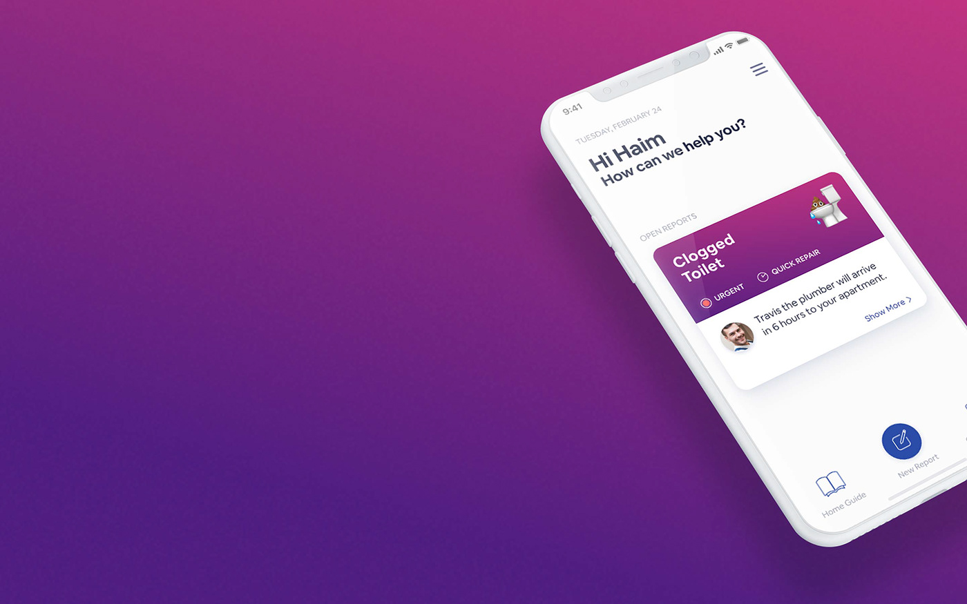
Home Screen
Moving on after the wizard the user lands at the home screen with a new “open report” card at the center of the screen. The user will use this app to report malfunctions in his apartment so the main button is creating a new report for a malfunction. I created a bottom navigation menu containing the Guide and some past reports (I called it “closed reports”). I decided to emphasize the “New Report” button (size and style) and placed it in the center of the bottom bar.

Since most of the tenants usually cope with one report at a time, I created a big “Card view” for the reports (instead of a list) including the basic information a user needs to see when checking status on his report:
The top part has some critique details about the report: Problem name, urgency, repair time and some emoji icons describing the problem, 'cause who doesn't like emojis? :)
The body of the card contains status which is mainly the last message from the chat, and a profile image to increase reliability.
After I performed some quick user testings, I realized the card is not "clickable" enough, so I added a “Show more” label to hint the user there’s more info inside. When the user gets new messages for his report, the “show more” label will be switched with a notification about unread messages, Informing the user there is news about his report (alongside the push notification)
The header is welcoming the user, suggesting to help the tenant. When pressing a report card, the user will move to the report screen. The status mentioned in the card will be changed according to the step in the process helping the user tracking the process from the main menu:

Report Screen
After filing a report and send it over, the user lands at the report screen. The top of the report screen includes information about the report with 2 action buttons:
1. A visible contact button to reach the company or the contractor just in case there's something crucial or not understood (the option to reach contractor will appear once a contractor is assigned)
2. A “3 dots” action button next to the contact button to show more options for the case: edit report, close report and a guide to deal with clogged pipes while waiting for the plumber.
The Chat Timeline
The rest of the screen is basically a chat timeline between the party involved. The chat timeline helps us better achieving the goals I set up at the beginning:
Every step of the way is mentioned in the chat, hierarchically arranged and some actions can be done with designated buttons that appear in their place along the way.
Having all the professionals in one place will help to skip the waiting time for messages to arrive at their destination and buy us more time in the whole process and making the communication much better (Goals…)
The message is clear each step of the way, the user talks to faces alongside the professionals' names there is a timestamp for each step and the status of the message is always clear. the response is fast and the feeling that there is a response for you waiting whenever you’ll need it helps the overall confidence of the user, I believe. This basically answers our goal of coping better with the unknown.
Another thing helping us reach the goal of better facing the unknown is suggesting a guide to help the user understand the problem, it’s statistics (knowing that it happens a lot can help you feel better with the problem) and steps to take in order to make it easier until the contractor will arrive.
Moreover, the user is able to manage time properly by adding an event to his calendar after scheduling

The top of the report screen includes information about the report with 2 action buttons

In conclusion, My goal was to help the tenants report a problem Fast, Accurate and worries free while tracking conveniently the process. I tried to create an app that aims to do that and measuring the time it took to resolve malfunctions (I estimated it in less than 24 hours, In this case, less than 12) alongside the feedback from the users will tell if it managed to do so. Like in every project, I learned a lot about this topic. In general, I believe our role as UX designers is mastering each topic we dive into so providing my curiosity here was inevitable.
While designing the screens I tested my process regularly with close friends (that matches the persona) and ask quick opinions from experts to help me better understand if I’m on track.
Hope you enjoyed it as much as I did :)


