


Looking back to move forward — a flavour-filled rebrand honouring futures’ past.
The Time has Come.
Over the last couple of years, the Sticky Fingers E-Juice brand has grown rapidly in the Australian market. This accelerated growth signalled that the time had now come to upgrade the production facility to meet both customer demand and the ever-growing pipeline of distribution channels. This strategic expansion saw the introduction of a large new warehouse and purpose-built clean room; and also a must-embrace opportunity for a fresh brand identity that would guide the business confidently into the future.

A Balancing Act.
With a strong market presence and loyal customer following, it was important for Sticky Fingers to maintain their carefree, counter-culture attitude that was effectively cutting through the competition. With this in mind, the new brand had to balance familiar brand attributes with a relevant foray into a future brand that still infiltrated a cluttered market, and drove sales. Chaptr and Sticky Fingers had a strategic tightrope to walk.

New Look Back.
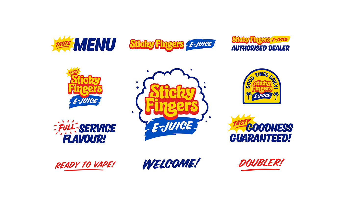
From our first meeting, Sticky Fingers realised that the rapid growth of the company had meant they’d lost their way as to who they were as a brand when communicating with customers. After a series of Chaptr facilitated discovery sessions, collaboratively we were able to identify and establish the Sticky Fingers personality and distill the key ideals into a bunsen-burning brand beaker of “who they truly are”; an essence of fun, friendly, flavour. With the brand direction now set, Chaptr also developed an authentic story that represent the brand sincerely and relevantly to both Millennial and Gen X markets — The future brand believers.


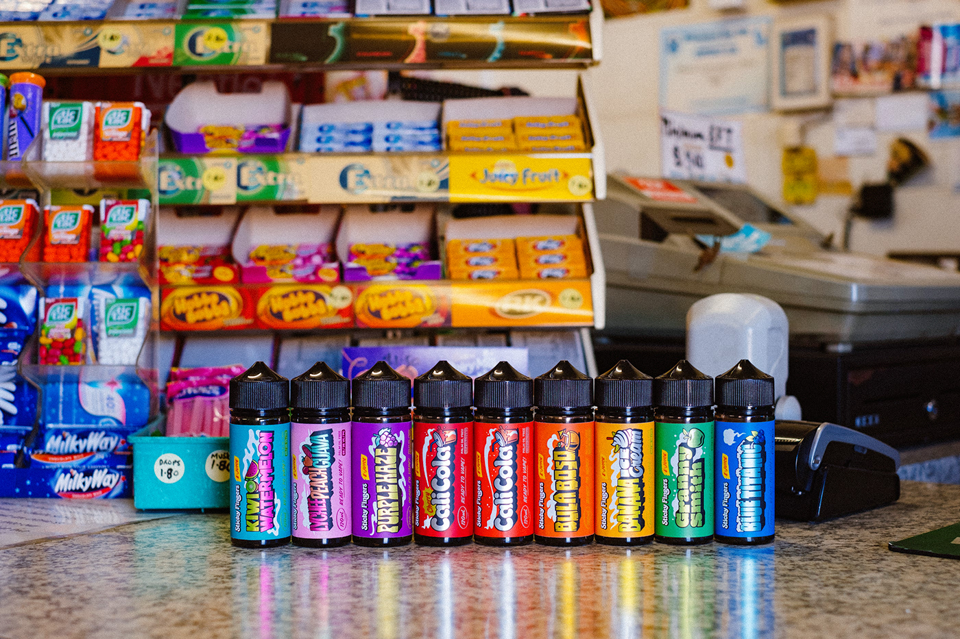
Fresh Look, Same Friendly Flavour!
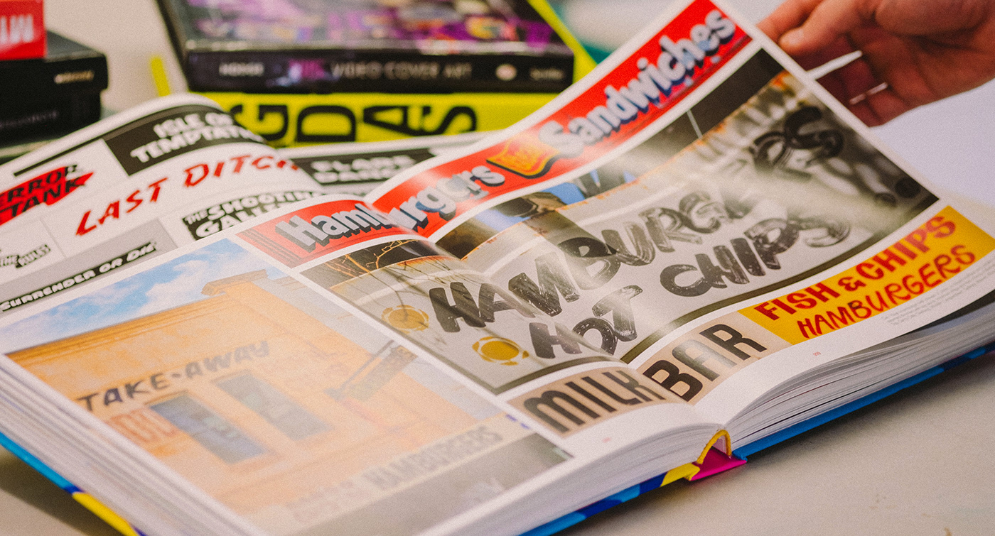
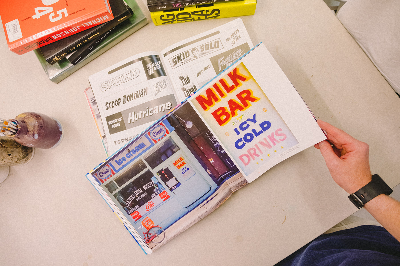
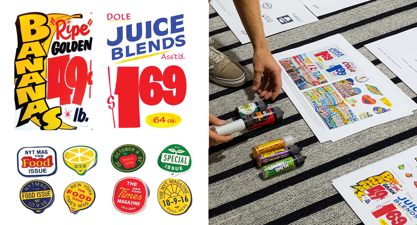
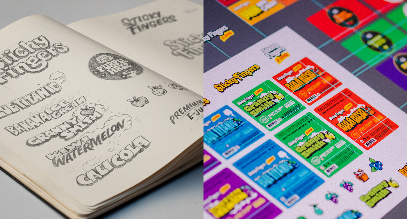
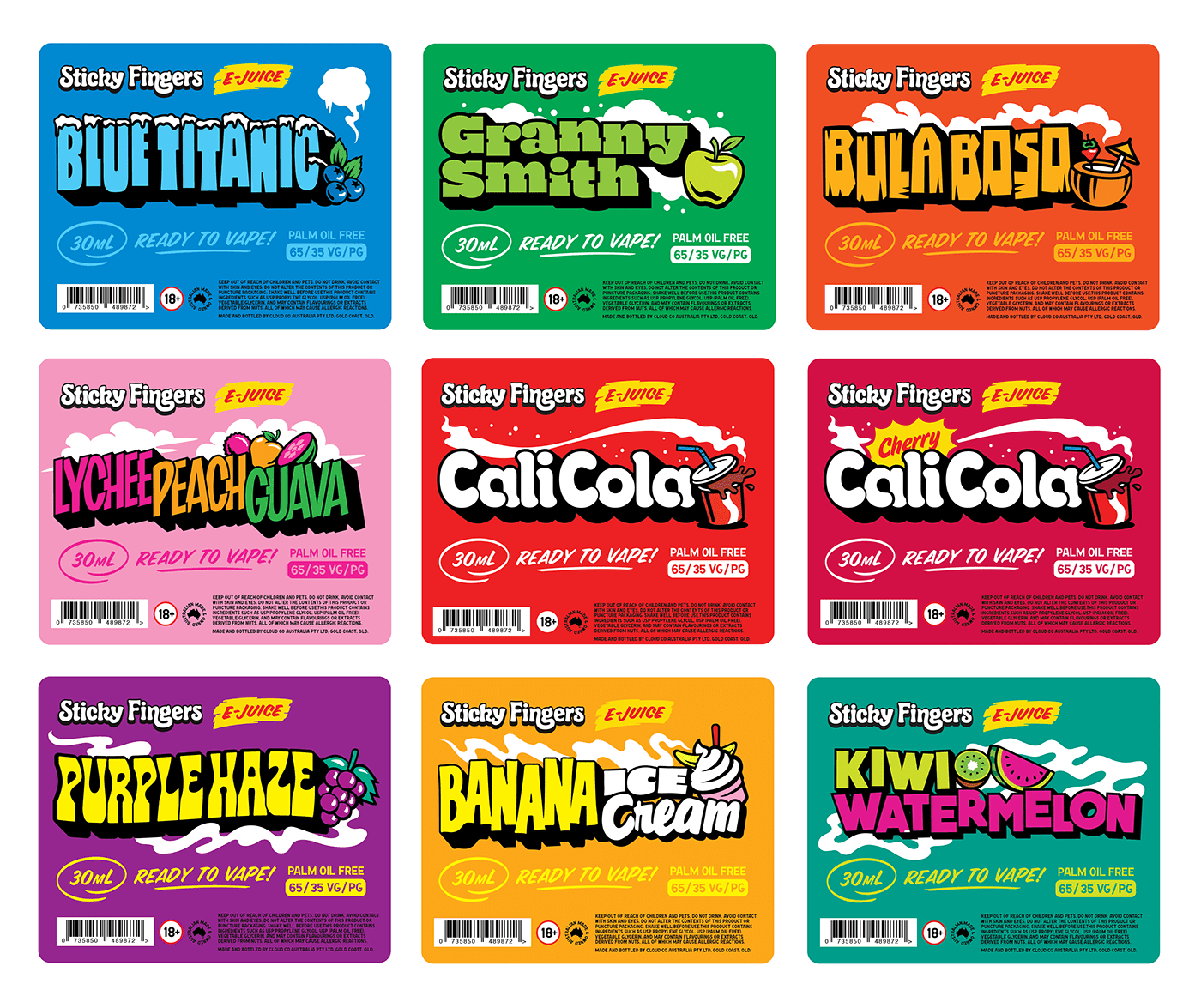
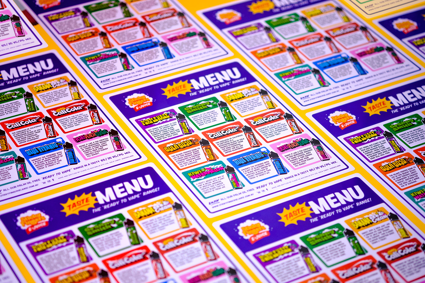
The final brand result was a new look Sticky Fingers created to capture the nostalgic tastes and retro feel of visiting your friendly neighbourhood milk bar; a step back in time to a once colourful hub at the centre of every Australian community packed full of friendliness, fun and flavour.
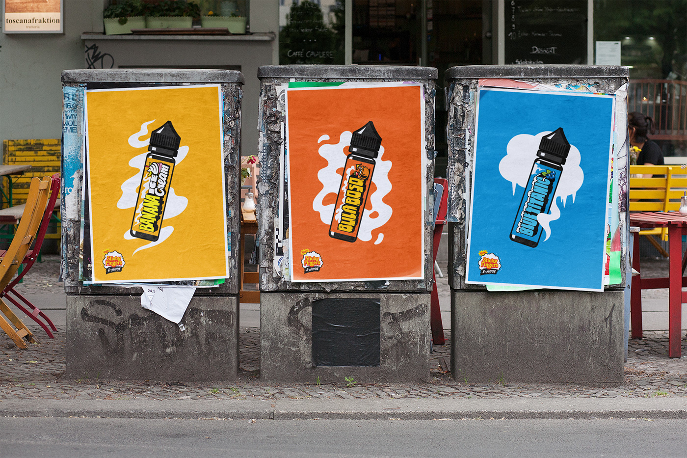
Sticky Fingers now had the best of both brand worlds; the ability to pair a bold, cheeky attitude with a welcoming, nostalgic touch. The vibrant new product packaging practically ‘jumps off the shelf’, helping Sticky Fingers stand out in-store and cementing them as an innovative leader in the global e-juice market.


- Jesse Wilson, Director, Sticky Fingers E-Juice.


