FORK
Presenting forking good food for the community!
FORK is a Malaysia food review channel.
The goal is to be number 1 channel to discover local hidden gems and build community to share and discover good content.

History
Fork was founded in 2015 as a site that posts and re-shares food related content.
In 2018, the site was given a proper facelift with a major rebrand on it’s brand identity including its logo, typeface and direction.
Brief of the Project
To build a food channel that not only reviews trending products and appreciates nostalgic treasures, but also becomes a place of commune for foodies to gather and share their culinary experiences.
Target Audience
18-35 years old
Urban
Relevant and up-to-date with the trends
Urban
Relevant and up-to-date with the trends
Challenges & Solution
1. Look & Feel
Challenges
FORK didn’t have a solid brand identity to present the brand to the masses and to potential clients.
Solutions
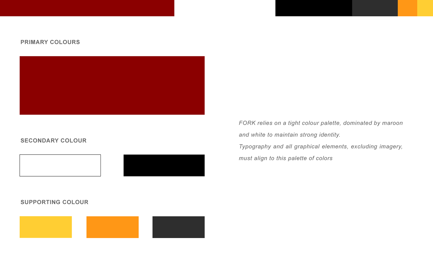
Based on FORK’s target audience and its nature of business, the team and I agreed to use warmer colours to present a more approachable and likeable persona. The colour code used for FORK’s official colour portrays passion, the kind of passion that reflects Malaysians’ love for food and everything tantalising.
Goals
1. To set up FORK on social media platforms
Why?: In order to present content to the audience and potential clients, the team and I help setup these social media accounts for FORK:
- Facebook
- Instagram
- Twitter
- TikTok
- TikTok
Action
The team and I created different content for each social media accounts to achieve the best amount of engagement possible per posting.
With this, each social media account was also given content and visuals with the accurate format and measurements set by respective social media sites.
THE LOGO