


The Challenge
Nutrisoy is proudly Australian, family owned and operated. They produce over 20 different varieties of high quality tofu and tempeh, under three different brands: Nutrisoy, Soyco and TLY, distributing throughout Australia.
Following the success of the Nutrisoy packaging design project, Percept were engaged again as the design agency that would take a fresh approach on their brands, Soyco and TLY, to bring their brand identity and packaging design in-line as a family.
The Solution
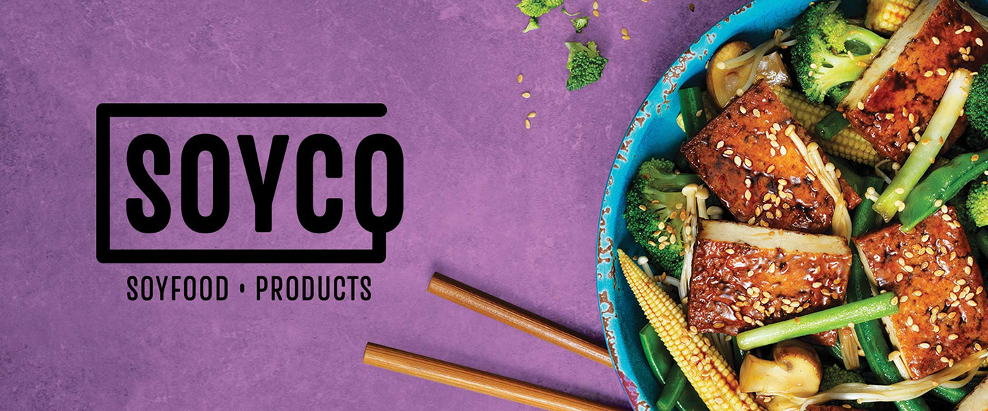
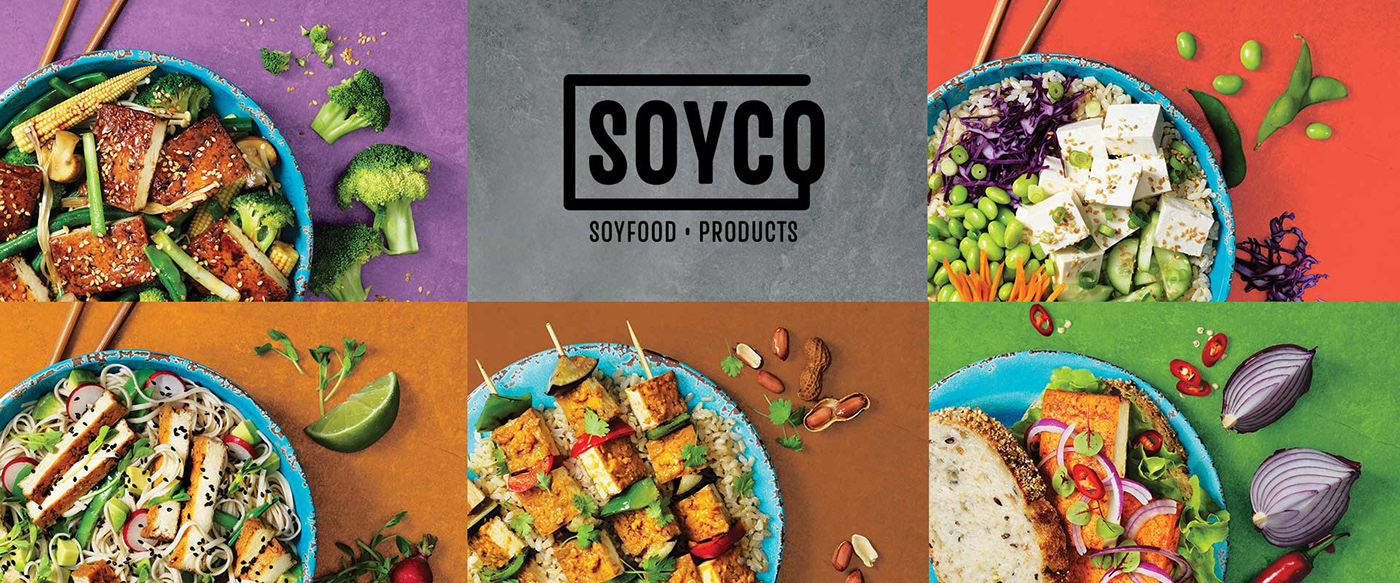
Branding agency, Percept, developed a contemporary logo design for Soyco which proudly launches a new direction for the brand identity. Strong and confident uppercase typography is housed by a keyline branching off the ‘O’, symbolising a soybean on a vine or spoon to enjoy the tofu.
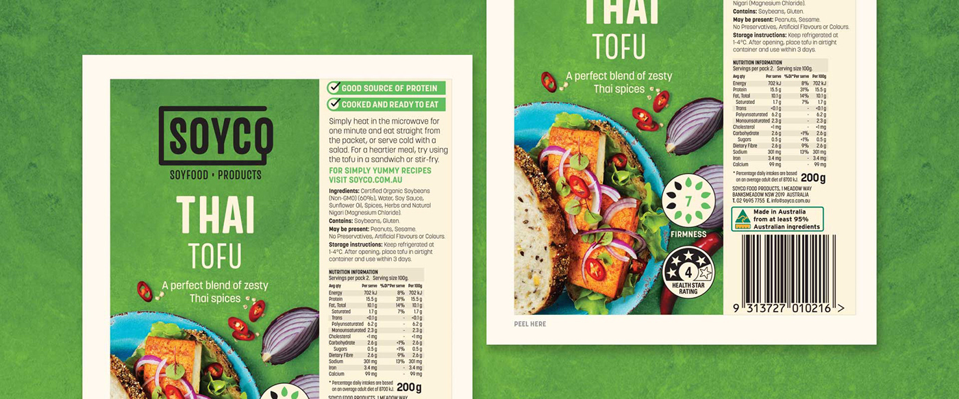
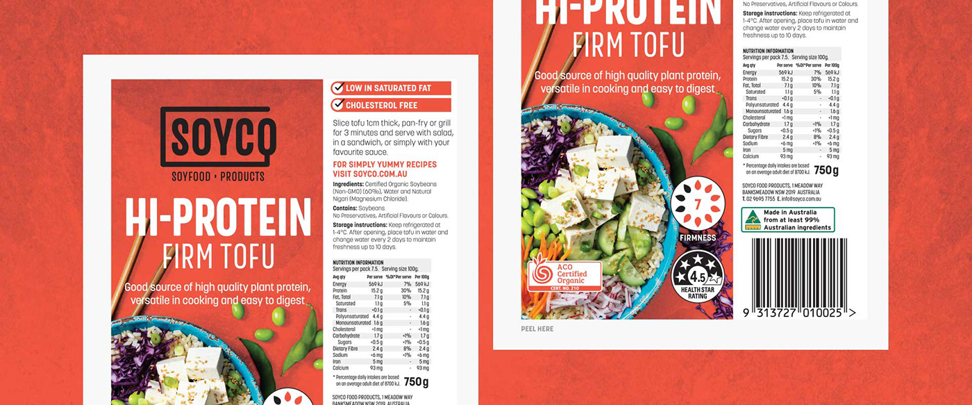
The new packaging design is product led, with strong colour blocking and textures that immediately allow variants to be easily identified. A contemporary touch is also applied to the TLY packaging through a clear and consistent hierarchy of information, which is imperative for brand recognition and legibility.
The brand identity and packaging design for both are visually rich, showcasing fresh food and ingredients which gives great shelf shout amidst cluttered competitor designs that are bland and busy. Australian branding agency, Percept, art directed a photoshoot for the different tofu variants for both projects, with flavour, colour and taste at the top of mind for brand coherence.
The new brand identity and packaging design effectively communicate the essence of the respective brands. The modern and confident look stands out in the market whilst still sitting neatly within the Nutrisoy family of products.


