YAN YAN FANG Rebranding
Client: YAN YAN FANG
Type: Rebrand, Packaging, Promotion
Photography : Andrew Kan
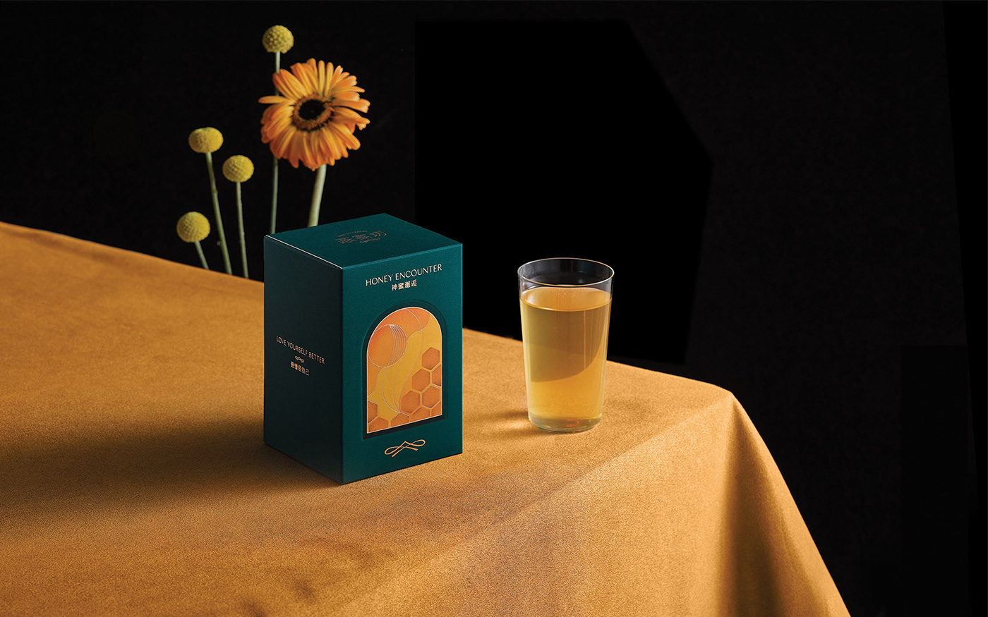
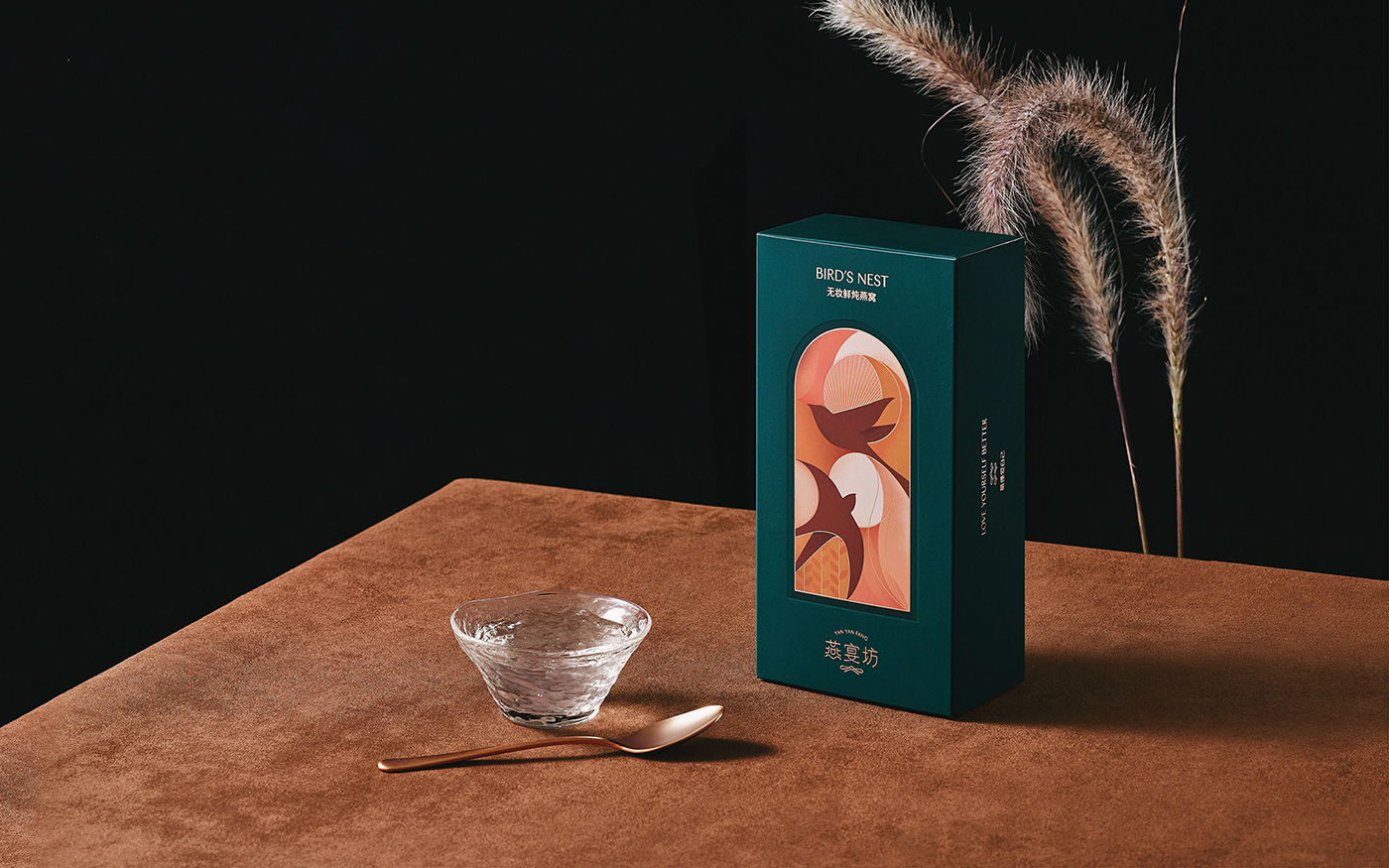
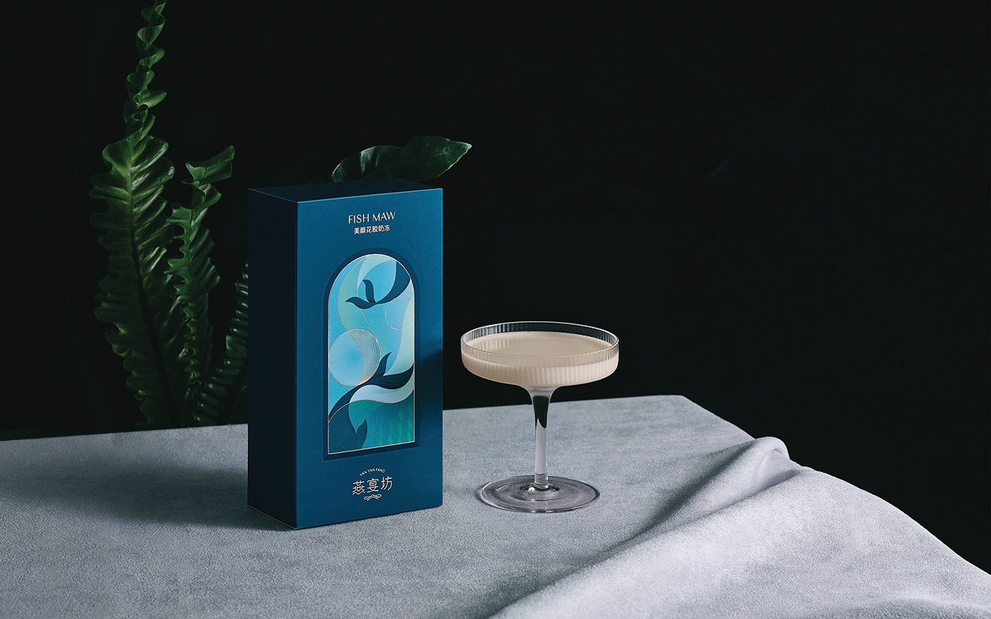
A system of rebranding and package designed for the edible bird’s nest brand Yanyan Fang based in Jiangxi, China. With the saturation of traditional bird’s nest in China’s market, most products deliver an old-fashion feeling to the younger generations. We challenge to innovate and create new connections with the young market by designing a refresh image for the brand.
We designed a collection of packaging with elegant color palette and illustrations, to communicate the brand values with modern language. The rebranding aims to reposition the brand and attract the eyes of the young middle class group.

.