Lambda-X is one of the world's leaders in creating and manufacturing optical systems for metrology and imaging applications. As a subsidiary of Verhaert, my job was to aid them in any graphic design they deemed necessary. One particular project was creating a new set of icons and branding for both their new software and hardware.
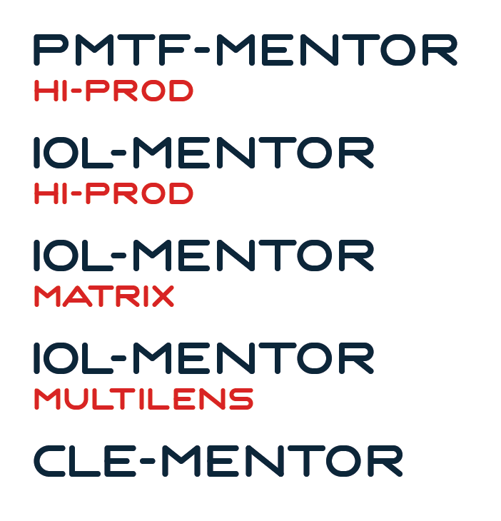
The Lambda-X branding already existed when I joined Verhaert, so the first thing I did was recreate the new product names in the same style as the Lambda-X branding. Since there was no font, I drew the letters I needed:
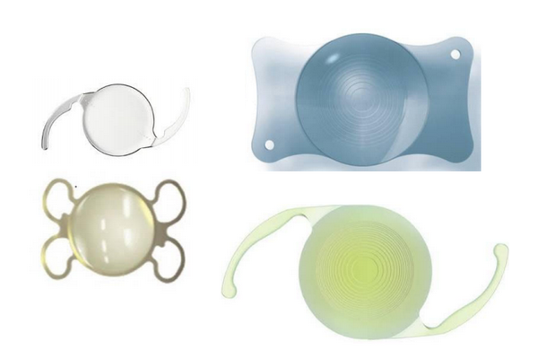
It took some more time to find the right icons for the software. I had a few good talks with one of their chief engineers, in order to get the basics of the different software/hardware editions down. Lens shapes, for instance:
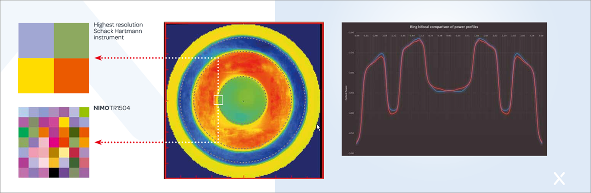
But also measurement profiles in the software often show up:
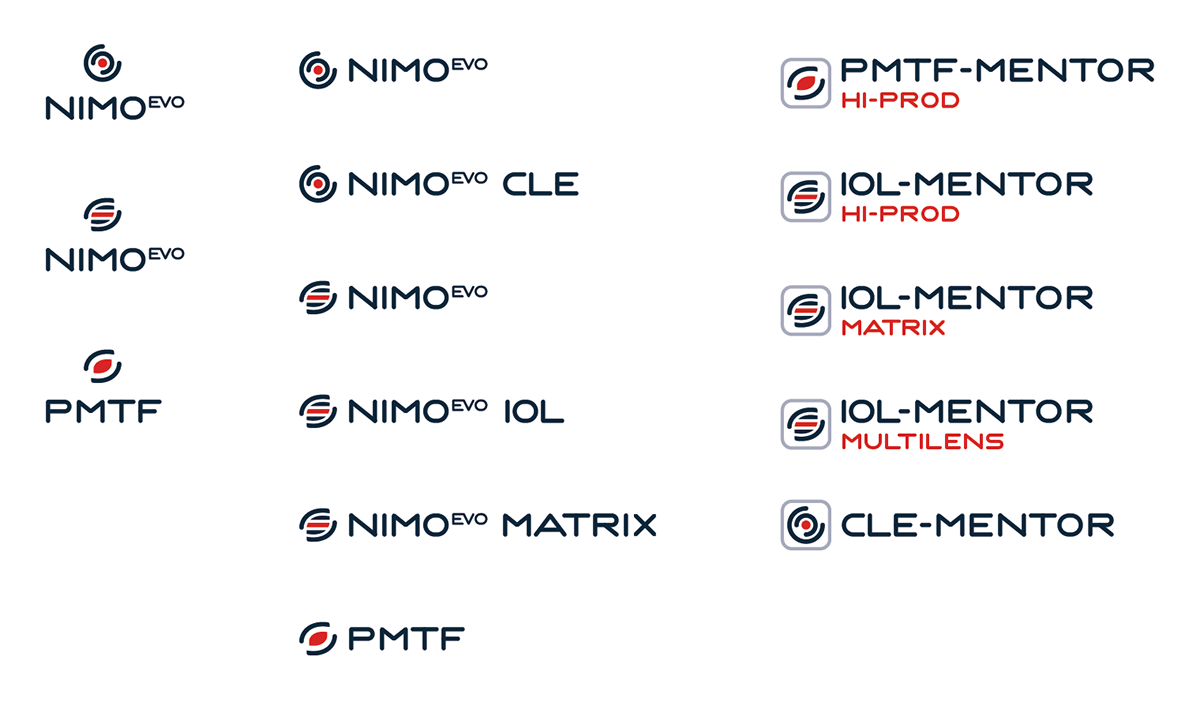
Combining these and using the existing colors, I came up with an icon for every edition they needed:


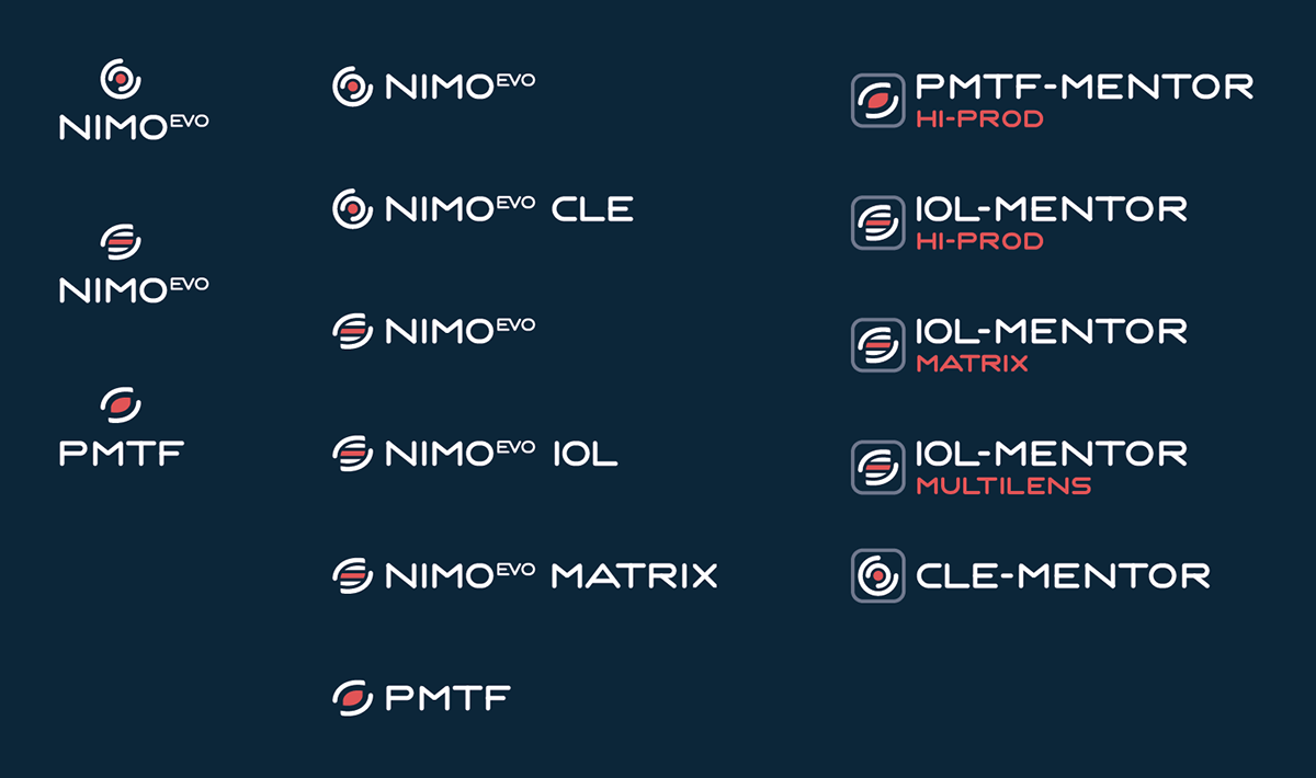
It hints at a lens, at an eye, at the measurement profile, while still being unique and recognizeable. It also feels very clean and sharp, which is perfect for the type of work they do. They were happy with the results, so I expanded everything to cover all bases: dark variants, software variants with borders, different placement etc:
It's always nice to see your creations come to life, especially when you know that you helped strengthen the product branding. You can see the journey of the NIMO product nicely in the product shots below: