PROCESS
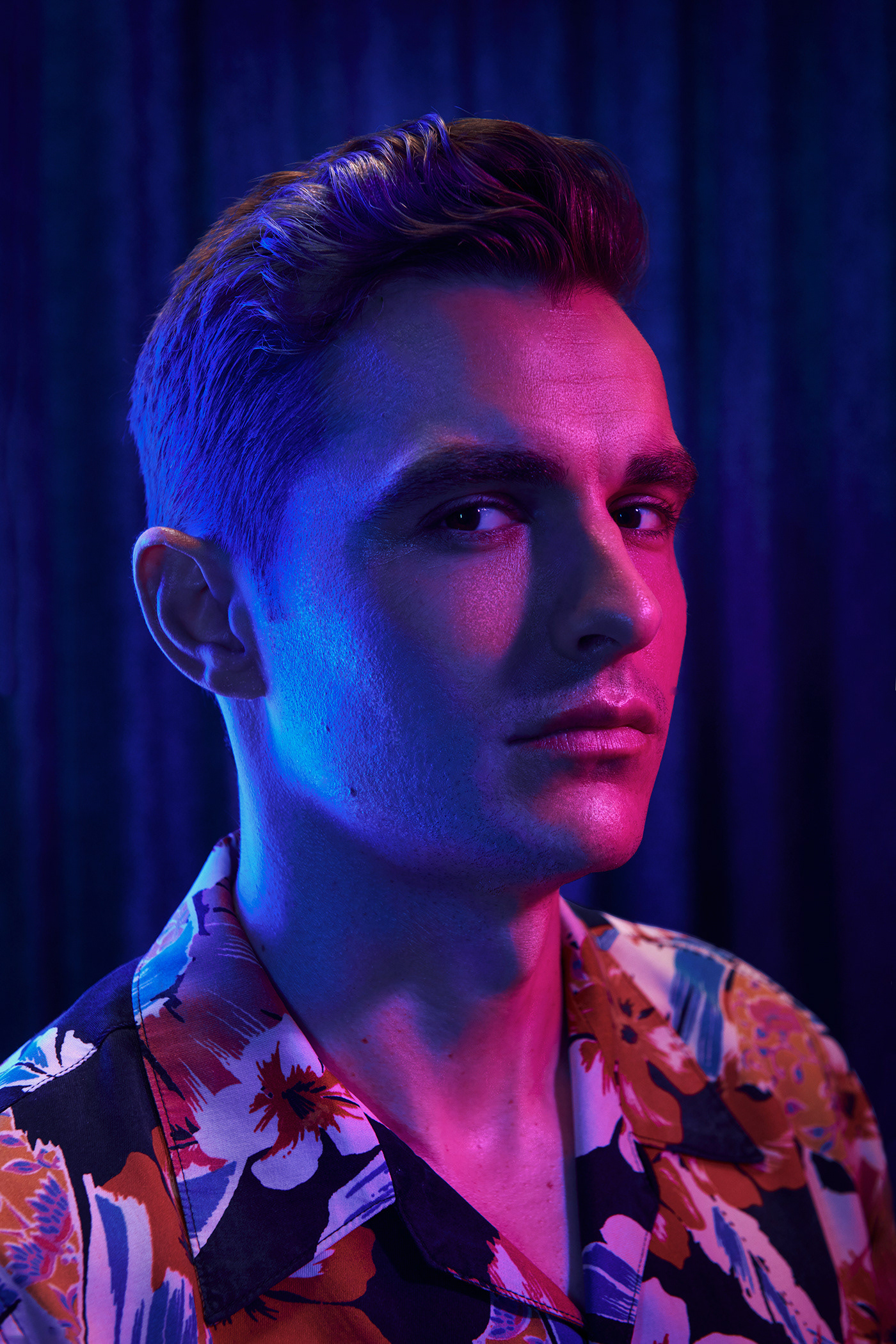
This was probably my favorite project for this class! I did yearbook back in high school, and I was really happy to see that some of those skills I learned back then, are still in me somewhere. I googled magazine covers to get some layout ideas for the cover. I noticed that almost all of them had a large number to grab your attention so I really wanted to include that in the designee and I think that helped give it the magazine look. The spread design was the first thing that came to my head. It was simple and displayed the photos. I choose to have the page numbers cut off on the ends because I feel it is a very modern look. You don’t need to see the whole number to know what it is.
This was probably my favorite project for this class! I did yearbook back in high school, and I was really happy to see that some of those skills I learned back then, are still in me somewhere. I googled magazine covers to get some layout ideas for the cover. I noticed that almost all of them had a large number to grab your attention so I really wanted to include that in the designee and I think that helped give it the magazine look. The spread design was the first thing that came to my head. It was simple and displayed the photos. I choose to have the page numbers cut off on the ends because I feel it is a very modern look. You don’t need to see the whole number to know what it is.
CRITIQUE PROCESS
We met in a small group in class and I showed them my designs. I was happy with their feedback and glad they caught me on some of the requirements I was missing. Going back to my design I added more photos & added a text wrap around a photo I cut out. But I didn't like it. I don’t really like the text wrap for this style, so if I ever do use this for my business I would change that back. Also I added the Issue number and date
We met in a small group in class and I showed them my designs. I was happy with their feedback and glad they caught me on some of the requirements I was missing. Going back to my design I added more photos & added a text wrap around a photo I cut out. But I didn't like it. I don’t really like the text wrap for this style, so if I ever do use this for my business I would change that back. Also I added the Issue number and date
AUDIENCE
Family Friendly and happy going theme.
Potential Clients
Family Friendly and happy going theme.
Potential Clients
FONT NAME & CATEGORY
Angelic Pro // Serif
Gadugi Bold // San Serif
Angelic Pro // Serif
Gadugi Bold // San Serif
Images used were taken by myself.


Above Left Image : Draft
Above Right Image: Final
Above Right Image: Final


