brand identity
2019

сosmo сase
cosmo сase is a digital agency whose engine is “a young team with a fresh look at familiar things.”
With this quote already it is clear that these guys need a special, new, but classic by modern standards design.
As, in fact, their name "cosmo case" says. Space elements and corresponding colors were needed.
The main ones in the color palette were shades of purple and blue, acquiring an associative connection
with the space theme being on a dark background.
The logo includes three cosmo-concepts: space ship, silhouette of the Milky Way, Saturn.
Also its shape is composed of two ideally suitable details - the unity of idea and its realization.
The corporate identity has received a combination of easily recognizable icons (like, share, settings, etc.)
and unattainable objects of the cosmic world.
Design: Roman K.
Client: Cosmo Case

01. LOGOTYPE


02. SERVICE ILLUSTRATION


03. COLORS


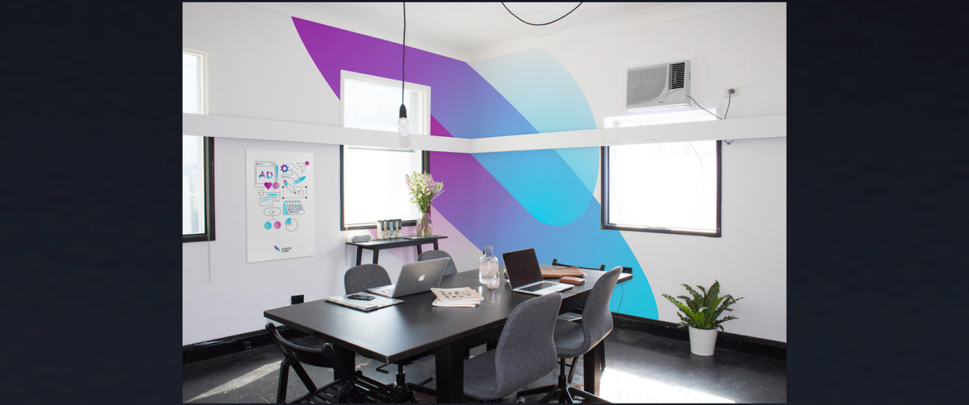
04. WORKSPACE