Life Property Developers (Pty) Ltd.
Life is a newly established property development company in Namibia, a country in southwest Africa.
Life develop property for affordable housing. Life strive to deliver affordable serviced even as well as affordable housing.
In Namibia owning property is very important. All classes of people strive towards owning property. Unfortunately most developers are aiming at the high income groups. We would also like to deliver for the high income groups, however our primary focus is aimed at middle to low income groups. Owning property is like starting a new Life.
Goal
The only choice for affordable housing in the country as well as to build up a portfolio for regional investors to use a vehicle for property development and investment.
Project Voice
Quality and Affordability!
Tasks
Logo design
Brand Naming
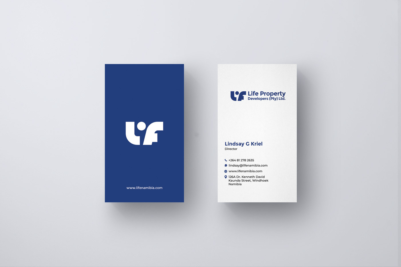
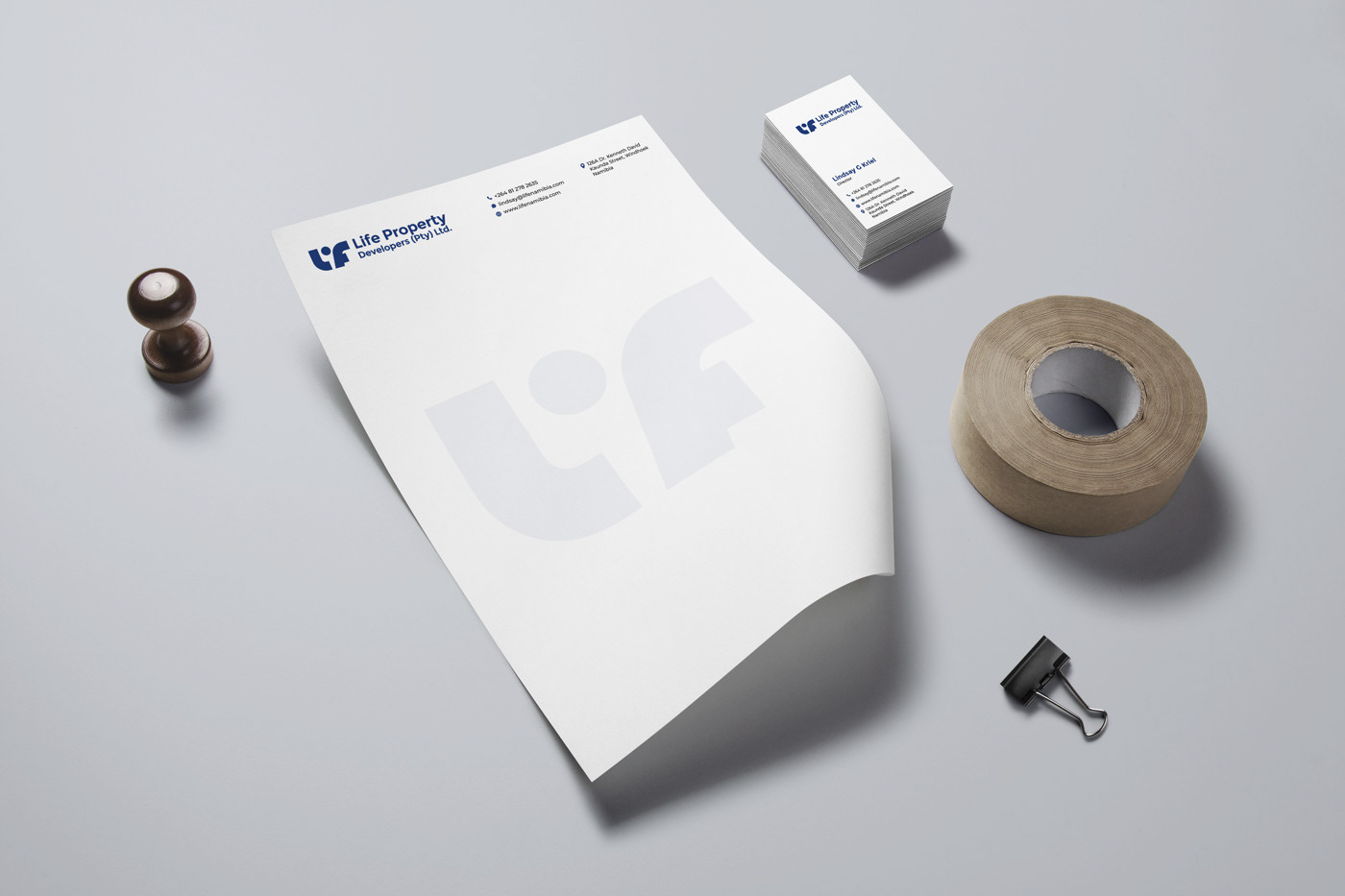
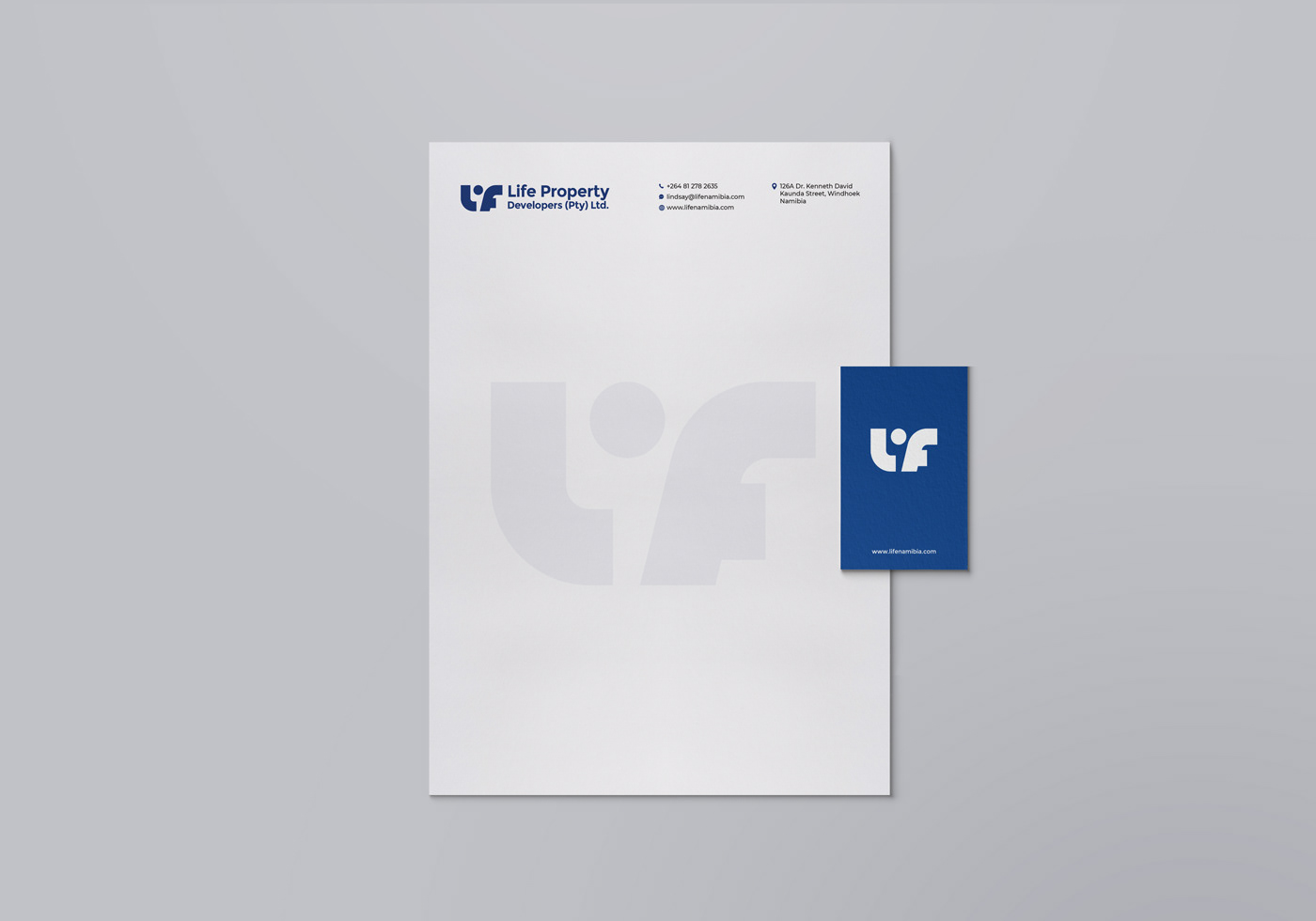
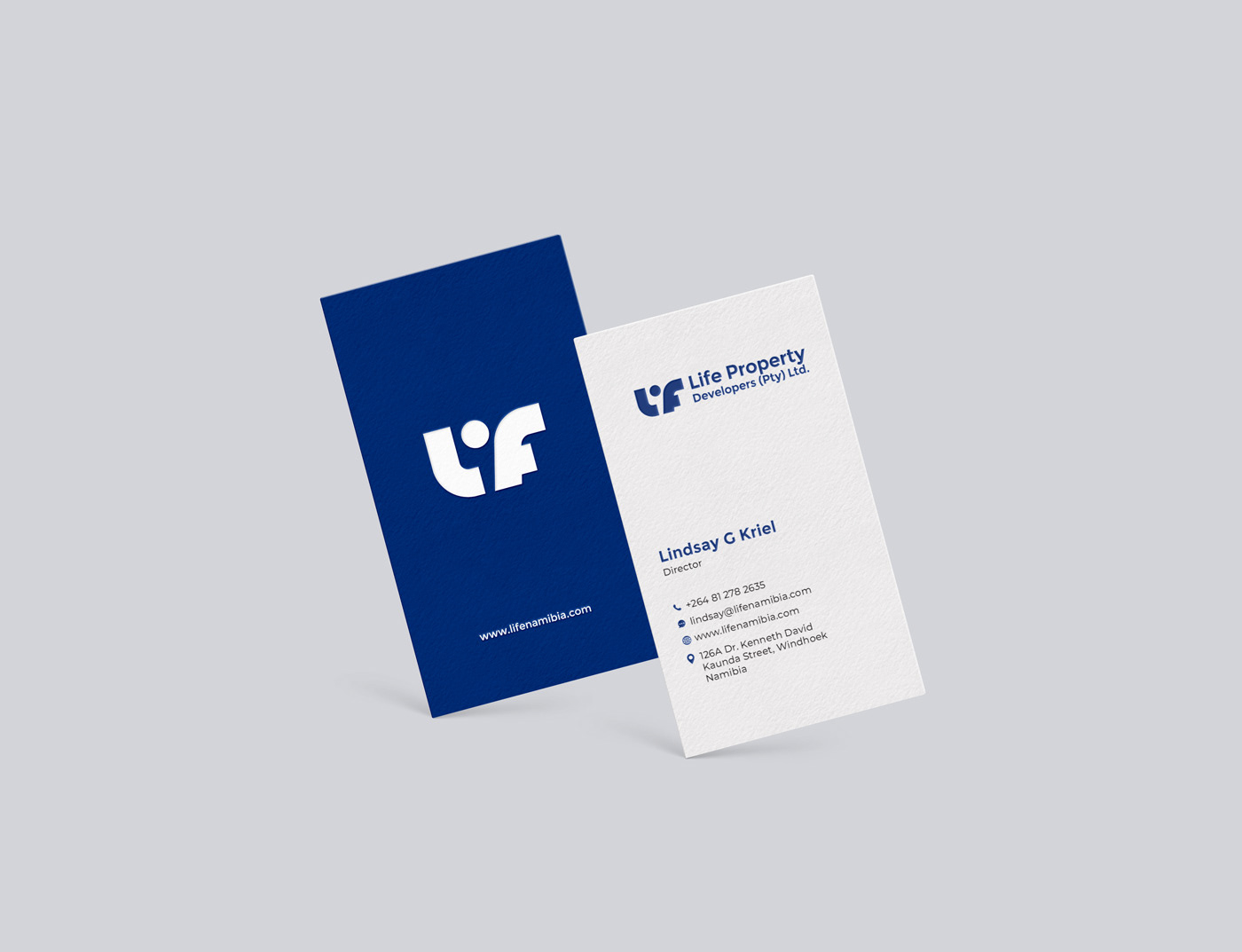
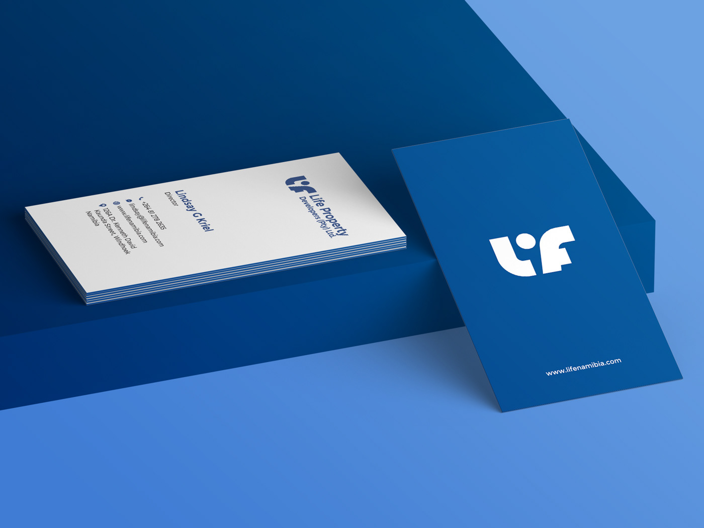
Business card and letterhead.
Brand Naming
Before designing a logo for brand. We discussed about that brand name with Lindsay. Because the name they suggested is LiFethat is a combination of 2 Names and the software & grammatically the name is incorrect while using in a word document or email it shows error. that was looking like more a grammatical mistake.
So we suggested to change the name slightly from LiFe to Life.
So we suggested to change the name slightly from LiFe to Life.


Research
after processing all the information about the brand started exploring the brand more.
Since life is aimed to provide affordable homes for people.
Since life is aimed to provide affordable homes for people.
I tried to include some elements from the nation like the Oryx the national animal of Namibia.
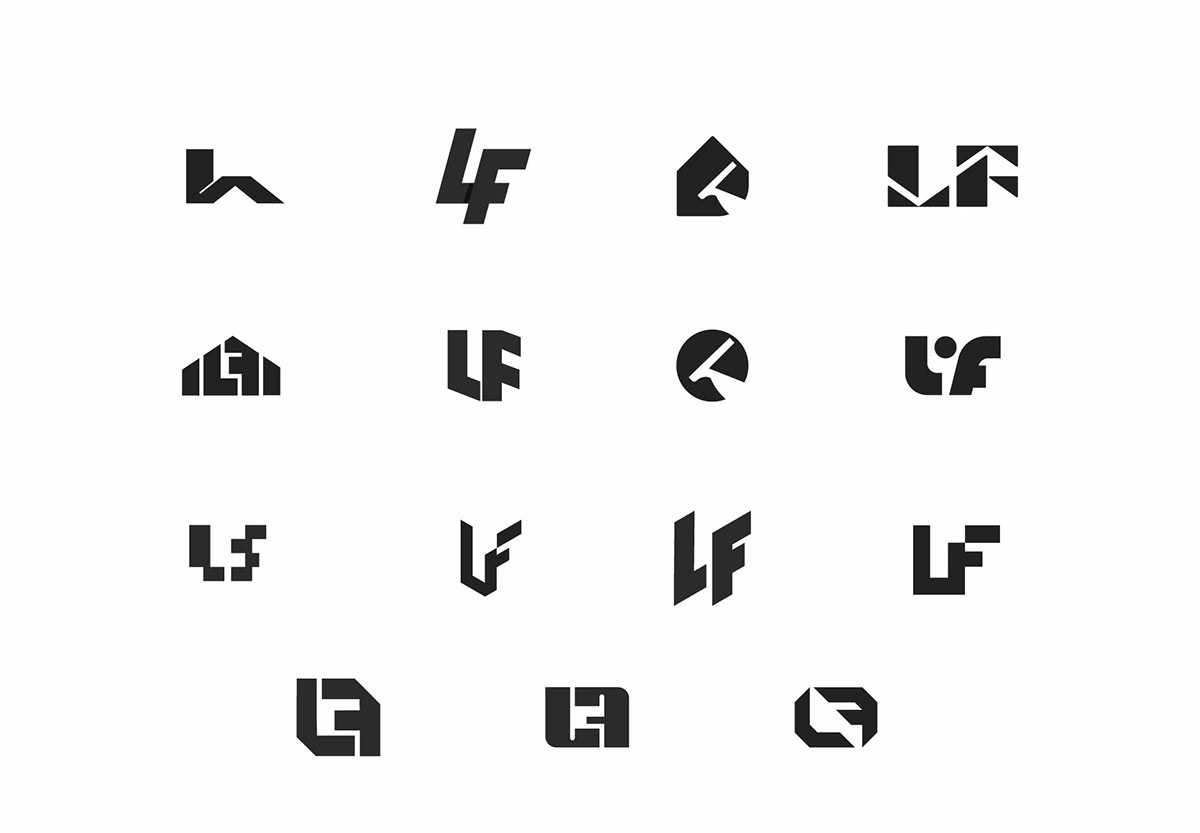
Some of the explorations are shown below.
Some of the explorations are shown below.
Finalizing mark
After the exploration we discussed each an every mark in depth & what message the marks convey about brand.
we choose to move forward with the 3 below shown marks. that are more appropriate for the brand.
we choose to move forward with the 3 below shown marks. that are more appropriate for the brand.

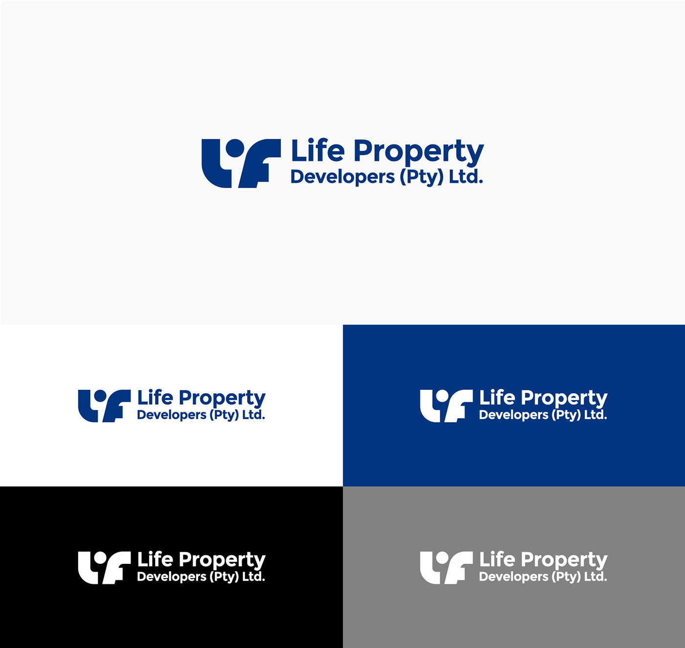
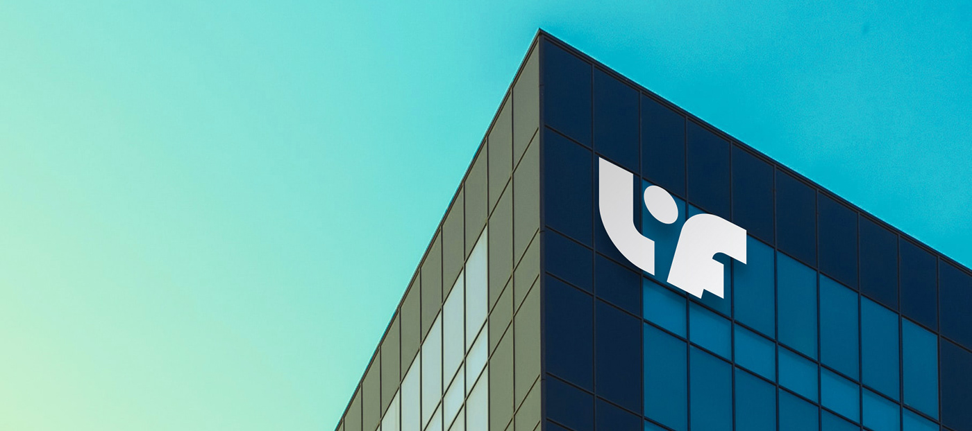
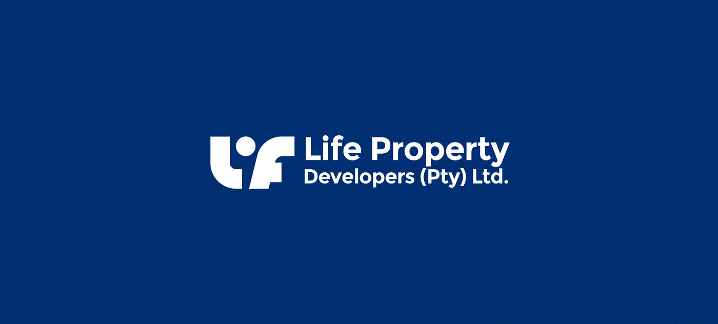
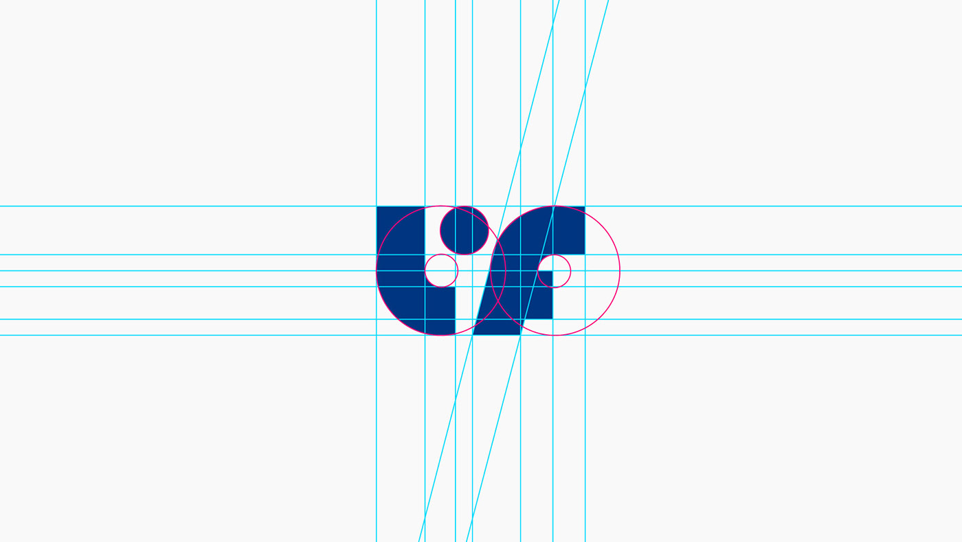
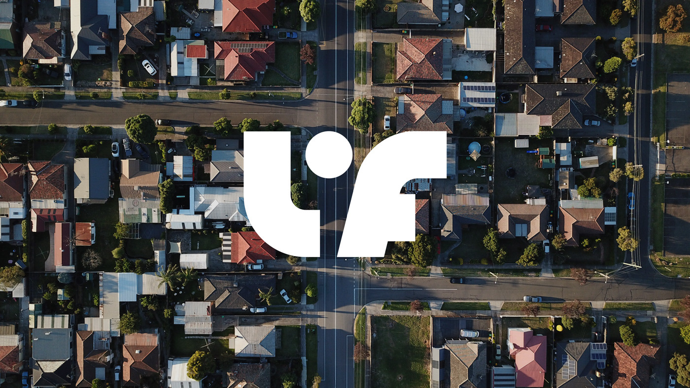
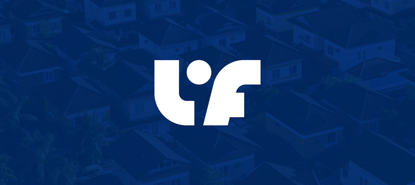
Final Mark
The circle between L F is to show the create a balance between the shapes & provide a safe environment to grow.
The circle also represents the sun that we can find in Namabian flag. The sun symbolizes life and energy.
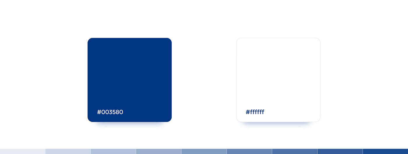
Color Theory
While choosing the appropriate color for the brand. we keep in mind about to give a national feel to the brand or include the nation in some manner so we choose to use color from the national flag of Namabia.
The colors and symbols of the flag all have their own meanings. The blue color is a symbol of the sky and the ocean both of which play a vital role in the country’s well-being. The red color represents the people of the country, their courage and determination to achieve equal opportunity for all in the future. White in the flag symbolizes unity and peace. The country’s agricultural wealth and vegetation are represented by the green color.
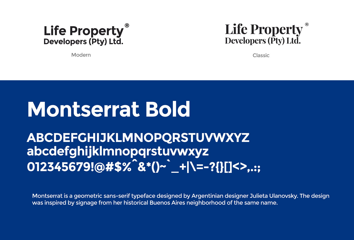
Typography
Because the Life is primarily concentrating on the middle to low income groups. the modern typeface is the right choice for the brand.