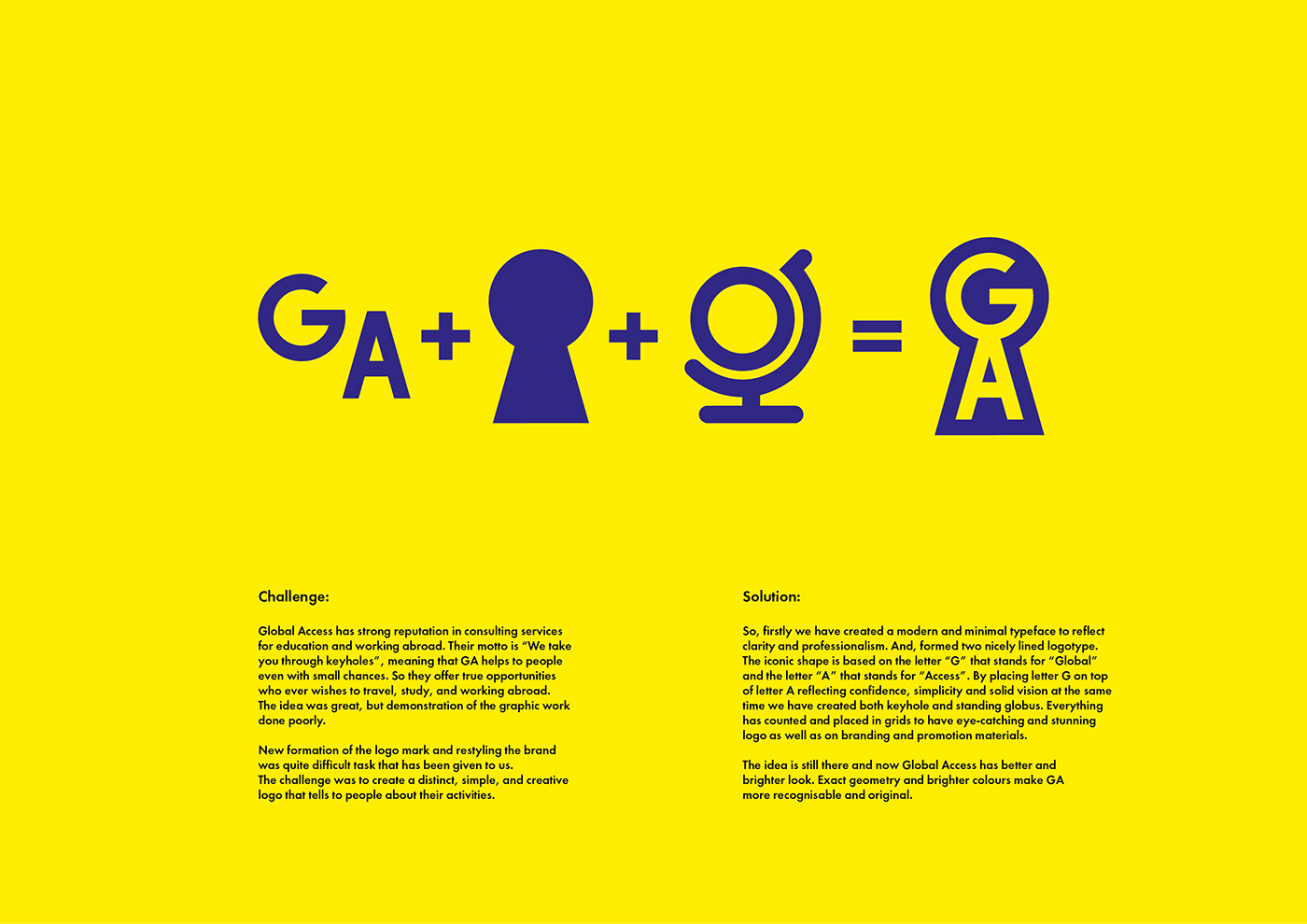
Challenge:
Global Access has strong reputation in consulting services for education and working abroad. Their motto is “We take you through keyholes”, meaning that GA helps to people even with small chances. So they offer true opportunities who ever wishes to travel, study, and working abroad. The idea was great, but demonstration of the graphic work done poorly.
New formation of the logo mark and restyling the brand was quite difficult task that has been given to us. The challenge was to create a distinct, simple, and creative logo that tells to people about their activities.
Solution:
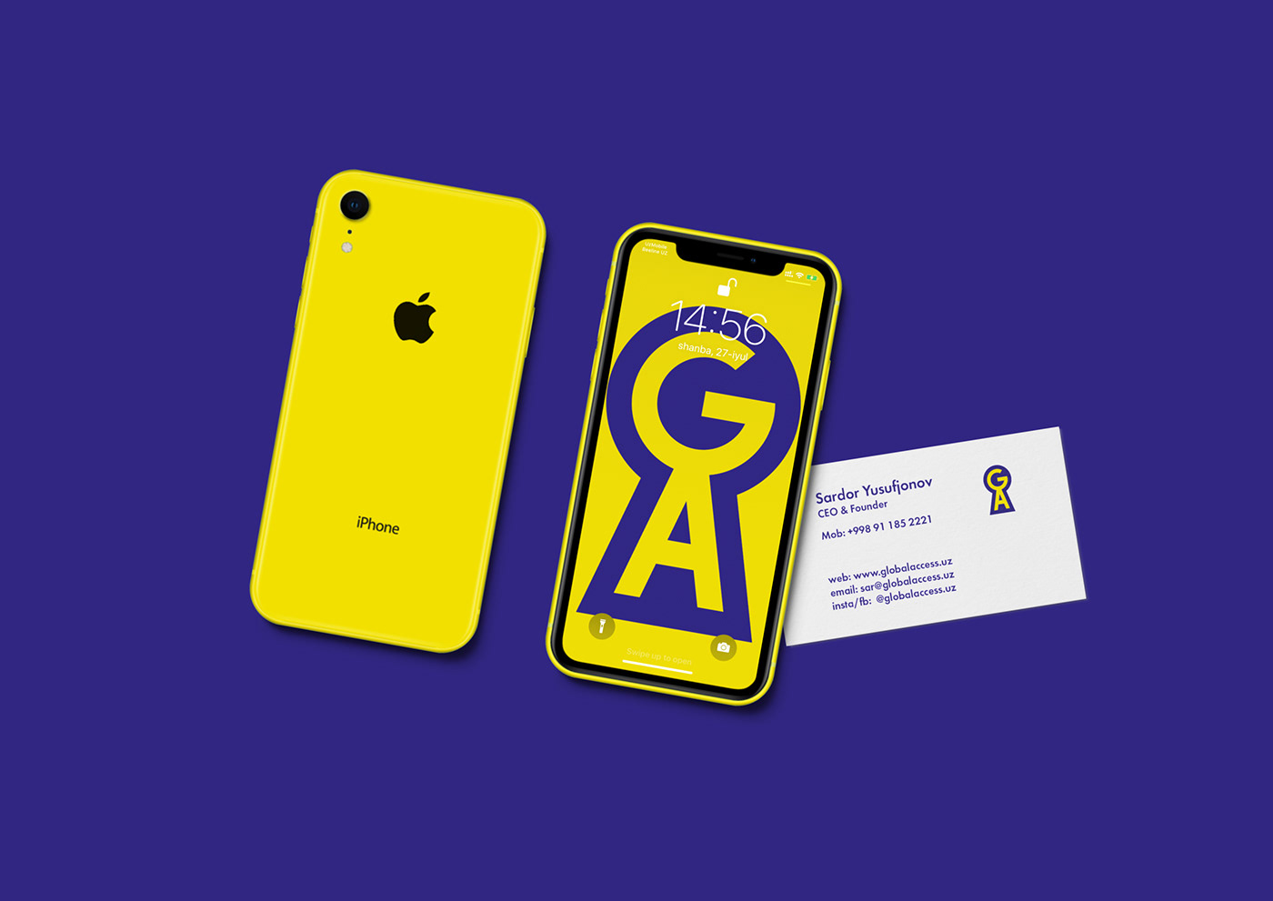
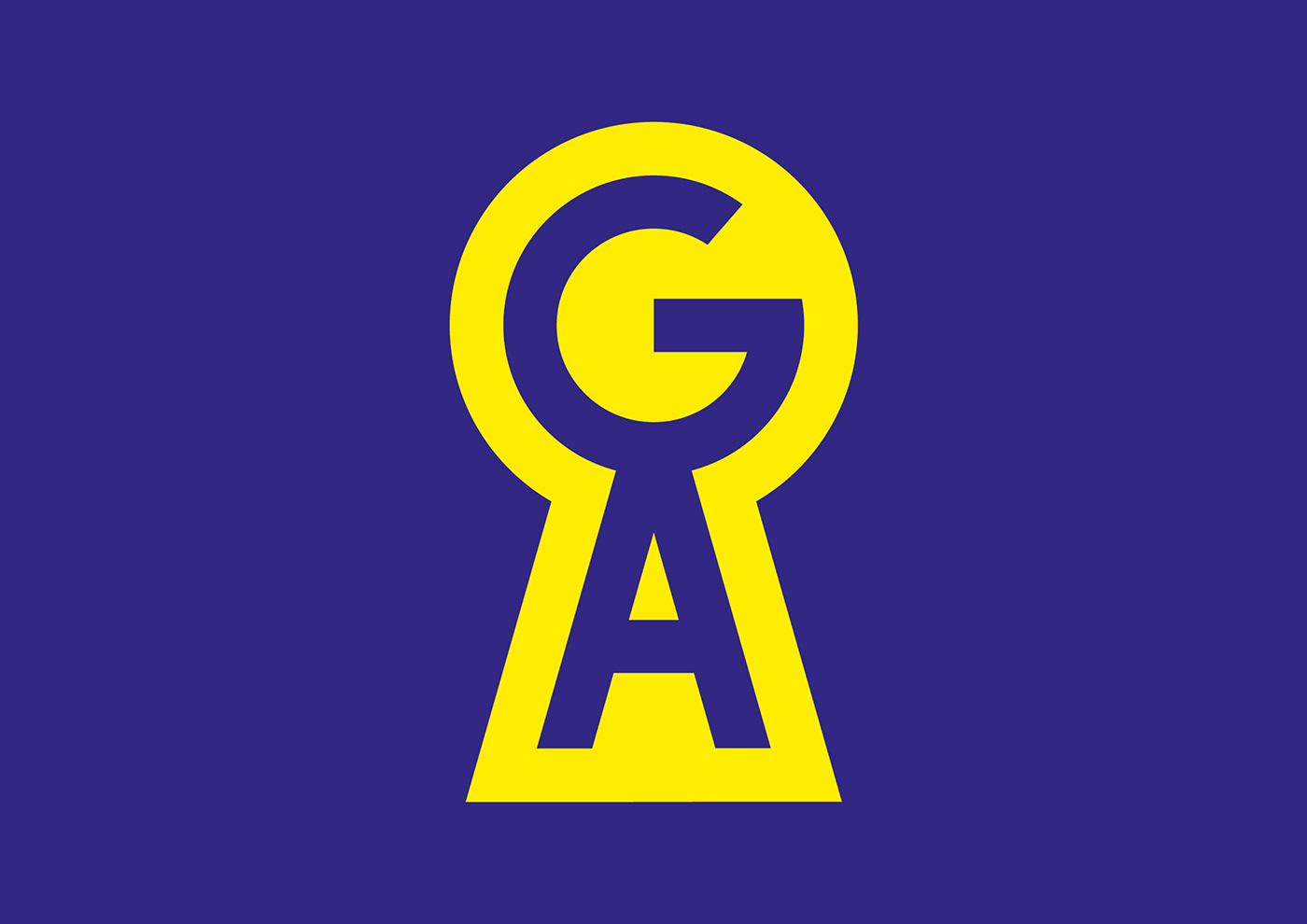
So, firstly we have created a modern and minimal typeface to reflect clarity and professionalism. And, formed two nicely lined logotype. The iconic shape is based on the letter “G” that stands for “Global” and the letter “A” that stands for “Access”. By placing letter G on top of letter A reflecting confidence, simplicity and solid vision at the same time we have created both keyhole and standing globus. Everything has counted and placed in grids to have eye-catching and stunning logo as well as on branding and promotion materials.
The idea is still there and now Global Access has better and brighter look. Exact geometry and brighter colours make GA more recognisable and original.