


Liptember is a charity focused on creating awareness around women's mental health, with funds raised by participants purchasing and wearing a colourful lipstick throughout the month of September. As they reached their tenth year of the campaign, the team approached Date Of Birth to evolve their brand to better capture and visually express exactly what Liptember represents — the need to spark conversations around women's mental health.


We partnered closely with Liptember to re-establish the core brand foundations, honing in on creating brand positioning and values that communicated a personality empathetic about the sensitive nature of women's mental health, while at the same time being positive and inspiring.

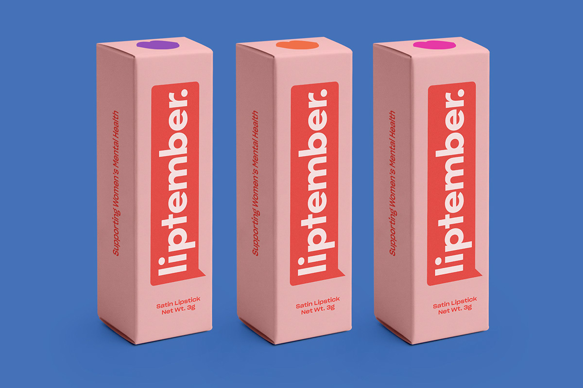
We started by evolving the logo mark. We loved the idea of speech bubble to represent opening up conversations about mental health for women, and wanted to celebrate this in the brand evolution. We kept many elements from the original logo to ensure brand recognition but shifted the focus towards legibility and instant recognition. We selected an unrounded variant of the original typeface to express femininity, empathy and consideration, rather than something playful and youthful as seen in the previous logo.

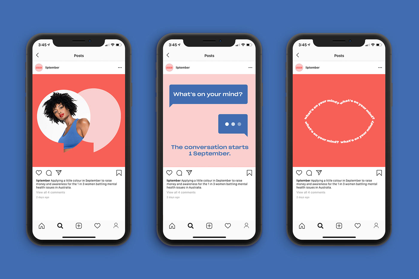
We developed a new tagline and typography system, that really spoke to the idea of sparking a conversation. The previous tagline and messaging felt mis-aligned to the empathetic personality of Liptember, so we created something a friend would say to you in a time of need — 'What's on your mind?' The typography is also expressed in different weights and widths, to represent the many different voices of women in the broad spectrum of mental health.
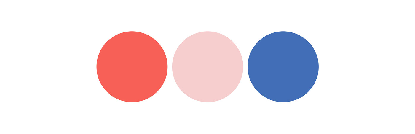
We also introduced a new bright and feminine colour system – red for the colour of lips, pink to represent women, and a contrasting blue to reference mental illness or the 'blues'. A set of bold and graphic icons were developed which were used across the brand, giving it a sense of character and personality.

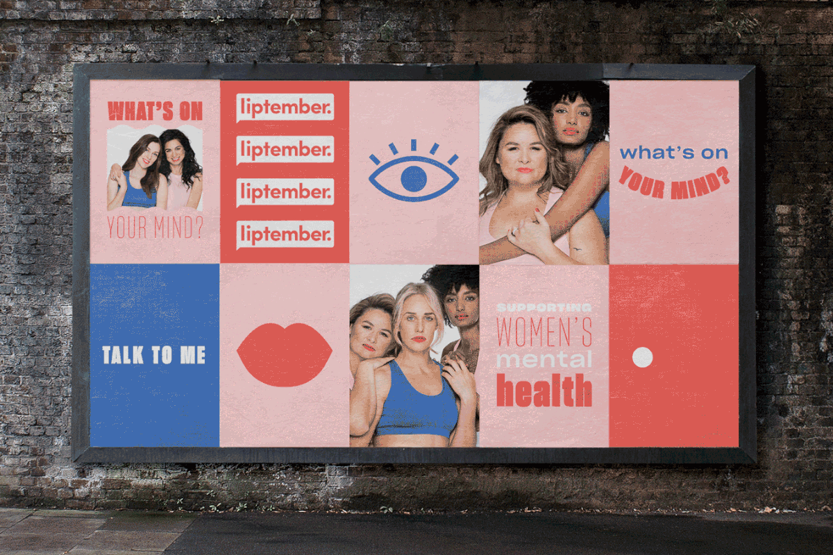


The campaign was tied together by strong imagery, depicting women from a range of backgrounds, to really support the message of empathy, unity, and the idea of the collective. This worked beautifully with the striking and engaging look and feel to create a compassionate brand personality that captures everything Liptember represents.


Agency — Date of Birth
Photography — Nick + Nardo
Website — Versa
Copy — Aidan Hathaway
See more work —


