

We Love Cake - Branding and Packaging
The Client
Bells of Lazonby is a family run business based in Cumbria with a rich heritage in baking and pioneers of the Free From industry - commissioning the first dedicated Free From factory in the UK.
The Brief
The client approached us to refresh their We Love Cake brand - a range of delicious gluten, wheat and dairy free cake slices and tarts. When the brand went to market in 2012 it was positioned as safe for people with intolerances with a sole focus on the medical attributes. Over the last few years there has been a shift in Free From becoming a lifestyle choice too. The brand needed a face lift not only to modernise and strengthen its position in the foodservice market but also to communicate the quality and great taste of the product.
The brief included a new brand identity, brand development and packaging. The key challenge was to re-position the brand to appeal to a wider lifestyle consumer without losing or alienating the loyal customer base.


What We Did
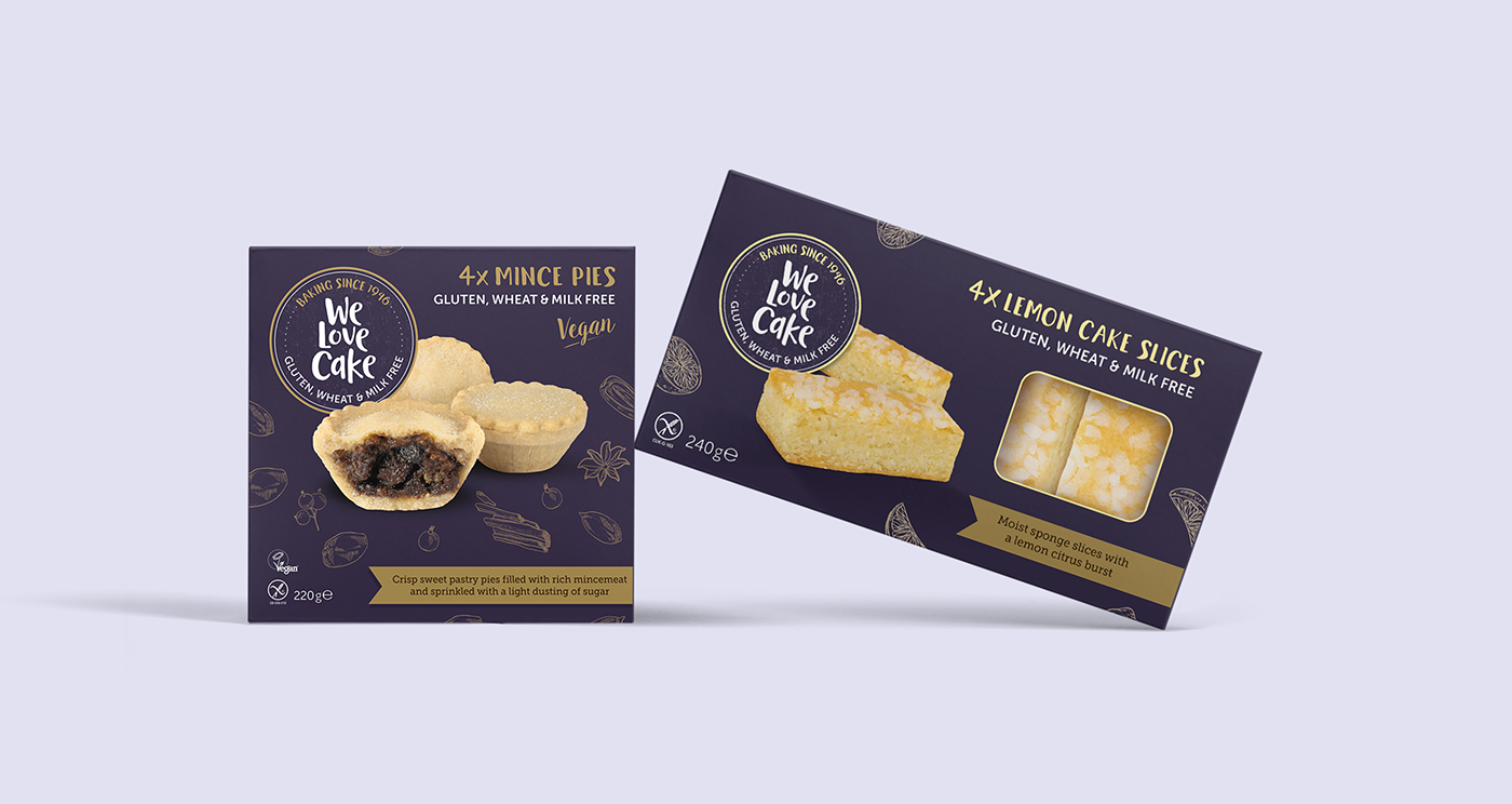
The logo and packaging were worked on simultaneously. Whilst some initial logo options looked good in isolation, they didn't translate across to the packaging. What became evident quite early in the process was the small space to create a standout brand as well as communicate a clear hierarchy of messaging. A balance had to be struck between highlighting the product’s USP without it becoming the focal point of the packaging.
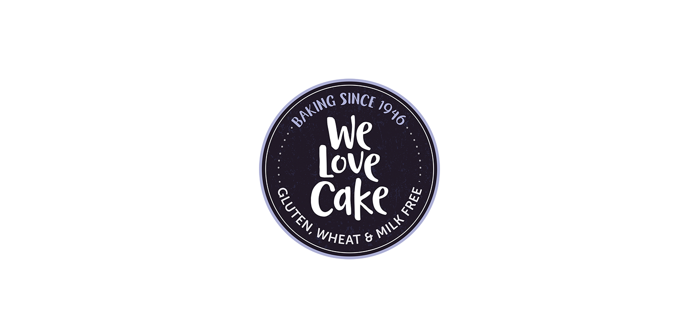
The circular format was retained from the old branding. Not only did this create some continuity from the old brand but, importantly, made maximum use of the space and enabled a clear space to showcase the product.
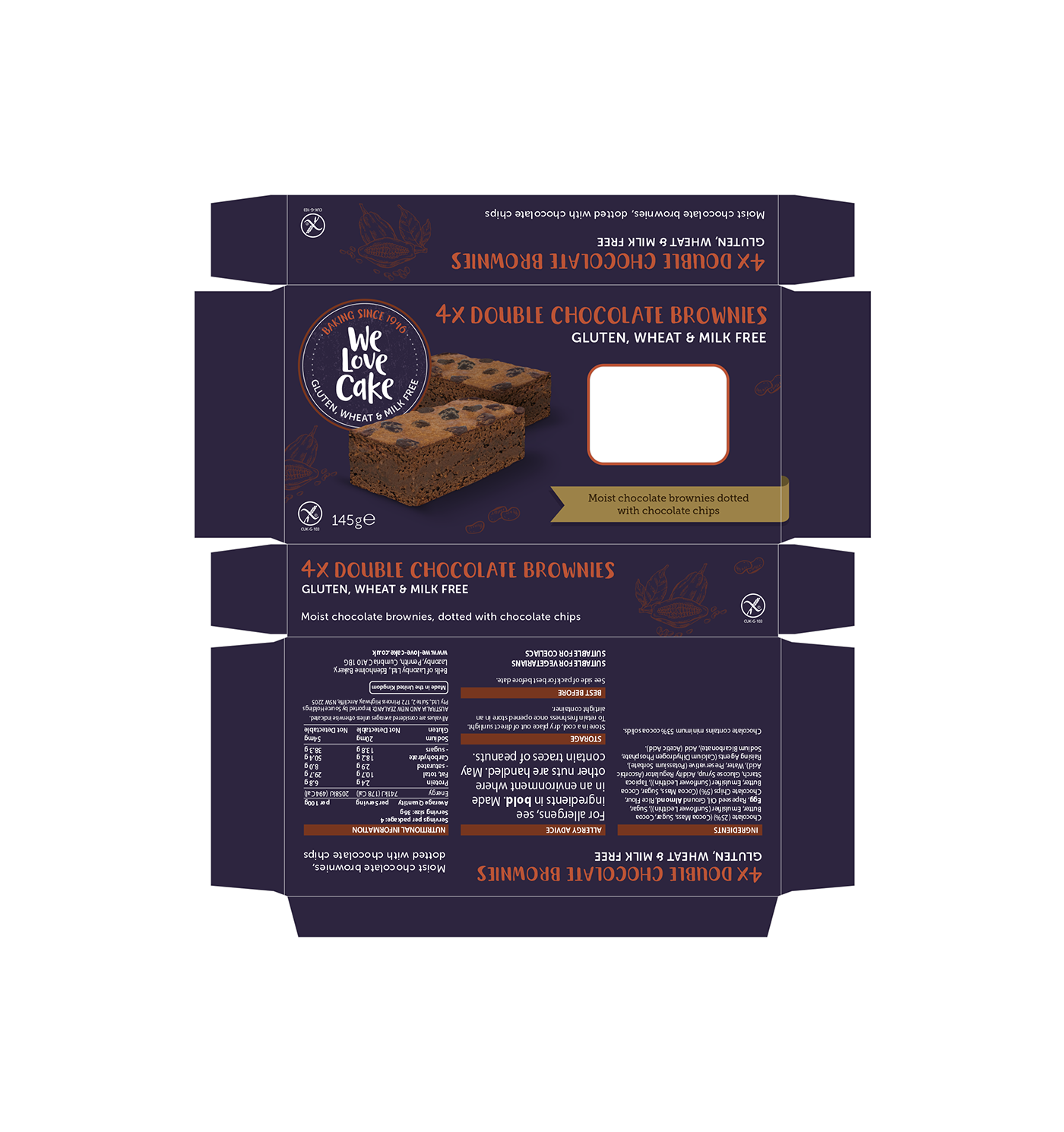
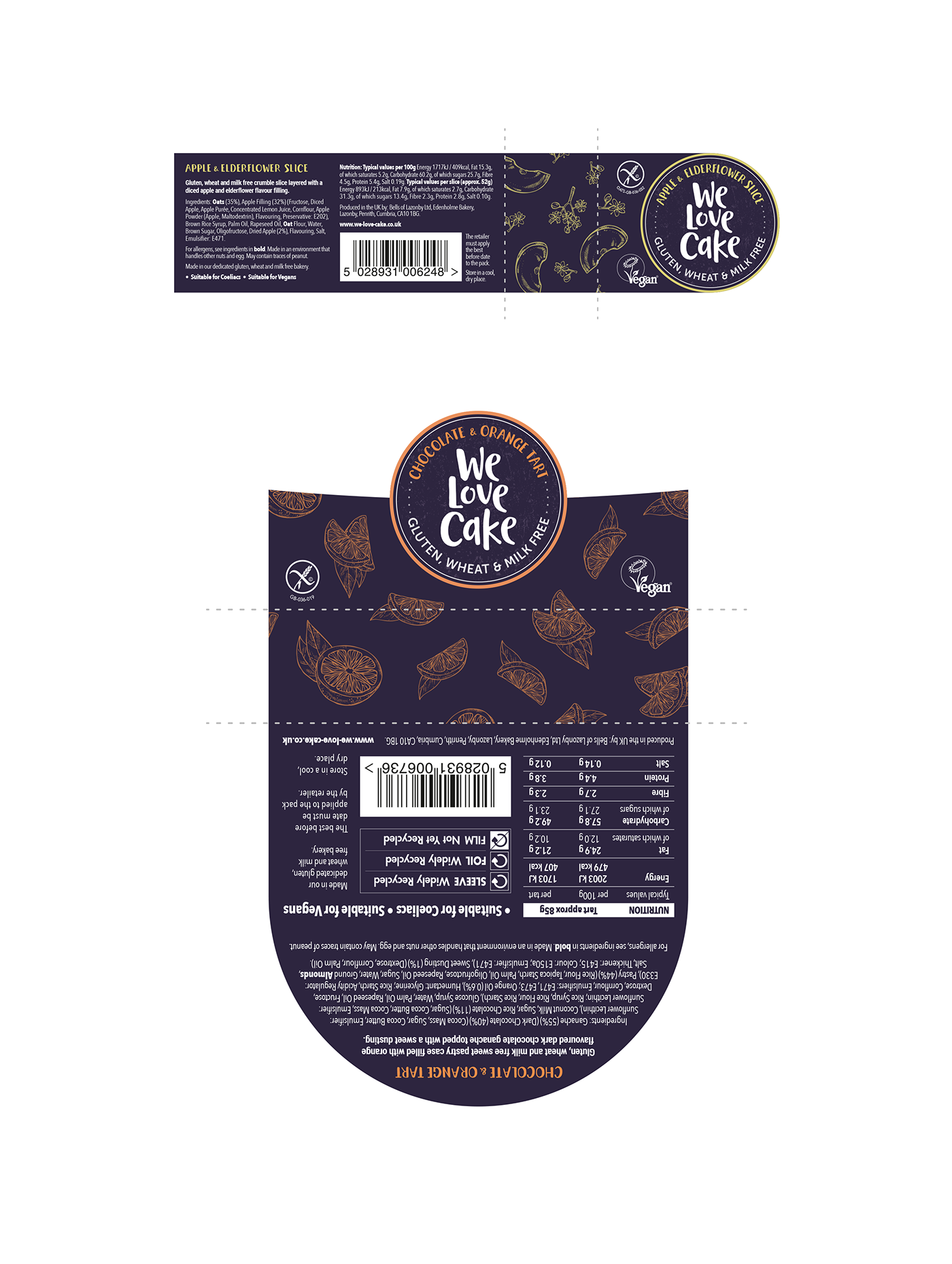
The hand drawn brand identity creates a distinctive brand. It has a wholesome feel with a playful side. The inclusion of ‘Baking since 1946’ highlights the rich heritage and conveys added gravitas and provenance. The handcrafted style is followed through to the packaging using illustrated ingredients to pick out the primary ingredients of each product.
The colours were toned down in preference to a more appealing and modern pastel colour palette. Each product in the range was assigned a specific colour to create clear differentiation on shelf. The primary brand blue allows a great base for a wide range of colours that are elevated against the dark background.
The final stage of the process was to activate across 14 lines and four different formats – Slices, Tarts, Muffins and Flow Wrap. Ensuring a consistent look and feel across all formats was paramount and attention was given to ensure all BOP information was consistent across all SKUs whilst keeping within the legal standards.
Latterly the design has been further developed across multipack format for both the UK and Australian market.

The Result
Since launch the rebrand has received a lot of positive feedback from distributers right through to the end consumer. Whilst moving the brand forward it has done so with a sensitive approach in order not to alienate the loyal customer base.
The refresh has help secure a new listing in Coles stores in Australia and has delivered a 28% increase in sales against the same 12-week period last year.


