'Pearl' Comic Series Logo Design
During the production of 'Pearl' (an interactive comic built for iPhone/iPad) we were tasked to develop a logo that would play well across mobile devices and represent the story style of the planned 10-episode series.
We started off by referencing many classic Sci-Fi/Fantasy covers and posters from the 80's, along with some outside inspiration to mix things up. The 80's was rife with veritable science fiction movies, comics and books – it's an exciting source to pull from, and we wanted to echo the purity that space opera adventures from that era still maintain to this day.
The logo also needed to feel uniquely tailored to the Rook Universe brand.

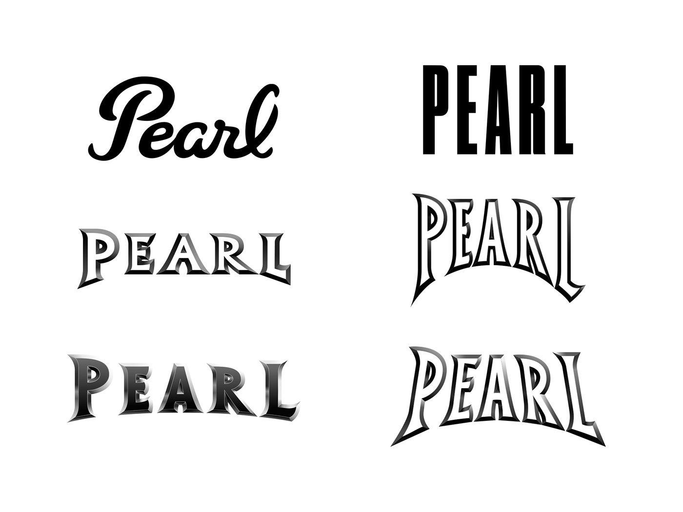
Dozens of ideas were generated to bring those concepts to life under one visual identity. One design in particular was modeled after the Persol sunglasses logotype. This design was used early in production and prototyping because the script style seemed to fit well with the personal narrative.
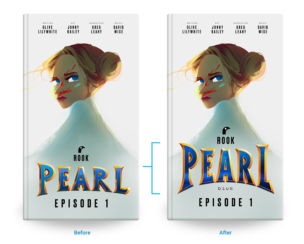
However, as production progressed and the story changed, it became clear that a more bold approach would have to be taken with the logo – something that extended beyond the usual.
The lead narrative arc became one of character polish, danger and trial. A sharp coming-of-age story meets political conspiracy thriller.
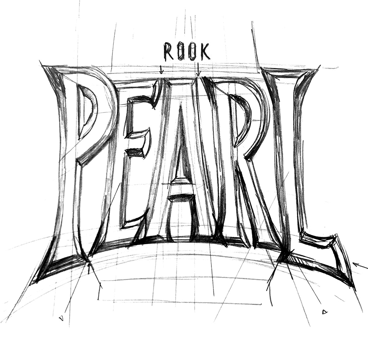
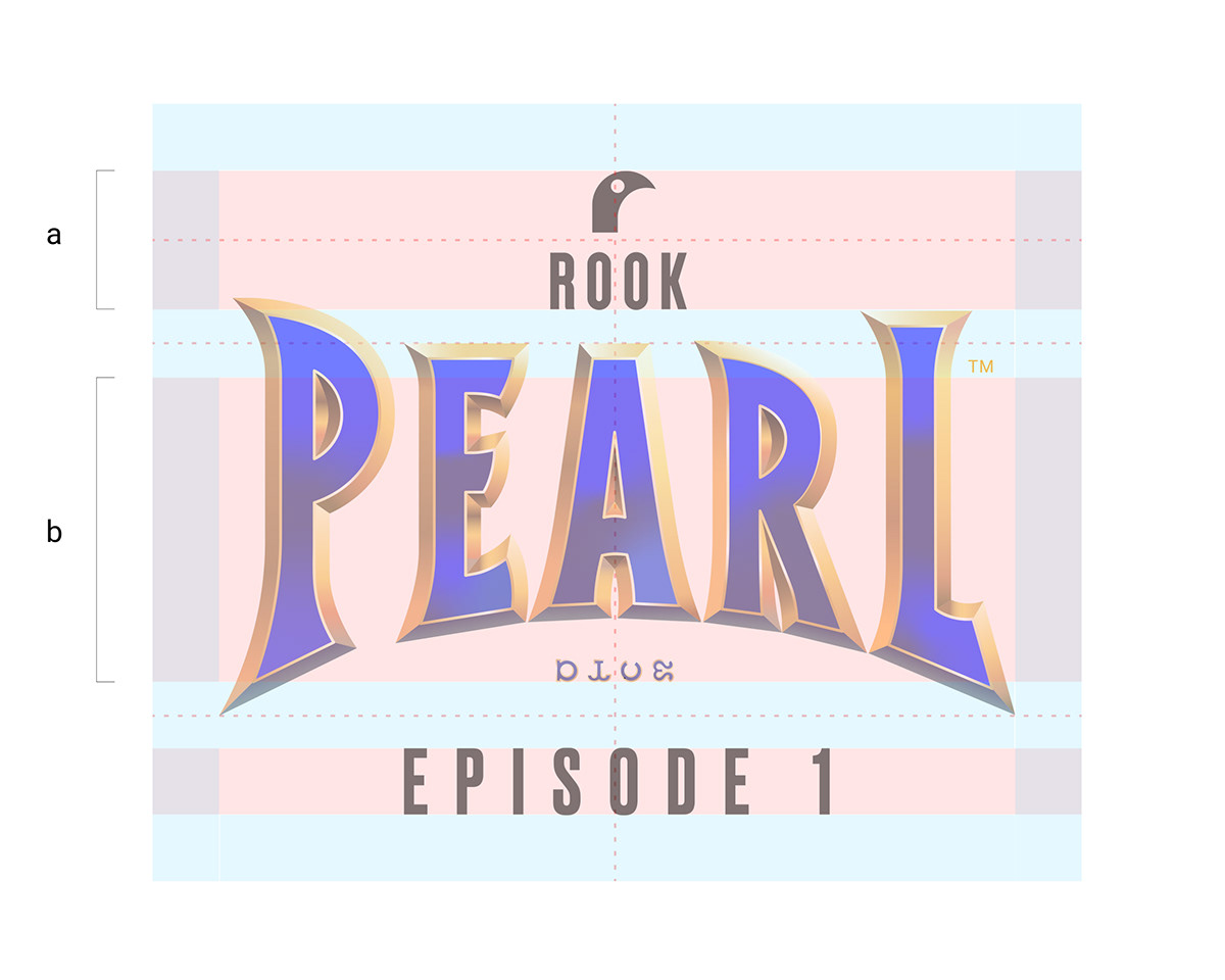
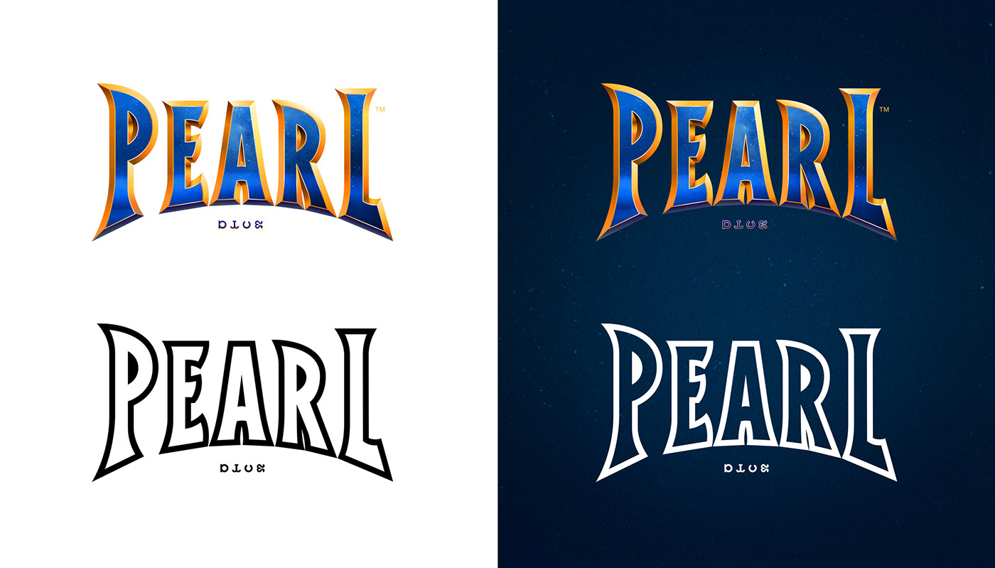
The visual language of the comic itself evolved to become very dependent on vertical framing and design. After a lot of polish and refinement the final version of the logotype followed suit.