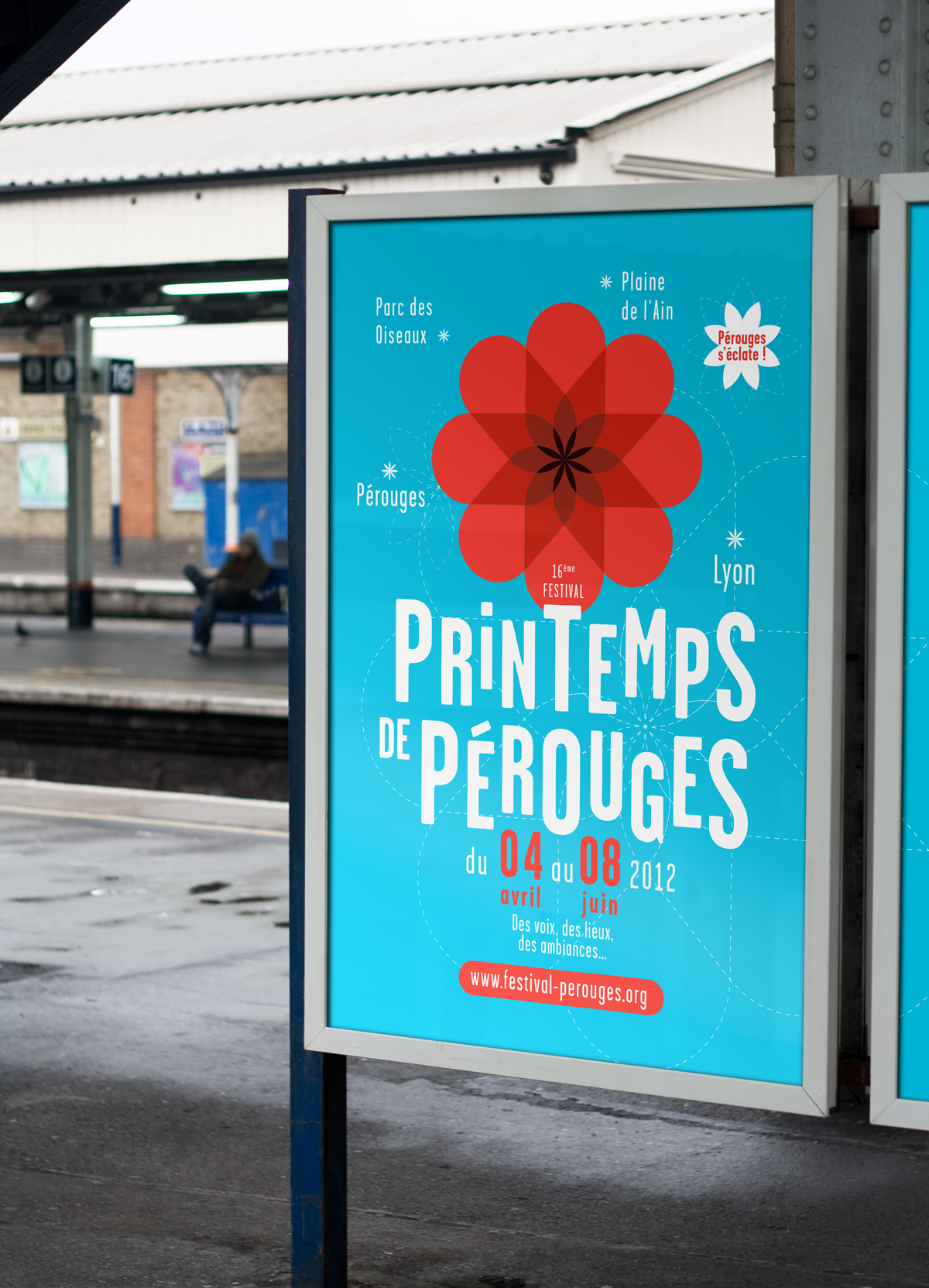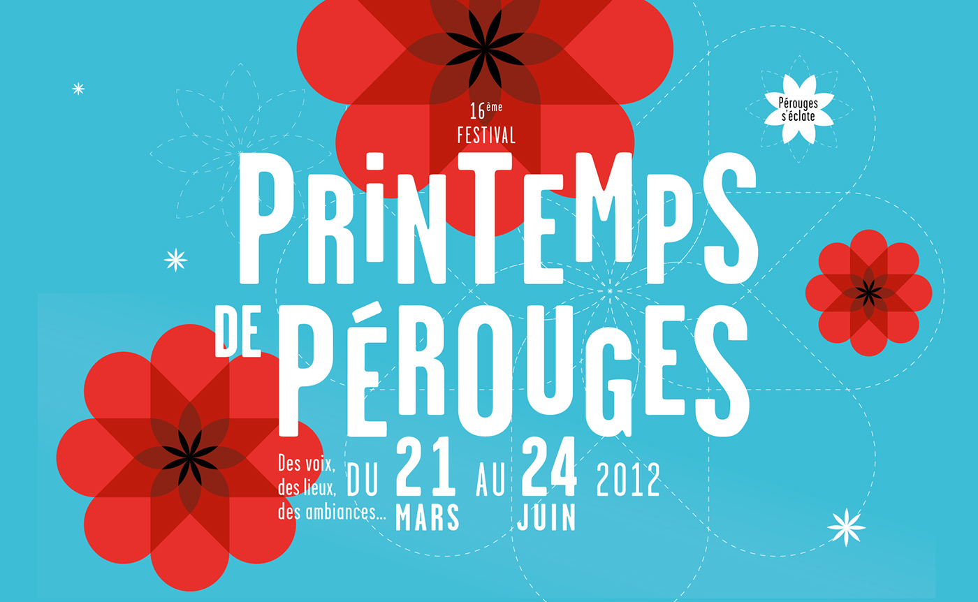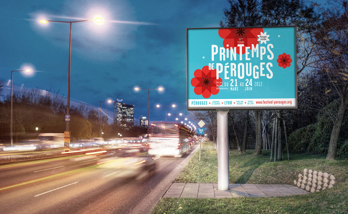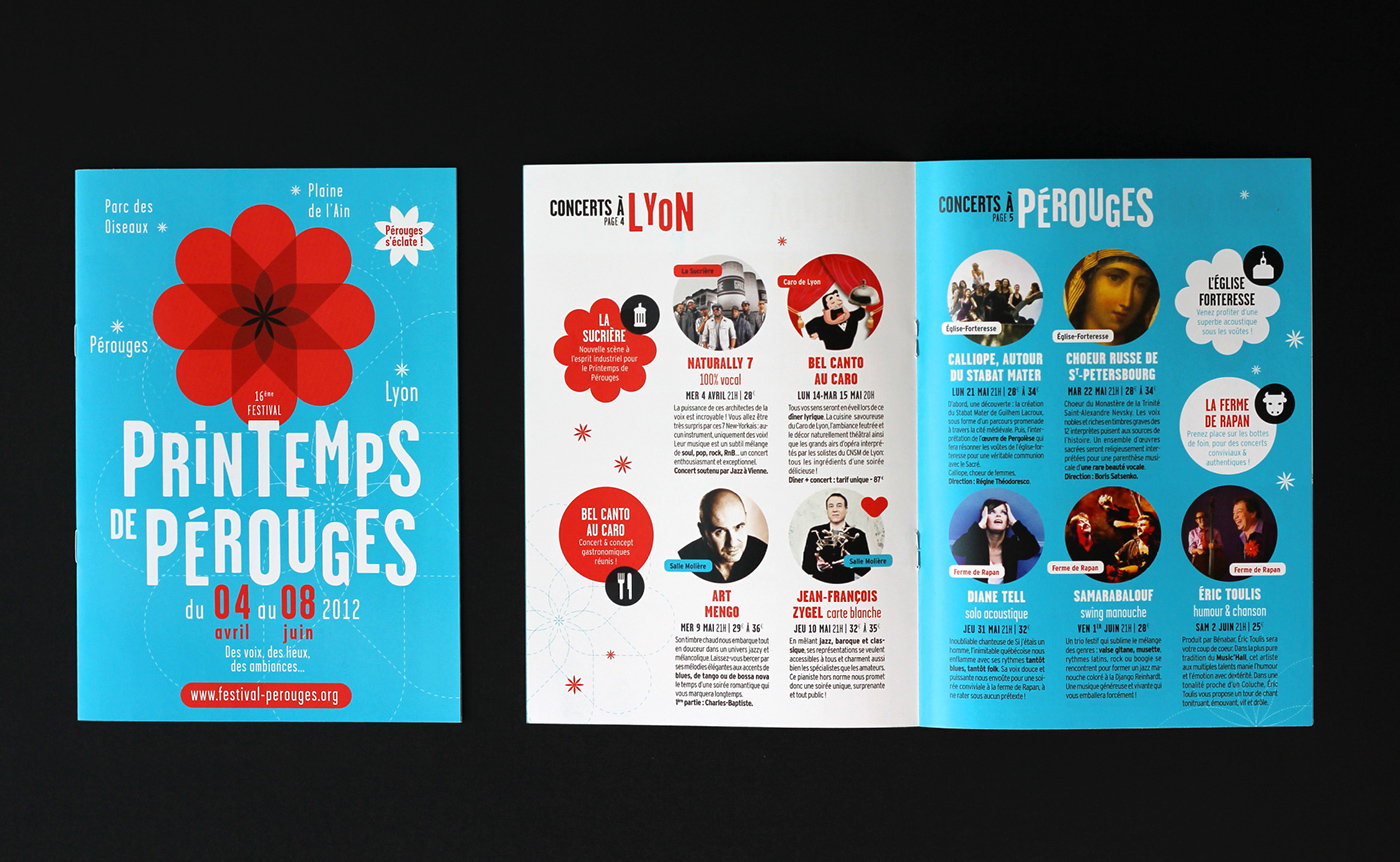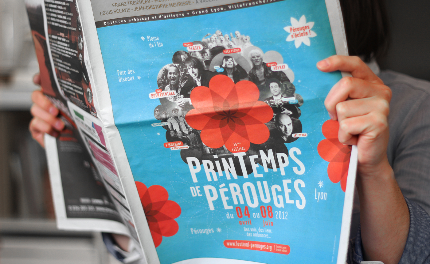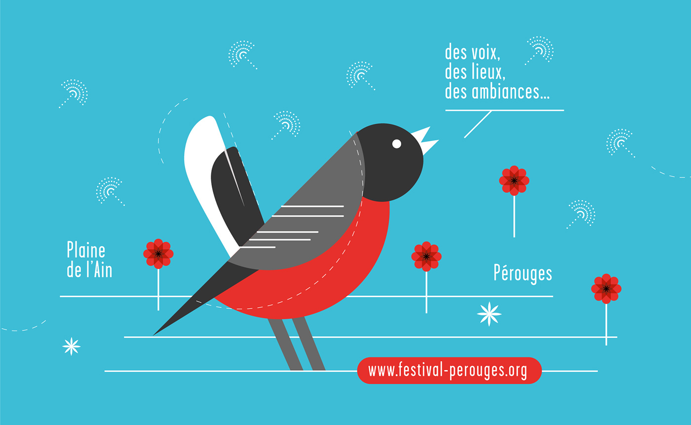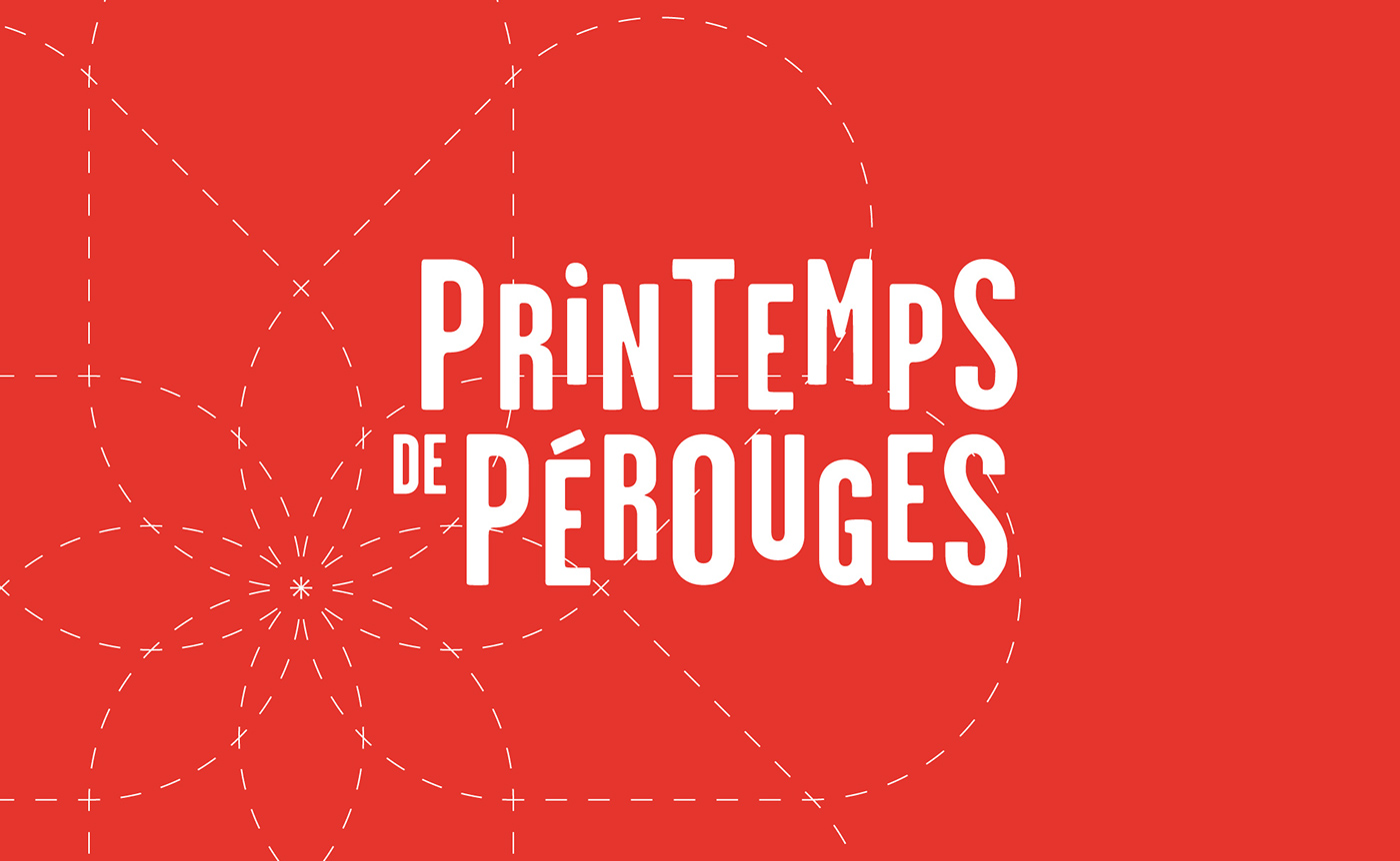
[FR] Depuis sa création, le festival du Printemps de Pérouges utilise le coquelicot dans sa communication. Fleur du printemps par excellence, sa couleur résonne bien avec la terminaison « rouge » de « Pérouges »… Nous avons donc proposé d’articuler l’identité visuelle autour de ce coquelicot, que nous avons retravaillé de manière géométrique. La composition typographique en Garage Gothic, vient juste faire danser les lettres et renforcer l’aspect festif.
[EN] Since its creation, Le Printemps de Pérouges (« Pérouges Spring Festival ») uses the image of a poppy throughout all its communications.
A poppy is the perfect Spring flower and its color resonates well with the end of the word «Pérouges», «rouge» meaning «red» in French.
We have imagined a visual identity focused on the poppy, to which we have given a new style, more geometric. The type Garage Gothic is used for the title, whose letters seem to dance, to foster the festive atmosphere of the poster.