

Skyline Network - Logo Design


Initial Design Sketches
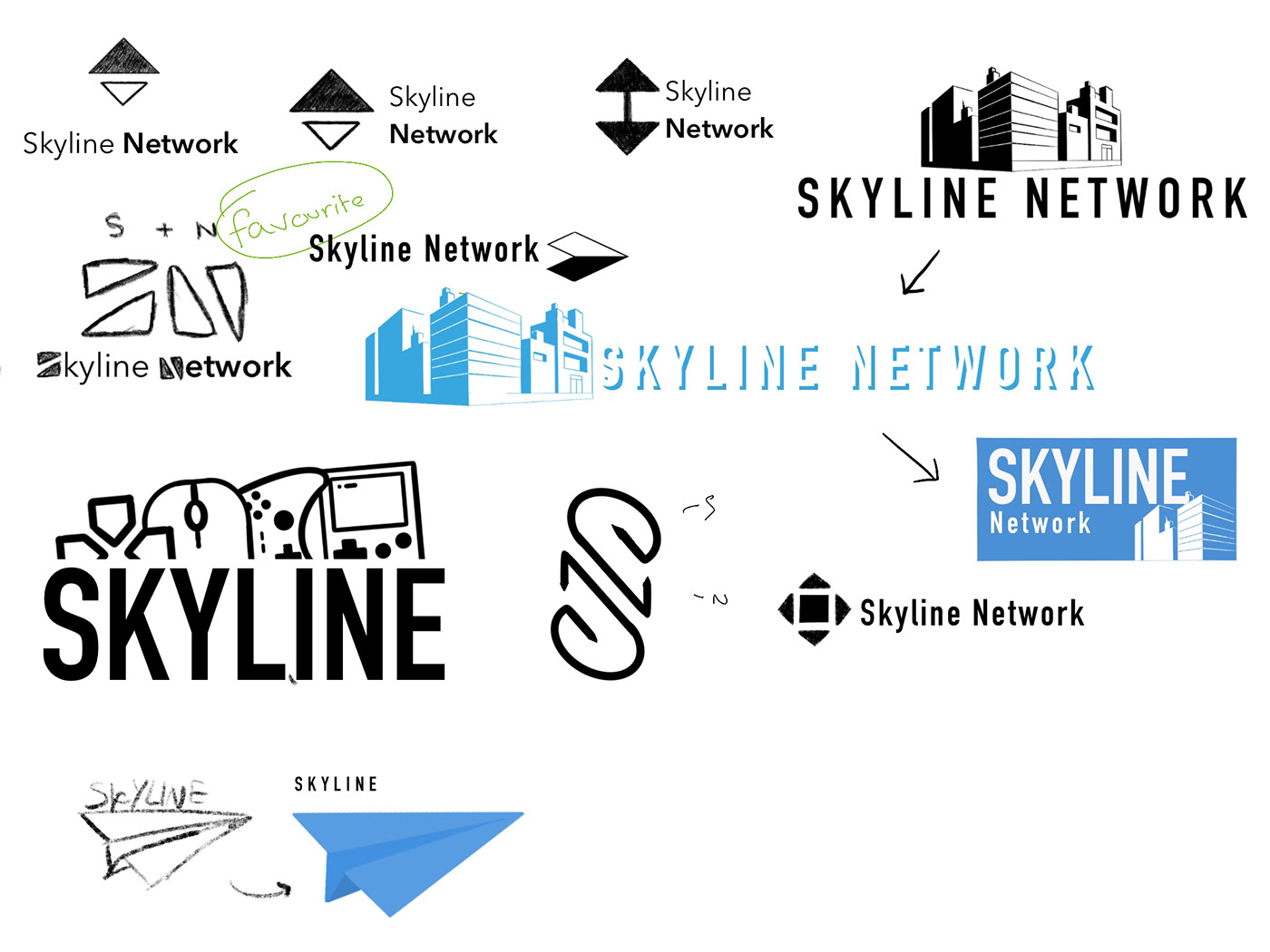

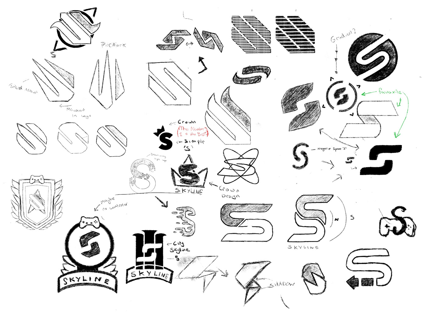
For the initial sketches, It wasn't as straight forward as we had hoped. the main ideas we were trying to get across was the idea of skyline being a new and modernised esports gaming network where small/new streamers and gamers would feel comfortable working along side them.
The main issue being. we weren't too sure how we wanted this aesthetic to be presented. playing around with a couple of different options, it was eventually in the best interest in the company to keep with the minimalistic S icon logo design but we thought that maybe the S was a little too basic to I hinted at the idea of creating it in a way that also made it look slightly like a city skyline. with all this In mind, we got to work.
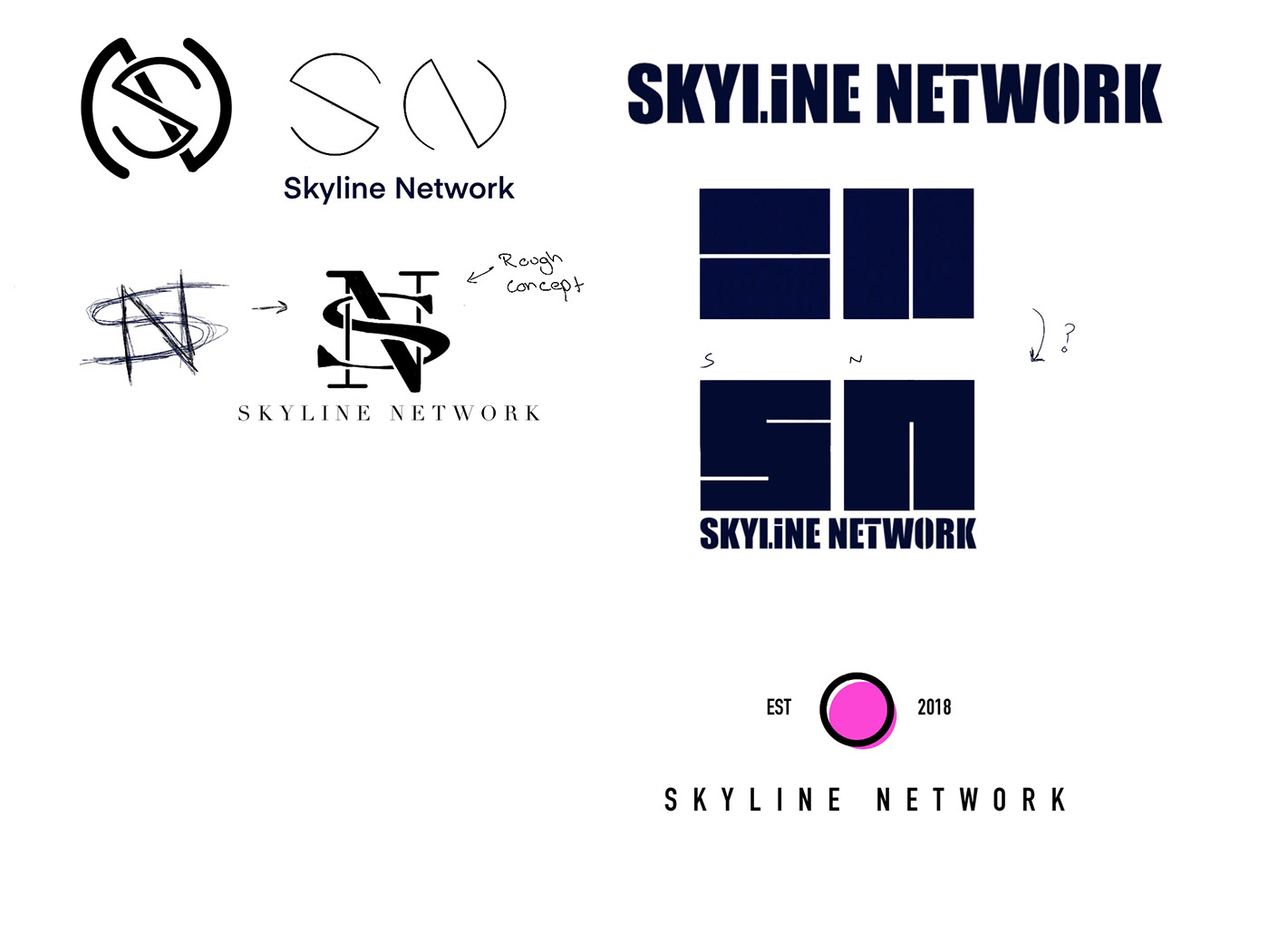
Logo Design Digital Development.


Over the course of two weeks, We got to work brainstorming and developing ideas from the sketches made previously in the the search for developing a much stronger idea until we fell upon a design that we in-fact Made right at the very beginning. - taking the angular S made in week 1 of the design phase, we found that removing its flat edges and giving the top of the S a slight "horn" it created a subtle flair that added to the design just enough that it was overbearing but didn't make it look plain and boring. It had movement, and thats just what we wanted!
Going through multiple different variations of this design, some being a flatter version, others taking on an a completely different shape all together, we finally found a nice middle ground to the design.
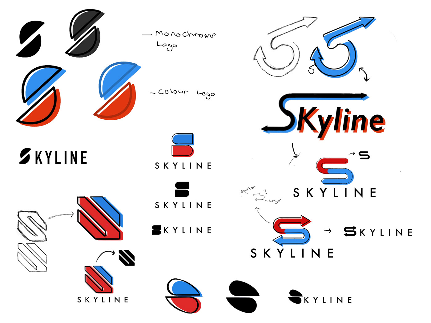
Further Design Development


Next Up, We wanted to experiment with adding a background element to the logo design, feeling that the S alone was a little barebones, whilst that wasn't a bad thing, we wanted to see if the design had any potential to work along side an extra element such as the designs you see above, some being rather busy and explosive, others holding a much more reserved feel to them with simple circles and circular like designs.
In the end however, we came to the decision that the Logo seemed a little outdated by closing it off to a finite object, it took away its potential and versatility because of the fact it would have been stuck within a separate shape.
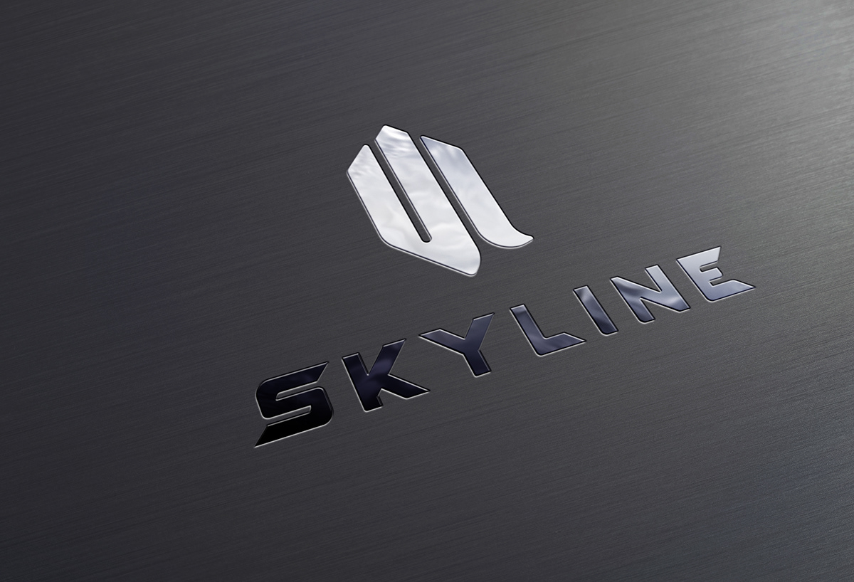
Colour Experimentation


A very simple part of the design process, picking a colour scheme. Seeing that we had Two elements of the design to work with, it gave us a lot of options to choose from, so from the clients chosen colour suggestions, I got to work putting together some colour schemes to present to see which would work best.
Custom Text Development


After Narrowing down the colour options to two final choices, it was a matter of looking for a text that would fill the shoes and stand along side this massive project. After some development work. the clients found that from three separate typefaces, they likes three individuals parts from each of them. I took it upon myself to try and take all three of these typefaces and incorporate their styles and merge them together into a final font that would sit along side the Logo icon. which ended up to look like this.
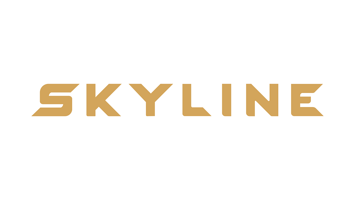
Taking inspiration from the individual letters and finding a middle ground on all of them, I found that I was able to put together my own custom lettering made from scratch that met the requirements and matches the aesthetic of the Skyline "S" Logo Mark.
Final Conclusion.
Some days you have easy clients, where you sit back and stay within your comfort zone. Other days you have clients that really push you away from everything you know and help you to open your mind to new ideas, and really stretch out your creative strings to put together something well worth the time that goes into the entire process.
The Time I spent with the team at Skyline, working with then to create the best possible outcome, has really opened my mind to new Ideas and breaking away from what I thought I knew about design and trying something new for a change.


Frgstn Designs
Daniel Sidebottom -- July 20th 2019.


