Hoogeveen architecten is a highly motivated architectural firm that offers intelligent design solutions. Its areas of activity include new construction (both residential and utilitarian), renovation and restoration, interiors, transformation and redevelopment, and concepts for area development.
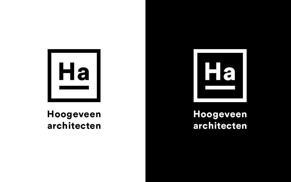
In developing the firm’s new identity, we started with a subtle change in its name: ‘Architectenbureau Hoogeveen’ became ‘Hoogeveen architecten’. By placing more emphasis on the surname, it offers better recognizability.
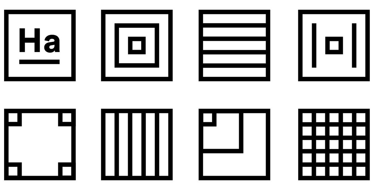
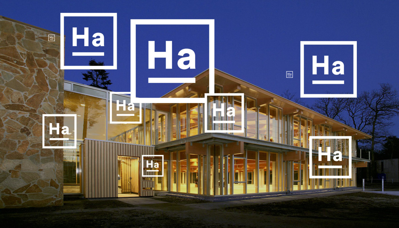
Our inspiration came from the former logo of Teun Hoogeveen, a stylized representation of the windows of the building in which the architectural office has worked for decades. We used this as a starting point for a new, powerful logo and a dynamic visual language.
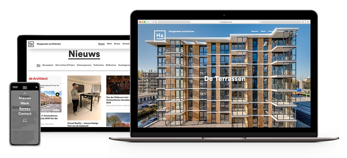
We put the projects at the center of the design for the website, starting with full-screen project photos (by Ruben Visser, among others) on the homepage. The subdivision of the different areas of activity, the clear overview pages, and the extensive project descriptions complete the website. Robbert Lokhorst handled the website development, and thanks to his input the website has been given a richer look and feel.