As stated on my "JUST." piece, I was working with a startup company starting July 2012 and in December of that year I began a process to rebrand.
After having to toss out my initial idea due to being concerned at the possibility of stepping on toes, with my branding plans similarity to a designers site branding, I had to use a different name.
Took a couple weeks, after making the original name and logo, to think of a new name I was confident with, as the first one took a month as is.
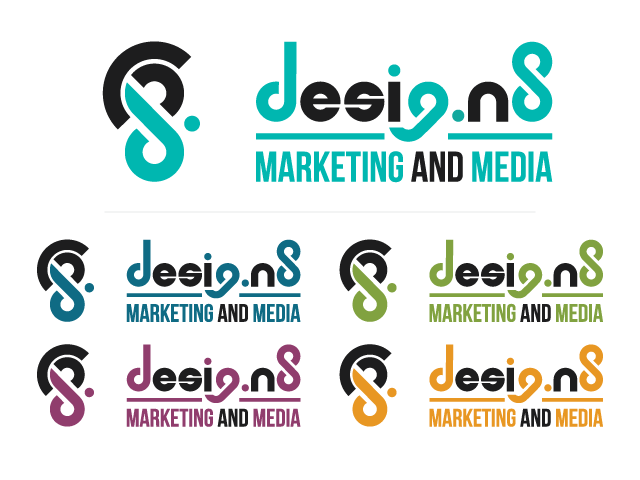
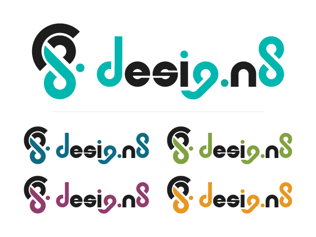
When I figured out a name, I used the same typography style as the original, since the symbol mark worked for this one as well. I rotated it, but it was still the same. Instead of the symbol representing the J, U, S, T and period from the old name, it now represented the d and 8. I kept the arc without real reason. It can sort of fit the n of n8.
I adjusted the core colour, making it more bright and vivid, and kept the other colours used for service branding and marketing.
The 8 stands for the ideals of the company:
Growth
Balance
Integrity
Unity
Passion
Communication
Perseverance
Professionalism
Honestly don't like professionalism in the list, because the whole point of the balance was to balance fun with professionalism /: so it makes it kind of redundant. I want to change it.
Balance
Integrity
Unity
Passion
Communication
Perseverance
Professionalism
Honestly don't like professionalism in the list, because the whole point of the balance was to balance fun with professionalism /: so it makes it kind of redundant. I want to change it.
The start up company has had to be put on halt, though, because the boss has had NO time to put any effort into it.