Knock Knock. Delivering comfort
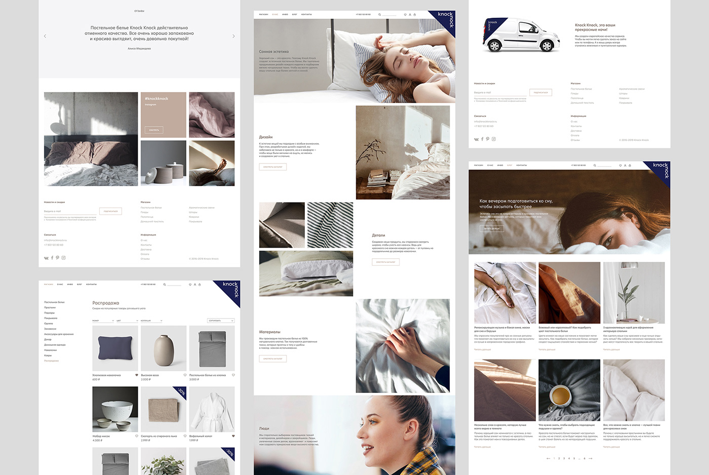
Bedding, textiles, and home goods in a stylish minimalist design at a European level of service — this is Knock Knock’s specialty. We have expanded our new brand with a name, positioning, a corporate style, a website and a communications strategy.
The manufacturer focused on Scandinavian minimalism for its product design and on diligent customer service. It has chosen to use an online store as its primary sales channel, to allow customers to shop with ease. After all, every product is delivered right to their door. Knock Knock offers something more than quality goods — customer care and that special atmosphere that the goods create within their homes.

We want to emphasize the modern approach the manufacturer has taken. Home and delivery have become the key semantic fields in creating a brand’s name and positioning. Every home starts at the door. Comfort and coziness lie behind it. So, the delivery person knocks on the door when bringing your items purchased online. This is where Knock Knock originated — from the sound of items being delivered. It is a playful name that sounds simple and as though it was inviting customers to join the dialogue.
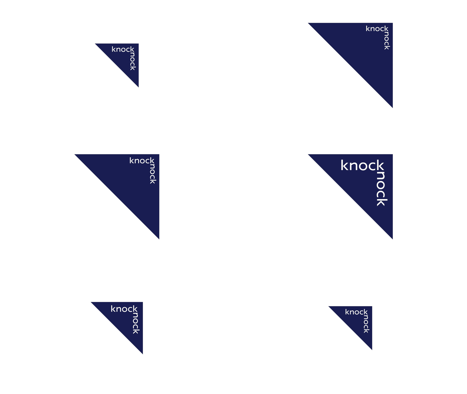
That knock on the door became a metaphor that formed the foundation for the brand’s positioning. Knock Knock is a brand that delivers comfort right to its customers’ door. It “knocks” when you are in need of warmth. This delivery concept continues throughout the brand’s corporate style. Global logistics services, from FedEx to DHL, use the arrow as their primary symbol. In our case, it has become a simple triangle.
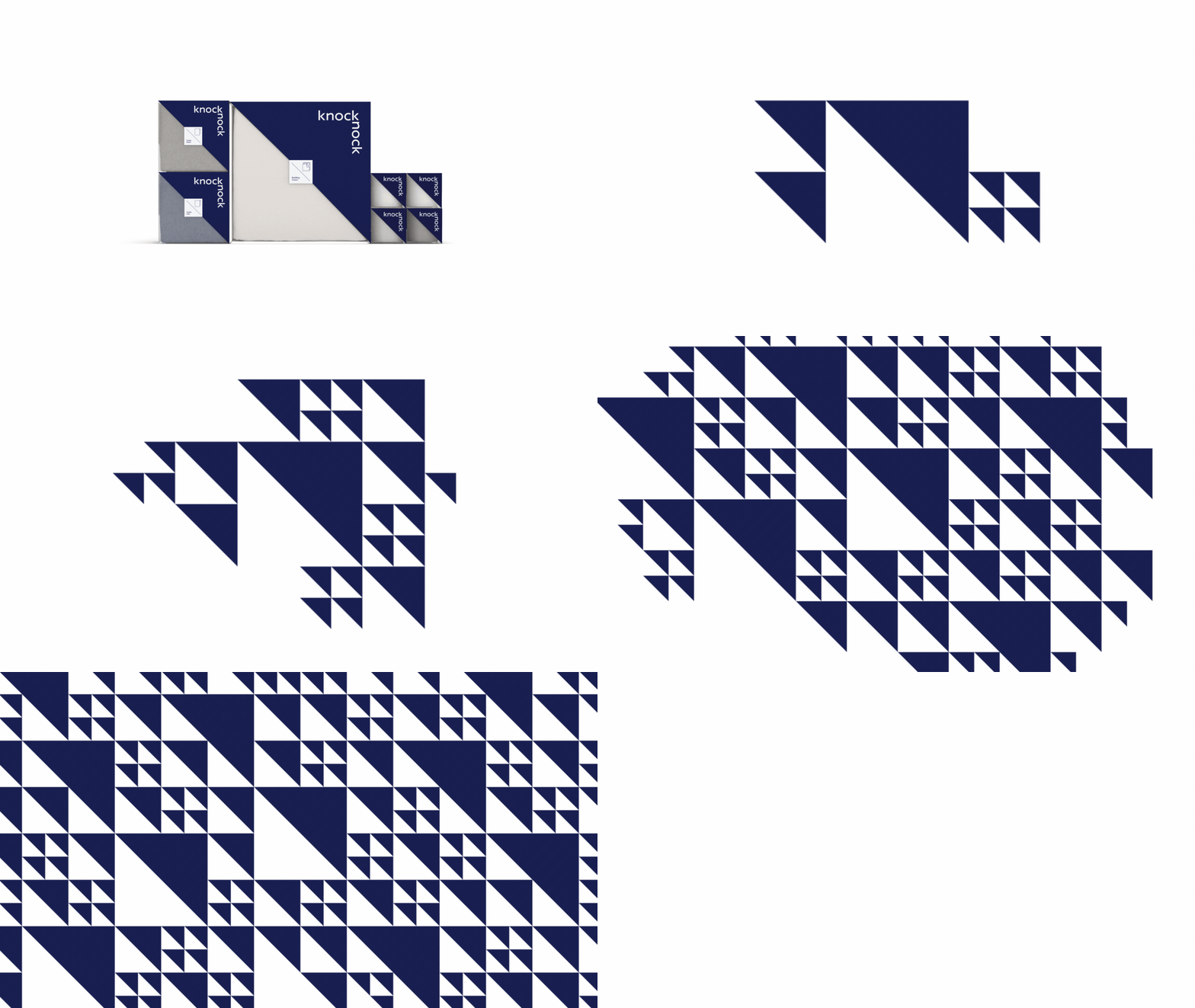
The shape comes from the logo. As DNA forms an infinitely variable modular system, so does our triangle. Thanks to this, the design rids itself of unwanted visual elements, creating a sense of cohesion and orderliness. This modular system has flexible morphological capabilities, from designing packaging formats to creating decorative patterns.


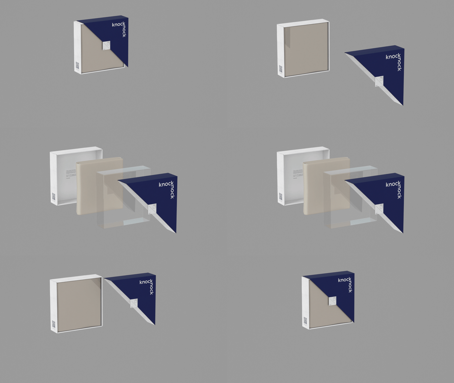


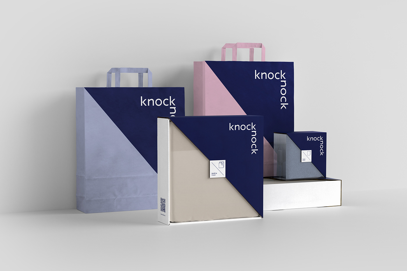
The packaging design is also based on a modular system, a solution that saves the box from visual noise. All that remains is the brand area and the item itself. This allows the company to play with how the goods are presented. Grouping packages of varying sizes creates a unified composition with a graphic logos pattern.
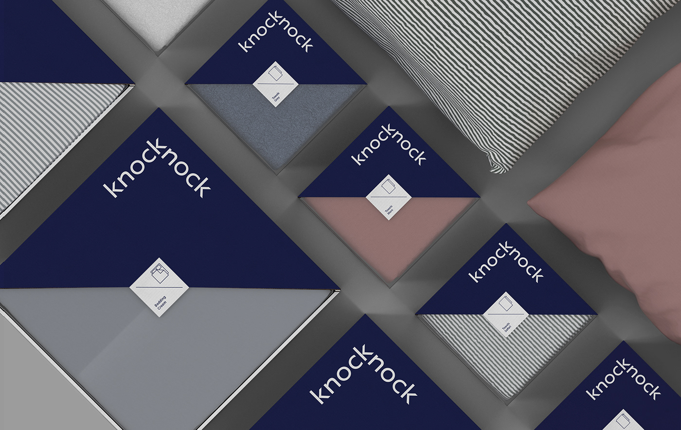
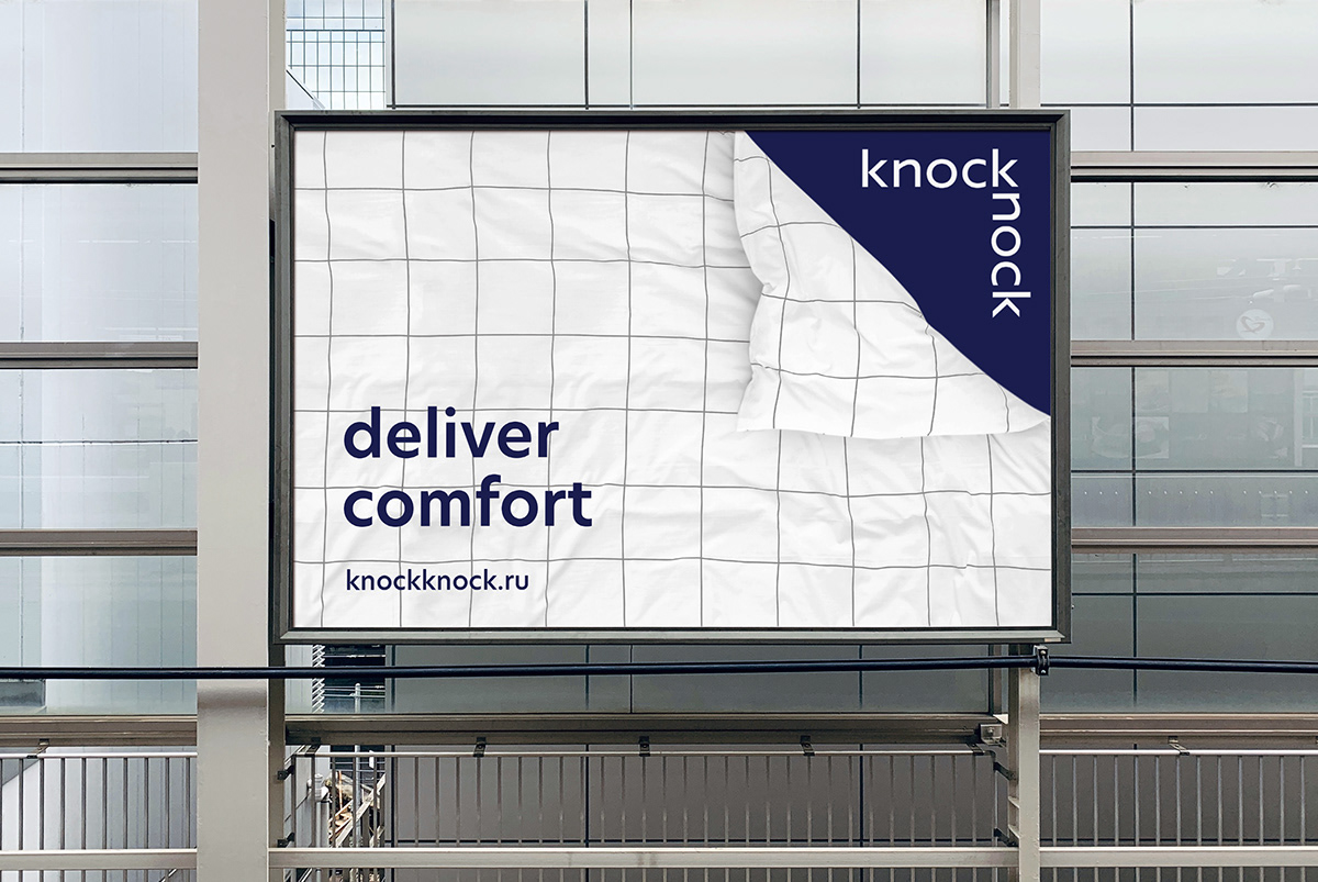
The brand’s color palette, deep blue with soft beige and gray, highlights the premium quality of all the items that combine to form comfort. Overall, Knock Knock’s corporate identity reflects the Scandinavian minimalism of its products and underscores the brand contemporary approach.


“Knock Knock, did you order comfort?”

Creative Director: Andrey Tarakanov
Art Director: Max Arbuzov
Designers: Dasha Ufaeva, Nikita Davydov, Vera Ivanova
Animation: Alexander Zakharov
3D Visualization: Alexander Shevchuk
Copywriter: Galina Evdokimova
Project Manager: Angela Popova, Dmitry Mayer
More info: www.tomatdesign.com
