


task: creating visuals for an anniversary is pretty simple...
...EXCEPT IT'S NOT
The look and the feel:
1.) The Colour palette and imagery was already established and stated in the NGO's Visual Identity Manual.
2.) Typography was also in the manual but the NGO was in the process of developing a new logo so a bold and clean font was picked complemented both.
3.) Composition was mine to mess around with but in order to simply and make the design stand out I kept everything pretty centralized.
Idea development process


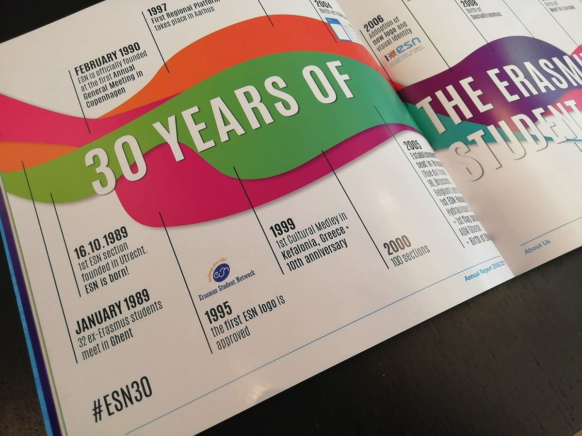
The 1st row is a play on semi-flat design and colours that I had at my disposal inspired by the lines on a geographical map. The swirly elements in the 2nd row are parts of the first logo of the NGO (click here).
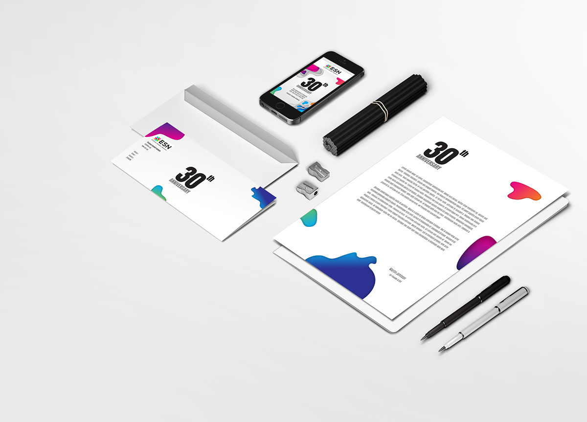
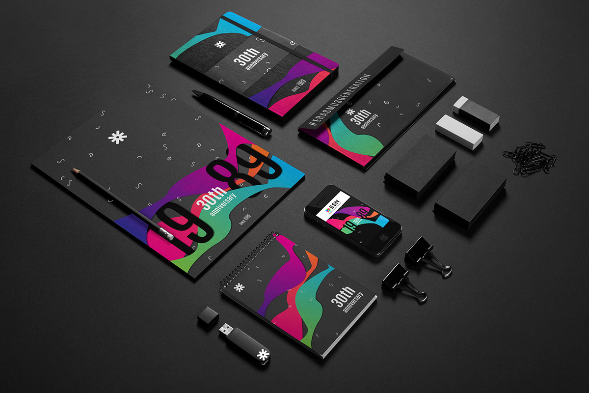
Examples of usage
What do you think the team chose?
In the end option 2 was chosen since it went along with the new logotype better. Additionally the swirl elements were removed since the first promotional material that it was used on was a 2 m long timeline and the team did not want it to look to busy.
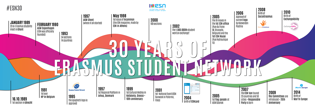
The Report is often presented to partners new and old.
and of course
promo+merch


