_
EN
An independent private equity, real estate and private debt company, M Capital has, since its creation in 2002, grown to become one of Europe's top 300 growth companies (Financial Time Fast 500). With more than €510 million in assets under management on behalf of major institutional investors and more than 27,000 private investors, we have become one of France's leading private investors. Located mainly in Toulouse and Paris, it is also a brand that defines itself as "chic and accessible", "rock and benevolent", and cultivates a particular state of mind in the financial sphere, both serious and respected, free and even impertinent. This atypical and recognized company, involved in particular in the reflection on the major topics of the future and the city of tomorrow, mandated us in 2019 to completely rethink its visual identity.
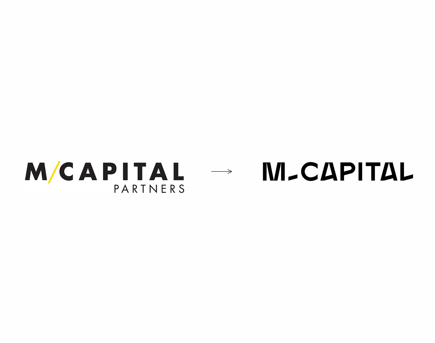
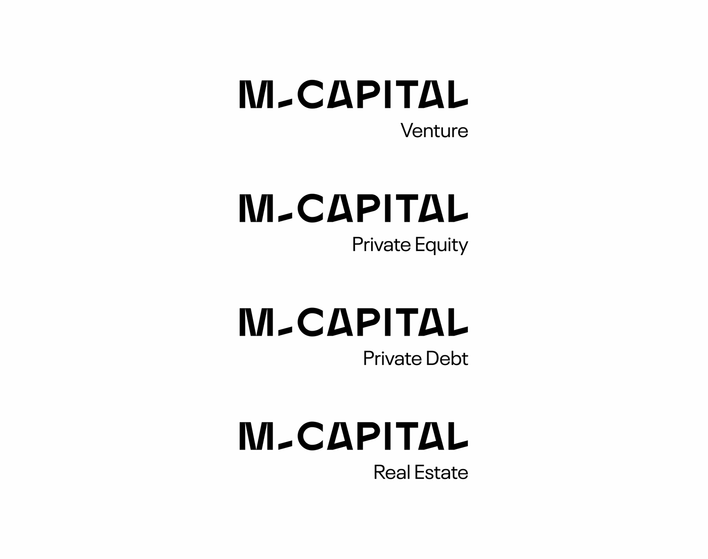
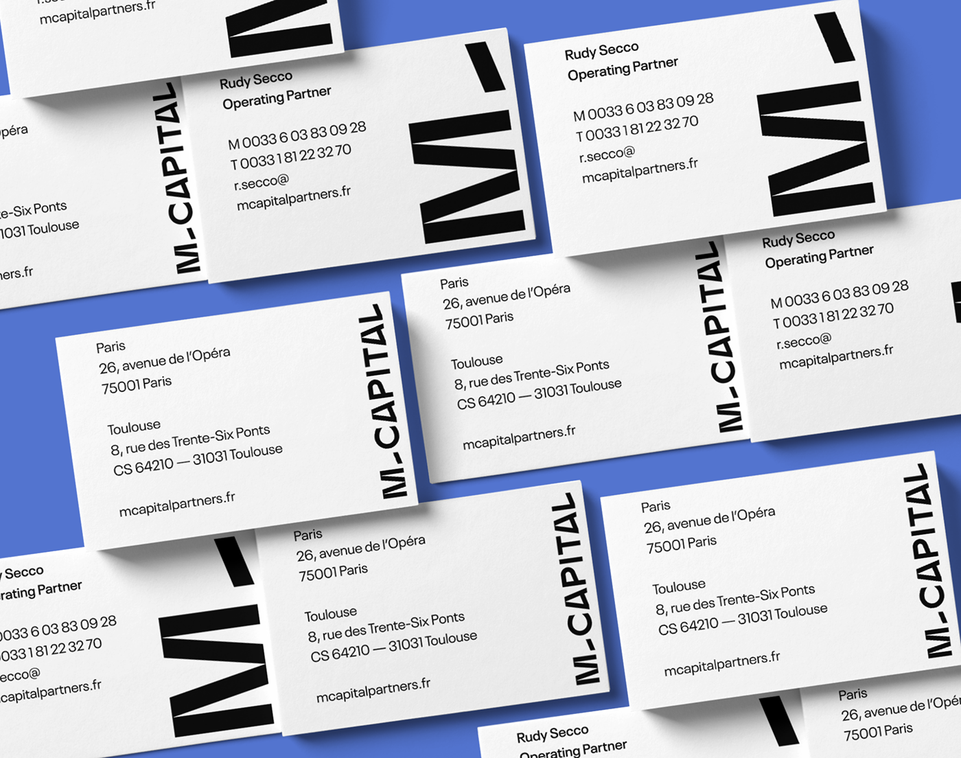
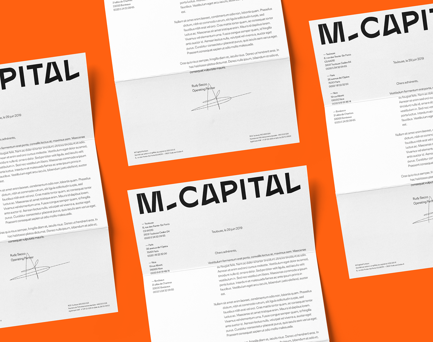
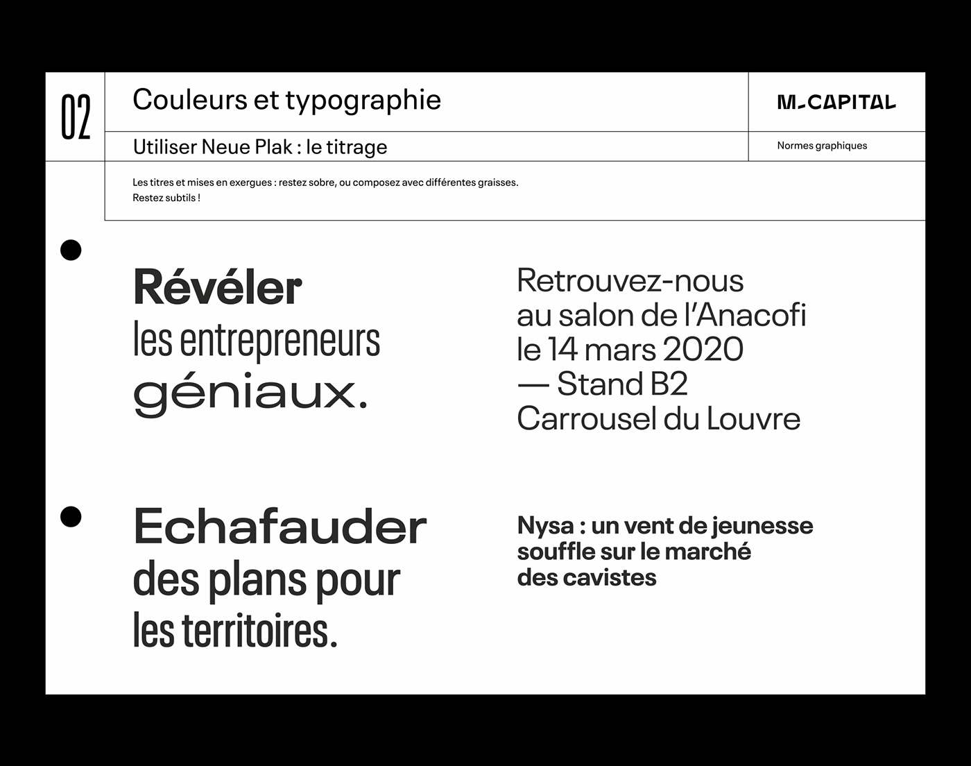
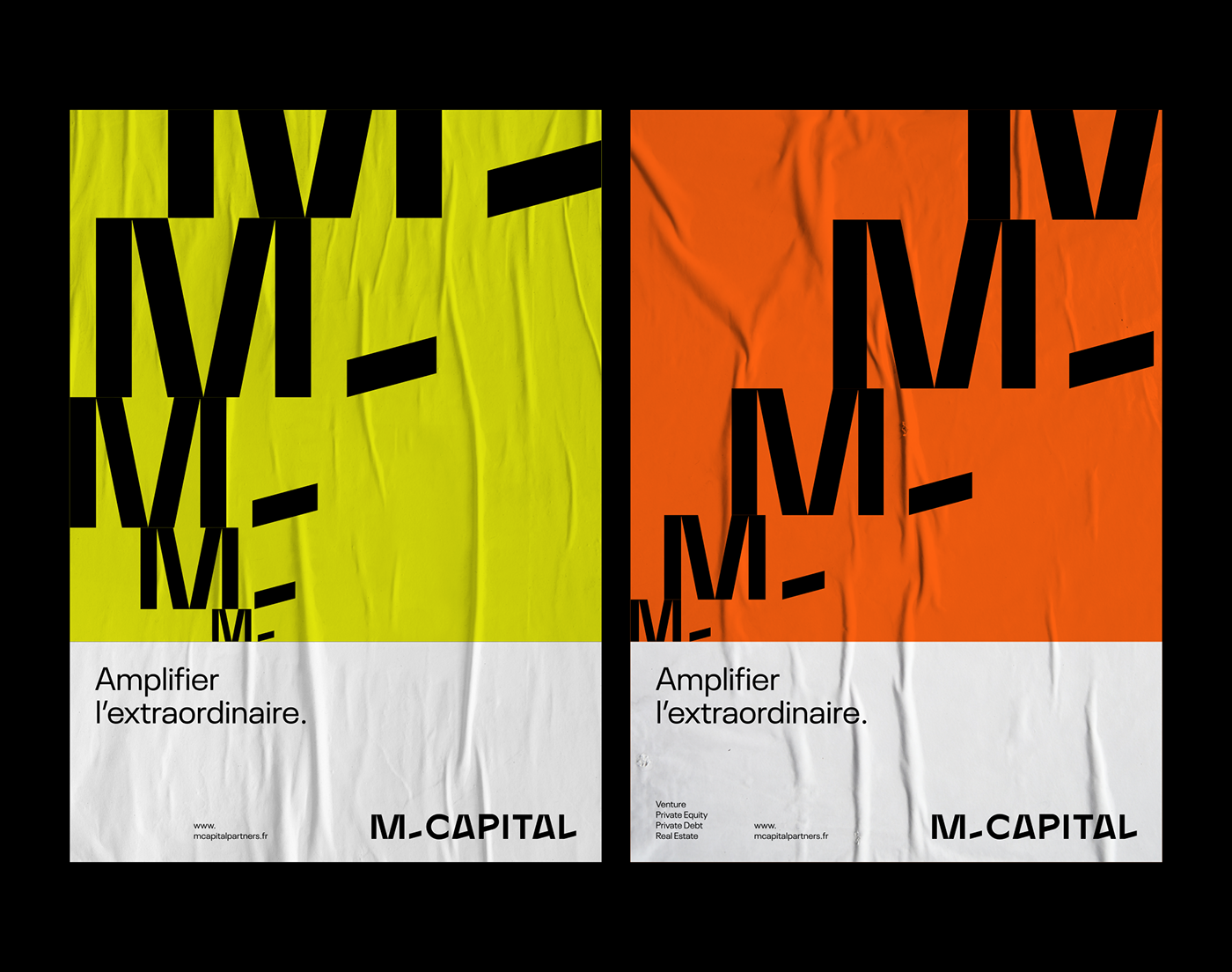
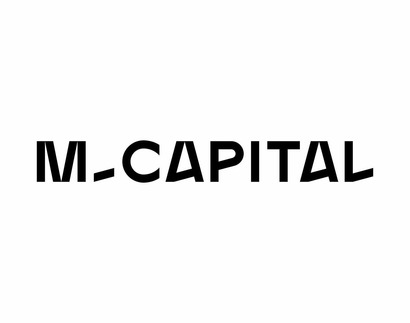
From the outset, we wanted to avoid conforming to the classic aesthetics of financial companies, while developing a solid and serious visual base. Our focus is on the mantra "Amplifying the extraordinary", an emphatic and deliberately oversized promise, we have built a typographic identity imbued with clarity and radicality. The logo, a stable and structured typographical design, reveals some oddities that bring the right dose of singularity. A palette of bright colours makes it possible to offer strong contrasts on the different variations.
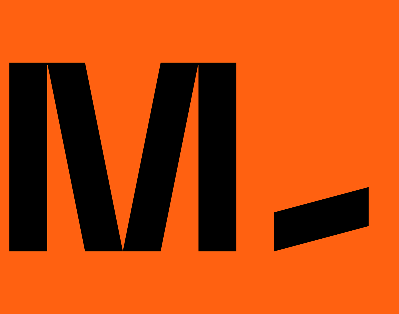
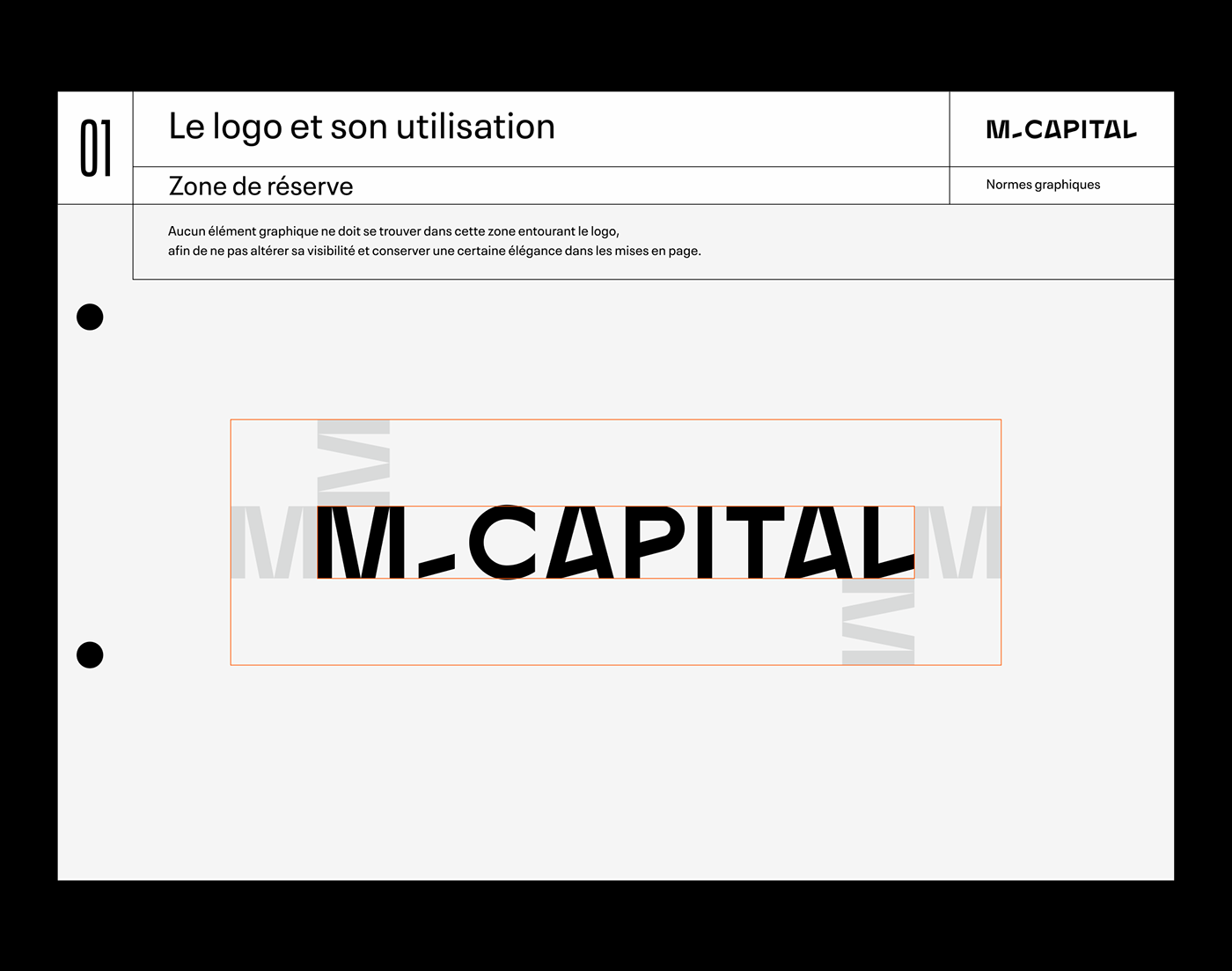
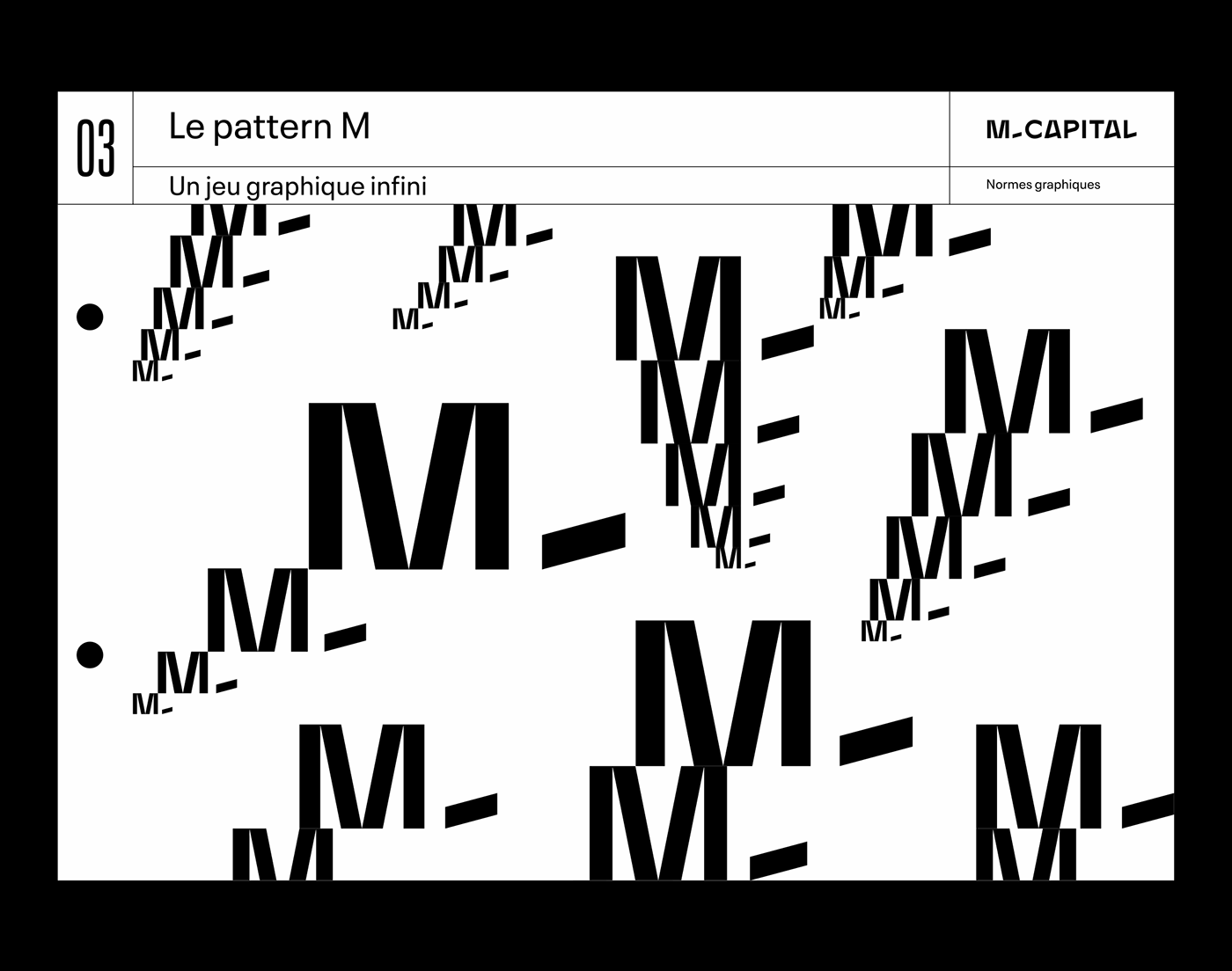
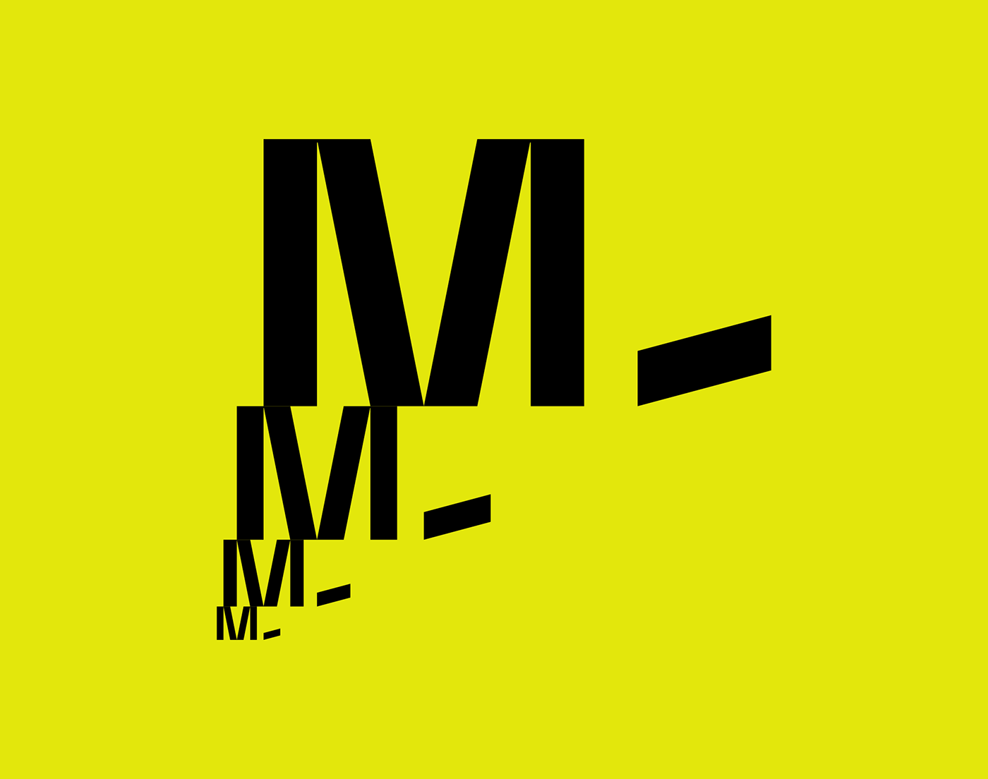
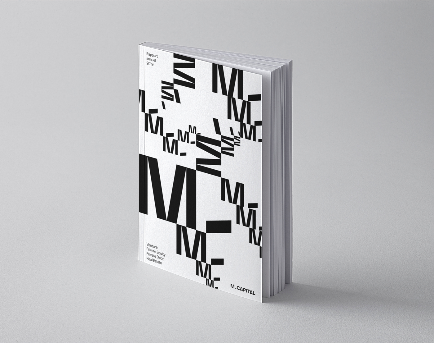
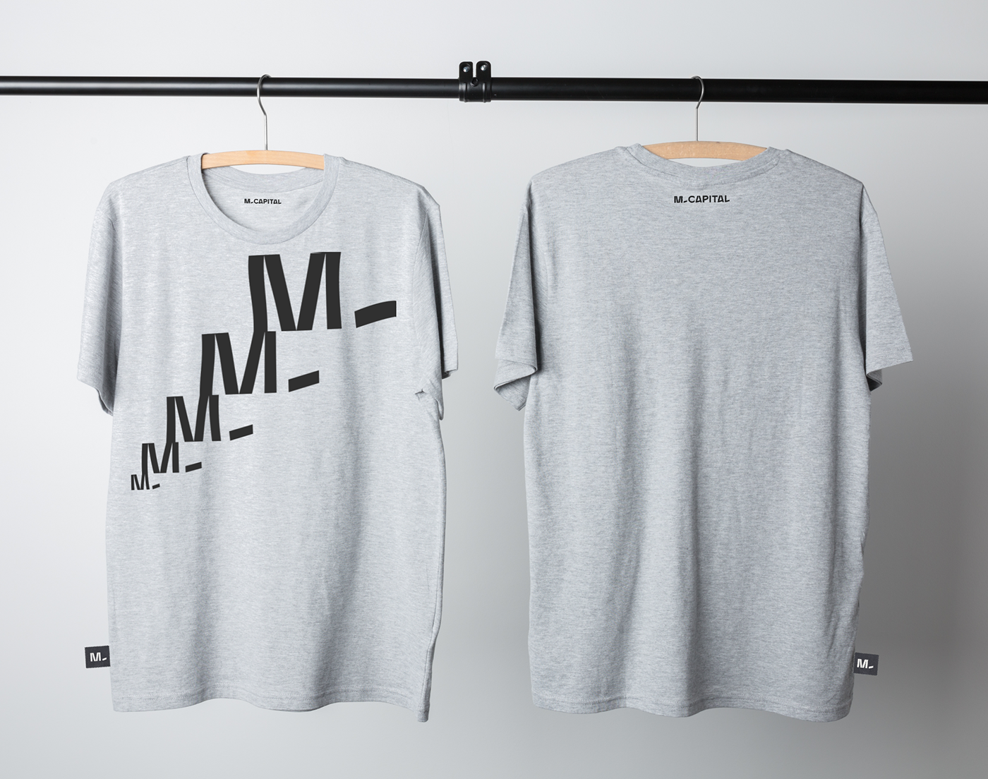
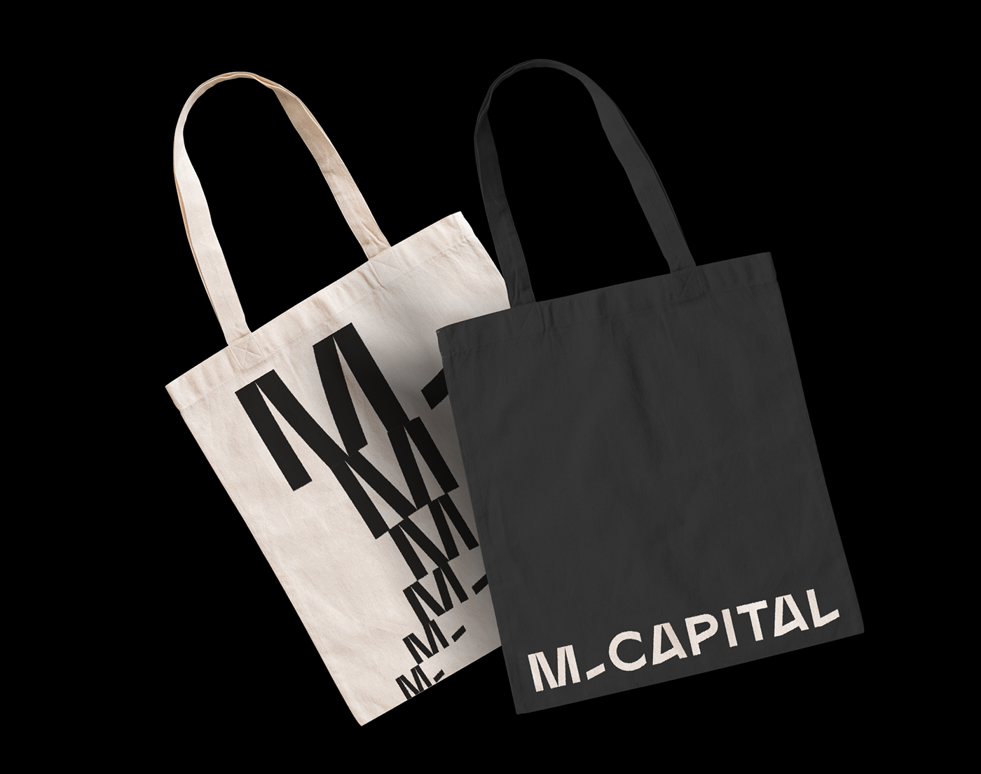
The visual imprint is then built around the monogram "M-", which, through a play of scales, illustrates the promise of growth and progress. A construction game that allows you to create infinite graphic patterns and unify the various materials.
Further developments will be added to this case study shortly.
_
FR
Société indépendante de capital investissement, immobilier et dette privée, M Capital a, depuis sa création en 2002, connu un développement qui le classe parmi les 300 premières entreprises de croissance européennes (Financial Time Fast 500). Avec plus de 510 M€ d’actifs gérés pour le compte de grands investisseurs institutionnels et plus de 27 000 investisseurs privés, nous sommes devenus l’un des principaux investisseurs privés français. Implantée principalement à Toulouse et Paris, c'est aussi une marque qui se définit comme "chic et accessible", "rock et bienveillante", et cultive dans la sphère financière un état d'esprit particulier, à la fois sérieux et respecté, libre voire impertinent. Cette société atypique et reconnue, impliquée notamment dans la réflexion sur les grands sujets d'avenir et la ville de demain, nous a mandaté en 2019 pour repenser intégralement son identité visuelle.
Nous avons d'emblée souhaité à éviter de se conformer à l'esthétique classique des sociétés de finance, tout en développant un socle visuel solide et sérieux. Notre axe de travail s'articulant autour du mantra "Amplifier l'extraordinaire", une promesse emphatique et volontairement démesurée, nous avons contruit une identité typographique empreint de clarté et de radicalité. Le logo, un dessin typographique stable et structuré, révèle quelques bizarreries qui apportent la juste dose de singularité. Une palette de couleurs vives permet d'offrir des contrastes forts sur les différentes déclinaisons.
L'empreinte visuelle se construit ensuite autour du monogramme "M-", qui, par un jeu d'échelles, vient illustrer la promesse de croissance et de progrès. Un jeu de construction qui permet de créer à l'infini des motifs graphiques et unifier les différentes prises de parole.
D'autres développements seront ajoutés à ce cas d'étude prochainement.
D'autres développements seront ajoutés à ce cas d'étude prochainement.