

UX Tartu | 2019
Visual Identity Refresh
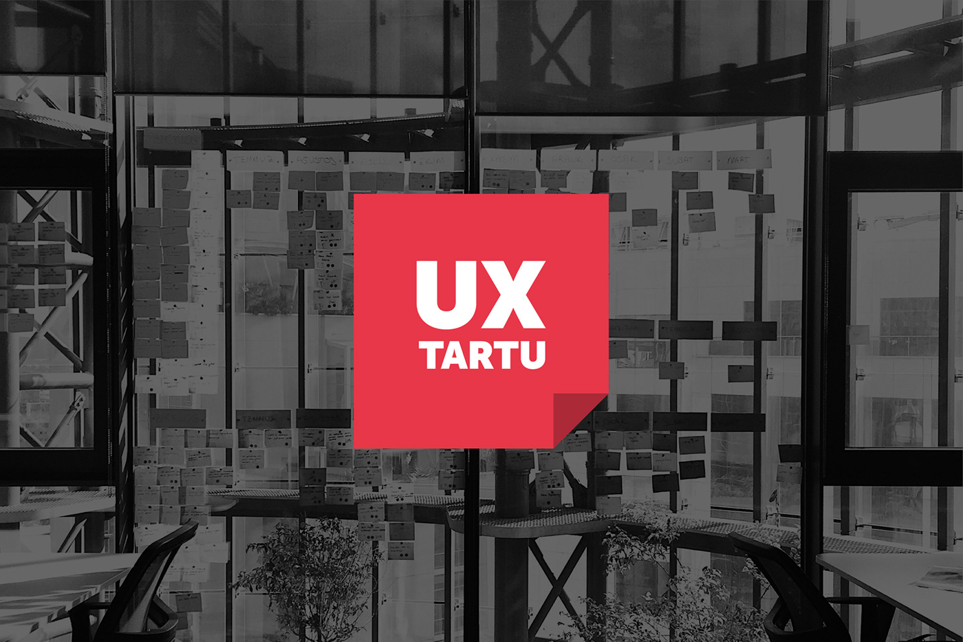
UX Tartu – the flagship in Estonia in its field – is part of sTARTUp Talks, which is an official side event series of sTARTUp Day. In 2019, the third event brought together hundreds of participants and several great performers, including specialists from Cleveron, Nortal, Pipedrive, and Velvet. For this purpose, Homne updated the visual identity of the event.
CONCEPT
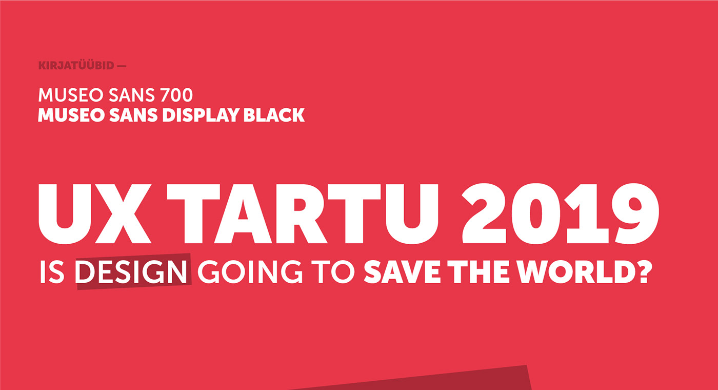
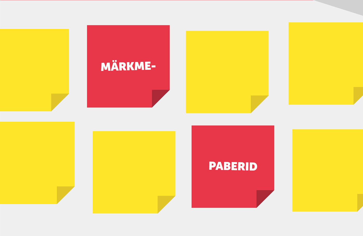
As sticky notes have a special place in every designers toolbox, it made sense to form the core of the visual identity around them. The assisting element is a free-hand drawn marker stroke. The main color red, which has identified the event for the past years, remained the same. A bold and clear typeface Museo Sans was added to match sTARTUp Day's visual language. The logo of UX Tartu was slightly updated as well.


CREDITS
Project Lead: Mikko Leo Selg
Art Direction, Graphic Design: Jakob Päll
© Homne 2020


