Identity for Saint Cashmere, the premium clothing brand
Saint Cashmere is a premium apparel made from Mongolian and Peruvian sheep wool. The brand audience comprises of wealthy women interested in high quality material and individual fit. They prefer practical and high-quality clothing that does not go out of style for decades.
The Saint Cashmere brand reminds of a successful woman who does what she loves, understands fashion, constantly creates something new and appreciates beauty and comfort. She is like Gabrielle Bonheur "Coco" Chanel, she is on an equal footing with everyone, yet strives for more, values traditions and knows how to look at them in a new way.

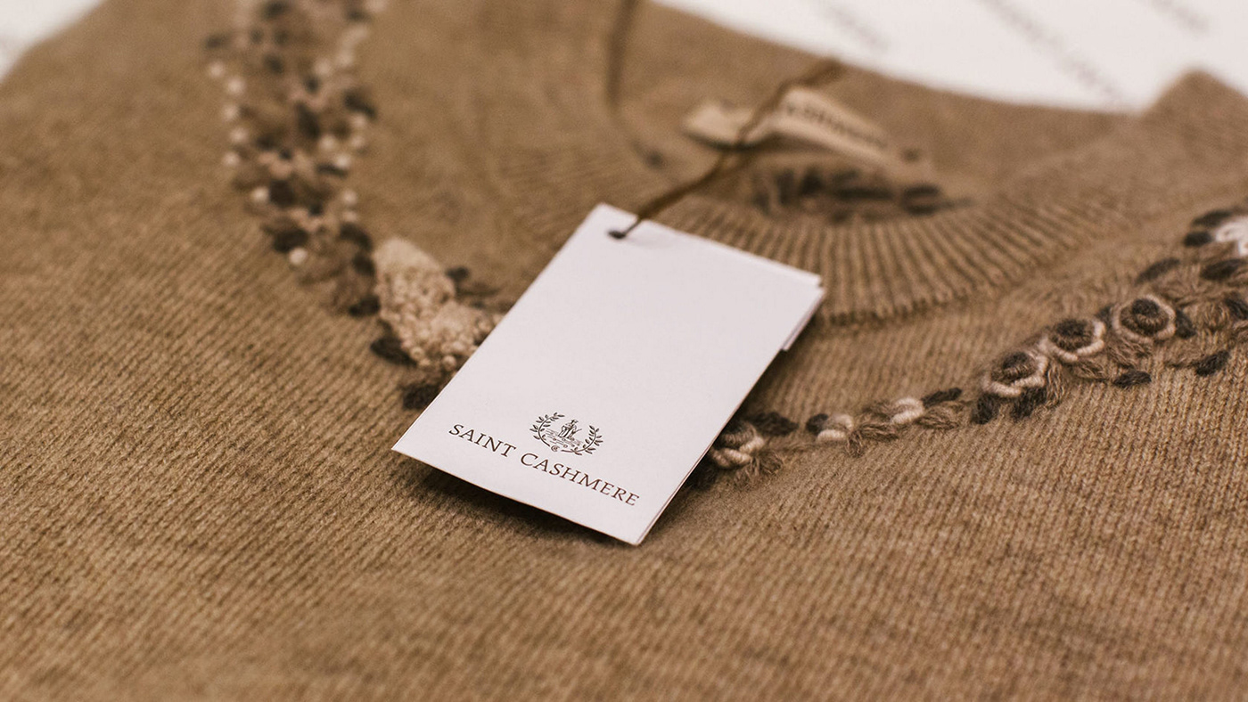
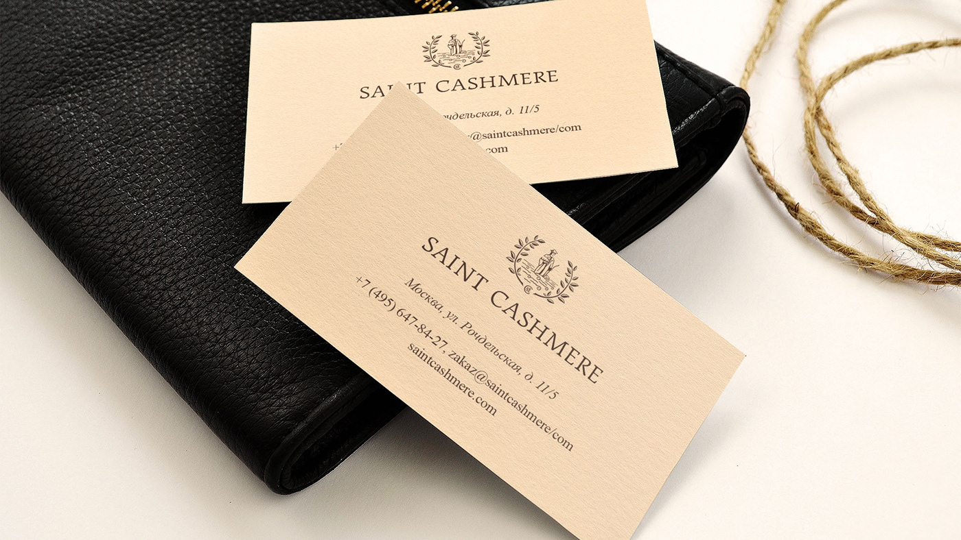
We developed the main logo for the company, logos and illustrations for individual collections and projects. The logo is based on the image of St. Wendelin, the patron saint of shepherds, who stands in the midst of a flock of sheep.
We chose the form of a clean coat of arms in order to denote the continuity with European traditions and quality. Compact version of the logo is the "st" ligature inscribed in “C”: the first letters of the name Saint Cashmere.


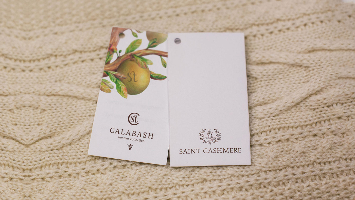
The brand keeps developing, growing, and launches a new line of clothing each season. Each collection corresponds to a unique sign organically integrated into the overall system.


The summer collection of Saint Cashmere is dedicated to the tropical plant Calabash. The additional sign is a branch of this tree. For tags, packages, printings and advertising, we drew a Calabash in the technique of botanical illustration: juicy green leaves, bright flowers, rounded fruits.


The autumn-winter Love & Money collection is Florence during the Renaissance: a special color palette, architectural motifs, Dante's work, the Medici dynasty. The additional sign of the winter collection is the heraldic lily, the symbol of the ruling monarch, meaning wisdom, devotion, valor.
The collection's illustration is Dante's subtle profile framed by laurel branches, a golden crown and a hammered coat of arms, shades of scarlet and purple, shadows and shine.


The spring-summer Les Fleurs collection is based on floral illustrations by French artist Jean Grandville. The additional sign is a flower branch.
The main focus is made on various details that help to convey Jean Grandville's style and touch: shivering butterflies and bees, climbing plant stems, a riot of leaves and petals.


The Capsule Collection is dedicated to the works of great masters of painting. Each artist has his own recognizable style and manner of writing, his own way of applying paint on canvas. The final touch to the picture is the author's trademark signature. Often it is only this signature what helps us to recognize the artist if he has departed from the usual style of work.
The collection logo is a bright brushstroke and the flying word "art" written by hand.
Despite its expressive character, such a sign is harmoniously combined with other brand logos. In the compact version, it is abbreviated to the name of the collection with the sign of the main brand.


A stroke can be done in different colors inscribing it in the overall design of the model. One can also add the texture of oil paint on promotional materials to make the metaphor more expressive.


Saint Cashmere Identity is a graphic and semantic system in which each direction tells its own story and has its own character. At the same time, the family features of the brand are clearly seen in the additional signs and illustrations. This allows the company to experiment with a variety of lines and products, while maintaining customer awareness and loyalty.


