


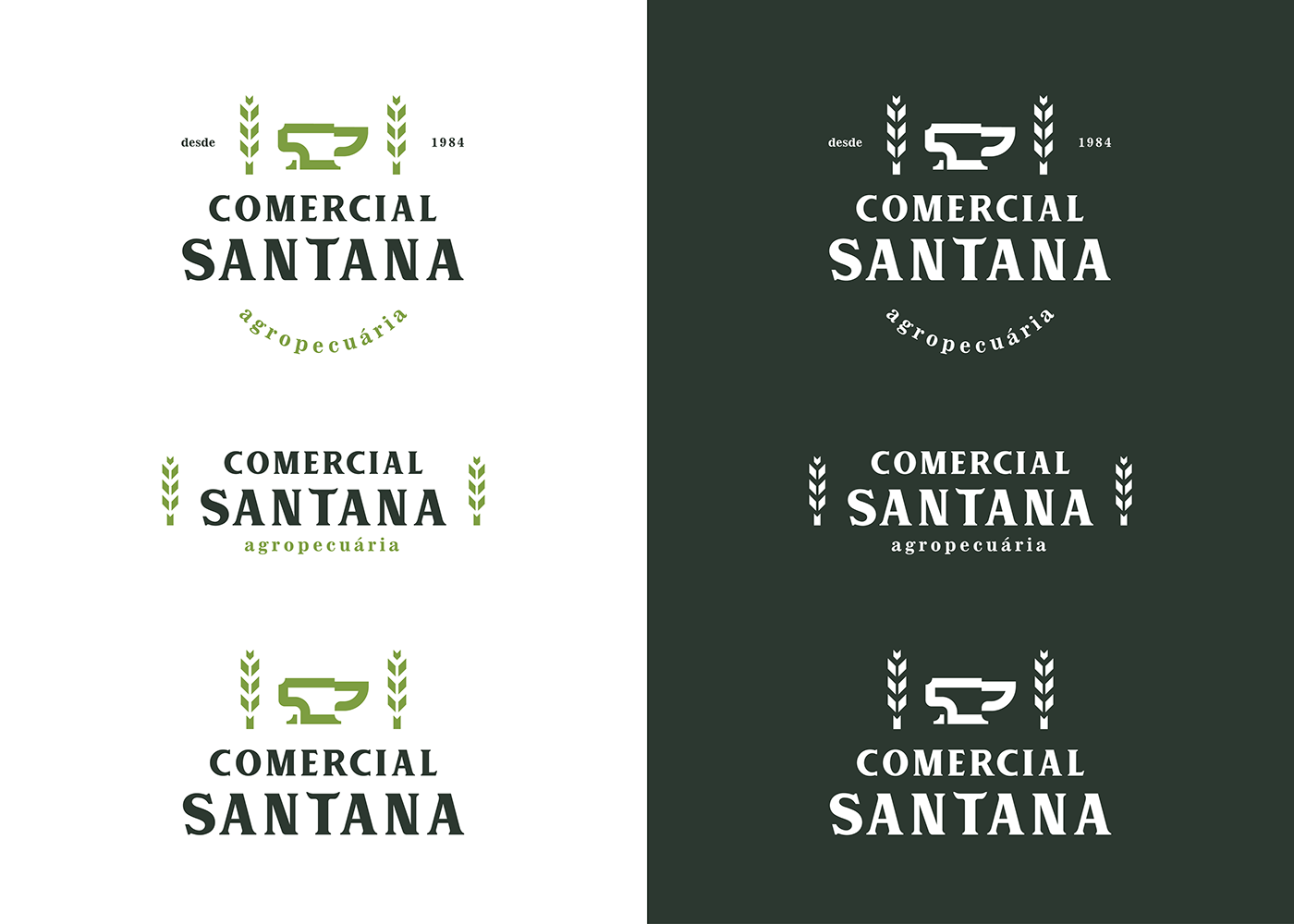
COMERCIAL SANTANA
O Comercial Santana é uma empresa familiar que vem atuando no cidade de São José -
SC à 35 anos. Decidimos criar uma identidade que capturasse a essência da marca, do público e da família Schmidt e transmitisse através do logo.
______
Comercial Santana is a family business that has been operating in the city of São José - SC for over 35 years. We decided to take the path to create an identity that could capture the essence of the brand, the public and the Schmidt family and decided to transmit that through the logo.
______

CONCEITO / Concept
Por ser uma empresa familiar, a principal inspiração para a criação do símbolo da marca foi o sobrenome da família: Schmidt.
Schmidt vem do alemão e significa Ferreiro. Por isso pensamos na Bigorna, o símbolo do ferreiro, um objeto que simboliza força, resistência e determinação.
Para incrementar o logo, optamos por criar também algo que representasse a agricultura. Rações, sementes e outros insumos relacionados agricultura fazem parte dos produtos vendidos pela empresa.
______
Being a family business, the main inspiration for the creation of the brand symbol was the family name: Schmidt. Schmidt comes from German and means Blacksmith. So after we did some brainstorming the Anvil come as the perfect symbol. The anvil is the symbol of the blacksmith, an object that symbolizes strength, endurance and determination.
To keep adding features to the logo, we chose to also create something that represented agriculture. Feeds, seeds and other inputs related to agriculture are part of the products sold by the company.
______

TIPOGRAFIA / Typography
A tipografia foi inspirada tipografia Cheltenham, tivemos a ideia de adicionar alguns elementos que remetessem a agricultura e animais.
_____
The typography was inspired in the Cheltenham typography also adding some elements that would refer to agriculture and animals.
______

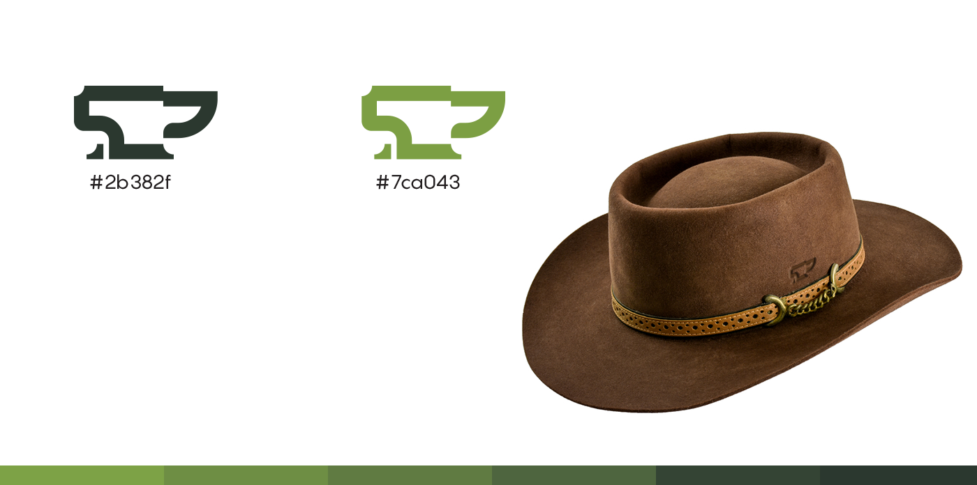
CORES / COLORS
Verde é a primeira cor que vem a cabeça quando o assunto é natureza, agricultura e afins. Não poderíamos deixar de utilizar essa cor.
O verde claro utilizado é uma cor gentil, tem uma forte conexão com natureza e remete bem a industria do agronegócio. Utilizamos como cor base para a tipografia um verde musgo de tonalidade mais escura.
_____
Green is the first color that comes to mind when it comes to nature, agriculture, and the like. We kept using that color for this obvious reason.
The light green used is a gentle color, that has a strong connection with nature and refers well to the agribusiness industry. We used that as base color for typography mixed with a moss green with a darker hue.
______


OBRIGADO
Thank you


