Blanc Bilbao Festival
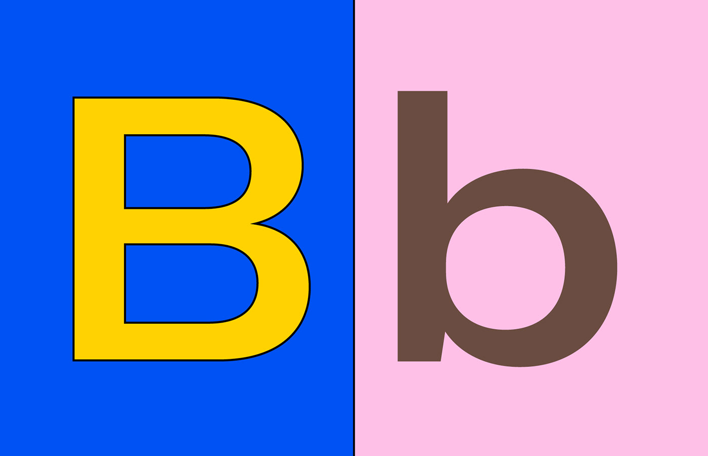
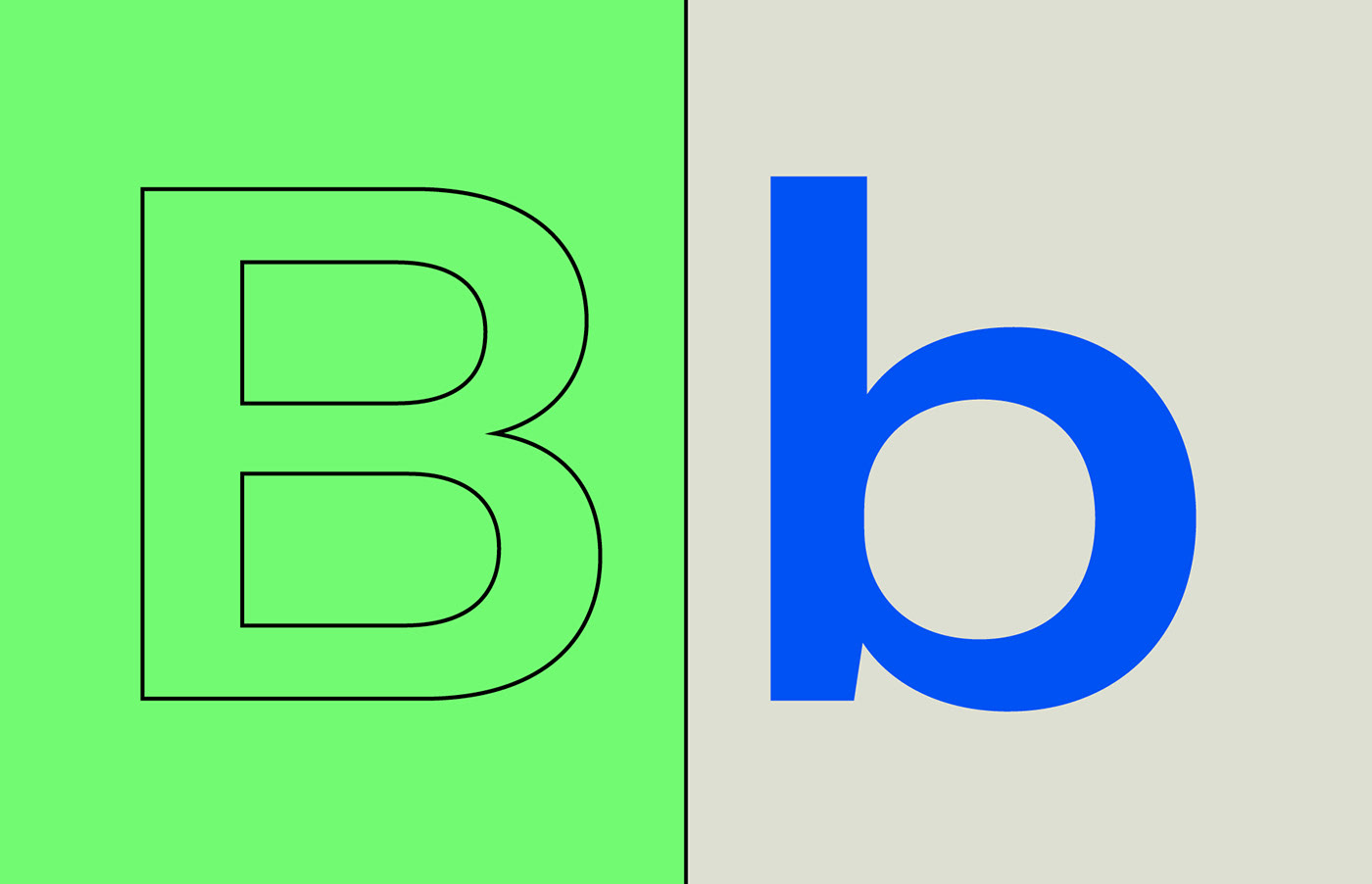
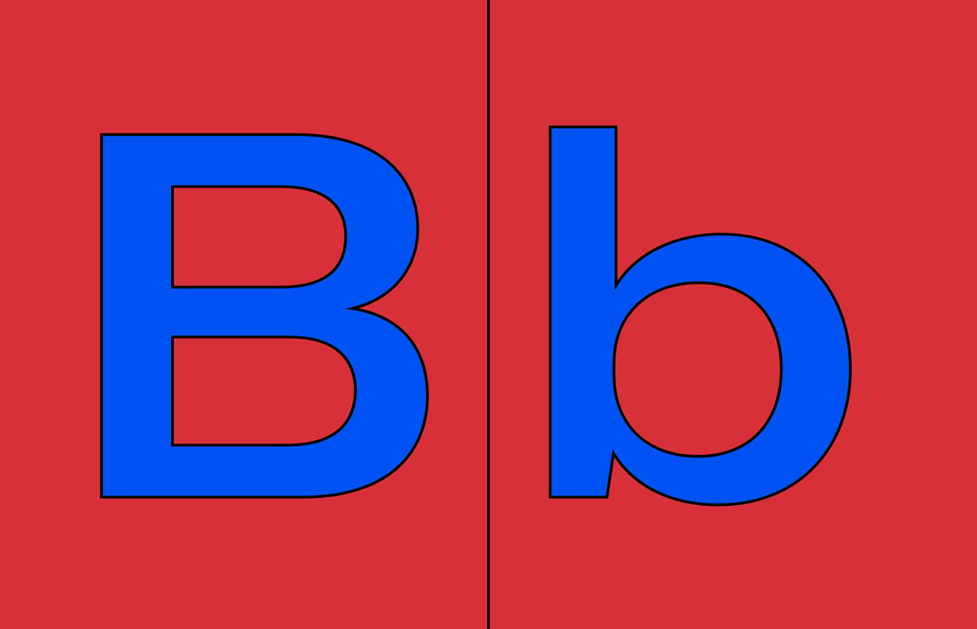
Blanc Festival commissioned Familia to design the graphic identity of their first event in Bilbao, Basque Country. The proposal explains Blanc’s DNA: an attitude of fun, happiness, plurality and diversity, with a common language among attendees and the graphic design scene. This attitude is given by the infinite combinatorial possibilities in the use of color as well as the mix of lower and uppercase letter B boxes in reference to Blanc-Bilbao initials and the typographic world.

Testing process and working approach
Testing is key in the workflow of any graphic designer as the right choice and combination of different type, colors, materials, formats and layouts will define the final message and its perception. The identity is focused on this trial and error process over a hypothetical monotonous final result, a common language in the world of graphic design.
Communication
Most of the festival’s communication materials were digital, except for some printed elements. Based on the concept of work in progress and the testing process of design itself, multiple ‘final results’ were created with ‘change’ being the main ingredient. The video became the perfect way to communicate the graphic concept of the festival exploiting all its possibilities while showing many different designs in a few seconds.


