
Beijing Office Space Design
RED HUB
小红书北京办公室空间设计
TIME:2018.9 - 2018.10

01 Theme | 主题
In autumn 2018, the RED Beijing team moved into the new office in which the REDesign has participated in the design of the RED Beijing office space. We have named this space RED HUB. The main concept of the Beijing office is ‘Technology is the key’. We have integrated this concept into the overall style as well as the front desk and meeting rooms.
2018年秋天,小红书的北京团队搬了新办公室,REDesign也参与了小红书北京办公空间的设计。我们为这个空间命名为「RED HUB」,正如北京办公室的主题概念:「技术亦核心」,在这里,从整体风格到前台、会议室,都融入了这一设计主题。


△ The LED characters ‘RED HUB’ at the front desk 前台处的「RED HUB」发光字


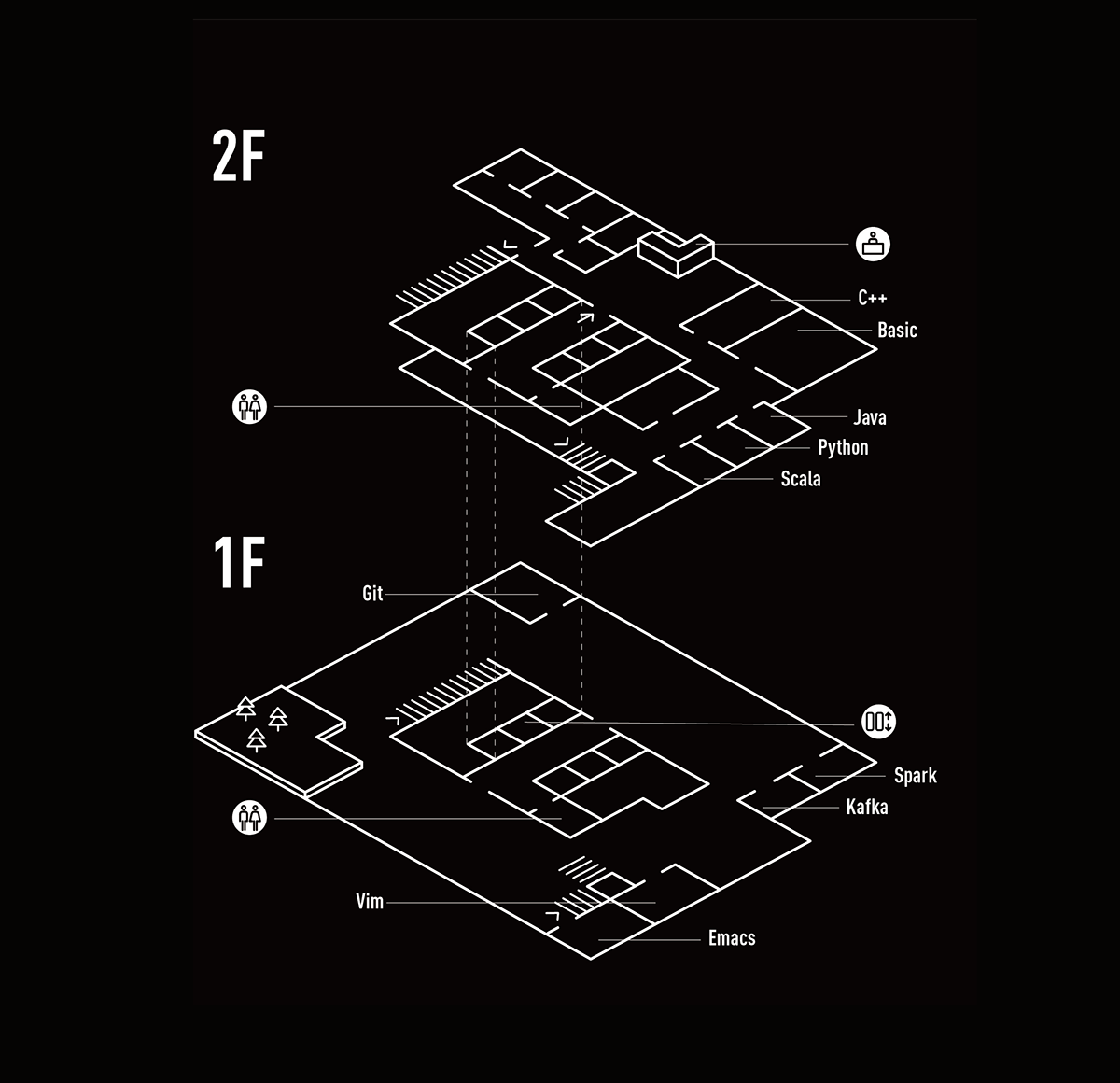
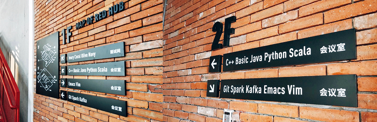
△ The Neon lights of the meeting rooms named after programming languages such as Java, Python, C++, etc.
以编程语言命名的会议室霓虹灯:Java,Python,C++…
02 Space Design|空间设计
To maintain the cohesion with the overall industrial style of the space, we have chosen to use the black-and-white color scheme as well as the metal painting 3D characters for the design of the guide signs.
结合空间整体的工业风格,导视标识的设计采用黑白配色及金属烤漆立体字。

In the lobby of the RED HUB, we have designed a card flipping letter wall in which every card is replaceable and different characters can be put together at any time.
在RED HUB的前台大厅,我们设计了一面翻牌字母墙,墙上的每一块翻牌都是可替换的,可以随时拼出不同文字。

△ In the English version of the value of the RED, we used red color to emphasize the word RED to express our vision of ‘DO IT THE RED WAY’, giving RED HUB more meanings. 在小红书的价值观英文中,我们用红色强调出字母RED,表达了「DO IT THE RED WAY」的愿景,为RED HUB赋予了更多意义。
Art Director 美术指导:Dora
Graphic Design 视觉设计:吉如 / 木鱼
关注我们 Check out more of our work on:
Thank you for watching!
▼


