


The Hay Fever | Movie Poster Design
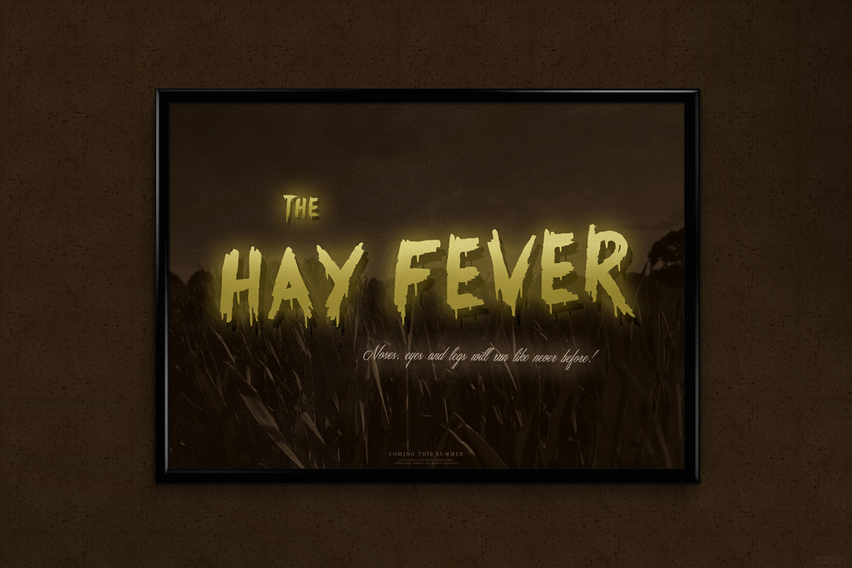
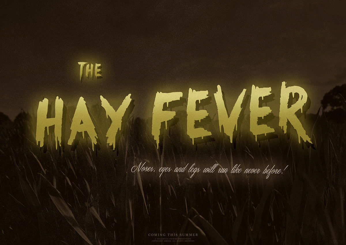
This project that began in late June was based around the idea of designing a parody-based movie poster that would help over-exaggerate the worry and dread of coming down with symptoms of hay fever, by the way of a visual style that is strongly reminiscent to the horror movie era of the 1940s and 1950s.
As you will see, the final outcome consists of different sections of text (such as the title, slogan and production credits) in various sizes and fonts in order to help assert hierarchy, as well as a photograph of a field in the background that all-in-all use numerous filters to help authenticate a vintage look as best as possible.
To help push the overall depth of design that little bit further, I decided to include lighting gradients alongside a grain texture in order to help push away from a look that I felt would appear far too flat, and way too polished for my own personal liking.
So, be sure to tell me what you think in the comment section below!
This is a non-commercial project.
*Some imagery has been subject to alteration and editing*
Credits:
Fonts - Something Strange, Masterics, Marion
Imagery - Pixabay, Karl Bembridge
Display Mockup - OriginalMockups
Display Mockup
Final Design
Follow Me:
Pinterest: http://www.pinterest.com/karlbembridge
Dribbble: http://dribbble.com/karlbembridge
Flickr: http://www.flickr.com/photos/kbembridge
Instagram: http://instagram.com/karlbembridge
Vimeo: http://vimeo.com/karlbembridge
Pinterest: http://www.pinterest.com/karlbembridge
Dribbble: http://dribbble.com/karlbembridge
Flickr: http://www.flickr.com/photos/kbembridge
Instagram: http://instagram.com/karlbembridge
Vimeo: http://vimeo.com/karlbembridge


