


A new branding for Arise Agency
On the occasion of the 10th anniversary of Arise, an advertising and photography agency based in Rouen, in Normandy (France), we created the new brand identity, in collaboration with Arise’s team. 10 years after its creation, the agency now evolves and operates on the principle of collective by bringing together photographers, graphic designers, and independent webdesigners. The agency becomes a « creative crew » and takes the digital shift by organizing itself into three poles: design, digital and photo.
---
A l’occasion des 10 ans de Arise, agence de publicité et photographie installée à Rouen, nous avons créé la nouvelle identité de marque, en collaboration avec l’équipe de Arise. 10 ans après sa création, l’agence évolue et fonctionne maintenant sur le principe du collectif en réunissant photographes, graphistes, et webdesigners indépendants. L’agence devient un « créative crew » et prend le virage du digital en s’organisant en trois pôles : design, digital et photo.

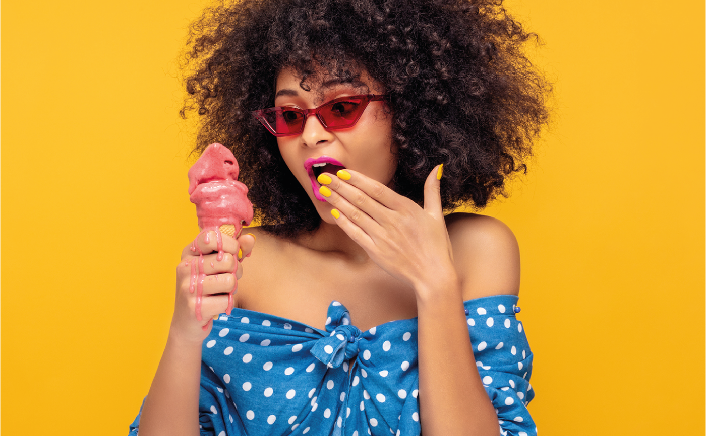
With Arise’s team, we chose to create a new identity completely different from the previous one, while keeping a few winks to the old logo.Thus, the orange color Tangerine is extracted from the old logo and the rising point is a reference to the high circle of the old logo. The typography is more readable and adapted to a digital display. The logo is accompanied by the “creative crew” signature to affirm the agency’s concept. This signature is underlined with an “underscore” for the digital aspect. The colours and artistic direction of the photographs, provided by Xavier Hennebel, are intended to be pop, positive and explosive to express the creativity of the «creative crew».
---
Avec l’équipe de Arise, nous avons choisi de créer une nouvelle identité tout à fait différente de la précédente, tout en gardant quelques clins d’œil à l’ancien logo. Ainsi, la couleur orange Tangerine est extraite de l’ancien logo et le point qui s’élève (« arise » = s’élever en anglais) est une référence au cercle en défonce de l’ancien logo. La typographie est plus lisible et adaptée à un affichage digital. Le logo est accompagné de la signature « créative crew » pour affirmer le concept de l’agence. Cette signature est soulignée d’un « underscore » pour l’aspect digital. Les couleurs et la direction artistique des photographies, assurées par Xavier Hennebel, se veulent pop, positives et explosives pour exprimer la créativité du « creative crew ».
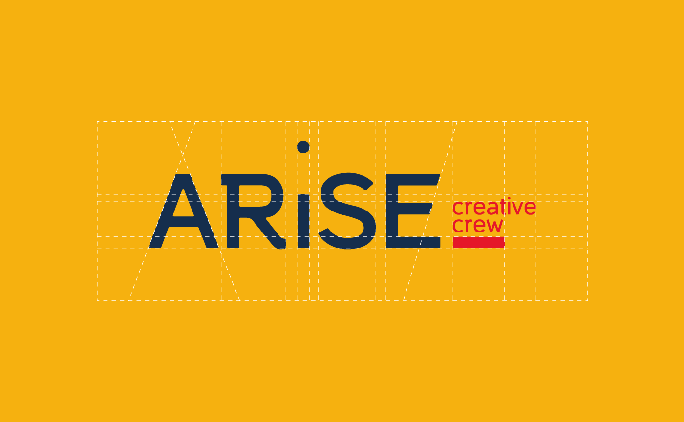


Two font families are used in the Arise Agency’s brand identity : Casper for titles and Avenir Next for current text. The first was chosen for its originality, particularly in terms of curves and wheelbase; the second for its readability and its wide variety of styles.
---
Deux familles de police sont utilisées dans l'identité de marque de l'Agence Arise : Casper pour les titres et Avenir Next pour le texte courant. La première a été choisie pour son originalité, notamment au niveau des courbes et empattement ; la seconde pour sa lisibilité et sa grande variété de styles.
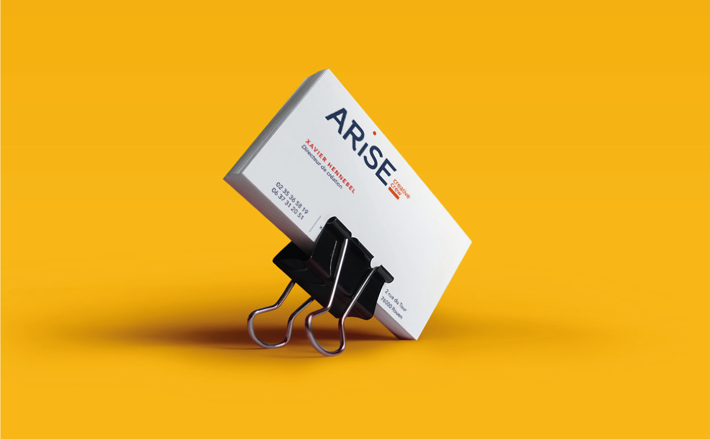


Brand identity & Graphic Design : Florian Pommier
Photography : Xavier Hennebel
Make-up Artist : Strenga Make Up


