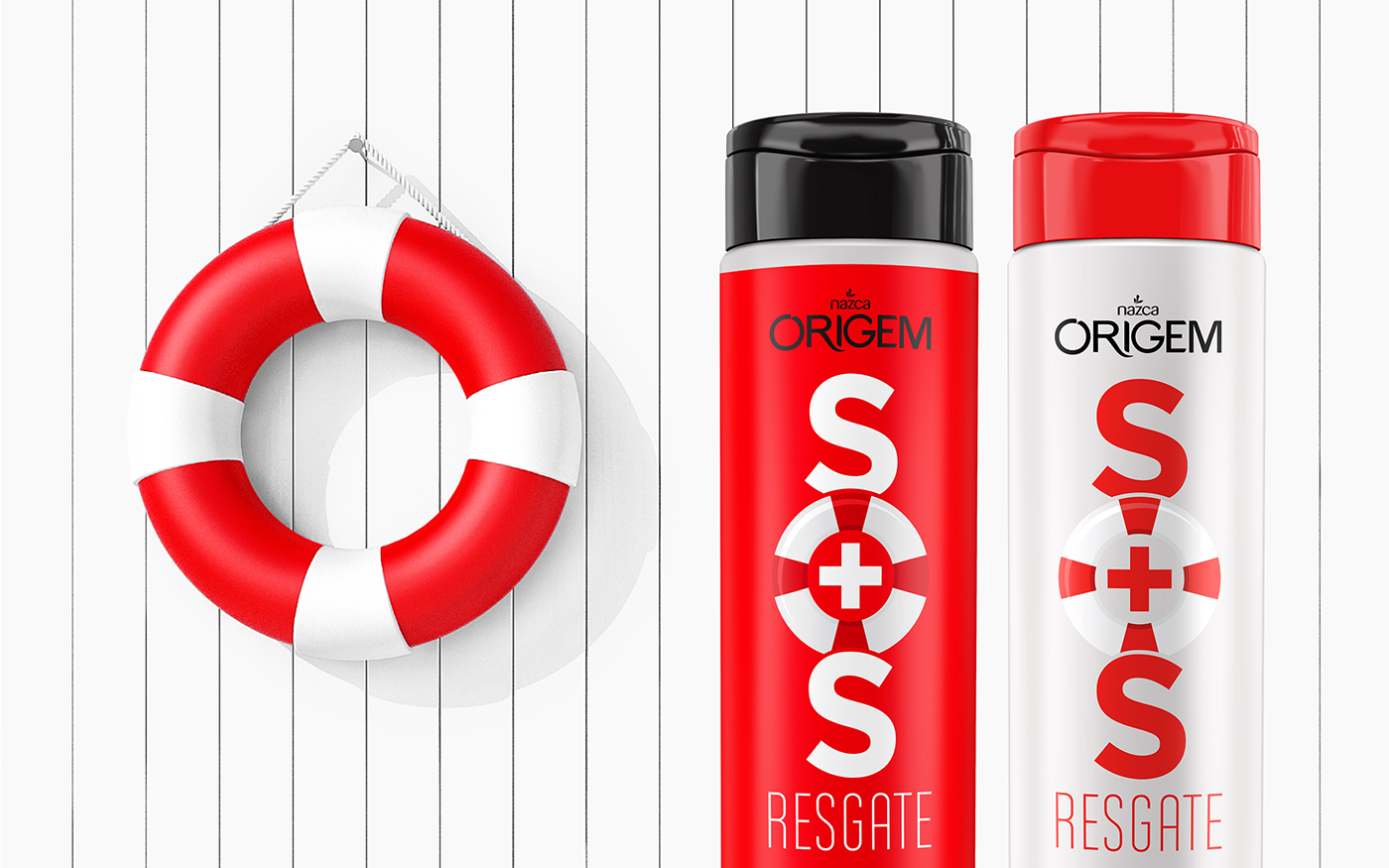
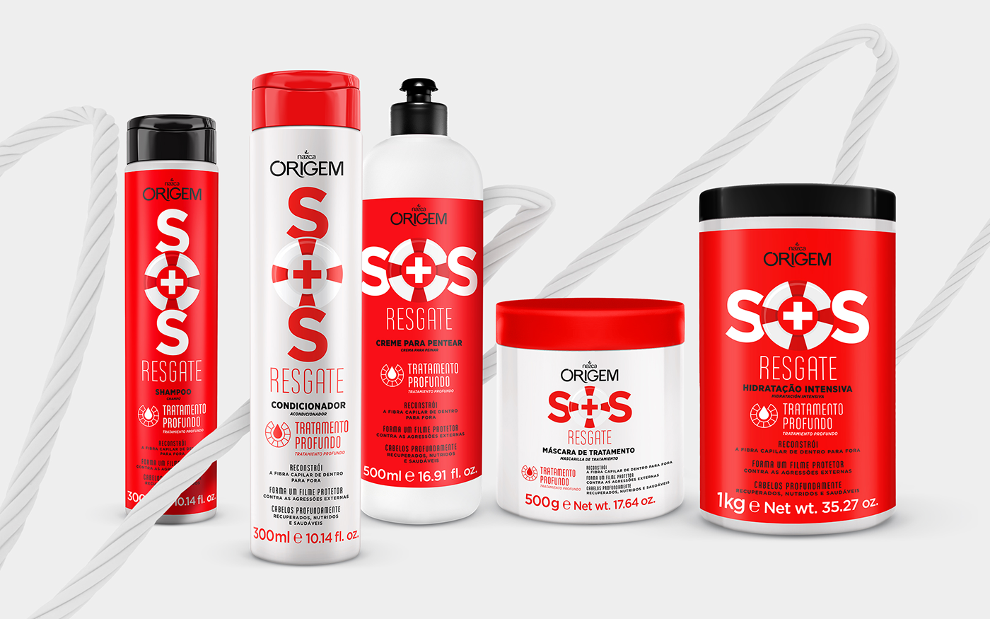
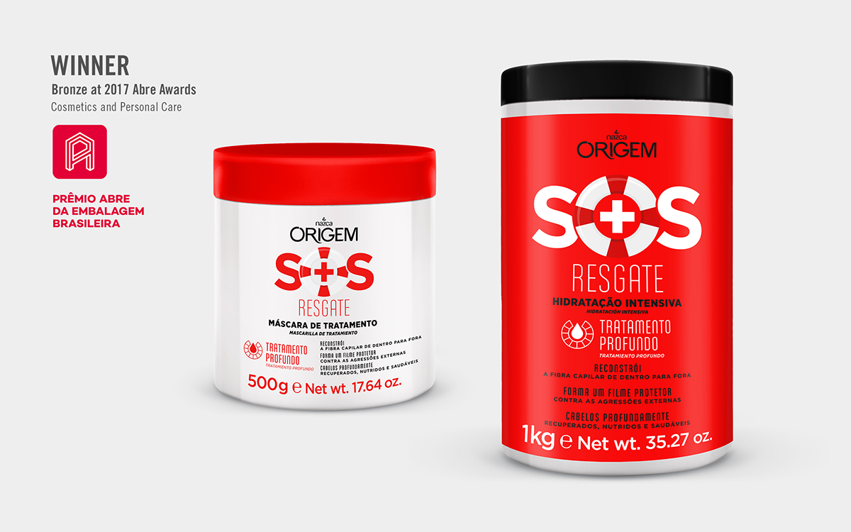
Nazca Cosmetics developed a line called ‘SOS Rescue’ focusing on treating and repairing damaged hair. The packaging design needed to reflect this concept of ‘salvation’ and at the same time be aligned with the simple, fun and vibrant essence of sub-brand Origem.
A lifesaver icon was adopted since it’s strongly recognizable as a symbol of rescue. And combined with a white cross, this element reinforces the products' role as hair saviors. The icon was used on the SOS logotype, creating a powerful point of attraction on shelf and translating the line’s main benefit in a straightforward way.
The red and white colors express the idea of alert, while the thin, delicate typography connects with the beauty category.
@ CBA B+G
Creative Direction: Sam Profeta, Fernanda Varnum
Client Management: Marcella Mota
Client Management: Marcella Mota