

Today, I'm so glad to introduce my lastest project.
TESE is an upcoming personal brand. It specializes in tea and beverage products from natural ingredients.
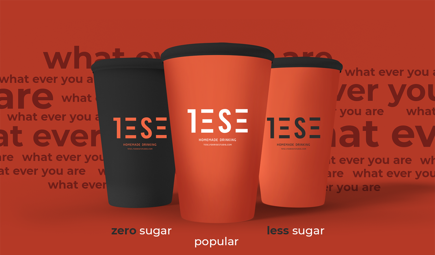
The important thing in this brand's identity design is that the product needs to be geared to young users - they love the youthfulness, color and usability of the products.

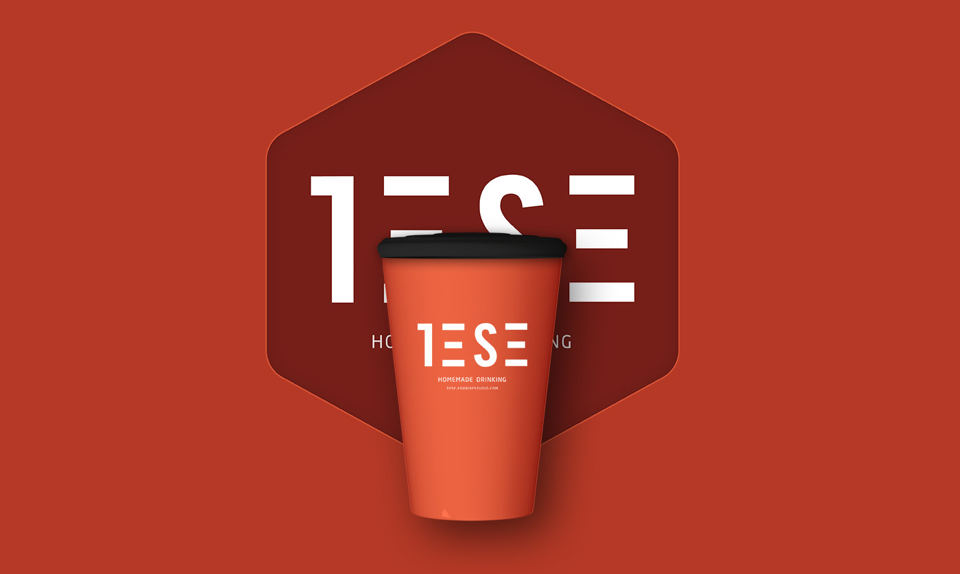
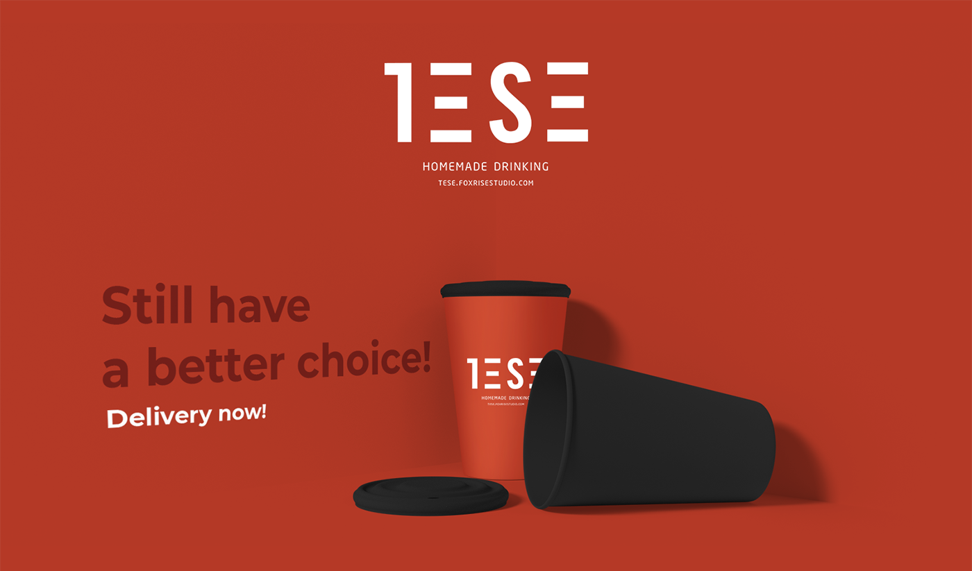
Logo is designed based on minimalist style and oriented to the spirit of the brand.
TESE is stylized to highlight 1S phrases with speed lines.
It also implies that the quality of drinks is always a leading factor, deciding the brand's success or failure.

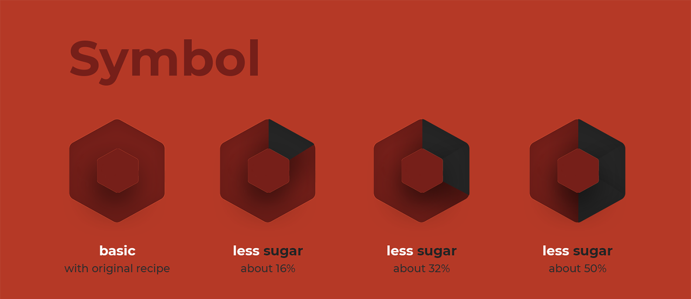
In order to enrich and easily identify the brand, I designed an additional icon - hexagonal with rounded corners.
Hexagon refers to beehives in real life. It makes viewers feel the sweetest, craving and most natural.


Fonts are very important in brand design. Everyone knows that.
However, it is even more difficult to design brands in Vietnam.
However, it is even more difficult to design brands in Vietnam.
Not many fonts support Vietnamese. Vietnamese people often use long paragraphs to describe a basic information salary... Therefore, the combination of both Vietnamese and English makes the brand more advanced, making it easier for users to access more information.
Typography are used flexibly, often combined with product images for users to easily understand information.

Thanks for watching!
Leave a comment for what you think about this project!


