
Saldens one of the most active Russian craft breweries.
Saldens stands out among competitors very well on a minimal white label.
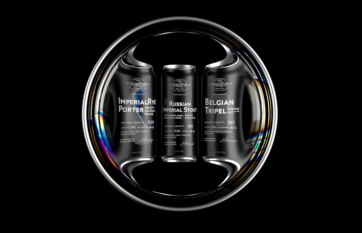
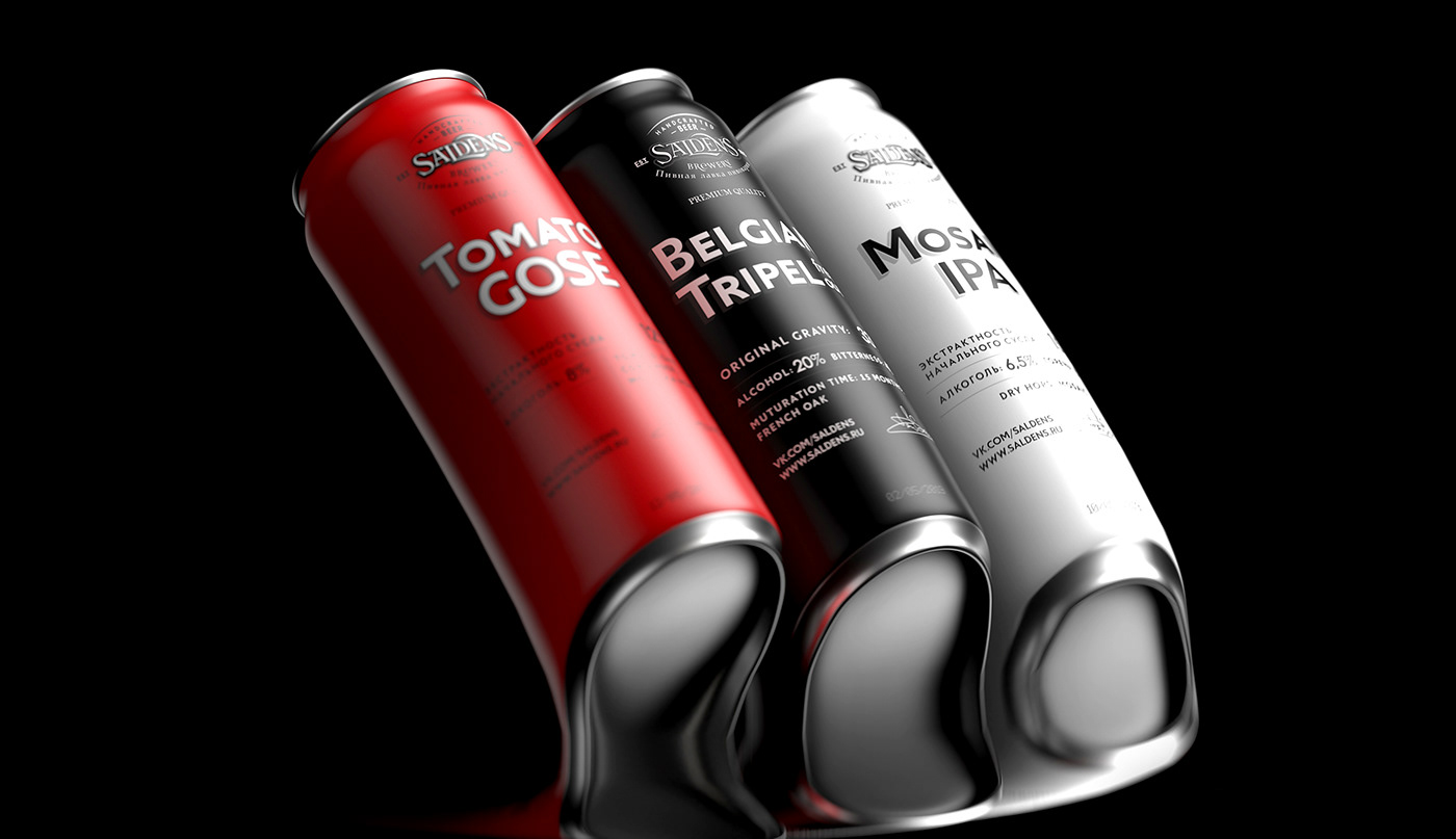
The peculiarity is that all the batch parameters are placed on the front side of the label: bitterness, density, hop varieties, amount of alcohol, etc. This is convenient for the consumer, but creates some limitations. Our task was to make a convenient grid for this information and express the character of the brand using typography.
Saldens stands out among competitors very well on a minimal white label.
The peculiarity is that all the batch parameters are placed on the front side of the label: bitterness, density, hop varieties, amount of alcohol, etc. This is convenient for the consumer, but creates some limitations. Our task was to make a convenient grid for this information and express the character of the brand using typography.
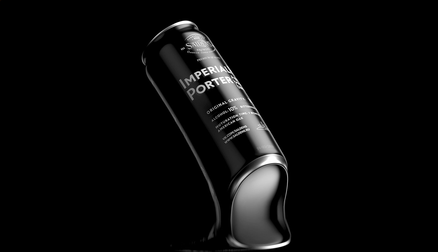
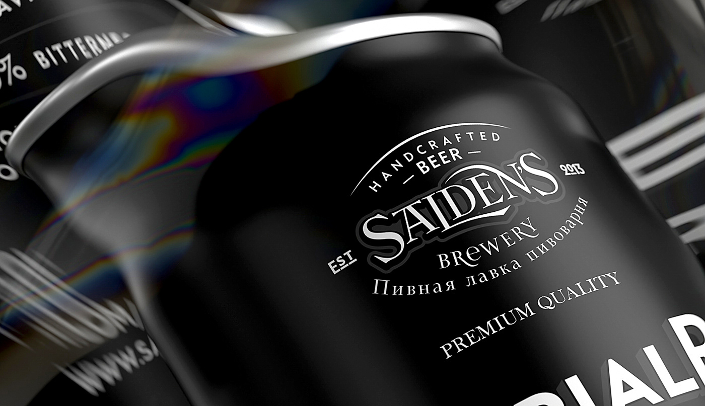


We chose two fonts by designer Yuri Gordon as the main font pair - BAKER STREET 221B MR HOLMES and BAKER STREET 221B DR Watson - they perfectly complement each other and express the post-modernist look of the Victorian era.


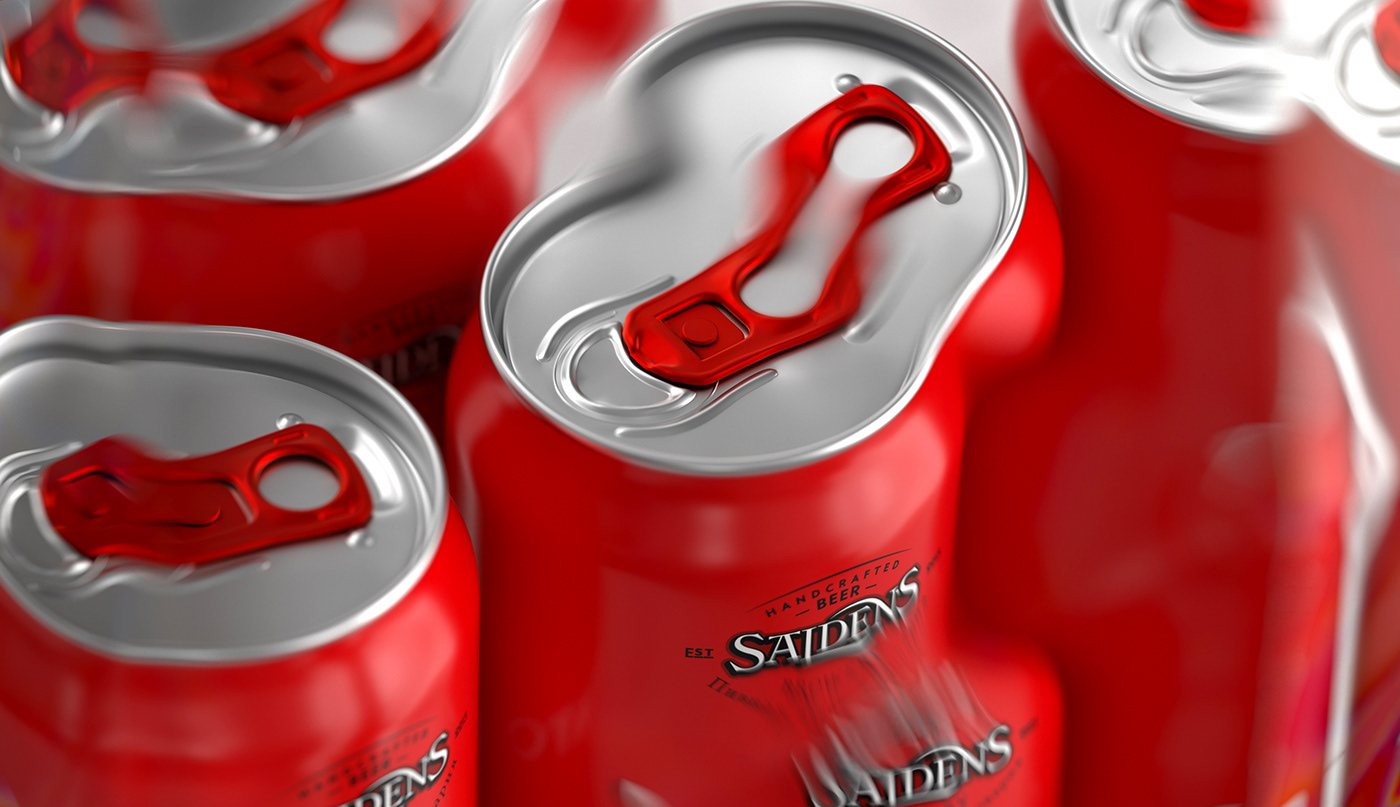


In our opinion, we proposed a rather logical color coding of the lines: the main collection remains white, porters and dark varieties — black, and tomato (of which very few) —red.


Thanks!


