Alepin:
Alepin is a French company with Syrian roots, the company provide to its costumers fresh healthy food like milk and wheat products, fresh vegetables and fruits. All the products are imported from Syria and the Middle East to Europe with high quality.
Problem:
Based on our meetings with the client and the creative brief we got that the Main goal for our client is to create a simple mark that can reflect the company vision and mission and carry the company message to their customers with the feeling of originality, health and the high quality. Also the company wanted to show the idea of linking the east with the west to reflect the unity between the tow worlds.
Concept and solution:
Our challenge is to create smart, unique, strong, simple, timeless mark that can serve the client needs. The perfect step to start with is to take part and analyze the client brief to make sure that we are on the right track.
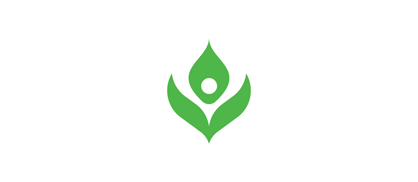
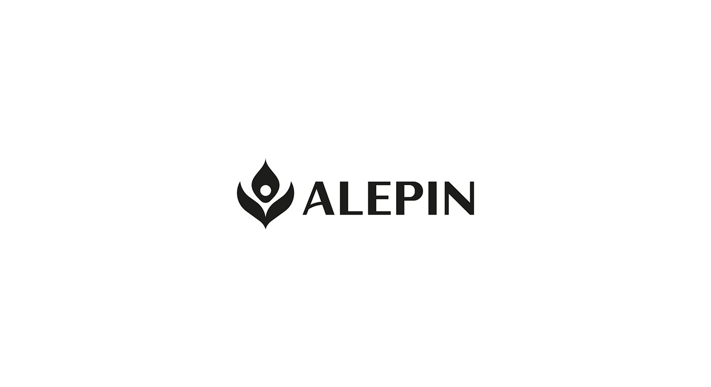
After that we decided to take nature as our inspiration river. With several brain storming and sketching sessions, our chosen concept was the small plant that contains a hidden figure and gives it the feeling that this tiny plant taking care of our figure referring to the healthy and high quality food. Also the mark contains tow leaves one of them refers to the east and the other one refers to the west all of this stuff refers to linking the whole world together as our client want.


Sketching:
In this project we spent to much time on sketching only to make sure that the final logo totally be original and unique.

logo Process:
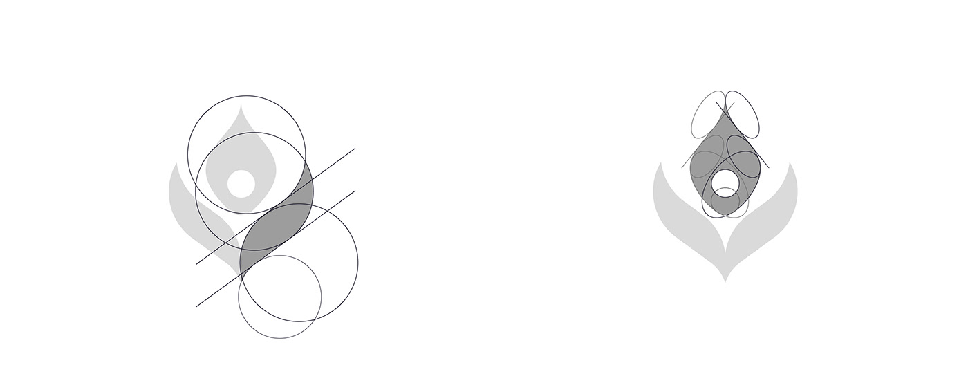

Logo Composition:


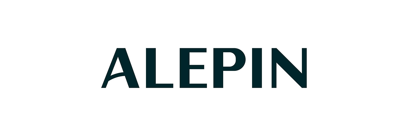
Logotype:
As we mentioned before that the nature is our source of inspiration in this project so we found that all the plants that are existed in our world have a big and wide trunk as the main base and then thin and light branches , so we wanted to reflect that on our logotype to give it the feeling of nature.


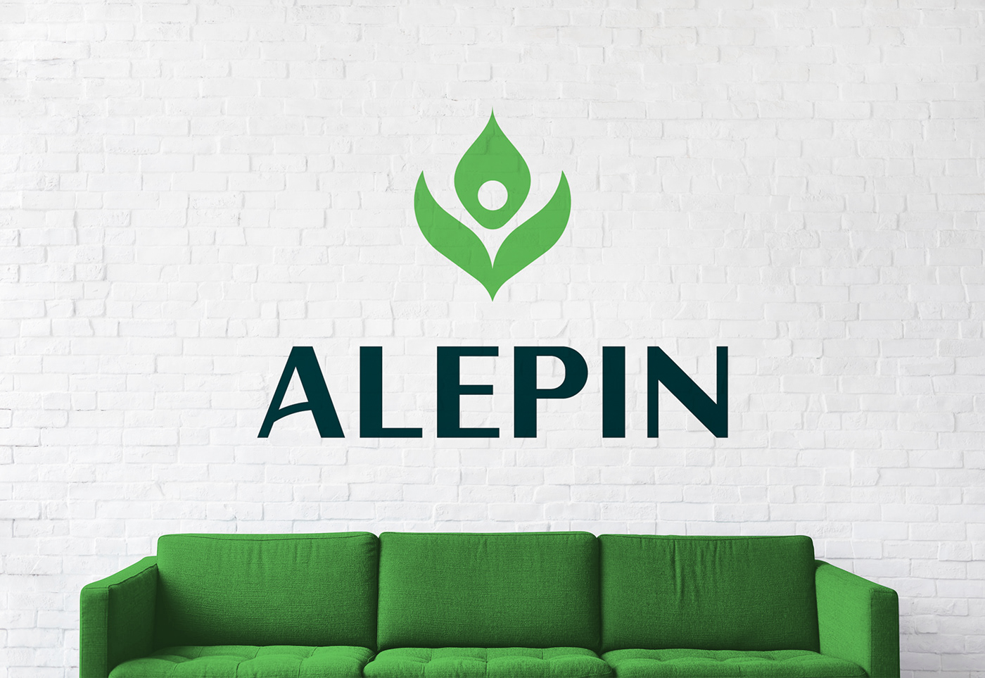
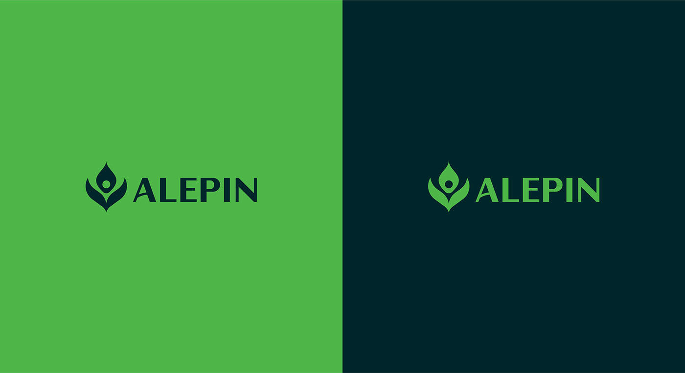
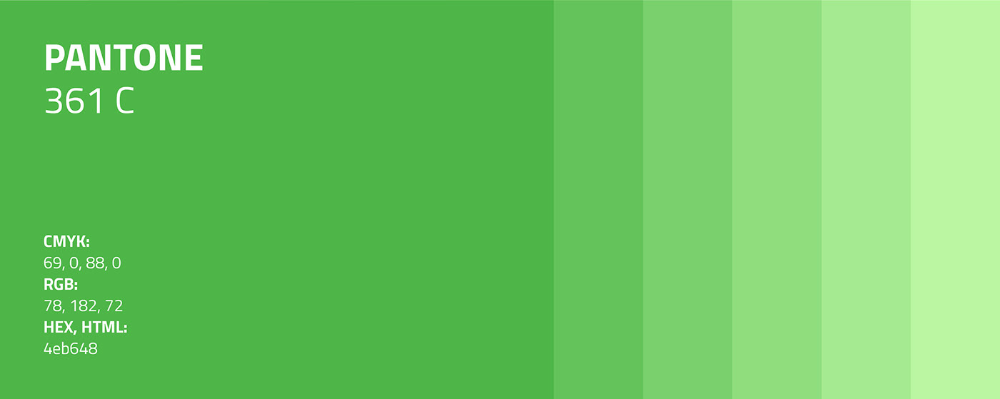
Colors:
We wanted the colors to be more healthy and organic so we go with the greens so it can be referable to a foods company.

Typography:
We chose Florentia typeface, for the headers and taglines so it can reflect the feeling of nature and the whole brand can be consistent and the brand Eco-system be more powerful and strong.
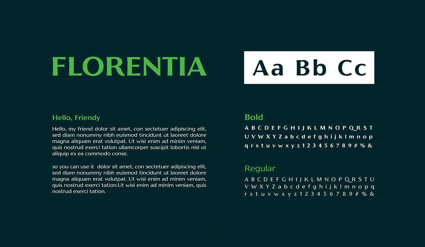
We chose Cairo typeface to give the brand texts and printed letters the feeling of the originality and modernity at the same time.


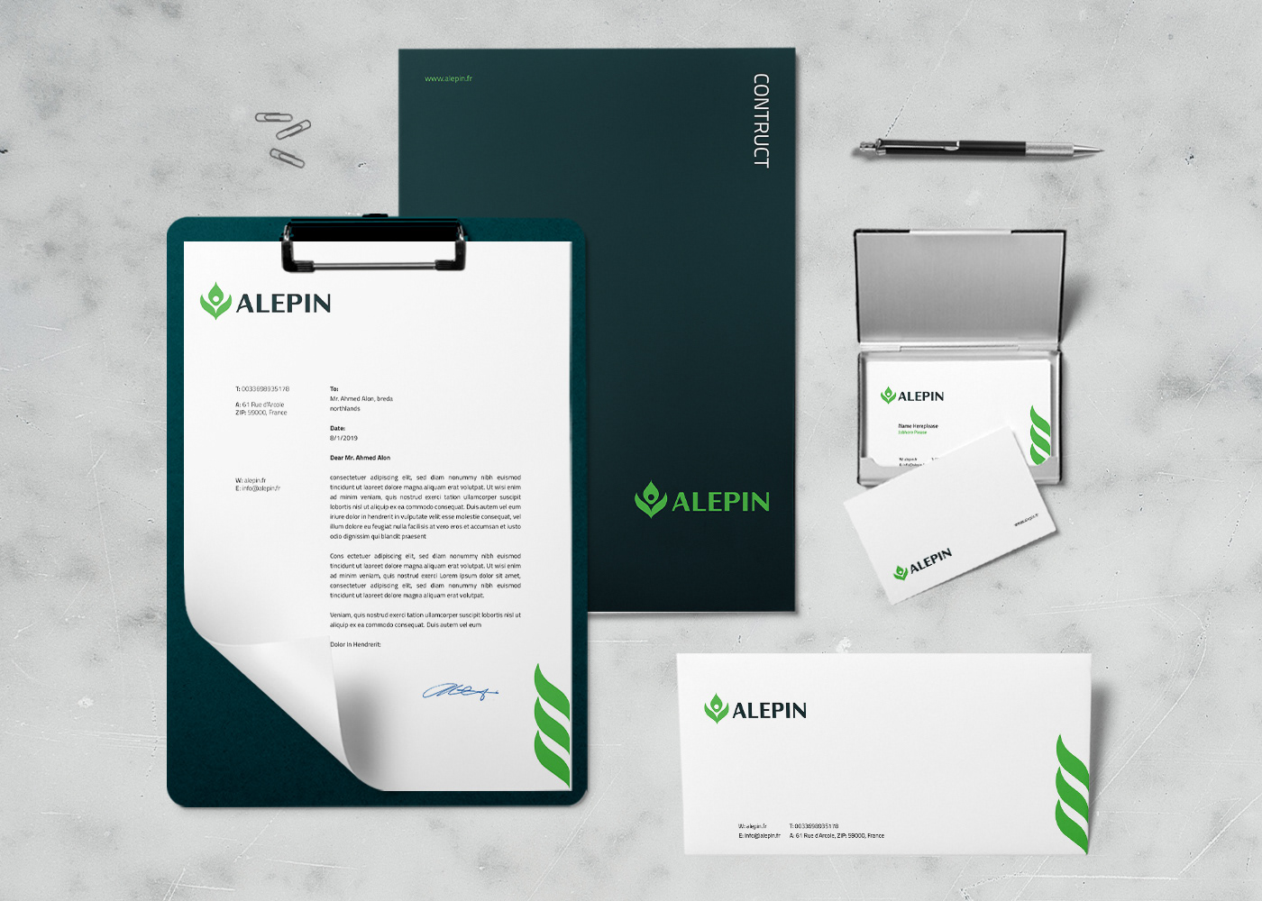
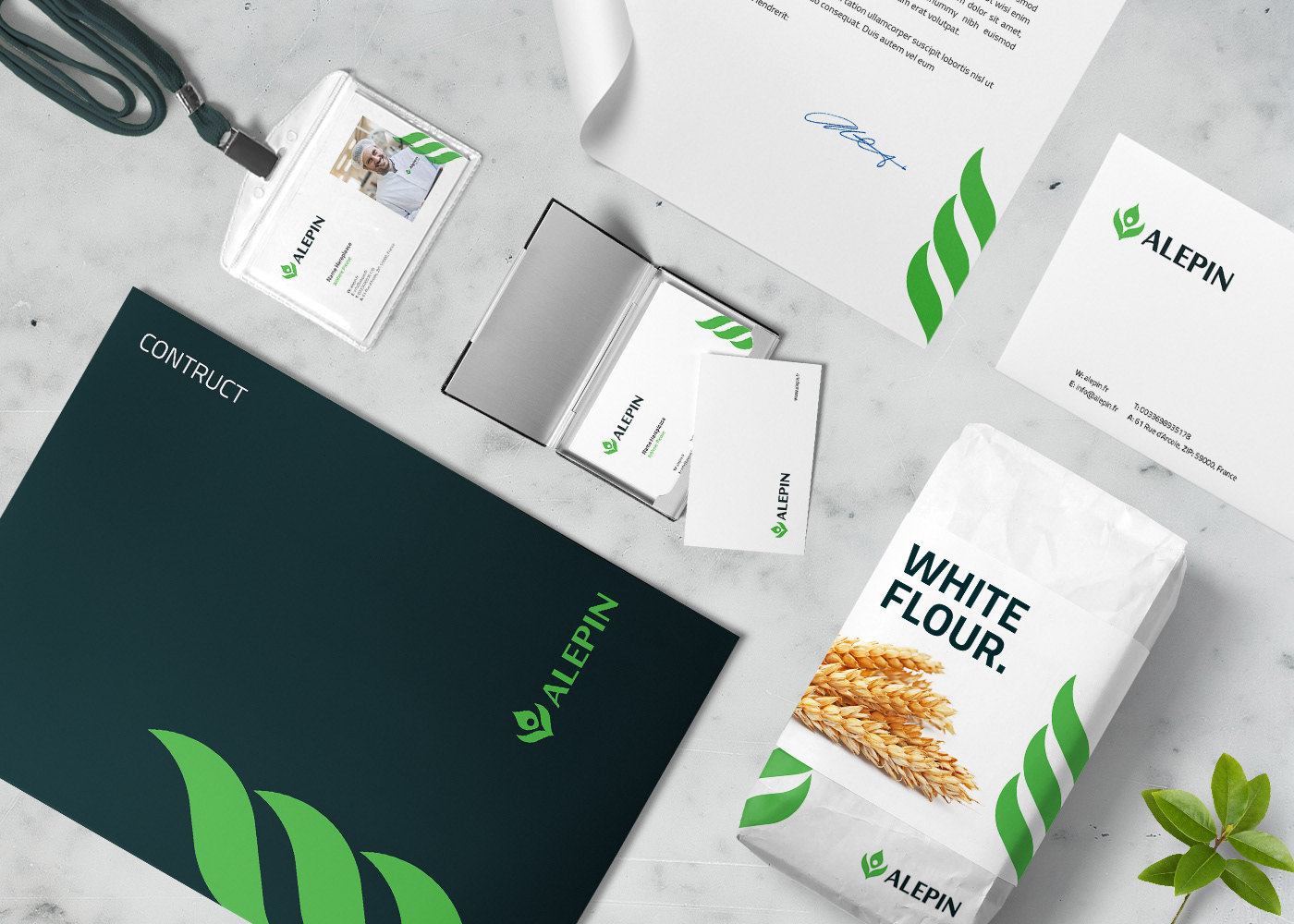
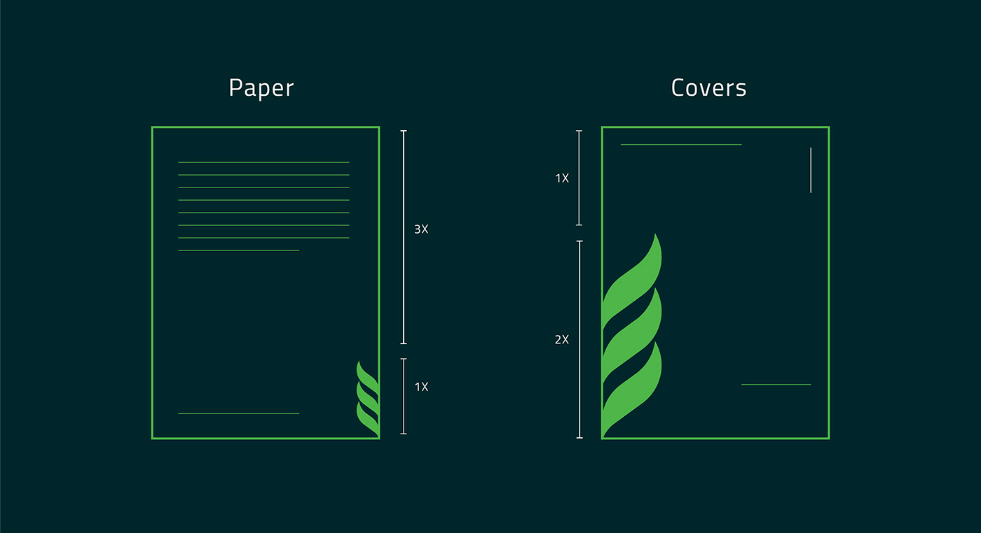
Identity Pattern:
It is made of three stripes of our logo leaves, we have here three each one of them refers to on kind of foods the company provides wheat, milk and the green stuff with vegetables and fruits.
Identity Applications: