Edmit
A tool to make smarter college choices; Web & Responsive | 2019
________________________________
Edmit is an early stage edtech startup, that helps families navigate the college selection process; cost, affordability, and value of different colleges.
I was brought on board to help the Edmit team (team of 5) evolve their product to better align with users' goals and solve for: What were users' hiring Edmit to do?
“
I need help finding a great college that I can afford.
________________________________
USERS'
The primary users' of Edmit are parents. Among the parents, there are those without any college admissions experience and others that have sent one or more kids to college.
We wanted to solve for parents who needed more help. Why? Because the parents who need more help are the majority of the market and is the user who would benefit most from the software.
TEAM & ROLE
I led the design for Edmits product and SEO marketing pages. Based on my own findings and research the team conducted, my role was to refocus the core product to better align with users’ goals.
I collaborated with a team of 5 on:

APPROACH
When I first started at Edmit, my main initiative was to understand 1. the college selection process and 2. how to guide users' depending on their goals.
Users' goals:
“
Help me build my list.
Help me understand am I paying a fair price?
Help me find the best colleges that are already on my list.
Help me find other colleges.
After understanding the users' goals and what we needed to accomplish,
we wanted to launch fast and quickly get customer feedback.
CHALLENGES
Working with an early stage startup was a lot of fun. You have a massive impact on the product you work on.
Here are some challenges I encountered:
Greenfield project: Edmit didn’t have a lot of existing infrastructure, so I wasn’t constrained by prior work. I was lucky enough to work on a project that gave me a lot of freedom, but it was important to strike the right balance between dreaming up all sorts of features and design them in different ways, while hopefully getting things right. My general approach was to think about the future, but not design for it just yet.
Working fast without sacrificing quality: Working with an early stage startup
it was important to focus on arriving at the best design solutions more quickly, without sacrificing quality. It’s definitely challenging to produce a concept and get it 90% right on your first attempt. I was able to leverage Edmits existing UI components and common UI patterns across products and interfaces. Users' will always approach
new products/features based on what they’ve used before. For this
reason I focused on user expectations.
_______________________________
BROUGHT TO LIFE
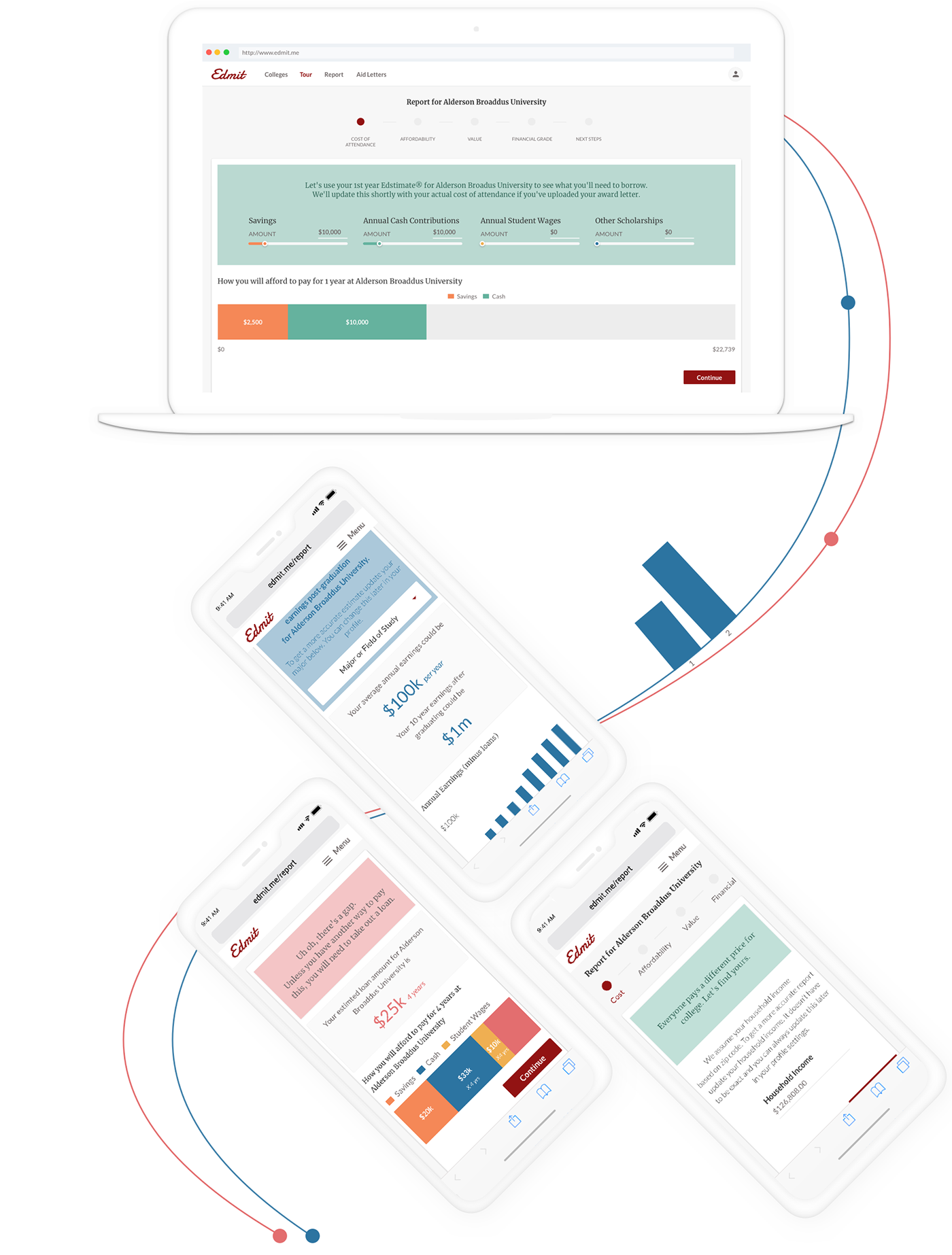
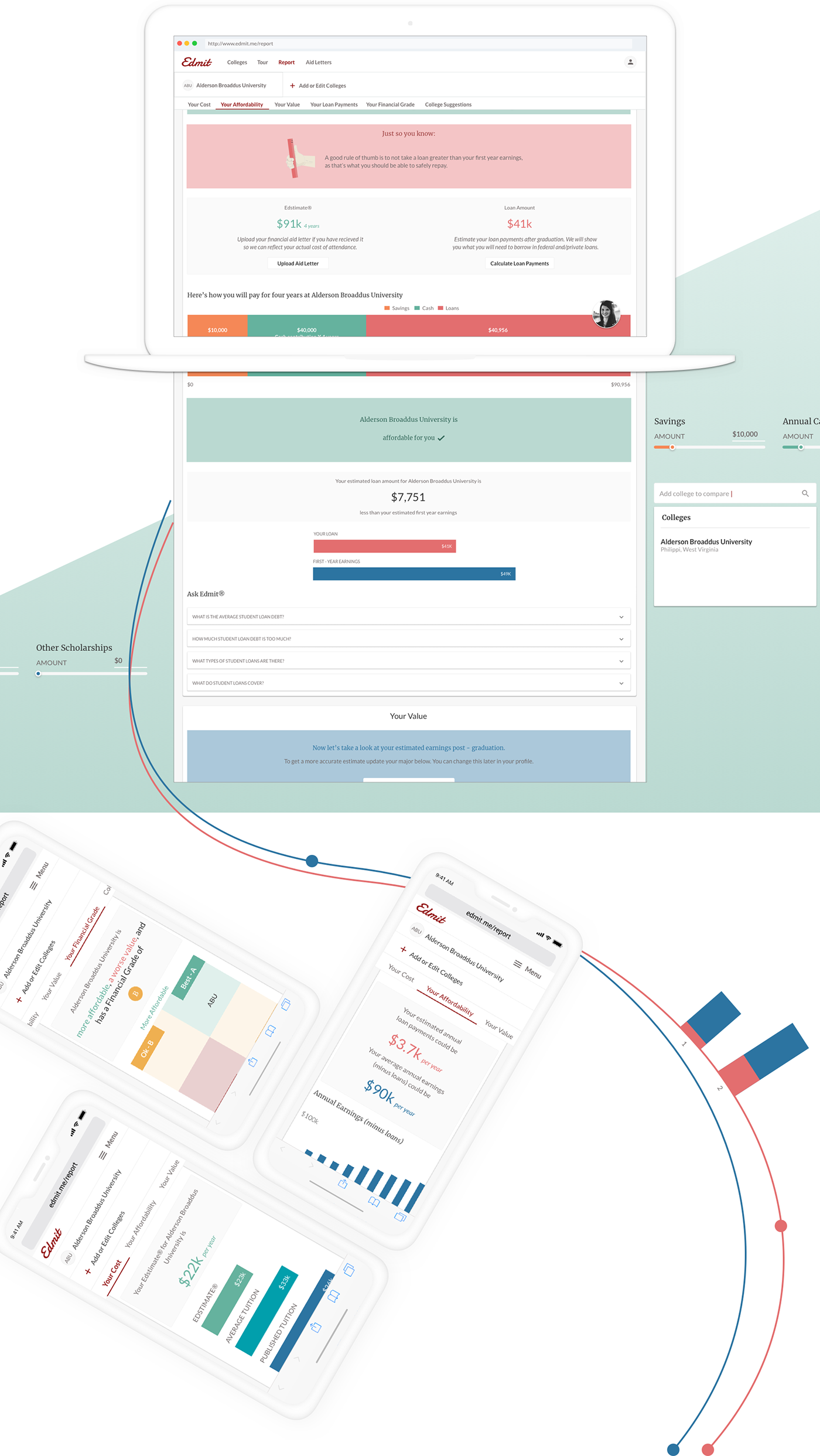
Here are some screens from the final designs.
My main goal was to:
I also focused on keeping the product overly clear. One simple example was adding data tables to most charts. Now a user didn’t have to completely rely on interpreting a chart to digest the information.
_______________________________
.ONBOARDING.01
The Goal of onboarding was to collect a minimal set of data upfront and educate users to set them up for success. It was important to show the value that was promised.
I chose a contextual and progressive onboarding approach, to guide the users' current point in the journey and show only the information necessary at that point in
the interaction.
.My Colleges.02
The Goal of my colleges was to allow users' to 1) compare college data and 2) help users' broaden there list and then narrow it down. We wanted to let users' explore colleges and increase their financial feasibility with tips or college suggestions.
“
How would a different major impact affordability and value?
Did we miss any schools?

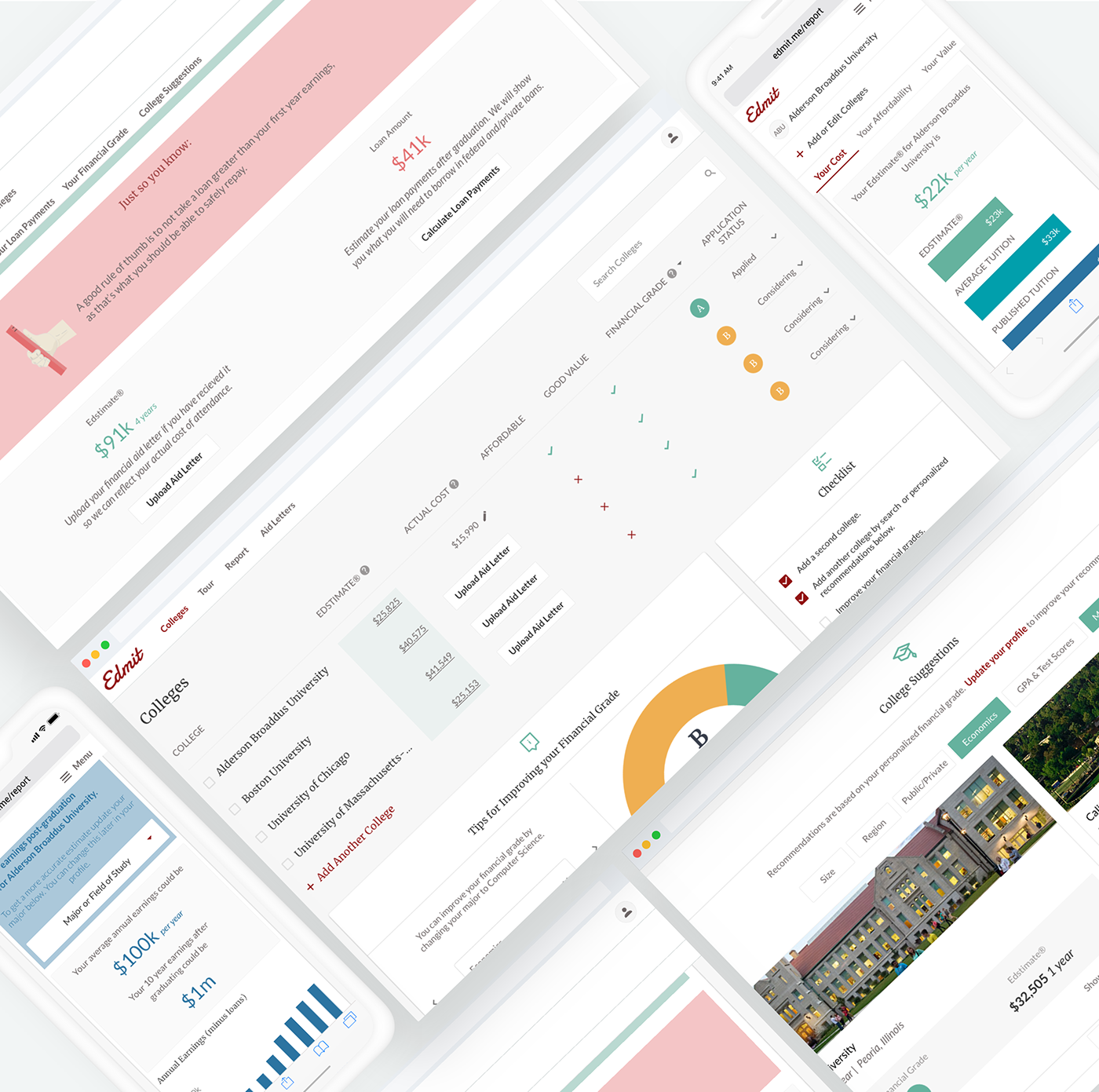
.College Report.03
The Goal of the college report was to helps users' assess their financial feasibility and compare colleges. We decided to surface insights and provide education, like how a different major affects ROI and quick tips i.e. A good rule of thumb is to not take a loan greater than your students first year earnings. For parents who don’t have any college admissions experience, they were adamant in interviews that more information is better. Providing education would also increase a users' confidence in Edmit
and their investment.
TYPOGRAPHY
Header
----

Body
----

COLOR THEME


________________________________
WHERE IT BEGAN
BRAINSTORMING & PROJECT KICK OFF
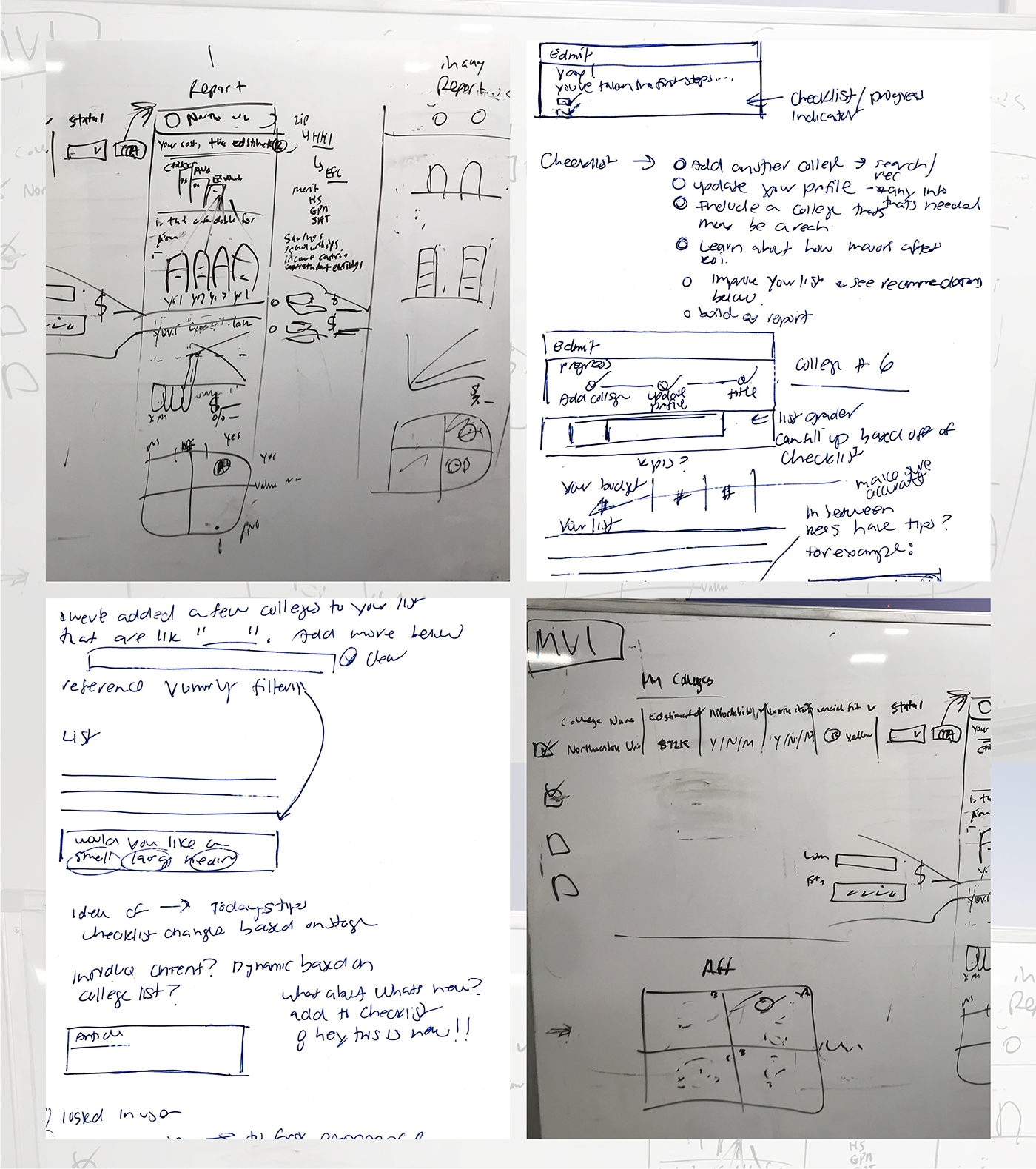
Kicking off the project, we started with an idea and white boarded. Our goal was to launch Edmits redesign within a month. Given the time constraints I started with a blank page and a pencil to generate many ideas. We skipped validating wireframes and low fidelity mockups. This enabled us to launch quickly and get user feedback (fail-fast methodology).
Here are some initial whiteboarding sessions and sketches:
________________________________
INSPIRATION
Before sketching my ideas, I like to use Pinterest to collect inspiration from competitors, popular applications, fun animations and anything that intrigues me (doesn’t have to be software related). To help expand my vision, I like to stay on top of the latest trends, what users are accustomed to and continue to learn from the best.
Here are a number of designs that helped me evolve Edmits product:

________________________________
USER TESTING
The redesign of Edmits product was well received with insightful feedback. We tested with various users' who were in different stages of the college selection process and reviewed interaction data with a tool called Logrocket.
_____________________
The main objective was:
• Do users' feel confident and trust Edmit?
• Do users' understand what they are assessing; value, affordability, financial grade?
The main theme across the board, was that:
Users' felt confident in the data; that it was helpful, easily digestible and personalized. What was insightful was that users' didn't understand where they were in the process, how they would make a final decision and they wanted more data and content around ROI.
“
Where am I in the process? How do I get started?
Say we send our son to Umass, is that going to make it more difficult to get into a grad program??? I'm thinking long term.
________________________________
OUTCOME
After the launch of the redesign, I continued to iterate on the product. I improved upon existing features and identified opportunities for new ones.
As a result of this experience I learned that the fail-fast approach is a great methodology to adopt. This approach enabled us to launch the redesign quickly to get user feedback. As the carpenter’s proverb goes, ‘Measure twice, cut once’. In other words, it’s quicker to iterate early on than to re-build later.
Thanks for scrolling till the end :)
Please appreciate this project if you like it. I'm also available for new projects. Say hello at jkolbech@gmail.com

