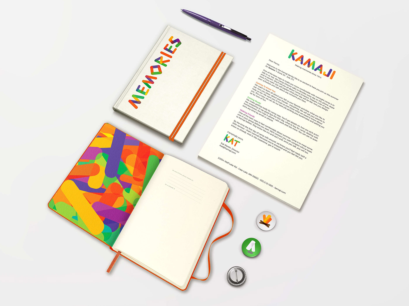
Many of my best childhood memories are from summers spent singing campfire songs and eating (far too many) s’mores at Camp Kamaji, an all girls sleepaway camp located in northern Minnesota.
My goal for this project was to create a flexible identity system that highlighted Kamaji’s playful, scrappy spirit. It was also important to create a brand that would appeal to multiple audiences: playful enough to attract children, but polished enough to reassure their parents.

Primary logo
All of the brand elements were created using a set of basic “building block” shapes and colors. The rounded shape is based on a campfire log, and the color palette was inspired by the camp setting: the sun, trees, lake, and campfire. These pieces create flexible identity system that can apply to any aspect of the camp’s brand.

“Building block” shapes

Monochrome logo variations

Icons

Custom lettering

Patterns

Marketing materials

Brand collateral

Signage & wayfinding

Recreation


