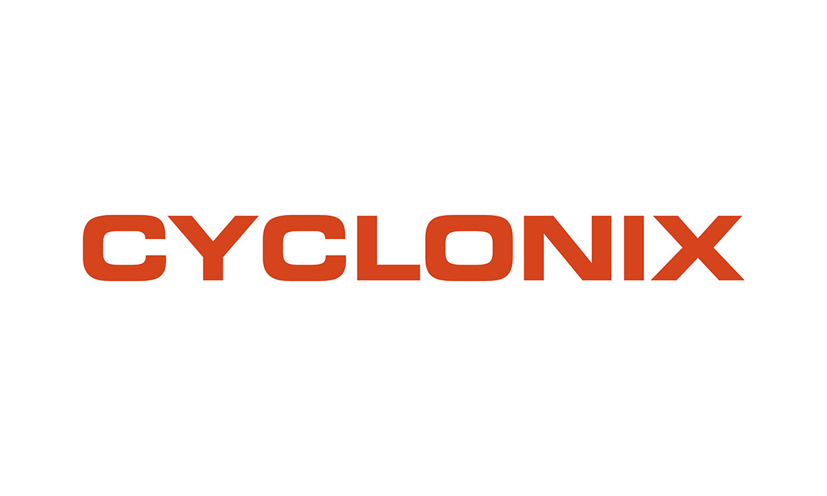

Above: Cyclonix Identity / Logo Re-Design
Cyclonix was founded on the principles of providing high-end design services, unmatched customer service and in-house production capabilities – an all-in-one design agency. The existing Cyclonix logo put emphasis on the 'x' as a way of expressing the unique philosophy of Cyclonix. This was my jumping off point when creating a new identity for the company. The 'x' encompasses the individualism of Cyclonix. It boldy expresses their unique approach towards the creative industry.

Above: New Cyclonix Color Palette – Pantone Warm Red C / Pantone 312 C / 88% Black

Above: The original Cyclonix logo.

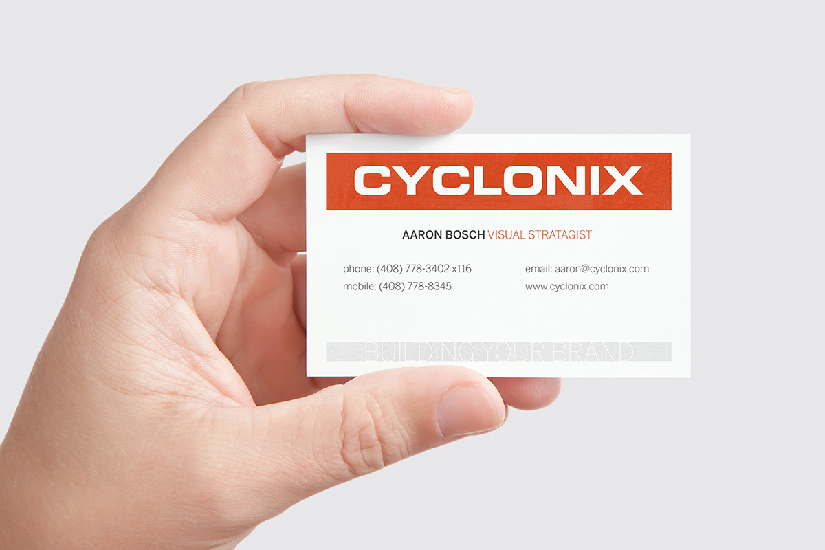
Above: Business Card Design


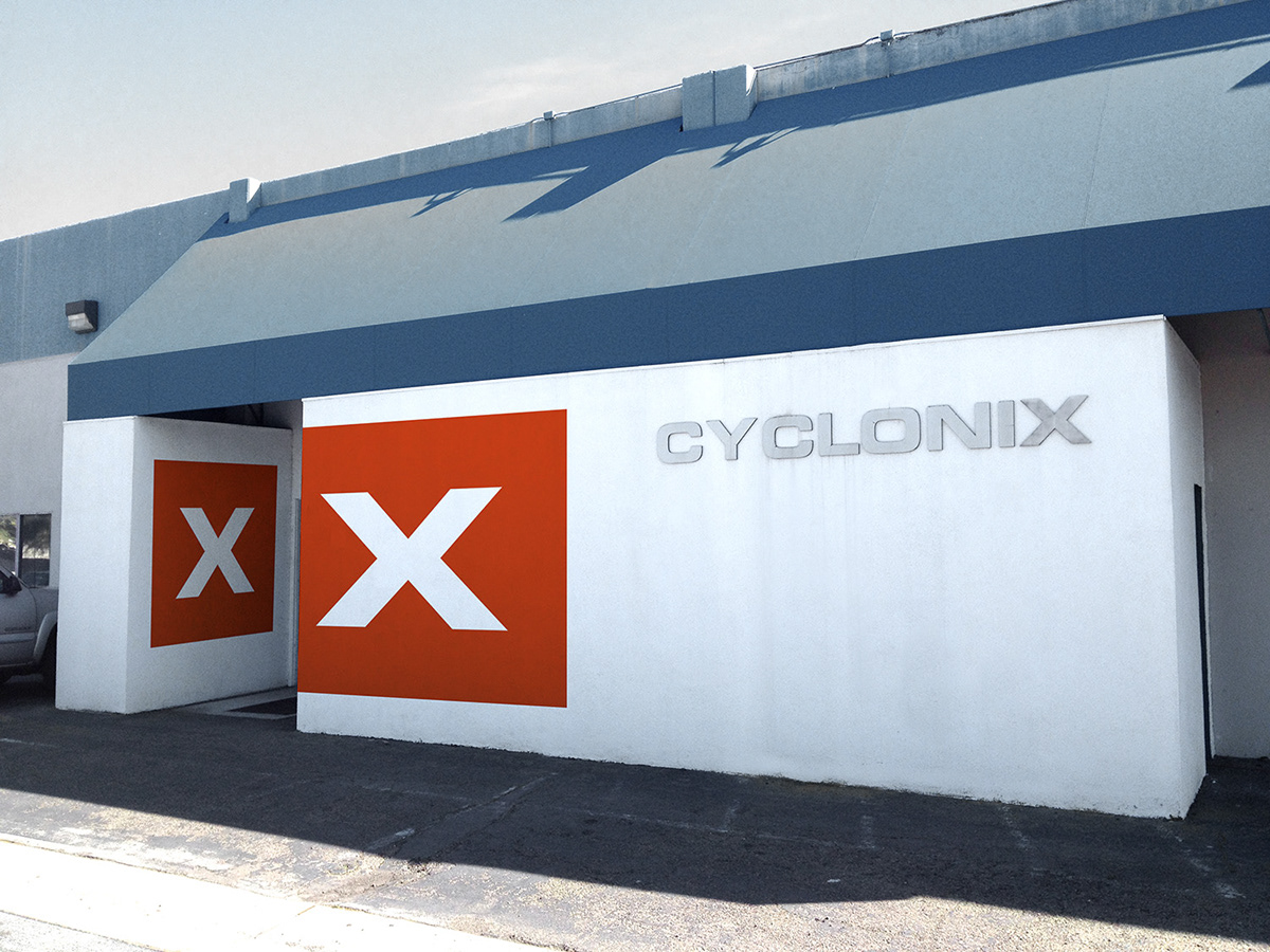
Above: Building Exterior


