

X-Men: The Last Stand is a 2006 superhero film based on the X-Men superhero team introduced in Marvel Comics. After numerous creative meeting with Fox International team in US and Fox Japan marketing team, We decide to go with core concept as "The ultimate (final) choices" Title was altered to "FINAL DECISION" instead of "LAST STAND" for Japan market. With its unique cultural difference, Japan is very different from the Western markets. The color and composition are a more graphical and simple 2-dimensional style to emphasize more Japanese sensibility of design.
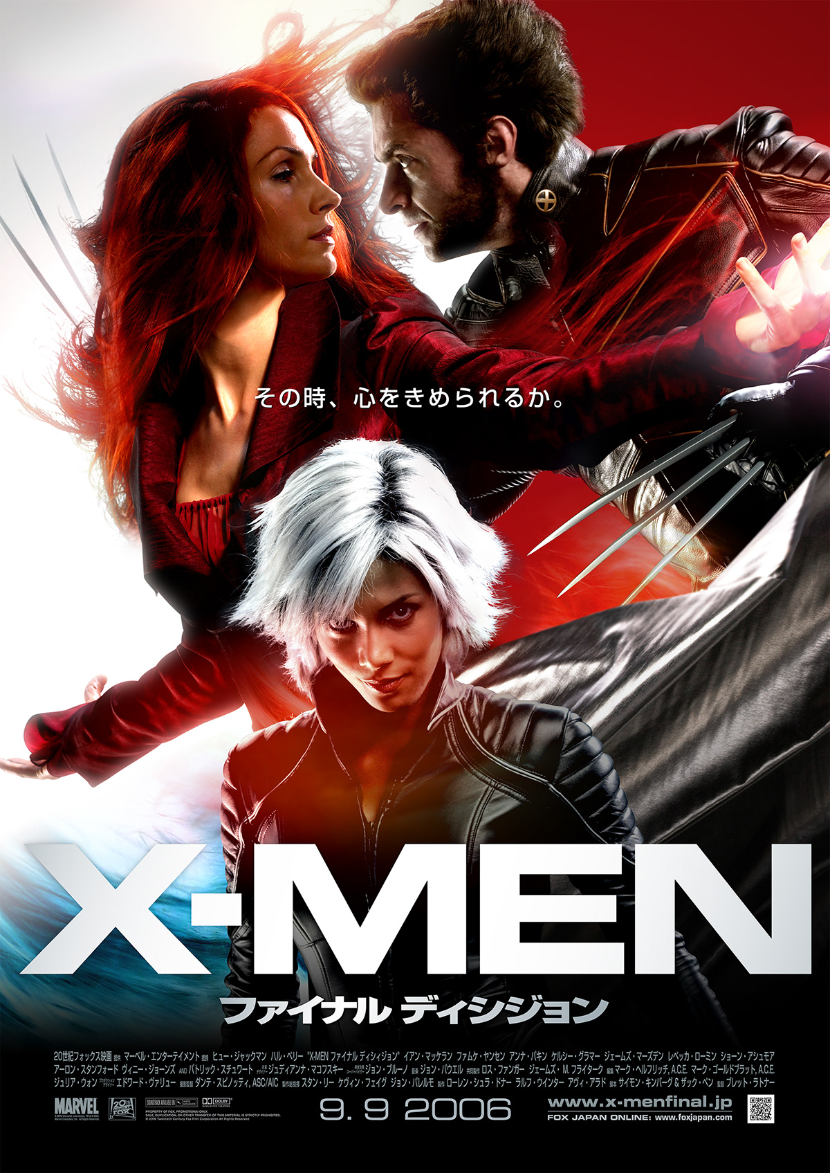
Launch Poster.

The main focus of the characters are Wolverine and Jean Grey (AKA Dark Phoenix) on the launch poster.
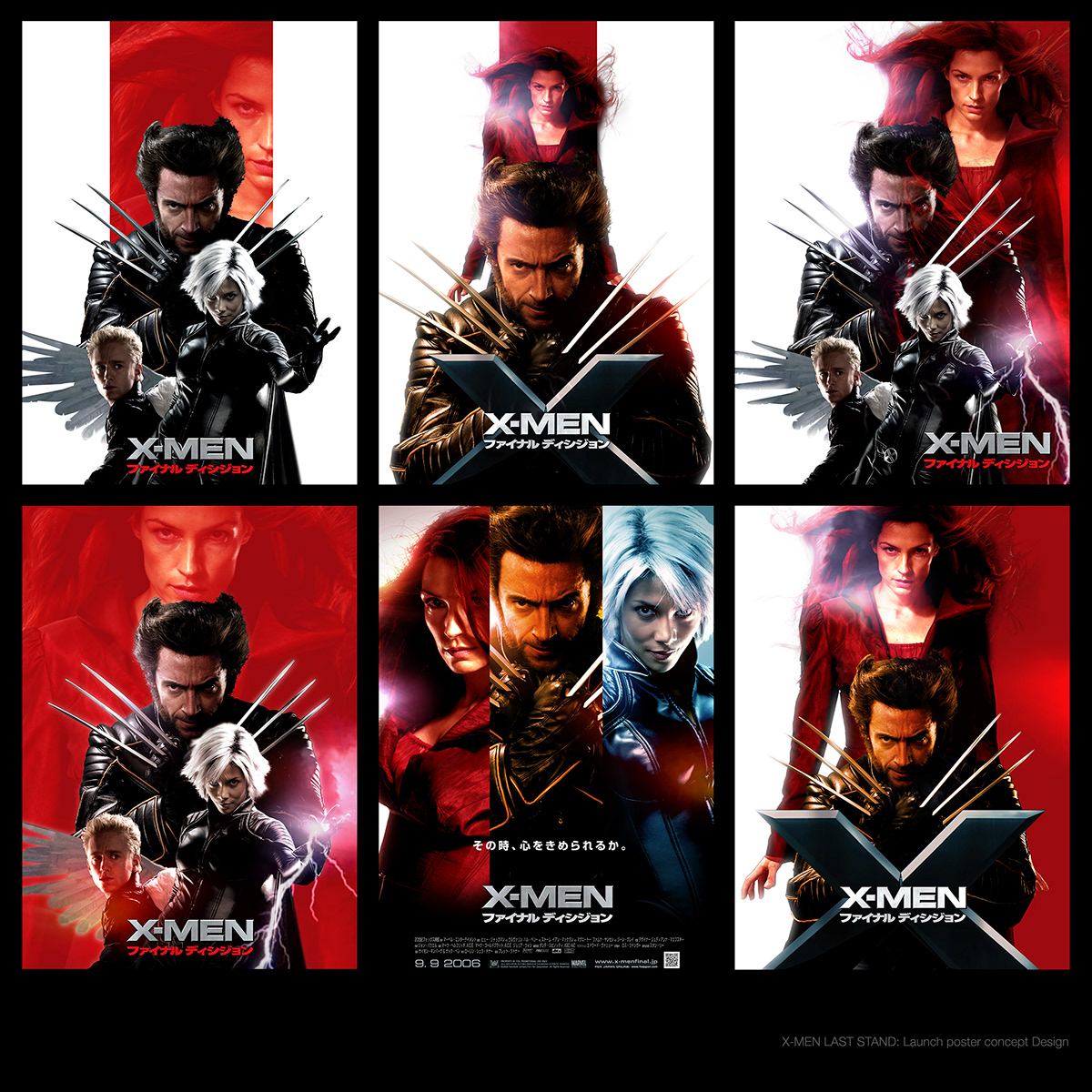
Early concept design for launch poster key visual.

First concept design for "Gone with wind" style key visual. Later, We found out Halle Berry (Storm) needs to be part of the launch poster on the same scale with another cast. It because of her contract with studios.


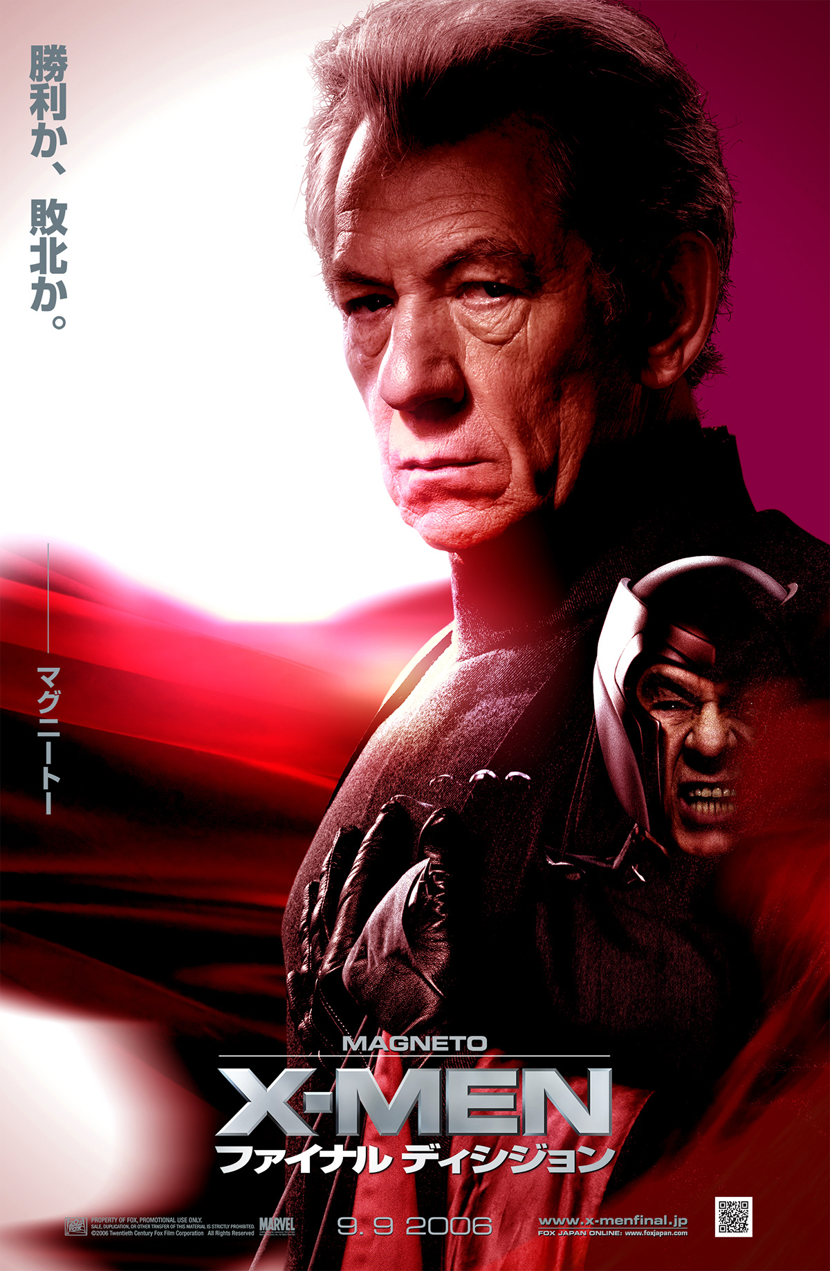
CHARACTER POSTER KEY VISUALS
In 2006, the Style of Sci-fi/Fantasy based feature film's poster had a similar style. So, we tried to distinguish the style from trend, And add a more clear concept and color for individual characters. Tagline and photo of characters express the inner struggle of the ultimate two choices they have.
In 2006, the Style of Sci-fi/Fantasy based feature film's poster had a similar style. So, we tried to distinguish the style from trend, And add a more clear concept and color for individual characters. Tagline and photo of characters express the inner struggle of the ultimate two choices they have.


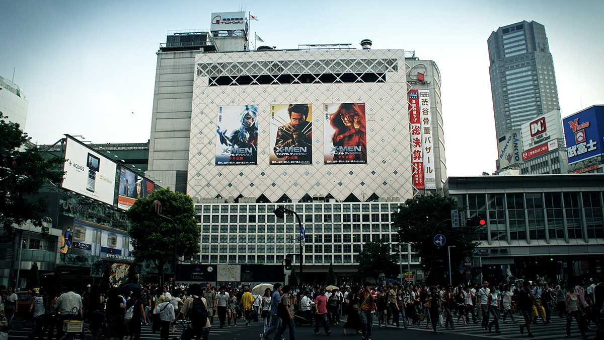
X-MEN: FINAL DECISION billboard at a big scramble crossing in front of Tokyo's Shibuya Station. One of the busiest in the world.

X-MEN: FINAL DECISION Billboard. The opposite side of the station.

Early concept design of the character posters.

Visual planning for a promotional campaign.

Client: 20th Century Fox International, 20th Century Fox Japan
Creative Director, Designer: Manabu Inada
Year: 2006
Creative Director, Designer: Manabu Inada
Year: 2006


