Background and Goal
PSYT Ltd. wanted to design and develop an application that collects, processes, and categorizes massive data gathered through its pulse survey app, me@. The application is mainly designed for HR professionals and organizational leadership. It allows them to gain insights into engagement scores and KPIs that drive performance and engagement.
I, along with other members of the PSYT team, conducted user research, created personas, scenarios, user-flows, built information architecture, designed interactions, and created UI for this project.
Research
As the first step, I started by interviewing key stakeholders and domain experts to understand about the strategy, the market, and the UVP of the product. In this phase of need-finding, we researched and studied about users, their requirements, their end-goals and what drives them towards the goals.
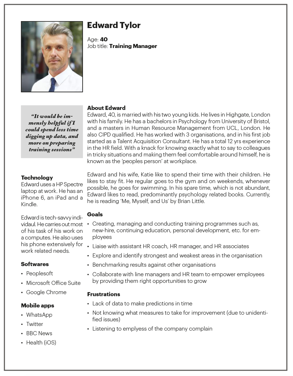
1. Personas
Then we began developing personas. To design personas all stakeholders gathered together and brainstormed to come up user behavior, characteristics, needs, etc. From there, all participants collectively ranked gathered data to 'types' of personas.
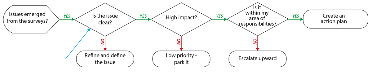
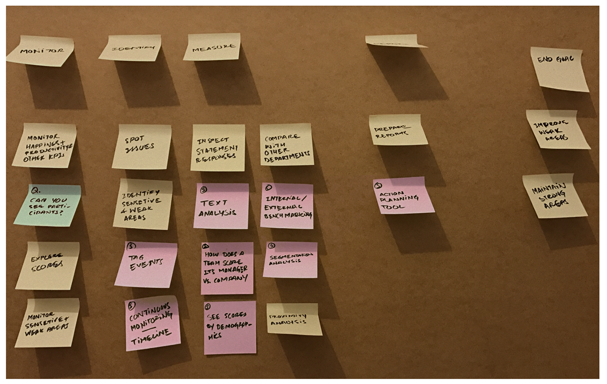
2. Users' action planning decision tree
As a part of the user research, a decision tree diagram created. This tree chart included all key questions and actions required from the user to reach his / her final goal — preparing reports and creating an action plans. The diagram served as the backbone of the project and ensured that we design the product to help user achieve their final goal efficiently.
3. User story mapping
Post developing personas and the decision-tree diagram we started to map user stories. It was a great way of looking at the product holistically and making it user-centered though putting down all required user actions, suggestion, and questions.
Development
With the help of findings and the insights that emerged in the first phase, we began with the development of the product. This included scoping out the project, designing, testing, iterating and handing over the product to the developers.
1. Functionality

Based on the user needs, product strategy and UVP we started spec'ing out the product. All possible functionalities were listed down. Then, their priority was reorganized based on how critical they were to the success of the product. For this we used MSCW (must, should, could, and would haves) technique.
2. Information architecture
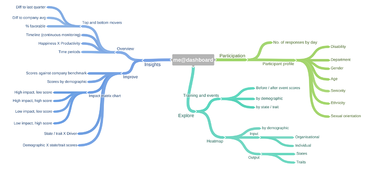
These functionalities then needed to be categorised to further the design process. Hence, we started creating information architecture for the dashboard. Through card-sorting method we optimized the IA. What we learned in this study was users grouped functions based on the final goal they had in mind, such as improving score, how organisational input is impacting output, etc.
3. Initial sketches and testing
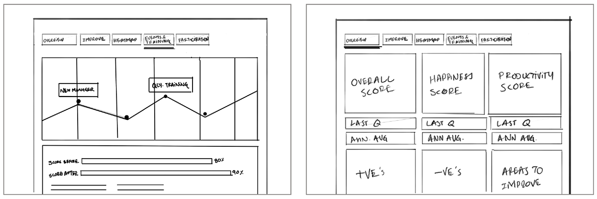
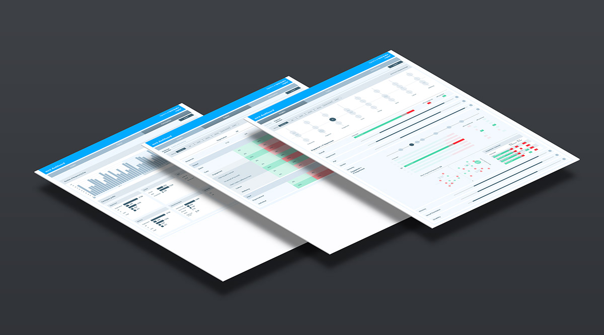
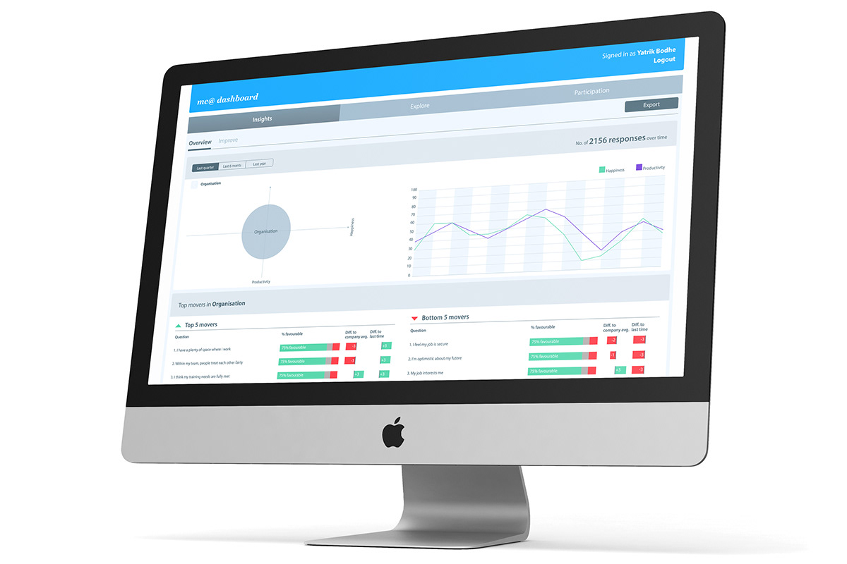
Once the functionality and information architecture were in place, then, I started sketching out the key features and interactions of the application. The technical development team had decided to use the D3.JS framework for data visualisation on the dashboard. The team then collaboratively decided which type of diagram would be appropriate for presenting a data-set. These paper prototypes were then tested for their usability. Based on the finding of the testing, we changed the design of the dashboard from a single tier to a two-tier hierarchical structure. We also changed the focus of the overview tab only on 'happiness × productivity', as this is the UVP of the product.
4. High-fidelity prototypes and wireframing
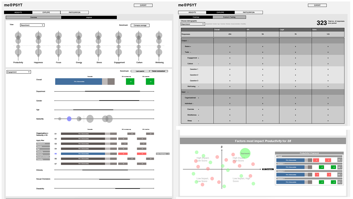
Once we finished revising the designs based on the usability test findings, the next step was to create high-fidelity prototypes. This included creating detailed interfaces, working on labels and nomenclature, and designing the overall layout of the application. After a few minor iterations and refinement, these wireframes were handed over to the development team to start planning and building the functionality.
5. UI design


In this last phase, after finalising the wireframes, visuals for the interface were designed. Colours played a crucial role in designing the interface to create a visual hierarchy within the various elements on the screen — ensuring most important bits stand out before others. The visual design for the dashboard carried forward the visual language developed for the me@ mobile app. This created a seamless user experience across products.