
A KHAN MUSEUM
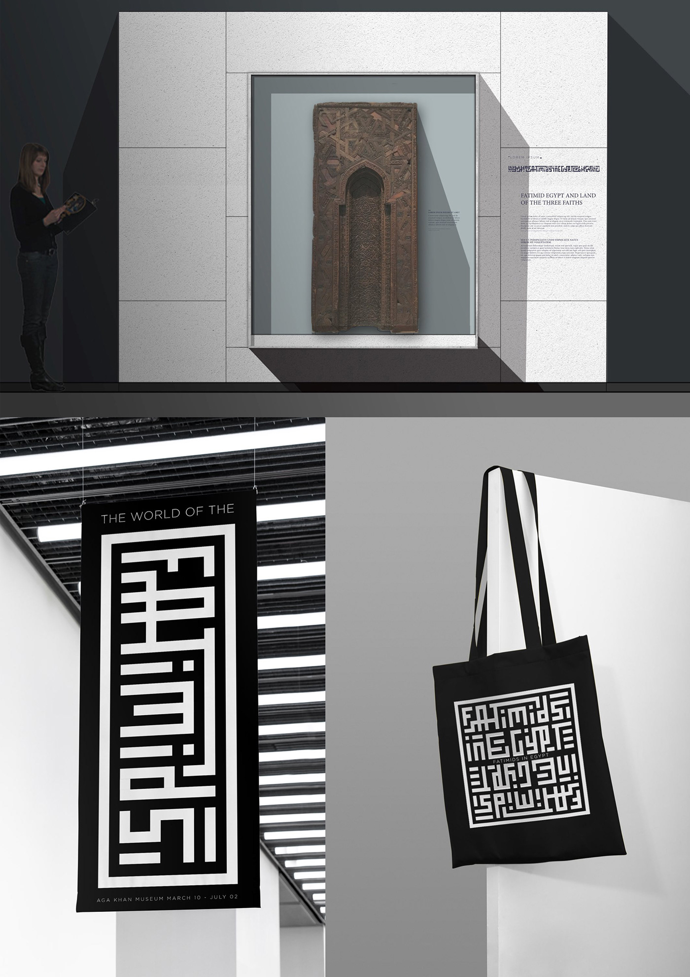
- THE WORLD OF THE FATIMIDS EXHIBITION
Design and look & feel for the landmark exhibition at Toronto’s Aga Khan Museum
The London based architecture studio London Atelier, asked us to help them create a visual language and system for the ‘World of the Fatimids’ exhibition at the Aga Khan Museum in Toronto, Canada.
The exhibition showcases the achievements of the remarkable dynasty of the Fatimids, who established one of the greatest civilizations in the world, promoted the arts and sciences, and influenced curiosity and culture throughout the Mediterranean, Europe,
and the Near East during the 10th and 11th centuries.

VISUAL SYSTEM
The main challenge was to create a simple, dynamic yet appealing communication system for all the different parts of the exhibition. We particularly focused on discovering the ideal font in order to communicate all the information that needed to surround the exhibition’s material, with the right emphasis.
We’ve created label templates for the plinths, maps and infographics for the layout of the exhibition, designed by the team at London Atelier.

RESEARCH & EARLY FOUNDATIONS
Extensive research lays at the foundations of every branding project. In this case, we’ve explored different ideas and concepts, by going on a journey through books, publications and spending time at the British Museum and other historical exhibitions.
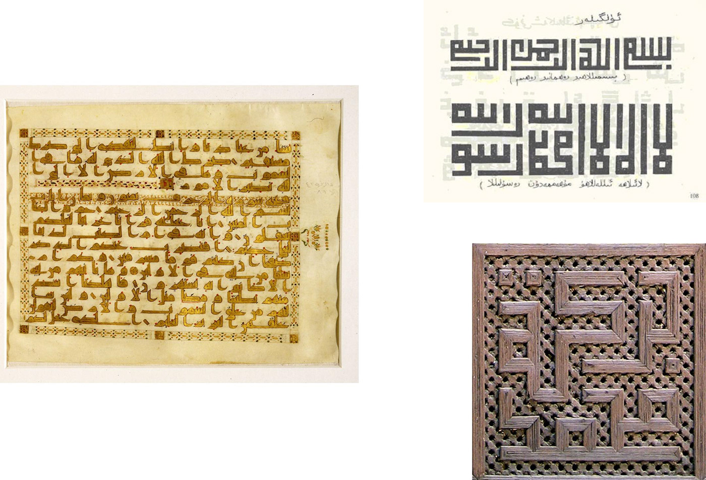
KUFIC CONCEPT
One of our earliest concepts was based on the Kufic script. It is one of the oldest calligraphic forms of Arabic scripts which consists of a modified form of the old Nabataean script. Specifically, we’ve researched the geometric Kufic, which is a simplified type used in tilings.
Originating from this iconic style, we developed a custom typeface and a decorative pattern to be used throughout the exhibition. We found this design to be very exciting, although we eventually decided to pursue a more traditional approach.


LOGOTYPE ROUTE
The second route led to a more traditional approach and was developed by working closely with the London and Toronto teams. The result was the creation of a logotype, based on the contrast between elegance and functionality.
The pairing of a serif font with a more modern san-serif, highlights the connection between tradition and modernity while demonstrating how the remarkable history of the Fatimids still influence the present.